How & How relaunches exchange-traded fund analysis platform

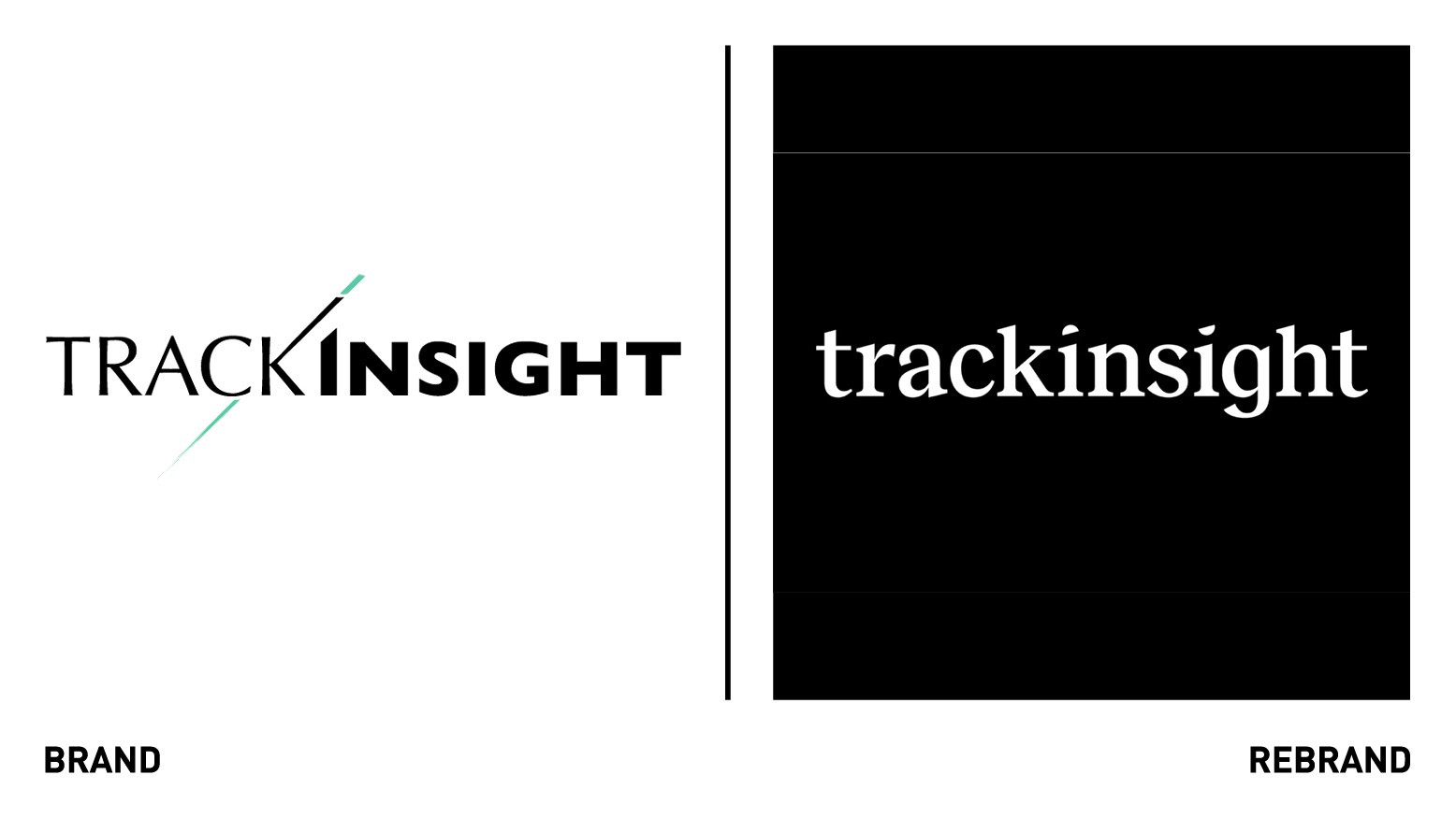
London and Lisbon-based digital design agency, How & How, has developed a new brand identity for Trackinsight, an exchange-traded fund (ETF) analysis platform that provides ratings and comparison tools on ETFs in the US, Europe and Asia.
As a data-driven ETF resource, Trackinsight aims to facilitate the calm that investors desire while making decisions. The new brand, therefore, centered on the experience the platform promises to its audience: an ‘oasis’ of analysis, where they can ‘focus’ and ‘cut through’ the noise of the the other thousands of ETFs listed worldwide to find the right fit.
The two semi-circular lenses in the logotype take inspiration from the spectacles and reading glasses, items use to help people see better, which reflect Trackinsight’s mission to help users see more clearly. The logo forms part of a grainy design system, where gradients were cut-through with razor-sharp graphic elements.
As Trackinsight is partnering with the Financial Times and expanding in the U.S., How & How chose a typeface, founder Grotesk, that gives a strong editorial and American feel. The agency selected Inter for its varied UI capabilities and large glyph set.
The tone of Trackinsight’s messaging aims to complement its typographic elements, being editorial, approachable and strong. Just as the brand’s gradients simultaneously represent the antagonist (noise) and the proposition (an oasis), the messaging across audiences was as much about removing negatives as it was proposing positives, How & How explains.


