DUAL refreshes brand and website for Sharp Focus Productions
Oxford-based video production company Sharp Focus Productions commissioned digital consultancy DUAL to overhaul their brand and website.
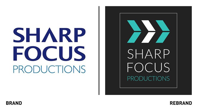
As Sharp Focus Productions specialises in creative conceptual filmmaking, which includes writing scripts, directing and casting to sourcing locations, filming, and post-production, the challenge for DUAL was to find a suitable logo that encompassed the six services in one single visual element. DUAL developed a clapperboard motif as the logo, with the idea that it provides instant clarity and can be used in a wide range of platforms and formats.
"We aimed to create a sophisticated identity to support SFP's pivot towards producing high-quality video dramas for large 'English as a foreign language' educational providers and public sector organisations. We also developed a vibrant colour palette, which allowed us to provide a unique look & feel for each of their core services,” says Simon Cook, creative director at DUAL.
DUAL wanted to go with a predominantly dark background as this really helped the brand’s photography and videos ‘pop,’ and provide a more sophisticated feel. In the end, the agency felt aqua green worked best with the dark background and therefore chose it as its primary brand colour with others becoming sub-colours.
The typography, Lato, is modern and precise, and similar to the previous typeface so it wouldn’t create a radical change and confuse the studio’s existing client base.


