DixonBaxi creates expressionistic brand for Canada Water
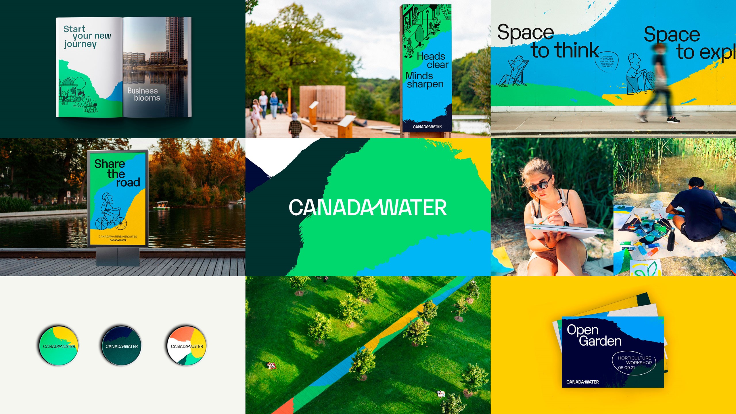
London-based creative agency, DixonBaxi, worked with British Land to reimagine Canada Water as a new town centre in London. The agency created an expressionistic brand identity for the home of the docks, with the aim of capturing the multidimensional identity and diversity of the neighbourhood.

DixonBaxi looked to the future to bring to life a new Canada Water. It also attempted to blend insights from the past by immersing itself in Canada Water’s heritage, culture and provenance.
DixonBaxi focused on the idea that Canada Water is defined by the resilience of its community and its history. The neighbourhood was the birthplace of leaders like social reformer Ada Salter and engineer, Marc Isambard Brunel. This led the agency to develop the brand positioning ‘Lead the Change.’
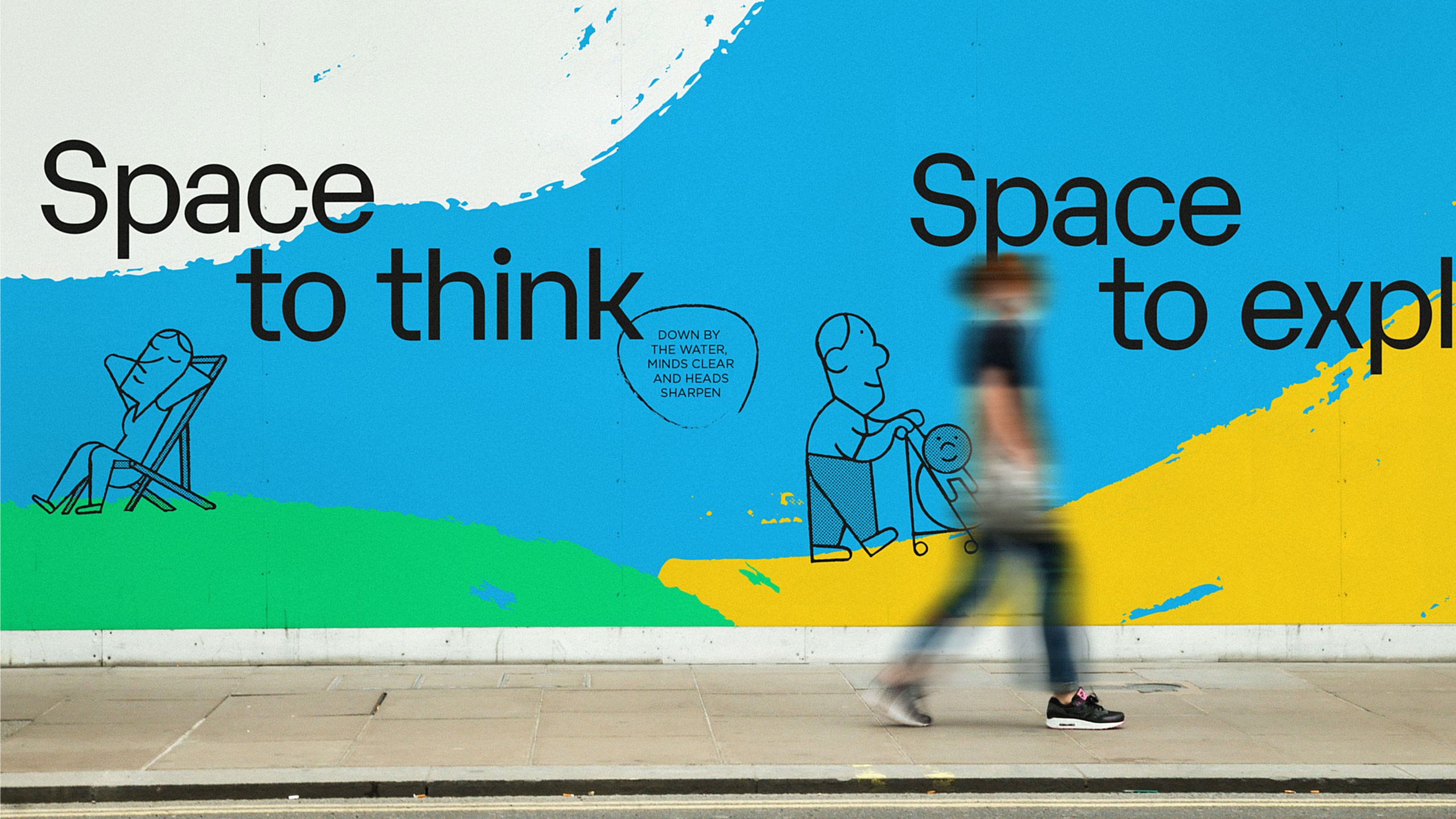
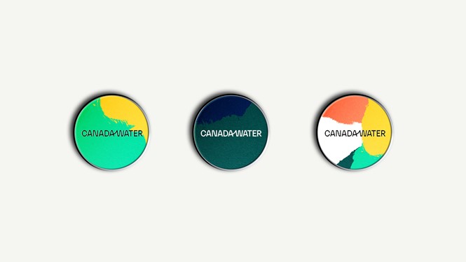
The agency developed hand-made ‘gestures’ by takings days out in Canada Water to paint, by the water, in the woods, parks and surrounding areas as a starting point for a hand crafted aesthetic. The gestures aim to express the overlapping communities, experiences and lifestyles of Canada Water and represent the neighbourhood that has been built and rebuilt over time. Inspired by the spontaneity of abstract expressionism, the gestures are open to interpretation and subjectivity. By using different crops and framing, DixonBaxi developed a design system that allows it to modulate the volume of colour, brightness and energy of the brand.
“Working in partnership with British Land and the local community, we were able to create a design language that can evolve and grow over time, and contribute to writing the next chapter in the pioneering history and future of Canada Water,” says Astrid D’Hondt, design director at DixonBaxi
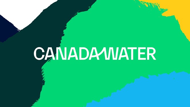
The Canada Water wordmark was chosen to celebrate the spirit, landscape and connectivity of the borough. Influenced by the ecosystem of Canada Water, the wordmark aims to express the relationship between the natural landscape and its positive influence on the working and living environment. The upward motif is echoed in the other 'A' letters to create a more human feeling while the angular forms of the typeface provide a contrast that feels more structured, DixonBaxi explains.
“What I love most is the brand’s exceptional flexibility from a design perspective: we have huge room to move across every format within a really strong brand framework, whilst at the same time sitting clearly within the wider family of British Land brands,” says Alexandra Maclean, head of marketing at Canada Water.
The colour palette, sampled from local areas and historical icons, from local bridges to the docks, were given names such as Harmsworth Blue, Brunel Clay, Mayflower Yellow and Stave Hill Green. DixonBaxi chose Karelia as the primary typeface for its organic curvature and contrasting geometric forms.
