CIOB’s rebrands in positive shift for the future
The Chartered Institute of Building (CIOB), a global organisation that represents professionals working within the field of construction, worked with creative agency Dragon Rouge to develop a stronger, forward stronger, forward looking brand to maintain its success and growth into new markets.
As CIOB looked to enter new markets, inspire new audiences and build on its rich heritage, the organisation recognised the importance of addressing key brand questions, including its brand architecture, its brand platform and how these are brought to life through its brand identity.
The new brand idea of ‘for standards, for change, for people’ was developed to help CIOB reinforce what it’s always stood for and focus on the value it creates.
CIOB’s diverse range of activities and initiatives didn’t always link clearly back to the brand, something which was limiting CIOB and diminishing the scale of the brand’s reach. Dragon Rouge decided to move towards a monolithic brand ecosystem, allowing CIOB to build awareness and equity in the masterbrand.
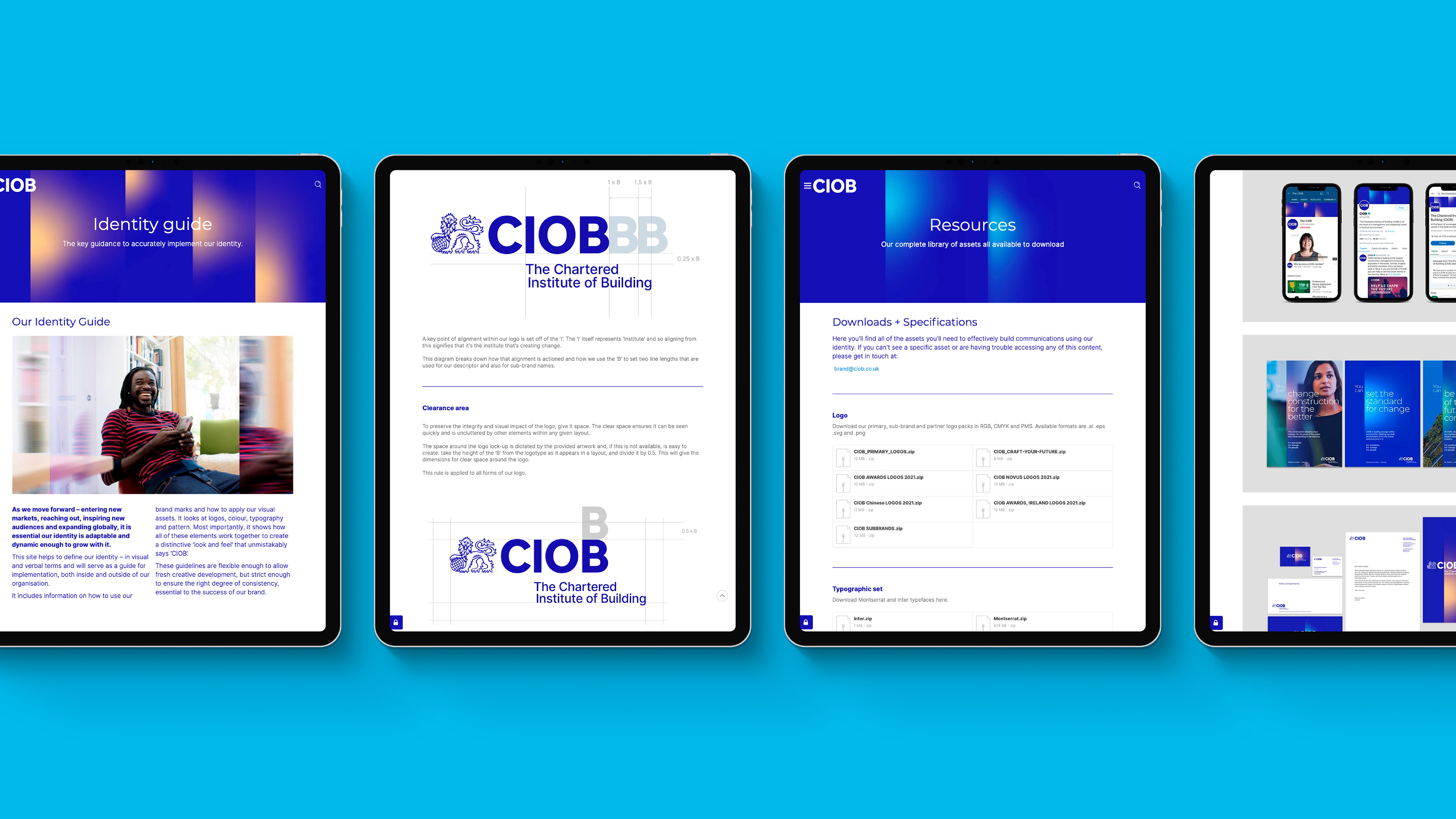
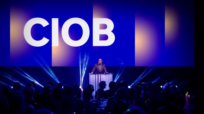
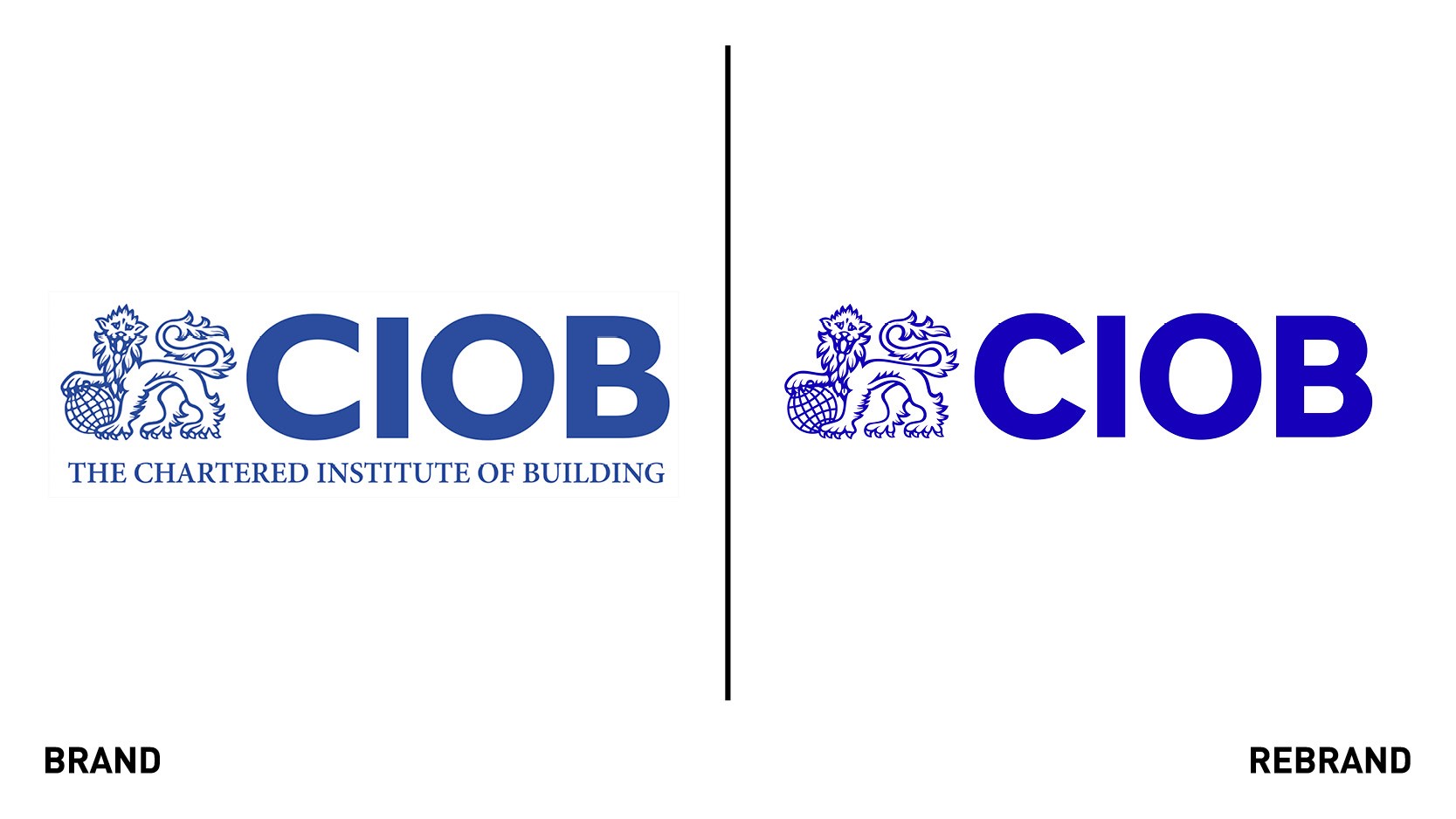
The visual identity takes the idea of positive change, using a graphic ‘shift’ to communicate the cultural shift and societal impact that CIOB enables. The vertical ‘shift’ is used in different ways including gradients, photography treatment and in motion to create a distinct graphic design language for the brand. The logo was simplified, making a hero of the redrafted workdmark to maximise impact on digital channels.
The rebrand also introduces digital-first colours and clean and clear typography, with a refreshed approach to photography which focuses on the impact and benefits that CIOB create rather than generic shots of buildings.
The same characteristics that influenced the visual identity also informed CIOB’s new tone of voice principles to ensure a consistent, authentic experience of the brand, for all audiences and channels globally.