BrandOpus develops a reinvigorated identity for British soft drink producer
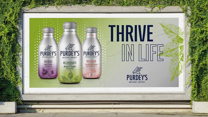
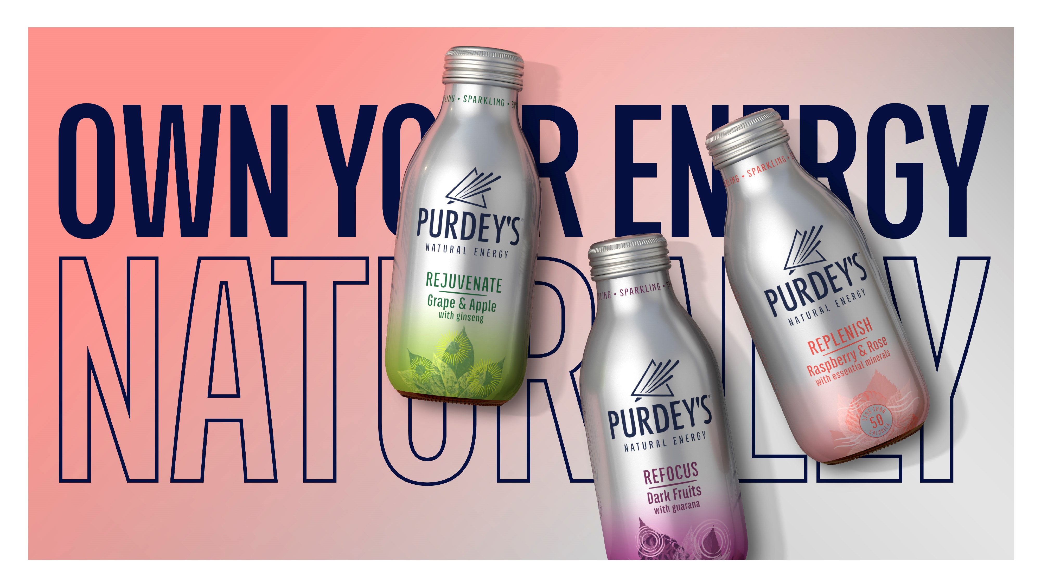
British soft drink producer Britvic worked with global creative agency BrandOpus to unveil a refreshed identity for its natural energy drink brand Purdey’s. The revamp of the classic brand aims to grow Purdey's to a mainstream brand by broadening its appeal to a wider audience looking for functional drinks.
Having gained a loyal following over the past three decades, Britvic were on a mission to grow the brand even further with a new identity that better reflected its role as a natural energy drink, moving away from the caffeine-fuelled beverage tropes.
“With more and more consumers looking for an energising lift that they can feel good about, it was time for us to take a step back and re-evaluate how Purdey's was manifesting itself in the world. It was crucial for the new design to stay true to our roots, yet paving a way for Purdey’s to attract new consumers through demonstrating our great taste, unique flavor and more natural ingredients,” says David Laidler, growth space marketing controller at Britvic.
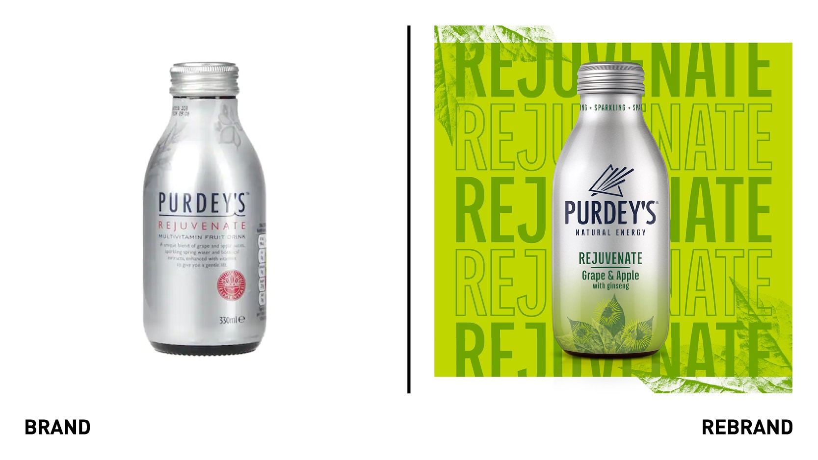
BrandOpus uncovered there was an opportunity to better decode the brand’s naturalness and help consumers understand the product’s benefits and flavours. The agency realised the need to elevate Purdey's existing packaging, imbuing its metallic look and feel with more natural cues.
“Because Purdey's taps into energy at a holistic level, we wanted to craft a visual expression that truly captures the brand’s unique take on natural vitality. The recharged identity heightens purveys positioning by bringing relevance and meaning at a brand level,” says John Ramskill, executive creative director at BrandOpus.
The ‘prism’ symbol to the word mark aims to tell the story of the brand transformation that happens within, while the overall softer aesthetic of the new typeface alludes to the freshness of the drink. The silver canvas has been overlaid with pops of colour to inject a sense of liveliness to the overall brand, while a gradient style aims to bring a ‘gentle lift of energy.'
Drawing inspiration from the drink’s feel-good energy and fruity flavour, the new identity wants to be more accessible and distinctive.


