B&B studio reimagines keto brand FATT with new branding
London-based creative agency B&B studio worked with keto brand FATT to reposition and redesign the brand as it looks to build on growing category awareness and expand its product portfolio. The rebrand builds on the FATT name, the brand’s strongest existing asset, but introduces a new visual identity to connect with a new generation of in-the-know eaters.

B&B was keen to harness the energy of committed keto-eaters, forging a strong connection with a small, but loyal, target audience, while letting the products’ broader health benefits attract a wider group of low-carb eaters along the way. To achieve this, the rebrand aims to reclaim the word FATT, infusing it with positivity and challenging consumer perceptions and dated idea language while championing good fats.
“The repositioning and rebrand has had the fantastic effort of re-energising us internally, sharpening our focus on the future, helping us champion the benefits of keto and building our reputation as the obvious snacking choice for the committed keto lover,” says Hannah Sutter, FATT founder.
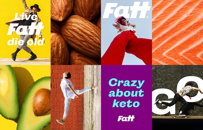
The logo features a hidden lighting bolt that seeks to capture the dynamism of the keto lifestyle, believed to increase energy and mental sharpness, while vivid colour combinations aim to express a feeling of amplified clarity. The new range features bars, bites and a cookie, coded and differentiated by colour and format.
Injecting a lifestyle feel into FATT was important in elevating the brand beyond its product focus and connecting with a community of keto lovers. Social media and branded merch help exude a youthful energy, while messaging like ‘Live FATT, Die old’ allow the brand to communicate keto benefits without having to rely on the often dry nutritional language.


