#TransformTuesday: 9 June

Here is this week's selection of rebrands from around the world, from fuel networks to data analytics to life care organisations. For more from #TransformTuesday, follow @Transformsays on Twitter.
AMPOL

Design agency Houston Group Sydney worked with AMPOL, former Caltex Australia (CTX) business, one of Australia’s largest fuel networks, to create a new and more modern visual identity that would bring the brand back to life while retaining its local heritage. Ampol was a historic Australian fuel business, originally known as the Australian Motorist Petrol Company, which then merged with Caltex in 1995. The new identity is centred around the new design of the logo, a distinctive leaning A, which symbolises the brand’s “forward momentum.” “The business needed to fast-forward twenty years of evolution whilst retaining its original DNA. The strong bands of the original logos and colours gave us the creative foundations of the new mark,” says Alex Toohey, Houston’s executive creative director.
CEO & Founder of Houston Group, Stuart O’Brien, said that although return of AMPOL was much more than a nostalgic one, with the brand retaining latent equity in Australia as a trusted Tier 1 fuel provider, the brand was in critical need of a contemporisation. Ampol’s Interim CEO, Mathew Halliday, adds, “Our fresh new symbol will connect Ampol with a new generation of customers and underpins our commitment to again make it Australia’s most loved and admired fuel brand. The striking simple symbol will be a beacon for customers when on the road.”
The first Ampol sites will appear in Sydney and Melbourne in the second half of 2020, with roll out nationally in 2021. The transition from Caltex to Ampol will be completed by the end of 2022.
Bayzat
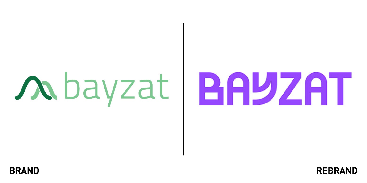
Bayzat, a UAE-based B2B platform offering progressive human resources, payroll, insurance and employee benefits worked with London-based branding agency Ragged Edge to create a new brand identity that would be bold enough to communicate its modern approach to the the way businesses and employees think about work in this region. The company’s different functions, from the technology to the humanity and imagination, are represented in the new identity as graphic shapes that combined together create a machine of possibility. The logo reflects the company’s unconventionality, while the tone of voice communicates both the visionary messaging and the day-to-day functionalities. The photographs of real people in real offices, combined with a purple colour scheme, visually sets Bayzat apart from a sea of corporate blue competitors.
“Bayzat has an amazing product. And an amazing culture. But it was battling generations of entrenched workplace practices in the UAE. On top of which, Bayzat had adapted and grown over the years to meet the needs of its clients, from insurance to HR to workplace benefits. It was struggling to convey the breadth of what the platform has to offer. So instead of focusing on the different features and benefits, the new brand is built to inspire employees and employers around the possibilities of a new kind of work life,” says Max Ottignon, co-founder of Ragged Edge.
Canvas GFX
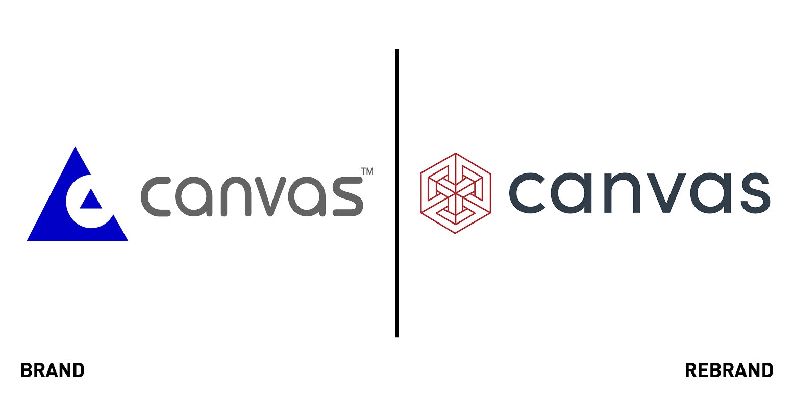
American technical illustration software provider Canvas GFX worked with Boston-based design agency Matter7 to create a fresh brand identity, which includes a new website and visual identity to mark the next phase of the Canvas story as an independent organization with fresh investment and new leadership. The new visual identity can be viewed as two or three dimensional, reflecting the ability of Canvas software to import and handle both 2D and 3D image files. The hexagon symbolises balance and structural stability.
“When we sat down to create the logo, we wanted something that was both simple and complex; something that was both precise and compelling. This led us to a linear logo that can be seen as a 2D hexagon or a 3D cube, depending on how you look at it. The cube communicates stability, while the hexagon has the best torque for mechanical engineering,” says Katie Burkhart, founder of Matter7.
“At the core of the new Canvas proposition is the effective and precise visual communication of complex objects and ideas - and the visual elements of the new brand were conceived to tell that story,” adds Pat Hume, CEO of Canvas GFX. In addition to the new brand identity, all product branding has been aligned around the core Canvas X brand, so Canvas’ geospatial data visualisation product, formerly known as Canvas X GIS, has been rebranded as Canvas X Geo.
Conjura
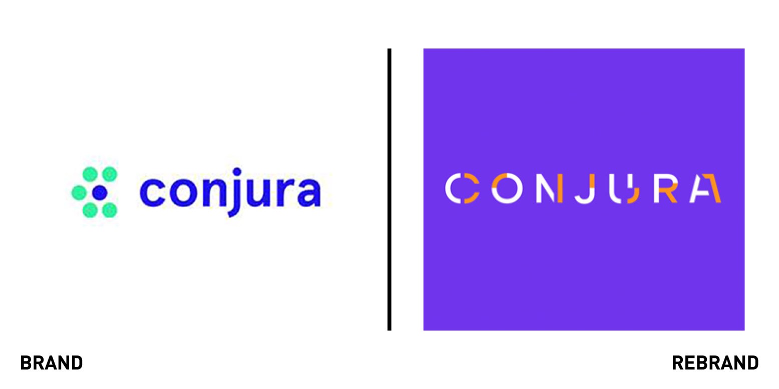
Conjura, a data analytics consultancy based in London, Dubling and New York worked with UK design agency Clout Branding to create a new identity, website and brand strategy. The idea behind the rebrand was to show that Conjura, unlike competitors which were talking about ‘data insight’, had the power to alter the course of events and provide clients with foresight. Data Foresight therefore became the heart of the new positioning, and the narrative and visual expression were built around the direct benefit of that ‘Change the outcome.’ To reflect this Clout Branding used graphic language that distorts only to reveal the clear and full picture. ‘You dodged a bullet! We showed a private equity client when it was better to say no’ a poster ad says, as a fragmented picture of a bullet is shown among purple squares. The logotype also symbolises the idea of falling into place and completing a bigger picture, which is what the company tries to do by changing outcomes through smarter use of data.
CEO of Conjura, Fran Quilty, described the rebrand as “the perfect fusion of creative expression and industry relevance that allowed us to differentiate ourselves in a way that reflected our personality.”
Mountbatten
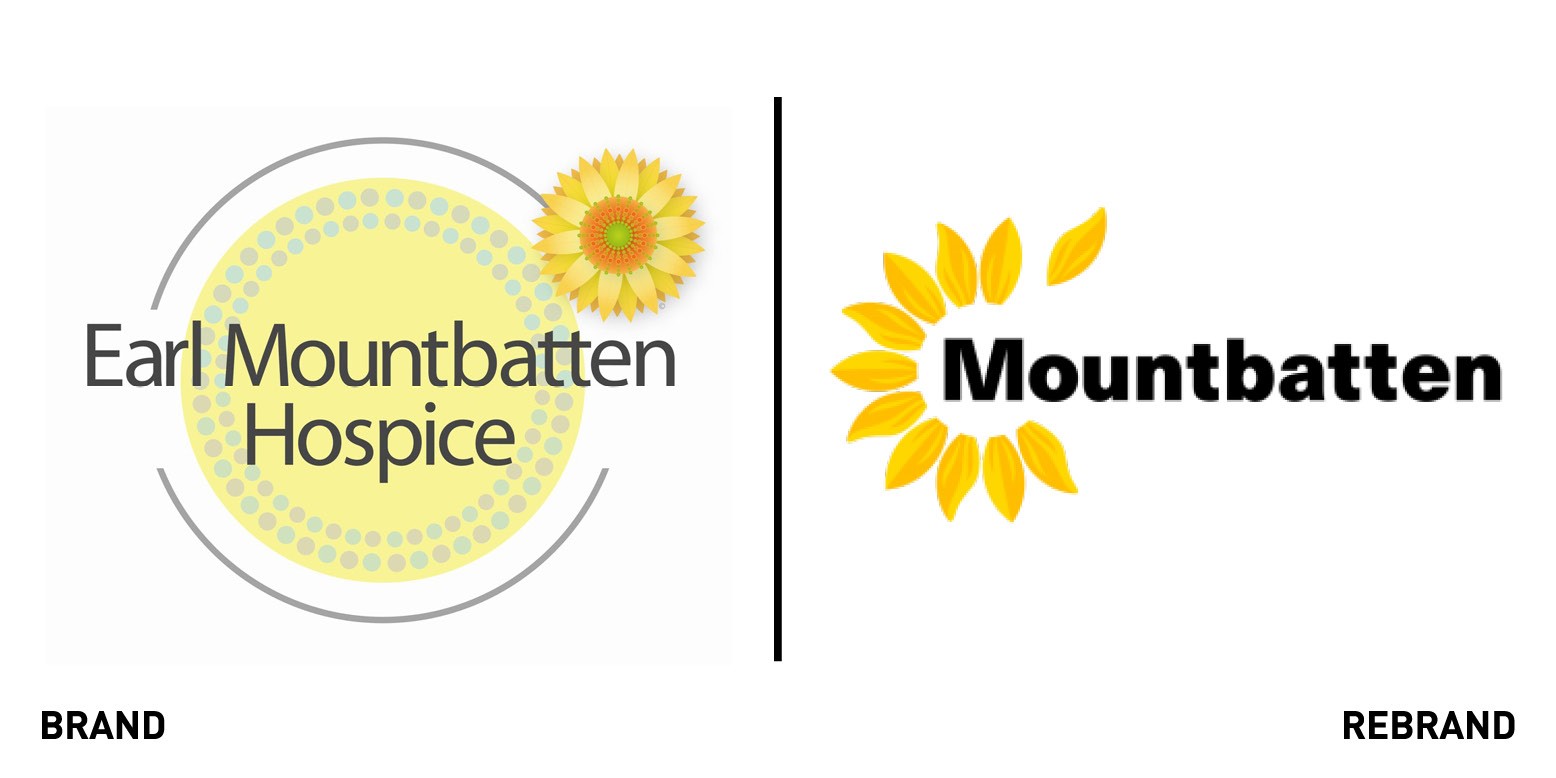
Formerly known as Earl Mountbatten Hospice, the end of life care organization on the Isle of Wight worked with brand consultancy Thinkfarm to create a new identity system, including a new name, that would support all future and present services, places and fundraising activities across the Isle of Wight. The organisation sought to rebrand because when it realised that focusing on the word hospice was not a good start to the complete story. The independent charity provides expert medical, nursing, end of life care and bereavement to over 1,600 people not only in the hospice and local hospital, but also in people’s homes.
“We needed a name and an identity to help us tell our full and developing story. We are so reliant on our community for their support and we need people to know how the money they raise for our cause is used,” says Mountbatten CEO Nigel Hartley. The result of the rebrand is a strong visual identity of a petal separating to reflect the importance the teams places on talking about death, something which is also reflected in the strapline: Living, dying, Remembering. Since the rebrand, the Countess Mountbatten Hospice in Southampton has been renamed as Mountbatten Hampshire.


