#TransformTuesday: 8 September

Here is this week's selection of rebrands from around the world. For more from #TransformTuesday, follow @Transformsays on Twitter.
CopperNose Jerky
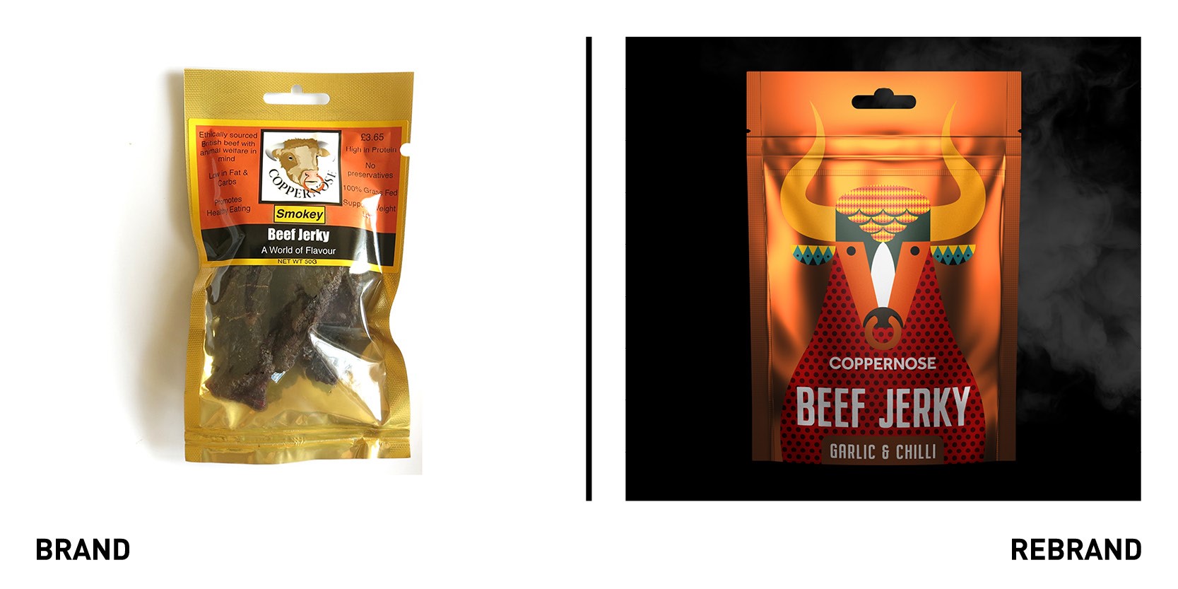
Somerset-based design agency Pencil Studio worked with British Coppernose Jerky to create a new packaging that would steer the brand in a growing market. While the product was renowned for its distinctive taste, the packaging failed to reflect these different tastes and therefore stand out in a sea of similar looking brands. The new identity is focused on jerky heritage, founded in how traditional Native American jerky is produced, which is reflected in the style and pattern of the packaging taken from traditional Native American apparel. The heritage links are further emphasised through hand-illustrated bull, leader in the Jerky field. The animal takes centre stage in the packaging and represents different flavours. The blue bull is the ‘smokey’ beef, while the red is ‘garlic and chilli.’ The range of colours on the packs marks an evident distinction between the flavours, which catches the consumer’s attention and allows them to swiftly take a decision at the supermarket shelf. The ‘C’ of Coppernose has also been made into the ring on the bull’s nose, a hidden extra element to the packs.
“We really wanted to have a reference that reflected the heritage of Jerky and Native Americans who created Quechuan (Dried Meat) as Coppernose smokey their product in a similar traditional way,” says creative director of Pencil Studio Luke Manning.
Ideal Heating
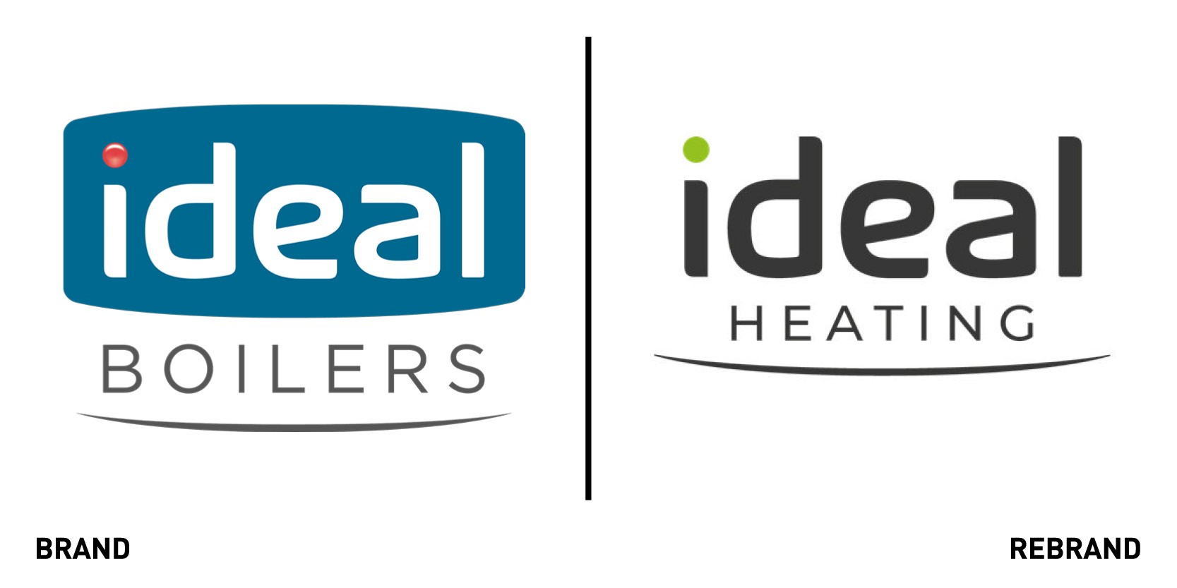
Creative branding and communications agency The Team rebranded the ‘ideal’ brand family, Ideal Boilers and Ideal Commercial to Ideal Heating to future-proof the positioning of the brand portfolio, embrace the diverse product offering and a commitment to low carbon technologies. The new logo retains the familiarity of the previous one, but adds a green dot on the 'i' in place of the previous red one, to reflect the link between Ideal Heating and a more sustainable future. With the old logo still being recognisable in the market, it will retain its previous clients while also attracting new ones.
“We’re keen to dispel any misconceptions that could come with our name – for years we’ve offered so much more than just boilers, and there’s more exciting innovation to come. Our ambition is to be the number one choice for installers, consumers and businesses when selecting a heating and hot water system,” says chief marketing officer at Ideal Heating Jo Shepard.
INTL
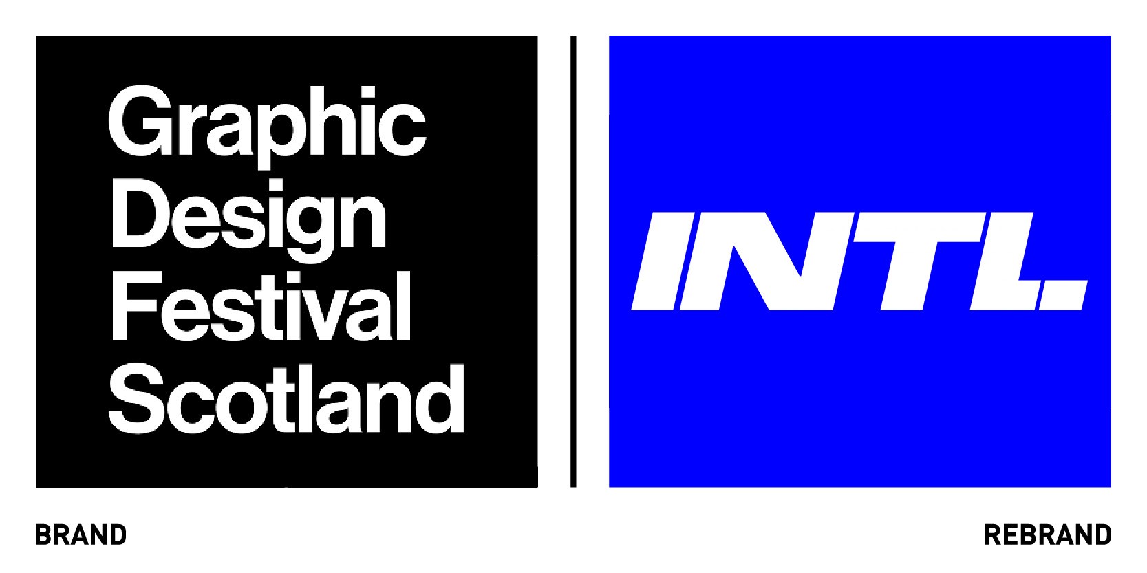
The Graphic Design Festival Scotland (GDFS) worked with Glaswegian graphic design agency Warriors Studio rebranded as INTL and unveiled a new, vibrant visual identity. The aim was to create a more established, consistent and recognisable brand for INTL, although parts of the identity will be fluid and able to evolve annually. However, unlike the GDFS identity, which changed each year, there will be recurring elements to allow the identity to work as a cohesive brand every year. The rebrand is flexible, with INTL having an identity to anchor each even to its brand but with an adaptable aspect that can accompany different campaigns. Warrior Studio collaborated with Nam Huynh, an artist who animated the three type-transition motion graphics in which the GDFS letters transform into INTL, conveying the rebrand in a concise way and adding motion into INTL. The typeface and colour palette are bold and dynamic, which reflects the attitudes of people at INTL.
Kalamazoo
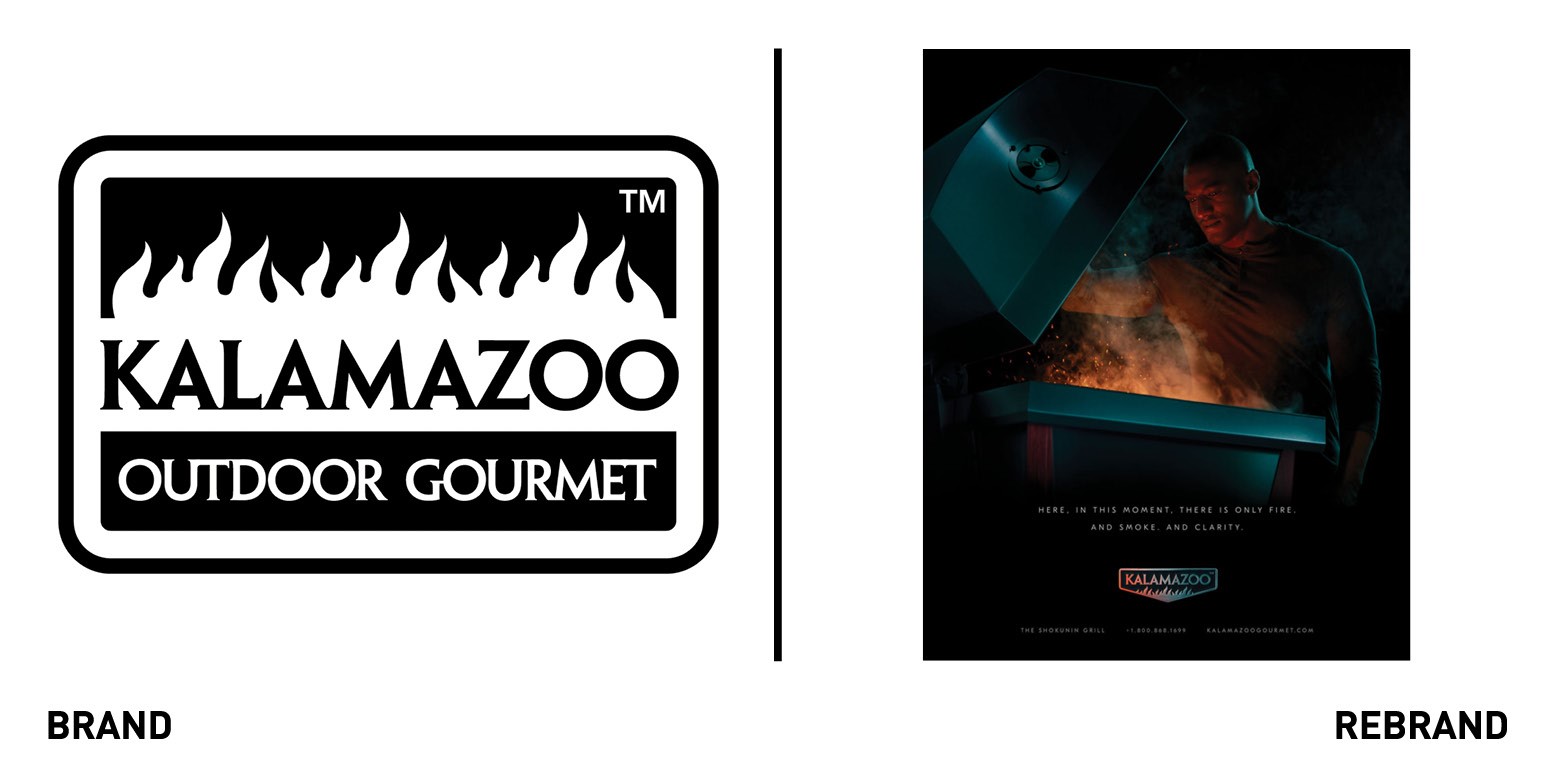
Luxury grill Kalamazoo Outdoor Gourmet worked with Indianapolis-based independent agency Young & Laramore to launch a new brand identity, in a time where consumers are looking to elevate their home experiences as the pandemic has caused more people to stay home and renovate their houses. The rebrand campaign was created off the insight that the brad’s name is associated with the highest standards of design and manufacturing and that current owners refer to is an ‘immersive grilling experience.’ With this in mind, the creative team began with a captivating visual experience: the glow of fire on a face, flames against simple backgrounds, and stainless surfaces reflecting lights. The immersive campaign is fundamental to convey the feeling one gets from grilling on a Kalamazoo, as there is little possibility of trying the high-end product before buying it.
Whether you’re cooking on our innovative Hybrid Fire grill, stunning Argentinian-style Gaucho grill, or the performance-driven Shokunin kamado grill, the fascinating culinary adventure makes the rest of the world disappear. Our goal was to bring those feelings of captivation and intensity to life. Young & Laramore gets it and the campaign embodies that,” says Alexis Hiller, head of marketing at Kalamazoo Outdoor Gourmet.
In addition to completely re-doing the website, the agency produced print advertising for outdoor living and design magazines, collateral, trade-show graphics and video and partnered with Leap Agency for the back-end website development.
Locacuisines
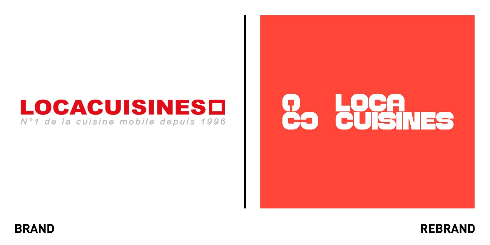
Locacuisines, a company based in Toulouse that designs and industrialises modular structures for temporary kitchens to be set up in record time, worked with design agency Brand Brothers to refresh its visual identity. The new tagline (Assemble to gather, ‘Assembler pour rassembler’ in French) became the starting point for the graphic language and modular system Brand Brothers developed. The symbol, an L made up to 3 C modules, which is based on an in-house typographic design, expands to form a set of muddles that connect together over and over, representing the core function of the brand of assembling restoration modules and forming ephemeral living spaces. An emphasis was placed on the deployment of this new visual system in a complex environment, from modular constructions to delivery vehicles to printed materials. The new visual identity was easy to implement yet offered a multitude of visual possibilities, allowing the brand to expand online and in print.
MacConvilles
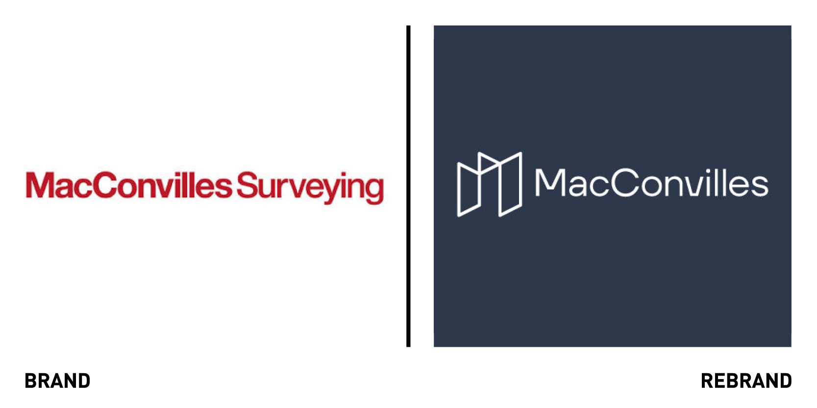
Brighton-based surveying company MacConvilles worked with branding agency UnitedUs a new visual identity to reflect their vision of being at the core of shaping communities across the South East. The new identity, while more simple and linear, brings MacConvilles knowledge and wealth of experience to the centre, continuing to develop their long-standing relationships with both the clients and communities. The new strapline ‘at the core of surveying since 1938’ focuses on the brand’s heritage and holistic approach, something which is further emphasised the by circular graphic devices and core textural elements. The colours, offering a twist on a classic 1930’s colour palette, paired with a modern typography demonstrates that the history behind the brand is capable to pushing them forwards into the future.
“For companies to stand the test of time, they need to not only embrace change, but actively look to evolve and become more than they are. The fresh and energised perspective of the MacConvilles leadership is championed in their vibrant new aesthetic, while the brand language now does away with the same-old-same-old of construction in favour of the human-centricity that drives the people within their team,” adds co-founder and creative director at UnitedUs Luke Taylor.
Mira Beauty
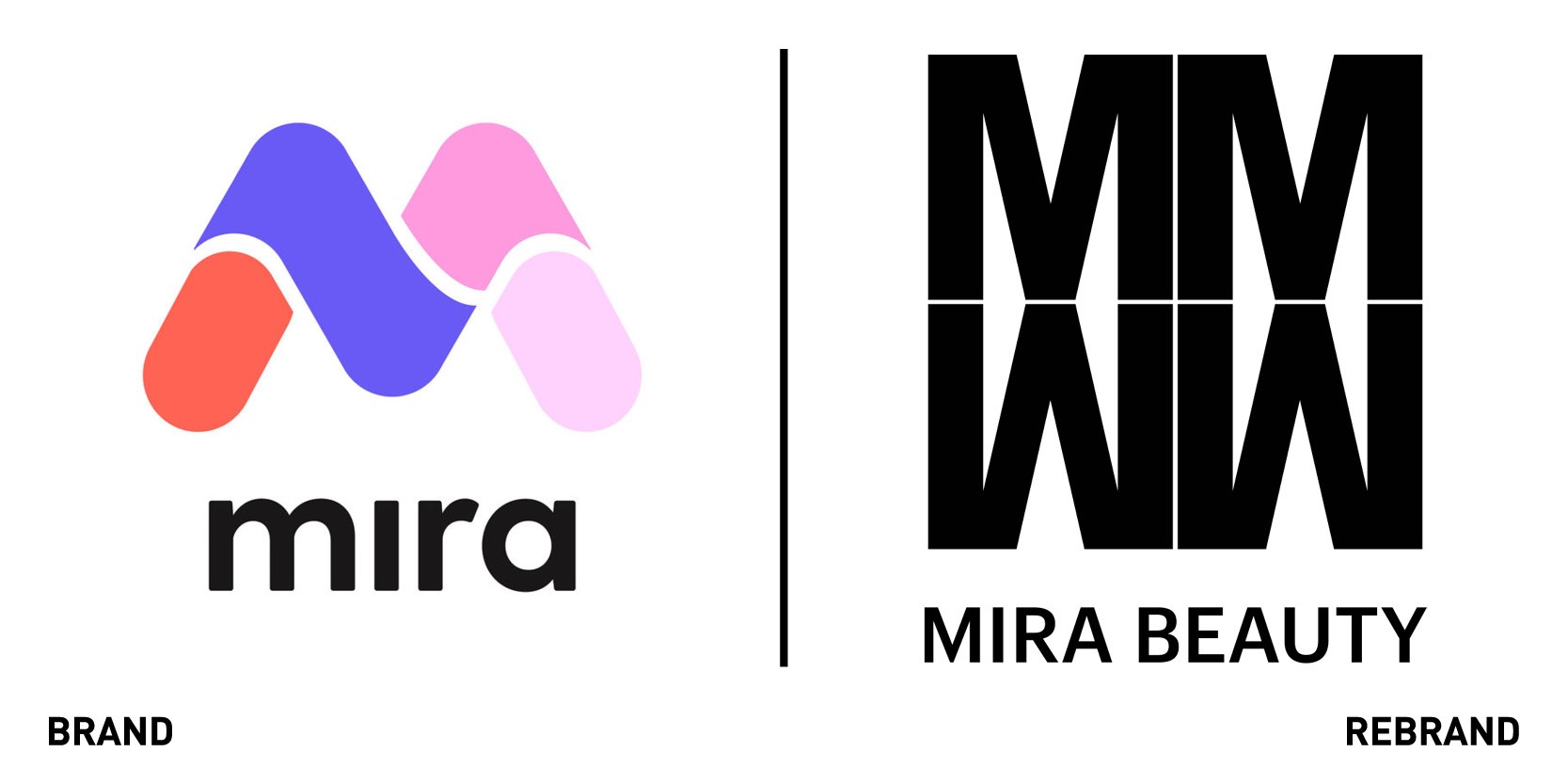
The world’s first universal store and collaborative library for makeup and skincare Mira Beauty unveiled a new visual identity to symbolise a strategic realignment with its rapidly growing audience. The brand’s in house creative and marketing team worked with Los Angeles based design agency The Pioneers. Mira Beauty introduced a new monogram, a mirrored effect of the double letter ‘M’, which represents the act of seeing oneself through someone else’s experience (Mira is Spanish imperative for look). The reversed M that can be read as a W is designed to break gender stereotypes, while the symmetrical aspect as a whole symbolises inclusivity, with four separate sets coming together to form a supportive community. The rebrand also includes powerful and bold photography encapsulating the visual, sensorial and experiential dimension of beauty products where shades, textures and finishes come alive in movement. The new strapline ‘Your beauty. Less of the rest,’ encapsulates the brand’s mission of bringing more personalisation to help customers discover products that are right of their unique selves.
"The beauty community is our true north, and our goal was to meet their standards of taste, quality, and inclusivity. Together with The Pioneers, we elevated the digital experience through a logo-leaning, streetwise, and emblematic aesthetic that also lends itself to a monogram print and future 3D applications,” says Benjamin Lord, CMO of Mira Beauty.


