#TransformTuesday: 31 March

Here's this week's selection of rebrands from LA football teams to Canadian children's clothes. For more from #TransformTuesday, follow @Transformsays

Los Angeles Rams
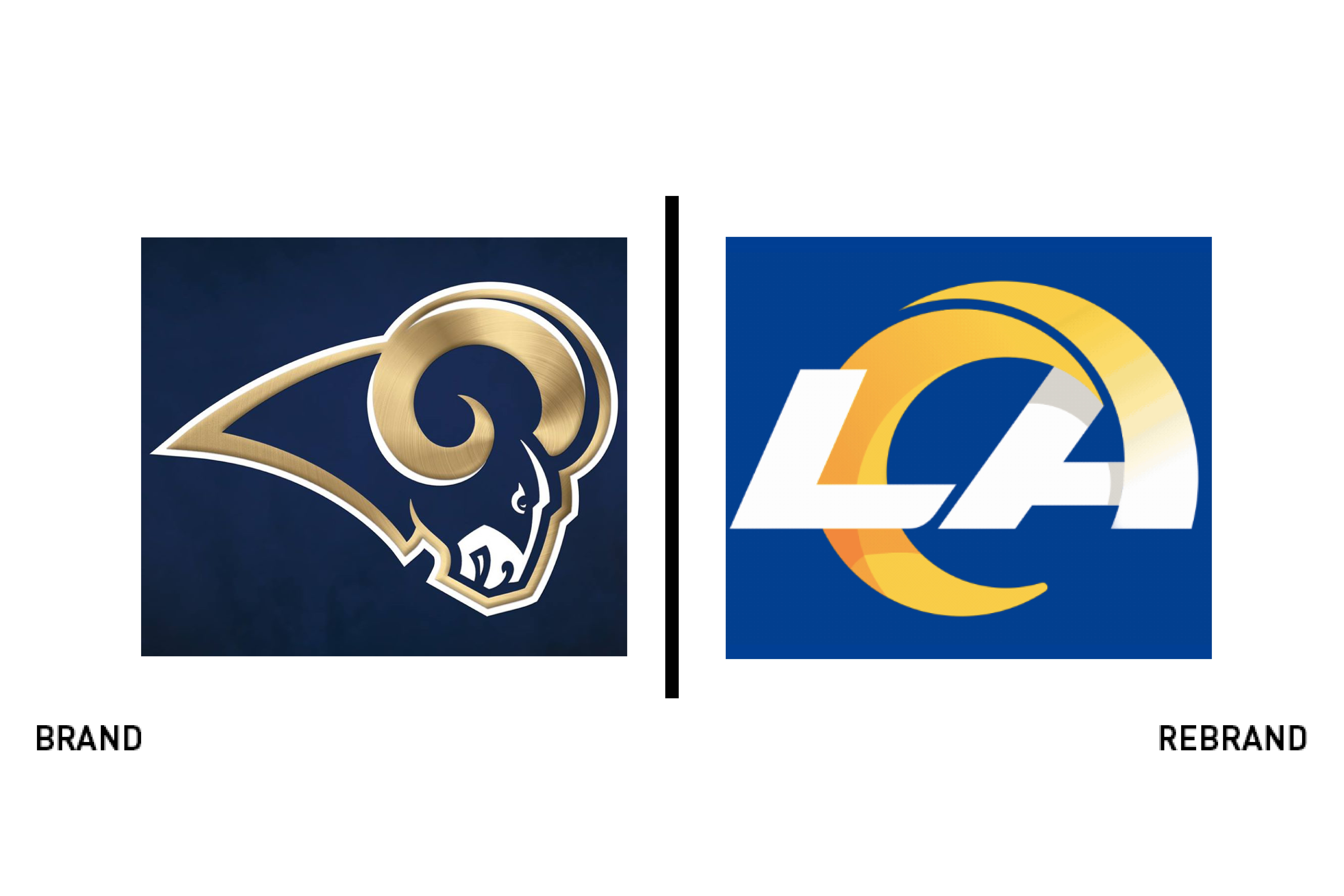
The Los Angeles Rams NFL team has called LA, Cleveland and St Louis home. It has a rich heritage that it is transitioning to its newly readopted home in southern California. Ahead of the 2020-21 season, it has announced a new brand that has received mixed reviews, as most sports rebrands do. The rebrand has retained the iconic royal blue, coupling it with a sunny shade of gold. It simplifies the ram silhouette into a simple swooping shape that represents a ram’s horns. By putting the ‘LA’ wordmark into the logo, the team is communicating its commitment to the city. “The LA mark was crafted with a focus on the horn intertwining with LA, ensuring that the Rams are forever tied to the city of Los Angeles,” the brand page reads. The team worked with Nike and it’s in-house agency Anomaly to update the identity. It has debuted an updated ram icon as well as the new wordmark and uses a vintage inspired typeface that further unites the team with its southern California home. The new brand will be rolled out across the uniforms, the team’s new stadium and all other touchpoints. As with most sports rebrands, the proof will be in the implementation and how the brand becomes part of the fabric of its fanbase and city over time.

M&S ‘Count On Us’
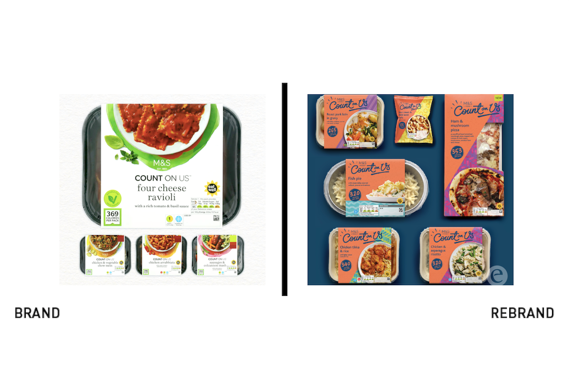
Reviving its low-calorie range, M&S has infused its packaging with colour and inspiration more aligned to modern consumer needs. M&S worked with Elmwood to transition the brand from a calorie counting diet option – that wasn’t been well received – to one with an emotional connection offering M&S’ unique own brand assets in a healthy product. Its debut of the Plant Kitchen range saw the grocer tackle a similar challenge of bringing emotion and connection into a meal alternative. It promised flavourful food despite its free from status. Similarly, Count On Us assures customers it will ‘bring flavour to life.’ Elmwood’s use of a rich colour palette and a personality-driven typeface built playful elements into the packaging that helped the range build a connection with consumers, while communicating the flavour qualities of the food itself. Aude Brunel, senior brand & marketing manager at M&S says, “Elmwood were a breath of fresh air. They really understood the challenge and market, and everything they did was driven by insight. They easily adjusted and reacted positively to any feedback, produced great quality work and nailed the overall brief.”

PK Beans
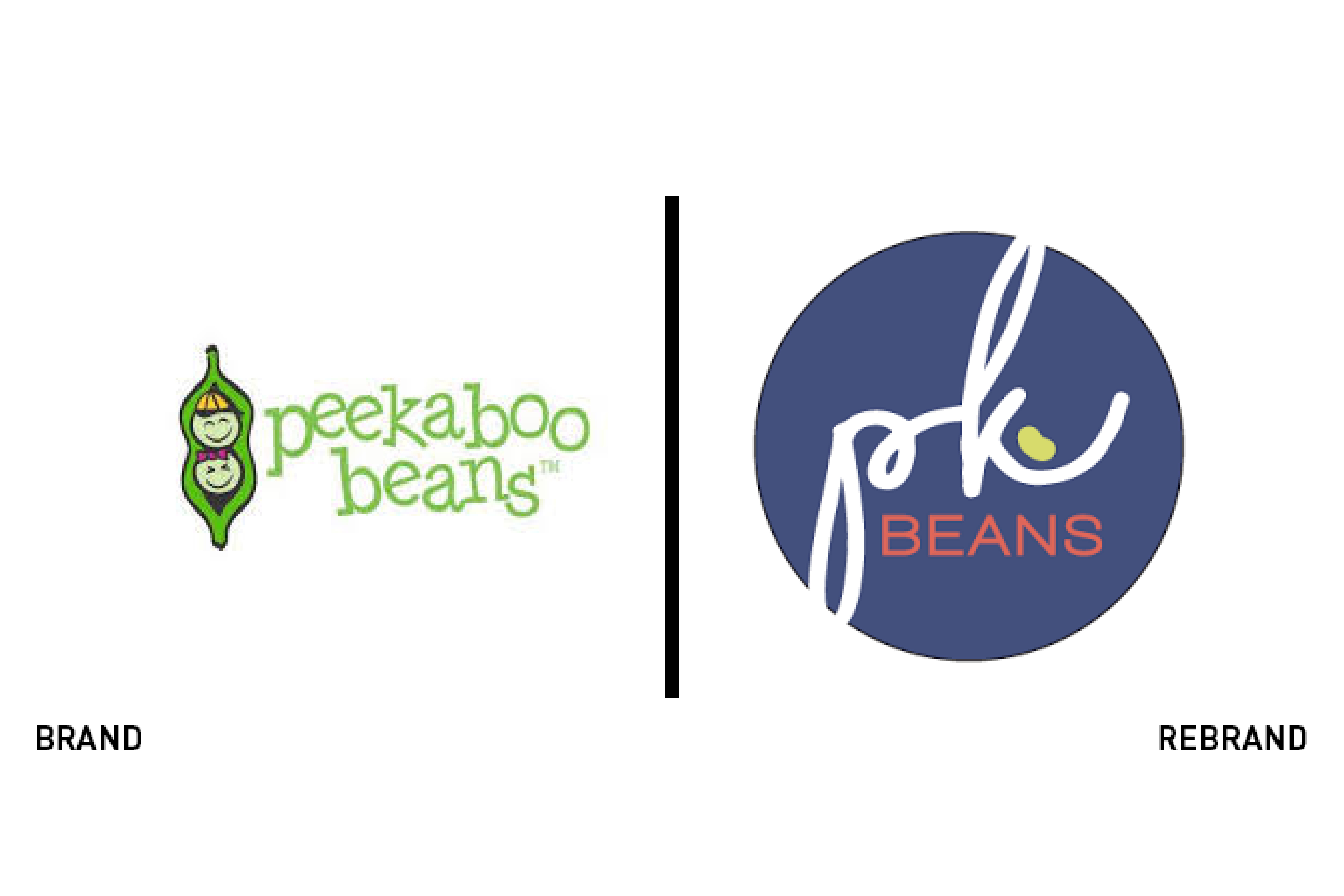
Canadian children’s wear brand Peekaboo Beans unveiled a modernised brand and name after 14 years of operations. To allow for a broader offer in terms of its size range and product offer, it refocused on its commitment to producing quality, long-lasting children’s clothing. "Peekaboo Beans holds a lot of meaning for us as a company," says CEO and Founder, Traci Costa. "We wanted to preserve the history of the brand and our community while becoming modern and relevant in the industry.” The previous logo was static and difficult on digital applications. The new PK Beans logo takes the two pea icons from the original brand and translates them more abstractly into an accent mark in the new logo. The new logo will debut on clothing from Fall 2020 but is currently live online. The new brand also introduces a broader colour palette. The brand’s commitment ethical manufacturing, sustainable productions and customer service remain unchanged.

Seven Bro7hers
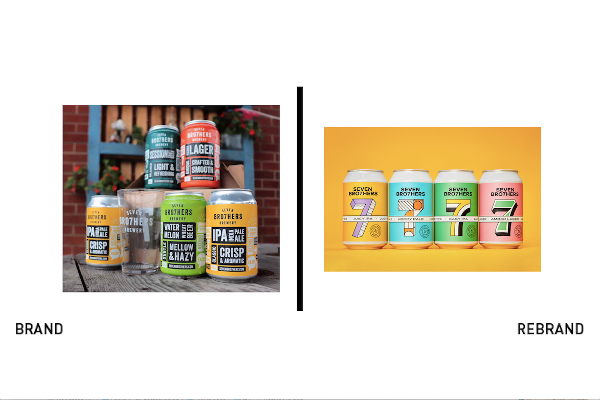
Manchester brewer Seven Bro7hers worked with agency Creative Spark to refresh its Lucky 7 beer branding. The result is a pop-art inspired, brightly coloured range that transitions the craft beer from busier, forceful packaging to a shelf-ready competitor with wider appeal in a tough category. The new packaging will allow the brewery to expand globally and better communicate its values to a wider audience. The ribbon device clearly expresses each product within the range and allows for consistency and expansion. Neil Marra, founder and creative director of Creative Spark, says, “By evolving the brand we created with them seven years ago I feel we are on their journey with them and it is a brilliant ride. I believe the McAvoys are the biggest family to be in the alcohol business and I am looking forward to their UK and then global domination.”


