#TransformTuesday: 23 June

Here is this week's selection of rebrands from around the world. For more from #TransformTuesday, follow @Transformsays on Twitter.
Karma Shoarma
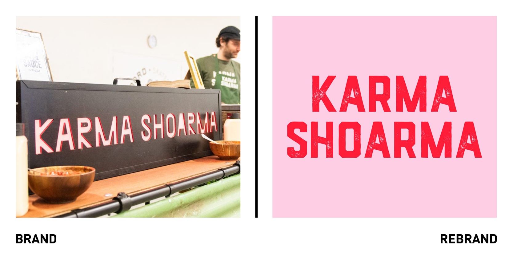
Karma Shoarma, a plant-based kebab brand from the Netherlands worked with Amsterdam-based design studio Kindly Made to develop a new brand identity that would reflect their business growth since 2018, when it first opened. The rebrand, which is applicable in many formats, is eye-catching and unique. For example, the primary colour used is pink, a traditionally more feminine colour which contradicts the notion that kebab is known to be the favour snack/dish of men around the world. The additional red and black colours, the rough typography and quirky illustrations add a more ‘masculine’ vibe, resulting in a well-rounded visual identity that works both digitally and in print. The strapline ‘Your portion good karma’ further emphasises the brand’s objective: to enjoy a kebab without causing harm to animals, the planet or one’s health. Kindly Made also worked on the packaging design, web design and visual communication.
Tomorrow
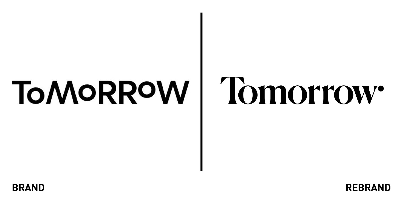
Tomorrow, the world’s first sustainable mobile bank provider based in Hamburg, worked with Berlin-based artist duo PLATFORM to developed a new visual identity that would reflects its evolving mission over the years, through more substance, more warmth and more of a human touch. PLATFORM used Tomorrow’s core principle ‘the human side of technology’ to create the pillar of the new brand identity, through acrylic paintings, which depict people using the app and natural landscape. The illustrations not only reflect the importance of considering the human side of technology but the aspect of financial culture too.
Kingston 62
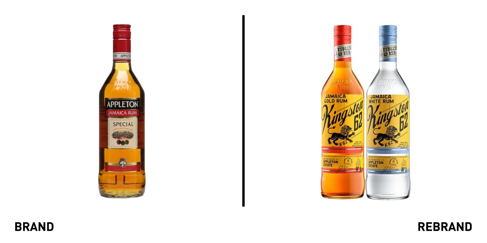
Jamaican rum brand formerly known as Appleton Special and White have rebranded as Kingston 62, paying homage to Jamaica’s year of independence. The rum brand was first known as Kingston 62 when it was first born in 2006, however it quickly dropped the name and crocodile logo because it had a hard time competing against the established Red Stripe. The name Appleton will now solely be used for the Premium rum collection: Appleton Estate Jamaica Rum. The former crocodile has been replaced with a black lion, much like those used in Rastafarian motifs, set on a gold background, which symbolises Jamaica’s resilience and confidence during and after independent day. The brand, however, is keen to clarify that while the bottle has changed, the rum inside it hasn’t. The rolling out of Kingston 62 in the UK follows the successful rebrand in Jamaica earlier this year.
Yale
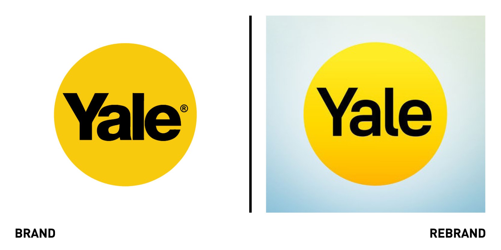
In light of its 180th anniversary, Yale, one of the oldest security product companies, worked with creative consultants GW+Co to rebrand its historic logo for the digital era and to better reflect its offering to consumers. ASSA ABLOY, Yale’s parent company, has a decentralised business model which means regions make decisions by themselves, resulting in the Yale brand standing for different in different countries. Therefore, the idea was to create a brand with a global positioning that would work well in the digital age. The result includes a bespoke typeface and new UX, motion and sonic branding, all of which are focused on its distinctive sun-shaped logo, which is warm and positive symbol understood and appreciated around the globe. GW+Co also created an illustrated brand mascot called Linus, based on the original founder’s son Linus Yale Jr, the first who made the pin-tumbler lock design suitable for mass production. The key aspect of the rebrand was to strike a balance between heritage, so the mechanical history, and the digital future.
Dr Will’s
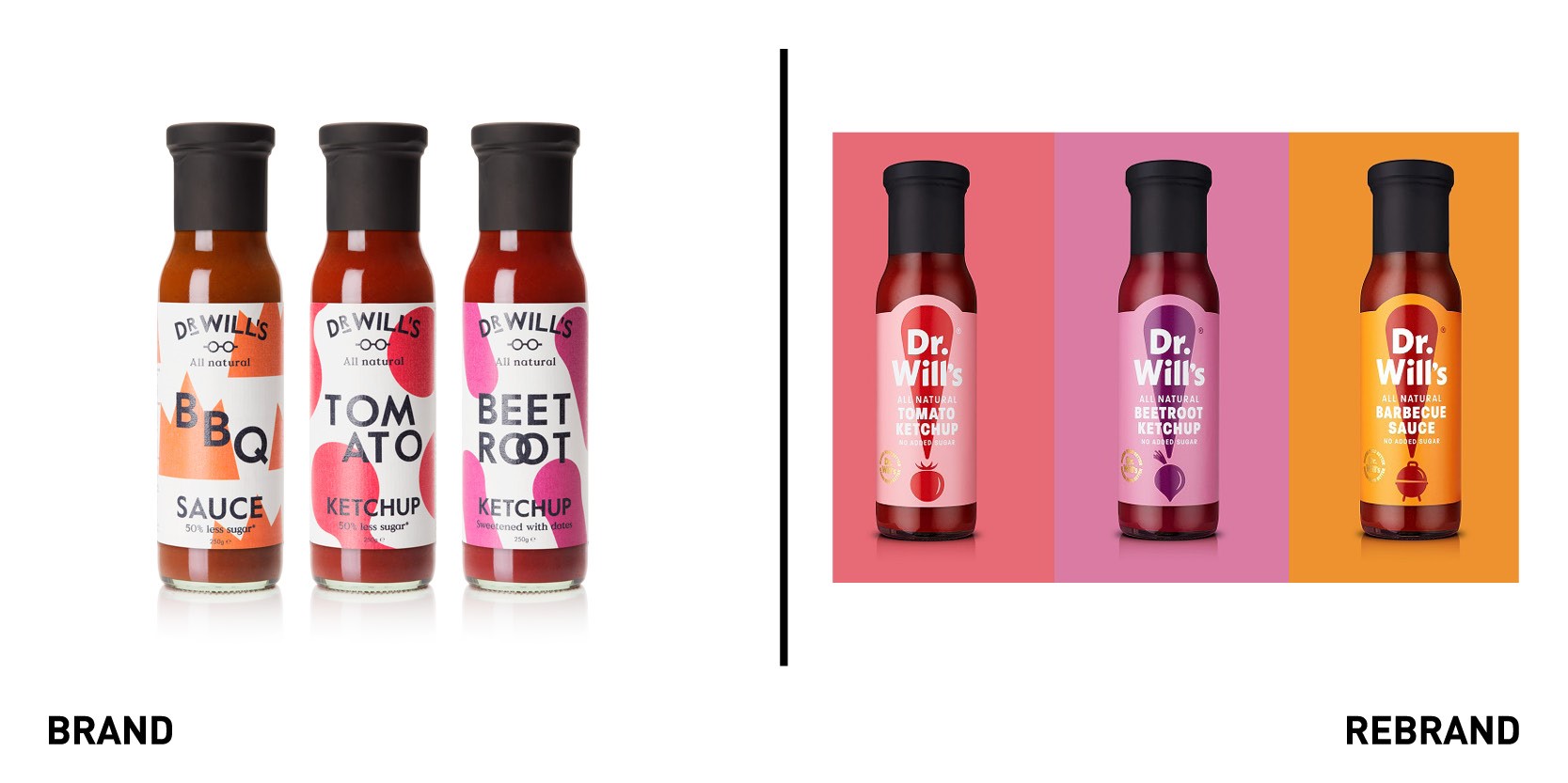
Dr Will’s, a UK company that produces natural, sugar free condiments, worked with London-based B&B studio to create a new brand identity and packaging enabling the brand to broaden the appeal of better-for-you sauces and encourage consumers to question what goes into the dominating brands. The rebrand brings flavour to the forefront of the products, with full-colour labels that create a rich and foodie palette across the range. The new visual identity focuses on an exclamation mark, executed on pack in complementary colour tones and feature an ever-changing dot to designate flavour from a tomato or beetroot on the ketchup bottle to a barbeque grill on the barbecue sauce. The exclamation mark was also necessary in making sure the niche sauce brand stand out on the shelf and include mainstream consumers. The overall result is a brand that feels premium yet is accessible to everyone.
The new logo and exclamation mark brand equity works on many levels as it creates standout whilst being a nod towards the idea that change is needed in the category – and that people should stop and think before they choose what to buy. It also lets us have fun when differentiating our product variants,” says co-founder of Dr Will’s, Dr Will Breakey.
“We’ve created a design that celebrates flavour and sets the stage for the brand’s fast-growing range of condiments. Clean and simple with a big personality, it perfectly captures the essence of the product,” adds Shaun Bowen, creative partner at B&B studio.
The Maverick Group
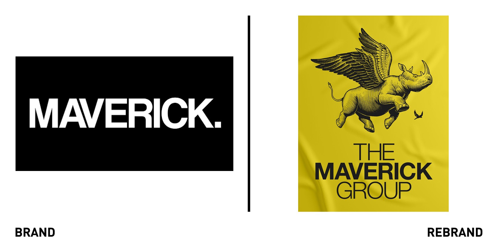
Maverick Advertising & Design have evolved their brand from Maverick to the Maverick Group, with the new name being a more accurate reflection of its journey from specialist brand and design agency to a fully integrated agency collective. The name is also supported by the launch of a new website maverick-group.com and a new logo, a flying rhino which reflects the ‘brave, agile and impactful’ nature of the business. The rebrand was created around a single company proposition ‘Think Maverick,’ which offers clients creative and strategic output via the central hub, a single point of contact between their clients and their end-to-end collective expertise. The rebrand also coincides with the hiring of new talent from around the industry to spearhead each of the specialist business units.
Kingstone Press
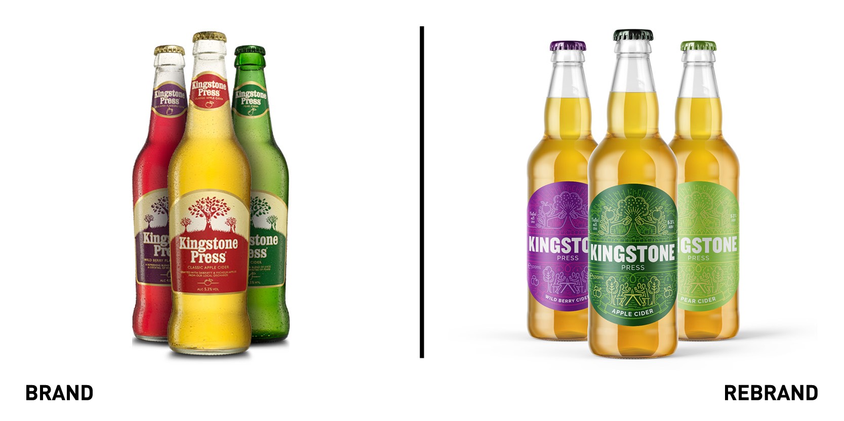
English cider Kingstone Press worked with Somerset-based Pencil Studio to develop a new brand identity that would position it as a cider to be shared and enjoyed with others, whether it is form a walk to the country pub or shared after a game of cricket. To encapsulate this, Pencil Studio worked with illustrator Ian Levett to create a series of illustrations, using only two tonalities of green, that depict this ‘daily life.’ One illustration shows a few people sitting outside enjoying a cider, while another shows two apple trees holding a pint and cheering. Others include homes, people playing cricket or walking a dog, and everything is knit together to create a sense of community, through the idea that wherever one is, one can have a Kingstone Press. The new brand is fresh, simple and vibrant.


