#NewBrandMonday: 22 June
Here are this week's selection of newly launched brands from around the world. For more from #NewBrandMonday, follow @Transformsays on Twitter.
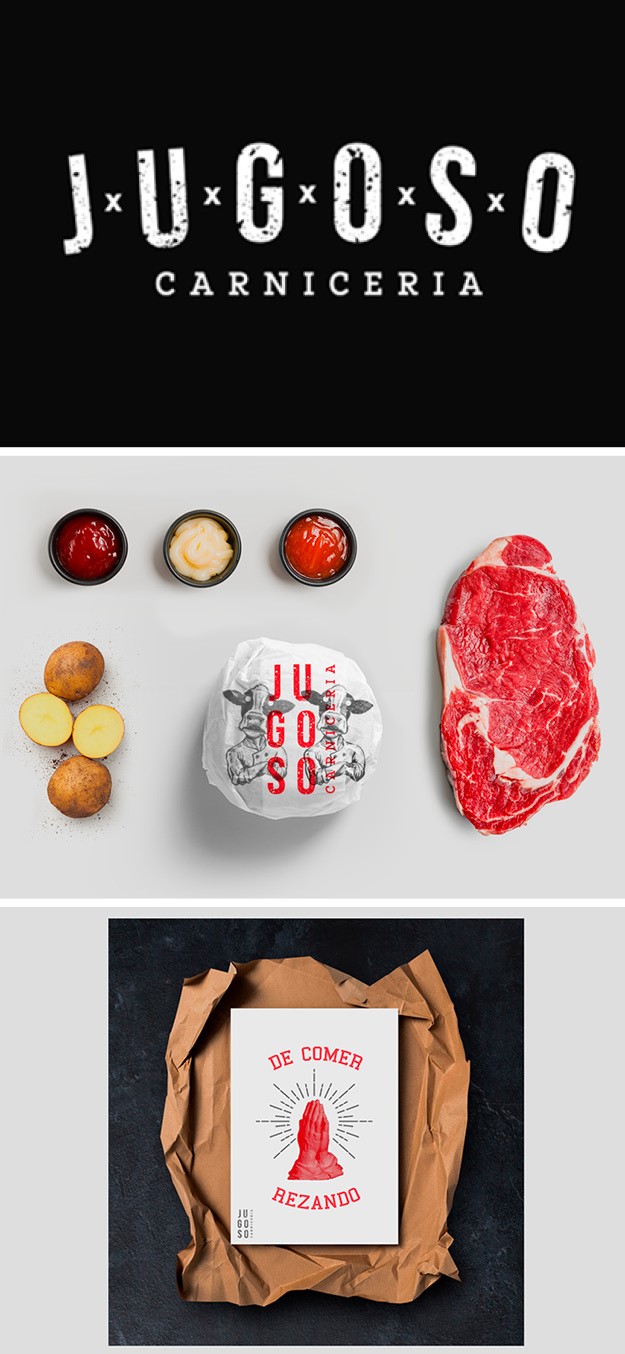
Jugoso
Brazil-based design agency Verka Studio worked with Jugoso, a bar and restaurant specialised in meats and its methods (based on Uruguayan cuisine) based in the south-eastern Brazilian state of Minas Gerais to develop a restaurant brand that would reflect the combination of having of a good meal, with high quality meat, with the essence of a good Uruguayan barbeque. To do so, Verka Studio created a flexible brand system, based on the ox shape, which can be adapted to both merchandise, such as aprons, napkin holders and beer bottles, and different illustrations. These many forms of logo application, similarly to the religious metaphors contained in the materials, strike the perfect mix between rustic and modern. The colour palette is reduced to a few, bold colours, centring around shades of red, which capture passer-by’s attention and plays on the brand’s name, meaning ‘juicy, meaty.’
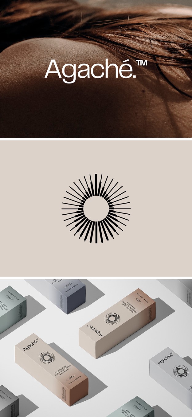
Agache
Macedonian-based design agency Alphamark worked with new American skincare product Agache to develop a brand identity that would make Agache’s products stand out in a highly competitive marketplace. Agache, which targets busy and career-driven women who are leading an active lifestyle, was created by an experienced dermatologist to restore and maintain a healthy skin barrier. This clean formula and pure ingredients inspired the visual identity, a sun over a raindrop which conveys the image of inner purity. The imagery, such as close up of women’s face, further by emphasising the brand’s pure and natural origins and is able to target its desired audience. Overall, the robust visual identity was developed to match the four different products offered by Agache and work in both digital and print.
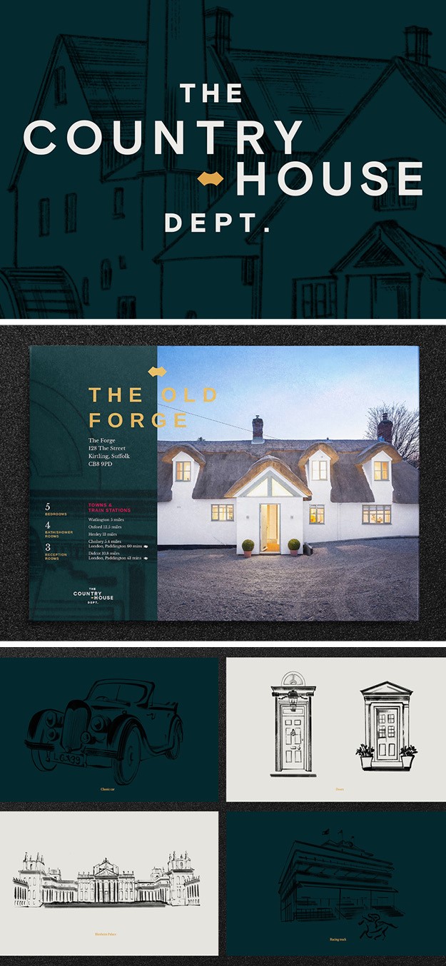
The Country House Dept.
Creative agency BrandCap created a brand identity for the new, reimagined real estate agency focusing on country home, Country House Department. The brand reflects the new kind of estate agency experience, breaking with a traditional model that was selling some exceptional properties short. The Country House Department ensures that its listed properties are showcased in a more immersive and visually arresting way than traditional estate agencies, using drone footage, 360 degree virtual tours and editorial photography. To emphasise these novelties in the field, BrandCap focused around three core pillars: undivided attention for you and your property; showcasing your world not your walls; and fairer fees for the fairest homes.
The end line, ‘moving, moved forward,’ further highlights the shift from traditional estate agency. The visual identity has been designed to reflect both the forward-facing outlook of the brand and the rich character of the houses it represents. The identity, which combines animation and property showreels with brush stroke illustration and a cinematic photography style that captures properties in their element, reflects the experience-led, lifestyle focus of the brand.
“We wanted to bring to life a new kind of property brand that was about capturing the whole world and atmosphere of a home, not just the bricks and mortar. This identity is grounded in The Country House Department’s desire to shake up a very tired and stale service environment so that it engages and resonates with today’s country home buyer.”
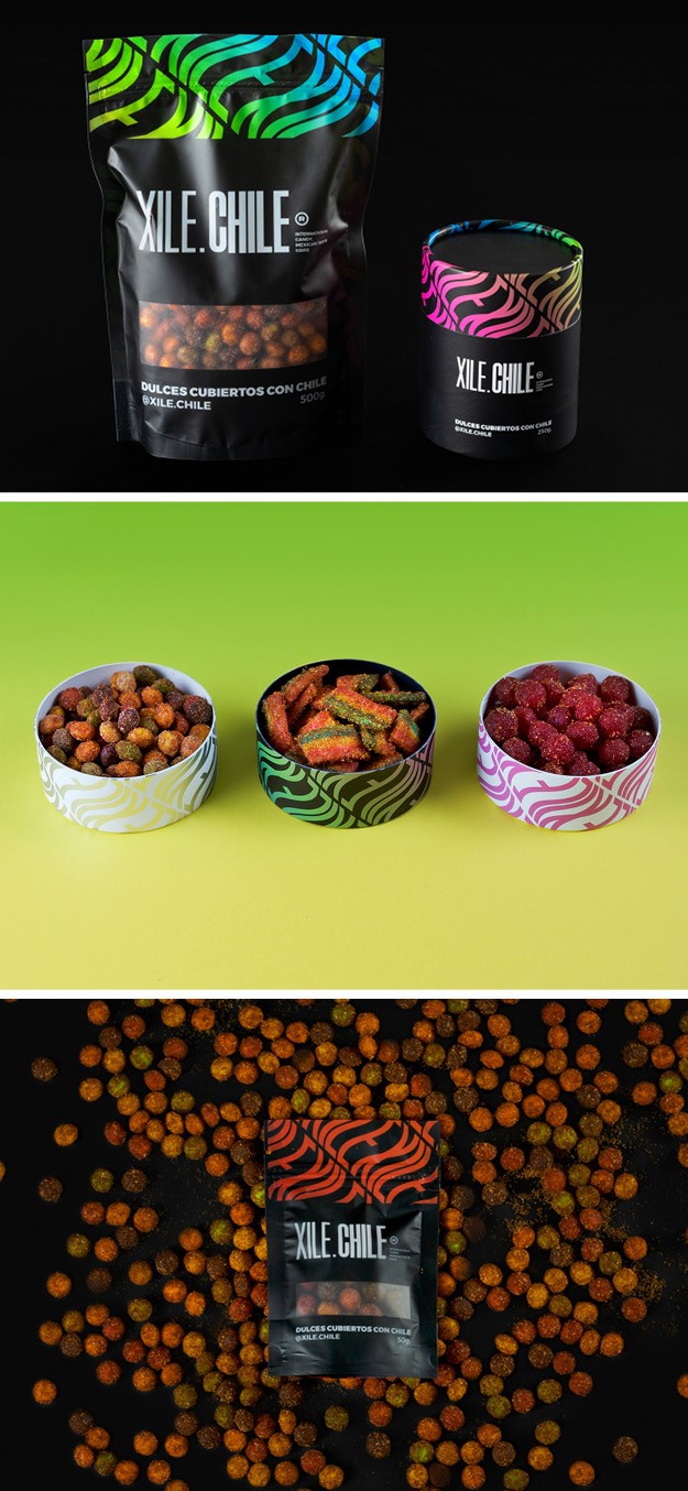
XILE CHILE
Mexico-based graphic design studio SHIFT created a brand identity for new Mexican spicy sweet and treats brand, XILE CHILE. Focusing on the brand idea of the sweets equalling happy and flavourful moments, SHIFT created a bold, fresh and youthful visual identity, focusing particularly on the brand's fun personality. They did so through the colour palette, which juxtaposes vivid colours, like bright green and hot pink, with black and white graphic elements, symbolising the unexpected variety of flavours in the treats. The design studio also developed different packaging solutions of simple and functional containers to expand the consumer experience.
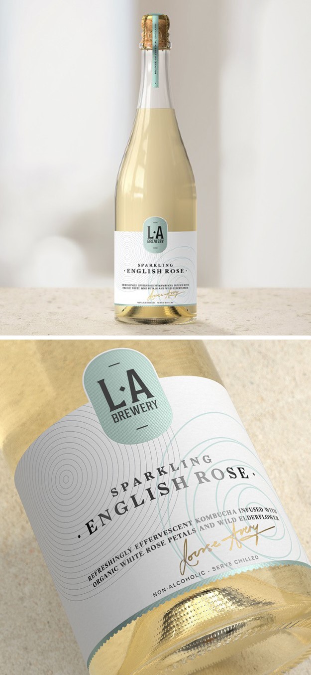
LA Brewery
British kombucha brand L.A. Brewery worked with London-based studio Here Design to launch a new Sparkling English Rose variant. The design celebrates L.A. Brewery’s key purpose: t o provide potent natural drinks that re-invent temperance for 21st century drinkers. It pays homage to traditional category cues from the world of champagne, such as a long-corved bottle and a muselet, the metal caged cork, making the opening of the bottle more elegant and ceremonious. Similarly, the sophisticated aesthetics also emphasise the celebrator aspect of the drink, giving people the opportunity to pop a bottle while consuming something alcohol-free. The Sparkling English Rose is also being released alongside a new Hops variant, with packaging also designed by Here. Together these new launches extend L.A Brewery’s range of drinks to appeal to consumers in search of sophisticated alcohol alternatives that pack potent flavours and cater to complex palates.