#TransformTuesday: 22 September

Here is this week's selection of rebrands from around the world. For more from #TransformTuesday, follow @Transformsays on Twitter.
Avon
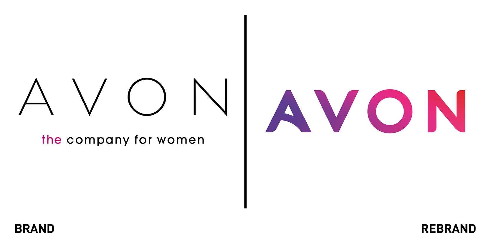
Beauty brand Avon worked with brand identity partner Bloom to develop a new position, architecture and brand identity to better reflect the innovative, bold and inclusive Avon of today. Bloom’s redesign brings power and beauty together, with a brand marque that has more substance and personality than the previous one. The new logo combines the curves of the original 1930s Avon logo with a new colour gradient based on the curves of a woman’s face, with additional assets like shapes and patterns that render the identity more human and flexible. The colour palette combines fell-good vibes with warmth of inclusivity.
“Avon is a global business, with a vast range, sold across multiple channels, by a workforce of thousands. So the identity has to look great and work hard. The logotype is elegant and modern, but is also easy to use in any medium,” says Michael MacNaughton, Bloom’s creative director.
“Avon has a long and proud history. The new identity brings it into the modern day, and will bring it to the attention of a new generation of beauty consumers,” adds founder of Bloom’s Ben White.
Bloom & Blossom

Family focused skincare product brand Bloom and Blossom introduced a new visual identity celebrating the beauty that occurs when generations collide. Working with global design-led creative company Jones Knowles Ritchie (JKR), Bloom and Blossom developed a strategic platform that aligns with their brand vision and allows them to connect with their families on their ultimate goal : a good night’s sleep for everyone. The new interlocking logo represents the relationship between parent and child, with the splatters of product that disrupt it that reflect the mess and beauty of everyday family life.
They have captured an audience of people that see beauty in the chaos of family life.
The new identity and experience delivers on that story and gives the business and audience the brand they deserve,” said Jonny Spindler, managing director of JKR London.
“We still do beautifully natural products and we still make them for real people using real ingredients, but natural doesn’t have to mean sunshine and flowers. The new-look Bloom and Blossom is all about embracing the chaos of family life, because what’s more natural than that?” add founders of the brand Julia Yule and Christina Moss.
Hem
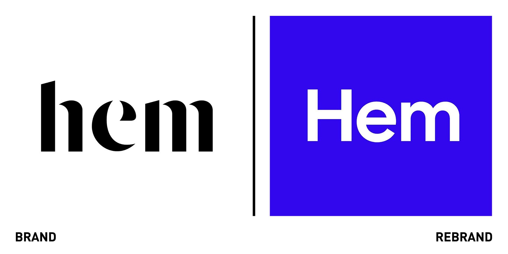
Swedish furniture brand Hem worked with London-based design agency Made Thought to refresh its visual identity and reflect its commitment to collaboration, innovation and experimentation, and its growth, with the company opening its first permanent studio in New York. The colourful visual adopted in the rebrand are playful yet reflect Hem’s design abilities. Core shapes extracted from Hem’s library of 3D model of products have been transformed into flat, graphic shapes that reflect the key product categories. These will be used as colour-block graphics on their own or as frames for other content like product photographs. The rebrand also includes a new custom typeface, Hem Sans, developed by the type foundry Letters from Sweden, which is an ode to the architectural geometry and interior design but is at the same time novel, unique and human. The colour palette vibrant and bold, with deep cobalt, bright yellow and red and deep green animating the identity as a whole and reflect the brand’s playful tone. Hem’s new identity strikes a balance between design quality and imagination and creativity, reflect what the brand character is truly about.
Sperlari
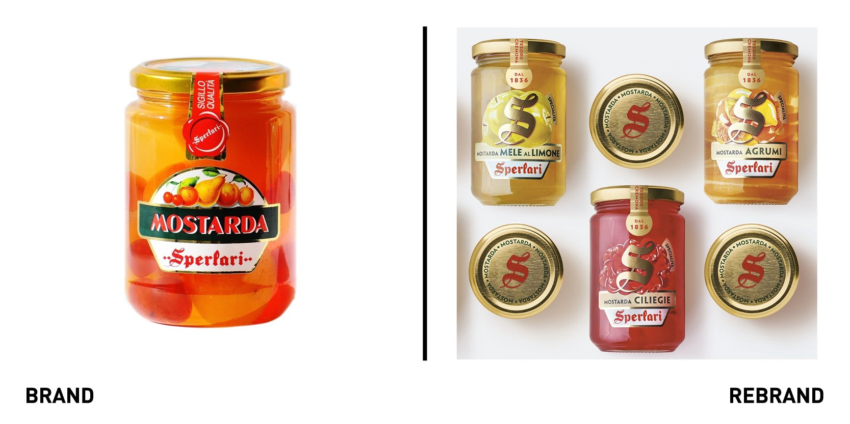
Cremona-based traditional Italian food company Sperlari worked with global design agency FutureBrand to create a rebrand that aimed to restore Nougats and Mostarde Sperlari’s allure and shelf visibility through a new look and feel, capitalising on the heritage, innovation and quality the brand is renowned for. For Mostarde, the rebrand leverages contemporary key-visuals that focus on the product’s ingredients, together with the logo designed as a noble golden monogram sealing the product and guaranteeing its quality. For Nougat, the Sperlari logo is again central, placed on a white diamond which expresses the high quality and the brand expertise that goes into developing a traditional product.
“A historic brand such as Sperlari is based on solid foundations made of tradition, know-how and excellence, values that we wanted to make even more evident and up to date to strengthen the bond with the estimators of our products. This is the sense of the path we took together with FutureBrand, and which led us to tell our story of quality with a more contemporary and engaging visual language, keeping the value of tradition firm,” says Michela Caone, Sperlari marketing director.
Tesco Mobile
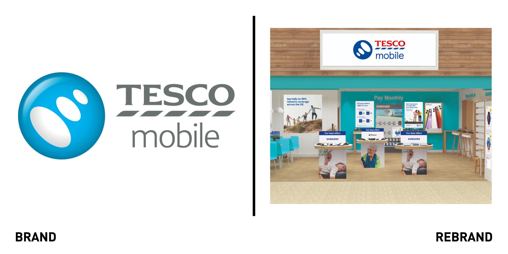
Tesco Mobile, the mobile network of UK supermarket Tesco, introduced a brand redesign to revitalise the brand expression and align it more closely to the wider Tesco family brand. The rebrand reflects Tesco Mobile’s positioning within the telecommunications market, with a focus on communicating and reinforcing Tesco Mobile’s values of quality, expert and helpful within the industry. While new logo still retains the familiar pulse icon, it has changed, flipping its orientation to signal connectivity the three dots from the pulse form the heart of how the new brand is expressed across different touchpoints. The colour palette of the iconic red and blue also align more closely with the Tesco brand portfolio as a whole.
“From research we know the changes we’ve made have had a positive impact on how our brand is perceived, with more people than ever saying our new look and feels signposts quality and expertise. Our new identity embodies our values and visually reinforces our position as part of the Tesco family,” says recently appointed Tesco Mobile CMO Rachel Swift.


