#NewBrandMonday: 21 September
Here are this week's selection of newly launched brands from around the world. For more from #NewBrandMonday, follow @Transformsays on Twitter.
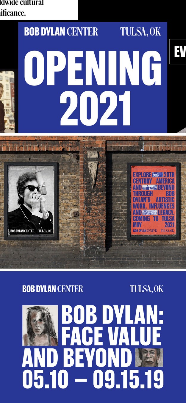
Bob Dylan Center
Global creative design agency Base Design worked on the design of the Bob Dylan Centre in Tulsa, Oklahoma, dedicated to the study and appreciation of the musician and his worldwide cultural significance. To truly create a holistic brand experience for the centre, Base Design focused on developing a visual identity that celebrates 20th century Americana, namely protest poster of the 1960s, which will educate, motivate and inspire visitors to engage their own capacity as creators. The centre’s visual identity draws inspiration from the ink blue annotations found in Dylan’s manuscripts and from the 60’s typefaces with a contemporary flair that evoke American newspapers. The logotype combines the familiar (Bob Dylan) with the new (The Center) while emphasising the importance of the site’s location in Tulsa. On a digital level, both the website and overall digital strategy allow for the centre to narrate the stories around their annual programming in a visually coherent way across all media platforms.
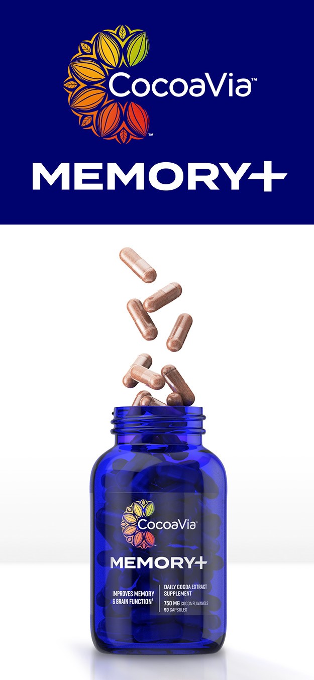
CocoaVia Memory+
London-based design studio Straight Forward Design has worked on the brand and packaging identity for Memory+, a new product launched by wellness and health company Mars Edge in its CocoaVia supplement portfolio that focuses on boosting memory and brain function. The brand identity seeks to differentiate Memory+ from the existing CocoaVia portfolio while still feeling part of the core brand, positioning it as a more premium product aimed at a target market that is specifically concerned with preserving memory and brain performance as they age. The lid of the cobalt blue bottle features user-friendly copy to communicate how the product should be taken to help consumers experience optimal memory benefits. The design for Memory+ breaks away from the box format of information of the core brand and simplifies it. This format supports the launch of future products, as consumers will be able to identity the different health benefits provided by different products quickly.
“It was important to consider the different target audience for this new product. It required a more refined solution, while creating standout in what is a crowded sub-genre in the health and wellness supplements sector,” says Mike Foster, founder and creative director, Straight Forward Design.
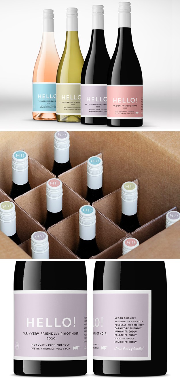
Hello Wine
Australian winery Fourth Wave launches Hello! a new range of ‘friendly’ plant-based wines, with brand strategy and packaging identity by drinks design specialist Denomination. As the plant-based movement is booming with more people seeking to reduce their dependence on animal products, Fourth Wave introduced a range of wine that is inclusive of everyone, from vegans to vegetarians, to flexitarians, and meat eaters. Fourth Wave sought to position Hello! in a way that is inclusive while also remaining recognisably animal-free. To do so, the agency created a soft colour palette, centred around reassuring pastel colours, and a matte paper stock that reinforces the natural position of the brand. The typography is simple and modern, easily readable by customers who immediately understand that this is a friendly wine for all.
“Denomination has communicated the brand’s credentials without relying on clichéd vegan design cues. It’s natural, it treads lightly, but it’s never worthy or dull. Hello! literally calls out from the shelf like an old friend. It’s warm and approachable,” says Nicholas Crampton, co-owner of Fourth wave.

Peazi
Manchester-based strategic branding agency Creative Spark developed the brand for Peazi, a new phone app that enables the hospitality industry to operate safely in times of Covid-19 social distancing norms by taking orders of food and rink, accepting payment and arranging delivery to consumers. Creative Spark created a playful brand experience that also reflects the reliable service the app provides; a sophisticated palette of contrasting colours and hand-drawn illustrations offer a vibrant yet reassuring brand. Unlike other more corporate-looking order and pay apps, Peazi has a lively brand personality, attracting people who are out and about wanting to have a fun night at restaurants without endangering themselves and others. The logo, an illustrated hand icon, represents the universal sign of calling the waiter.
“We introduced a variety of colours into the brand so it can work in any establishment, we’ve added unique northern charm in the ‘Order, Eat, Pay, Bounce’ strapline and we’ve used the international sign of calling the waiter to keep the brands personality alive in online interactions. We can’t wait for Peazi to be a huge success and enable people to get back out and have fun – safely,” says founder and creative director of Creative Spark, Neil Marra.
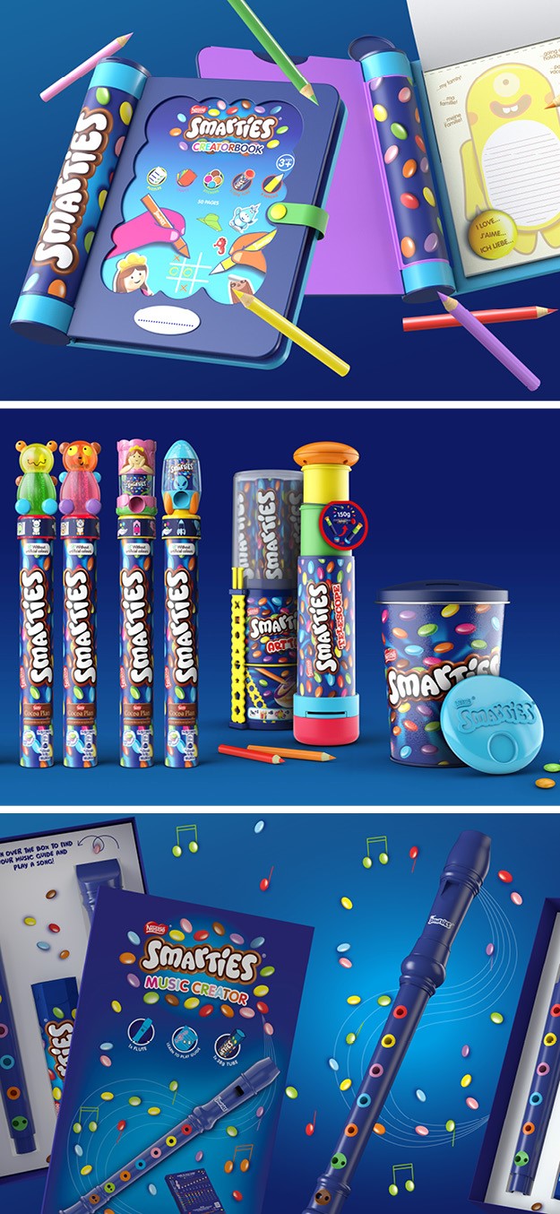
Smarties Music Creator
Brand design agency Echo announces its latest work with children’s confectionery brand, Smarties in redesigning its Smarties Music Creator (recorder) in addition to a number of downloadable online resources that bring music and learning to life. The digital learning resources offer children an interactive brand experience and the opportunity to acquire a new skill by engaging with different learning techniques. The concept sees physical brand packaging converge with online play, builds on Smarties’ previous range of products that encourage developmental play and a positive reward system that associates learning and treating. This, according to account director at Echo Peter Cowie, is an opportunity for brands to create experiences children’s needs for self expressional.
“Initially, we were asked to design the physical packaging for the toy, but we also explored the option of utilising Smarties’ online space to increase the educational value of the learning experience, driving deeper engagement with the brand and packaging and driving traffic to the Smarties website,” he says.
Inspired by Smarties’ signature fun and playful brand identity and to appeal to their young target audience (children aged 3-10), Echo designed a vibrant online portal.
We kept a fluent design language throughout the assets, replacing the usual black notes of the scores’ brown hues, resonating the brand’s chocolate pastilles. The function of the score remains the same but the presentation is in line with the brand’s colourful playful identity,” says Susie Whittaker, graphic designer at Echo