#TransformTuesday: 21 April

Here's this week's selection of rebrands from NFL teams to television channels. For more #TransformTuesday, follow @Transformsays on Twitter.
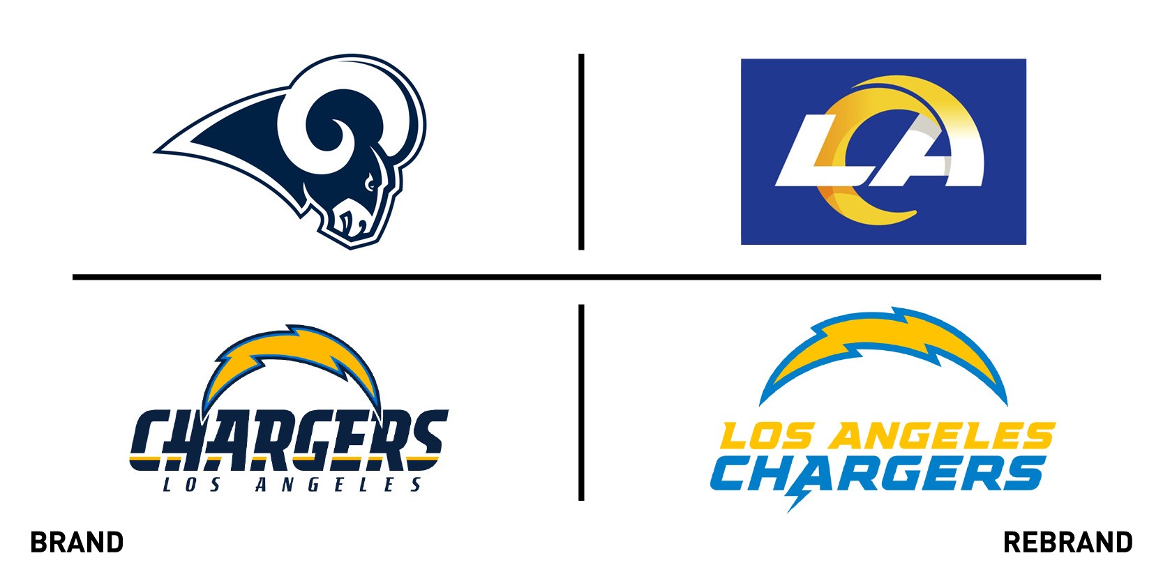
LA Rams and LA Chargers
As sporting events are becoming a dim and distant memory, it may be a good time for clubs to look over their visual identities. The enforced separation of teams and their fans may help limit the knee-jerk reaction so many sporting clubs have when they come out with a new identity. It is hard to think of an example when a team’s rebrand is not initially pilloried before the fanbase moves on and accepts the new look.
Coming out with a new visual identity only a day apart are two American football clubs: the Los Angeles Rams and the Los Angeles Chargers. Set to share the same stadium when it opens in July, the two clubs are battling it out both on and off the pitch.
First out with its new brand was the Los Angeles Rams. While abandoning the image of the ram, the horn is kept with its shape emerging out of the lettering. However, the stronger colours and playful lettering still did not let the club off the hook. Not only did the club’s supporter base pillory the new identity but its management did too, with the Rams own VP for marketing making lewd comparisons and commenting on his twitter feed how much the fans were against the rebrand.
The new visual identity from the Los Angeles Chargers retains the bolt of electricity but lets go of the other elements. While still using an italic font, the palette has been taken down to two from the original three. It is a cleaner look and certainly more contemporary. But it is worth remembering that the last time the Chargers rebranded, such was the anger from its fans that it dropped its new look after only 24 hours.

Monjasa
Danish fuel-shipping and trading firm, Monjasa, released its results last week. The company presented a growth of ten percent, a strong performance that earned it a place among the world’s 10 largest marine fuel suppliers.
The growth subsequently led the firm to focus on its brand, appointing Danish design agency Black to assist with a new positioning and visual identity. The purpose was to create a simple, transparent, and future-proofed look for digital transition, while preserving the successful core values of the brand.
Black used the original Monjasa oil pipes and created three iconic waves. The waves effortlessly double up as the new Monjasa flag. The logotype itself has been separated from the graphic element and modernised to fit equally well across all sizes, from mobile phones to giant tankers. Orange was chosen to reflect Monjasa’s commitment to safety.
The result is a versatile and bold visual identity that reflects the maturity of the brand. The new identity is not a revolution, but a strong evolution from its starting point.
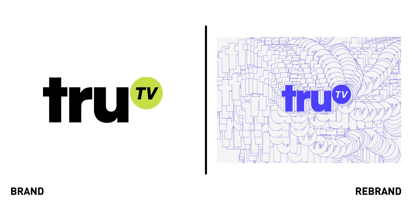
truTV
Over the past five years, TV networks around the world have evolved their brand and their visual identity, reflecting a push to advance their online positioning. There is no doubt that Covid-19 will hasten this process with an even stronger push towards media consumption across all digital touchpoints.
New York-based agency Block and Tackle Partners was commissioned by truTV for develop the rebrand of their network for original, creator-driven comedy series. The brief was simple: Focus on the content, keep it simple, have fun.
The result was a bold and quirky design system. The DIY approach embodies the brand ethos but also ensures a visual clarity across all platforms and devices.
TransformTuesday normally only shows the before and after of a new visual identity, but this is a rebrand that needs to be seen in its own backyard, at https://vimeo.com/406196182


