#TransformTuesday: 17 March

Here's this week's selection of rebrands from around the world, from waterfowl conservancies to Mexican beers to NHS services. For more from #TransformTuesday, follow @Transformsays
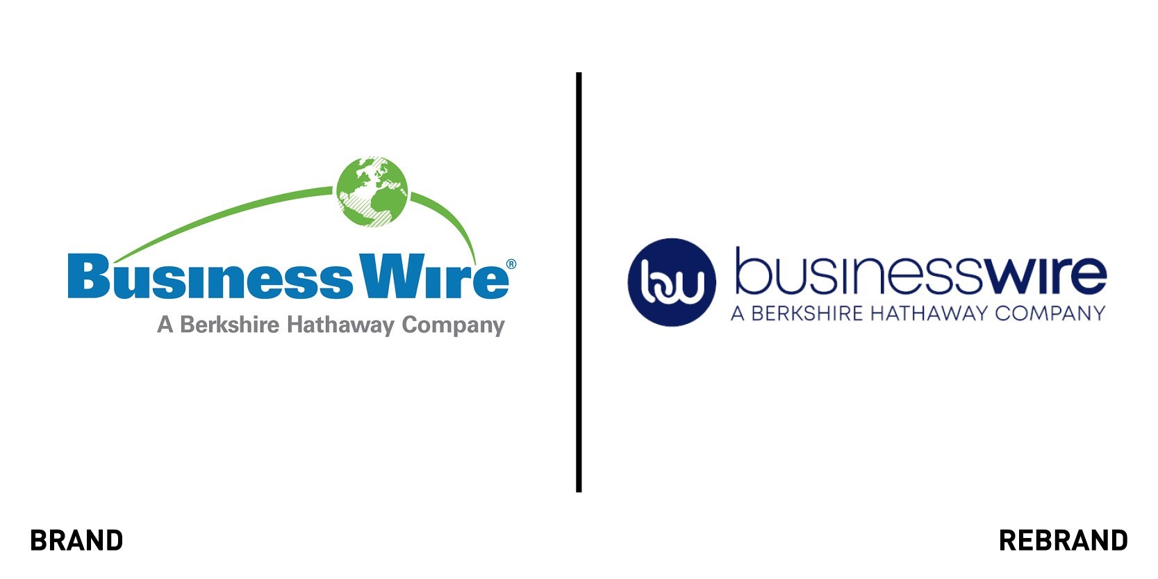
Business Wire
Business Wire, a press release distribution and regulatory disclosure company, has launched a new logo that includes a new colour scheme and typography. Leaving behind the thickness of the font in both Business Wire and the strapline ‘A Berkshire Hathaway Company’ by adopting a thinner and sleeker writing, new logo appears more refined and modern. The new colour scheme, solely based on different shades of dark blue and white, also give the logo a more serious tone, one that reflects the work Business Wire does and the audiences it interacts with. The most impactful aspect of the rebrand is the replacement of the green globe symbol with a simple, intertwined ‘b’ and ‘w’ representing the interconnectedness of Business Wire with the company’s many stakeholders and audiences.
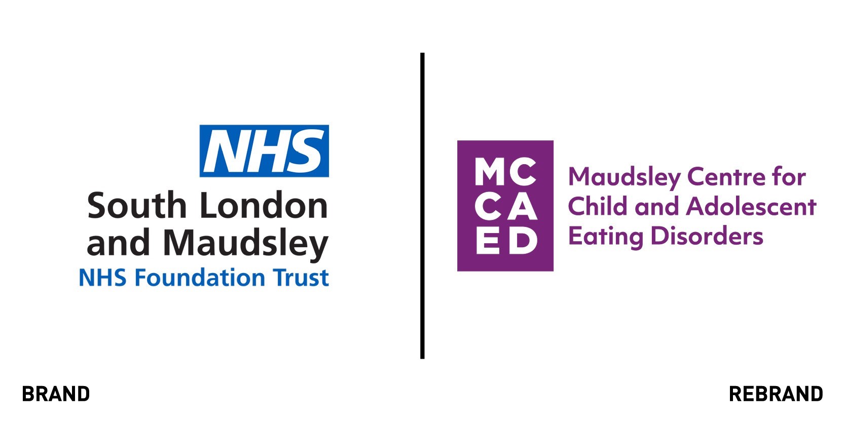
The Maudsley Centre for Child and Adolescent Eating Disorders
The Maudsley Centre for Child and Adolescent Eating Disorders (MCCAED), an NHS service that specialises in the research, training and treatment of eating disorders for under 18s, worked with brand agency Interstate Creative to develop a new visual identity that would adapt well digitally. Particularly considering that this service is aimed at young people, Interstate Creative decided to point everything towards an identity that would work well on online platforms and be easily accessible to under 18s, which is why it revamped the website as well. The new brand departs from the traditional NHS colour palette, based on whites and blues, opting for a livelier purple. The new colour palette appeals to a younger generation and distances itself from the overall NHS body, showing it is a special service targeted at a particular audience. This is especially conveyed in the new logo, a simple spell out of the centre in purple letters, a stark difference from the old one that no reference to what the centre was about. Stephen Brown, designer at Creative Interstate says, “We are proud to have collaborated with MCCAED on their recent rebrand, gaining vital insight from renowned mental health professionals, helping us work towards a human centred-design approach. As a result we have delivered an optimistic core brand with a redefined online user journey that facilities easy access to vital information for under-18s and families dealing with eating disorders.”
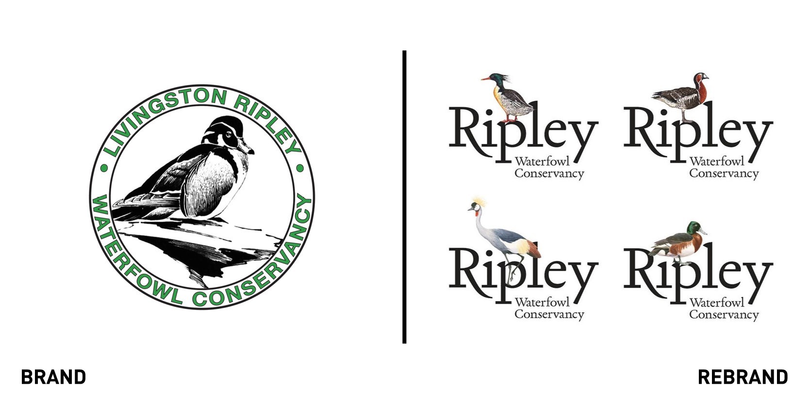
Ripley Waterfowl Conservancy
Ripley Waterfowl Conservancy, an international non-profit organization that conserves rare and endangered waterfowl from around the world, worked with American design agency Alexander Isley Inc. to rebrand and reflect its role as an urgently needed and globally relevant presence. Alexander Isley developed a bold, simple but distinctive identity that would differentiate Ripley Waterfowl from other ‘bird engraving’ brands. To do so, the agency worked with two of the world’s foremost naturalist and wildlife artists, James Prosek and Tony Henneberg who helped create the initial four logo variations which feature a diverse range of Ripley’s rare species. The new logo, which couples customized ‘Ripley’ with a single illustration, appears less wordy and therefore more modern and cleaner, working as a standalone mark. Each logo is prepared in different format to provide a flexible brand identity: a full-colour version for general use, a simple line art drawing for embroidery, and an engraved and grayscale image for single-colour application.
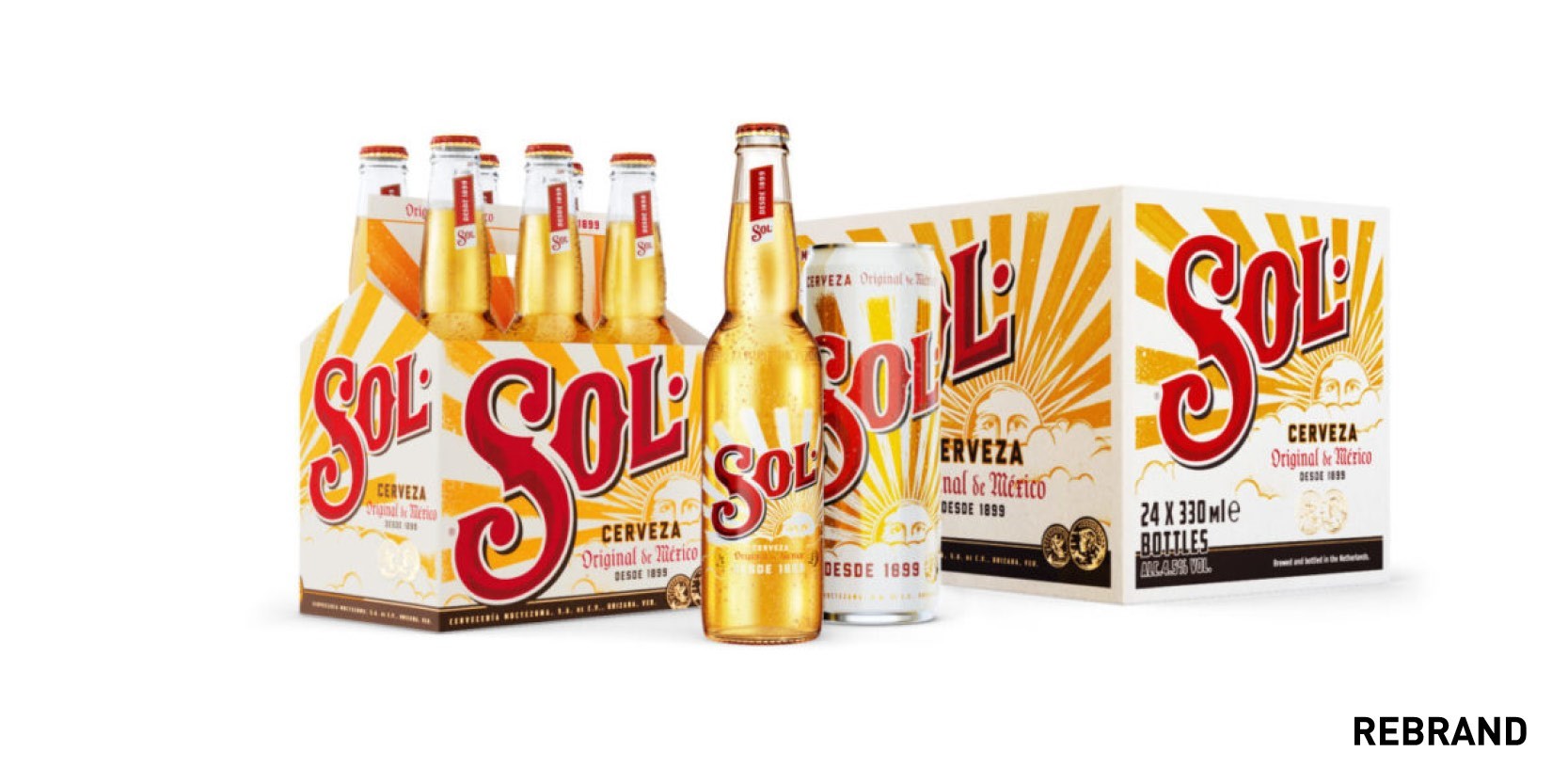
Sol
Mexican beer Sol tasked design agency Vault49 to create a new, more authentic packaging design for the beer in global markets. To do so, Vault49 conducted an extensive research into the history of the brand to reconnect it with its positive, sunny, authentically Mexican heritage that drew inspiration from handcrafted work by Mexican artists. The new design, particularly the warm colour palette, reflects the brand’s story of connecting drinkers “to the positive energy of the sun,” Sol’s iconic symbol. To further emphasise a return to its roots and craft, the design agency introduced the techniques behind Mexican artisans; the Sol sun and clouds were created with a hand cut lino print similar to what artisans used for saddle making, and the sun rays and medallions on the pack were hand-painted. Sam Wilkes, creative director at Vault49 says, “We were struck by the way that Mexican craft is so full of vibrant spontaneity and joyful colors. Texture plays a central role, through the use of natural materials and pigments which elevate the human nature of the designs. This combination of art, approachability, and heritage was the aesthetic we wanted to communicate for Sol through the new packaging.”
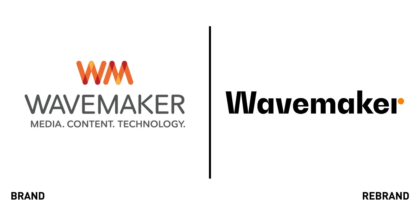
Wavemaker
Group M media agency Wavemaker revealed a new visual identity including a new global operating system, modular planning process and brand refresh, designed to bring the new positioning of ‘positive provocation’ to life and digitise and globalise its offering. The new positioning seeks to provoke positive growth in their clients and people through the new operating system. The added bright orange dot to the name in the rebranded logo symbolise the provocative and fearless attitude that makes up Wavemaker’s identity and makes the brand stand amongst competitors. The dot is also seen rippling through the white rectangular boxes, creating waves among its surroundings as it leads the way towards change and growth. Global CEO Toby Jenner says, “Growth models of the past will not serve the future. Established approaches and traditional thinking are being exploded in every sector, in every market. Exceptional growth now requires uncomfortable change. This change demands courage, from our clients and from our people. Wavemaker understands this, we must live our name which reflects a provocative, even fearless attitude.”


