#TransformTuesday: 16 June

Here is this week's selection of rebrands from around the world, from premium cider to dairy products. For more from #TransformTuesday, follow @Transformsays on Twitter.
Aspall

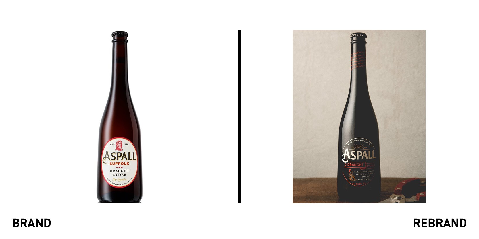
UK premium cider brand, Aspall, has partnered with global creative agency BrandOpus to create a new brand strategy and visual identity to elevate Aspall within the category as the cider of sophistication. The brand is based around the concept of ‘choosing the road less travelled,’ which reflects the brand’s history and Easterly origins in Suffolk. With cider usually originating from the West of England, the brand’s visual identity of rising sun and Easterly ribbon signify the brand’s unconventional spirit and heritage. The design is sealed with the knight, inspired by a Chevallier family memorial. He breaks from the expected by downing tools in favour of writing, a reference to the historic journals kept by the Aspall family.
“We wanted to stay true to the brands belief of taking the time to do things properly, crafting a bespoke calligraphic script applied to the neck of the brands iconic bottle” comments Ian Ritch, Design Director, BrandOpus. “A more elegant and sophisticated design has been created through combining traditional crafts with contemporary colours and finishes” he says.
Granja Rinya

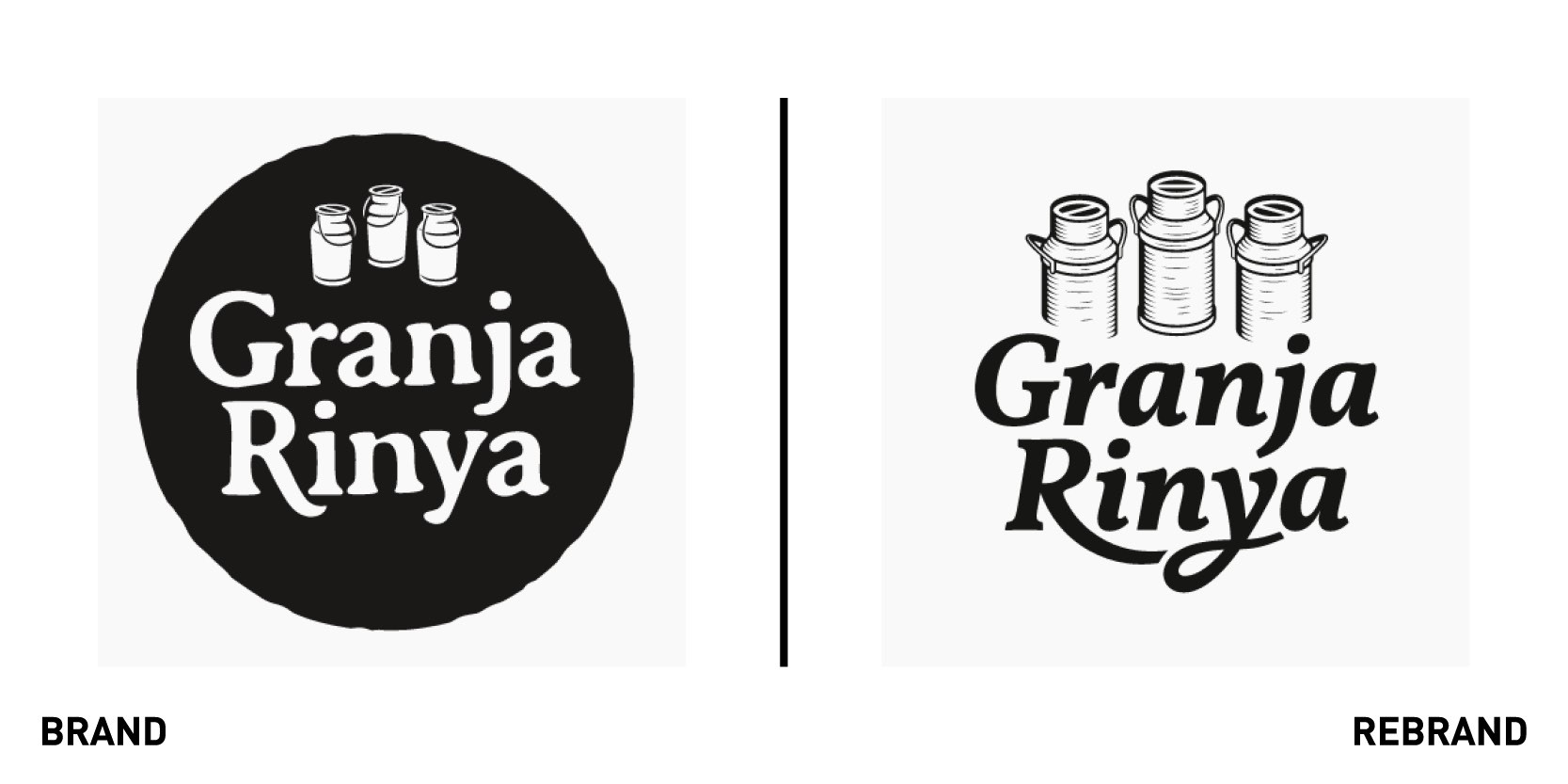
Granja Rinya’s, one of Spain’s biggest brands of dairy products, worked Spanish design agency Small to create a new brand for its fresh products and desserts. The rebrand was based on the idea of the ‘Return to flavour,’ which emphasises the authenticity and excellent quality product of Granja Rinya’s. To encapsulate this, the design agency took a step back in time and place, forming the visual identity around aluminium milk churns, kraft paper, handwritten recipes, and food illustrations. Small began by redesigning each letter of the name to improve readability, especially for small sizes, and creating a link that would take consumers back to the world of manual labour and craftsmanship while making the brand distinctive. The packaging was created by using hand-drawn illustrations depicting farm life or other products included in the cheese (such as almonds or papaya) ,which further emphasise the brand’s focus on wholesomeness. The result is a very traditional product that relies on branding and design to compete more effectively.
Echo Falls

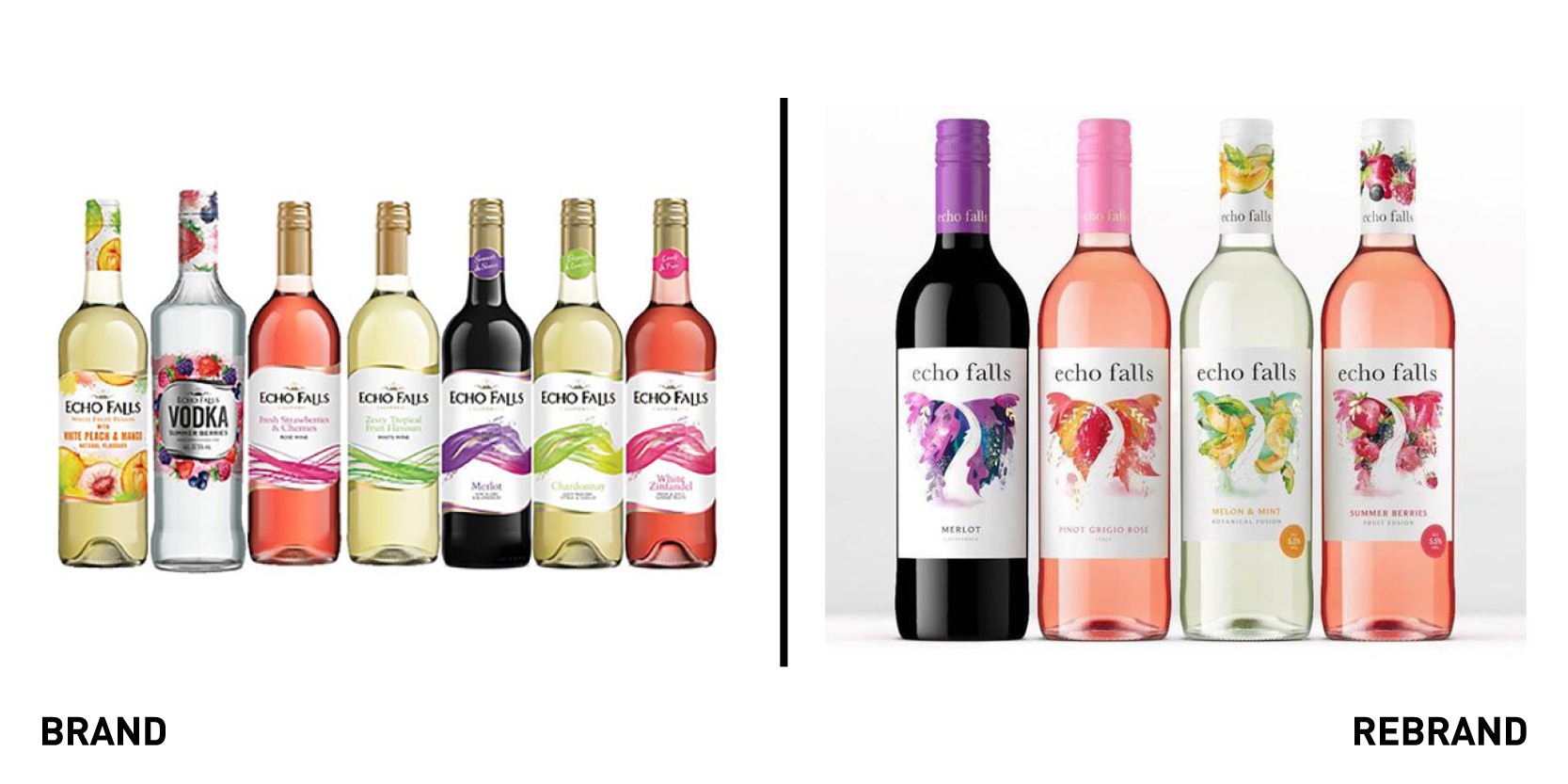
Second largest wine brand in the UK, Echo Falls (part of Accolade Wines) worked with global drinks design specialist Denomination to develop a new brand and packaging strategy that would boost its popularity and presence in the market sector. The agency created a contemporary and sophisticated look and feel, which made the brand much easier to understand as a whole yet retained its accessible USP. The new visual identity centres on a waterfall, which is instantly recognisable, gives a sense of flow, and delivers a premium look, drawing the consumer eye from the brand name down to the varietal. The abstract imagery and fresh colourways on the packaging single out specific variants and communicate flavour profiles.
“As well as being quickly and easily identifiable on and off pack, the new identity needed to appeal to a wider consumer base – those new to the fold, as well as people who may have experienced Echo Falls in the past but moved on, believing that the brand was no longer relevant to them,” says Rowena Curlewis, CEO of Denomination.
Lydia Freeman, European marketing manager at Accolade Wines, adds, “We’ve now been positioned as a modern, aspirational brand and are keen to reclaim our position as category leader. Denomination’s approach has taken us away from being perceived as a low-cost starter wine, to being sophisticated and good value.”
Axe

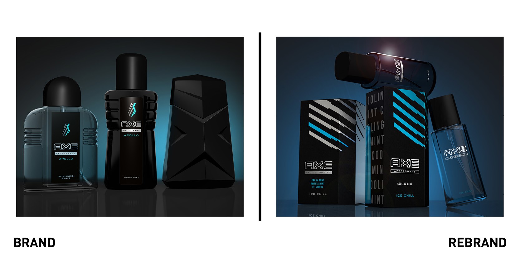
Unilever’s male toiletries brand Axe (Lynx in the UK) worked with London-based design agency PB Creative to reinvent the brand’s premium fragrance platform across all markets. With the rise in popularity of Eau de Toilette and After Shave variants in recent years the brand sought to redefine Axe’s mass fine fragrance offering and to harmonise and consolidate the varying packaging formats for global alignment and consistency, in addition to relaunching the range to make it feel more relevant to the current Axe consumer. To do so, PB Creative developed a new graphic and structural design of the primary bottle and outer carton packaging across both Eau de Toilette and After Shave tiers. The bottle is a contemporary combination of smooth geometry and confident lines to form a balance of softness versus the Axe edge. Bottle transparency across both After Shave and Eau de Toilette delivers differentiation, depth and intrigue as well as elevating Axe’s perception as a fine fragrance brand. The 2D aesthetic is inspired by the existing core portfolio variant icons cropped for dynamic impact with stripped back colours for enhanced sophistication.
“This bold fusion of structural and graphic design delivers a strong, contemporary approach to the individual fragrance stories with a refined yet instantly recognisable Axe Edge,” says Ben Lambert, creative partner and co-founder of PB Creative.
“The new fragrance platform builds on Axe’s core DNA but at a much more premium level, reinforcing the brand as being much more than just a body spray,” says Lara Kerbaj, senior brand manager at Unilever.


