#TransformTuesday: 15 December

Here is this week's selection of rebrands from around the world. For more from #TransformTuesday, follow @Transformsays on Twitter.
Acrisure
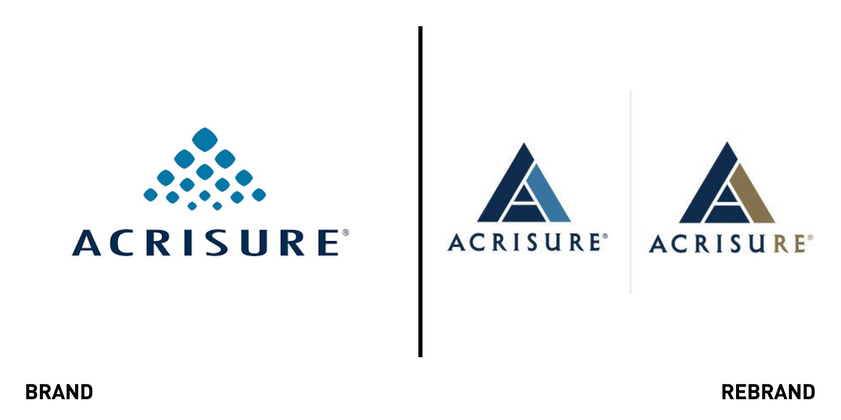
One of the world’s top-10 insurance brokers, Acrisure, unveiled its new brand identity which highlights its unique combination of financial strength, industry expertise and global distribution power with the integration of excellent AI and technology. The new brand supports Acrisure’s drive to become the most tech-enabled insurance broker in the world but it also stay true to what has fuelled the company’s growth to date: the people who comprise its unique agency partner model, reflected in the new tagline ‘Powered by exceptional partnership and technology.’ The new logo is an evolution of its legacy mark and expresses the company’s efforts to harness the power of AI. As part of the rebrand, Acrisure’s global reinsurance brokerage Beach & Associates, will become ‘Acrisure Re’ and ‘Acrisure London Wholesale,’ further aligning under the Acrisure brand.
"The new brand symbolizes our commitment to tech enabling every facet of our business and is an outward display of these intentions. In addition, re-branding Beach as Acrisure Re signifies how we intend to leverage the robust talent in our reinsurance division as it fully represents Acrisure in all markets,” says Gregg Williams, co-founder, CEO and president of Acrisure.
Buckwud
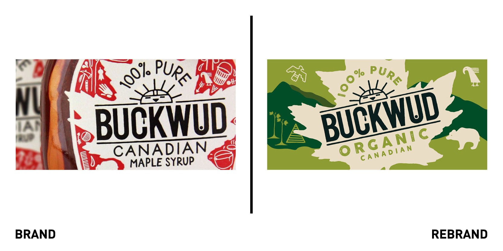
Brand agency bluemarlin redesigned Canadian maple syrup brand Buckwud, a premium UK brand with a quirky Canadian personality and now the single largest branded maple syrup on the market, used as a plant-based alternative to sweeteners. The rebrand’s goal was to dial up Buckwud’s credentials as an organic, plant-based product while increasing its unique character to achieve a greater shelf-standout. The new design is simpler and more linear, cutting back on the clutter and focusing on a natural green colour scheme to reflect its organic credentials while also adding approachability for any consumer looking for great taste. The maple leaf logo, central to the packaging, pays homage to its Canadian heritage and further emphasises its organic and authentic qualities.
Climate Change Committee
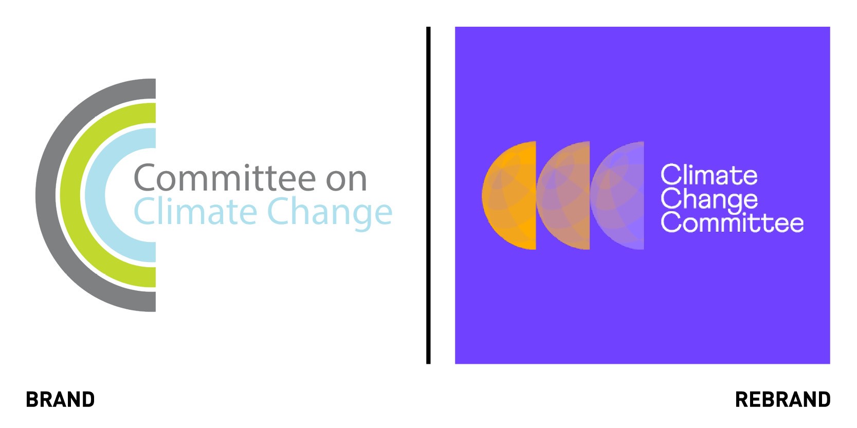
The UK’s independent adviser on tackling climate change, the Climate Chance Committee (CCC), worked with branding and digital agency Templo to refresh its generic, outdated and fragmented visual identity. The new brand steers clear from cliched tropes like the green earth logo, creating a stand out in the sector with the bold and unusual colour combination of purple and yellow. Inspired by global warming heat temperature maps, the logo sees the palette used to depict temperature change, where colour is used to convey the CCC’s role in helping us transition from a warmer, overheated planet to one that is much cooler. The colour is applied as a gradient across the three hemispheres that reinforce the CCC acronym. A series of ‘sunrise’ animations reveal the hemispheres in the logo. The ‘quantum field’ grid images complement grids within the logo and interact with the imagery content to highlight and show the effects of the subject matter. The rebrand also includes a fresh approach to data visualisation to drive and deliver the data and research findings, which are the main way the CCC advise governments and effect policy change.
"The CCC needed a fresh, modern look to revitalise our second decade of climate analysis and commentary. We have the best data and insights, but we lacked punch,” says Chris Stark, chief executive at CCC.
Freeman Mavericks
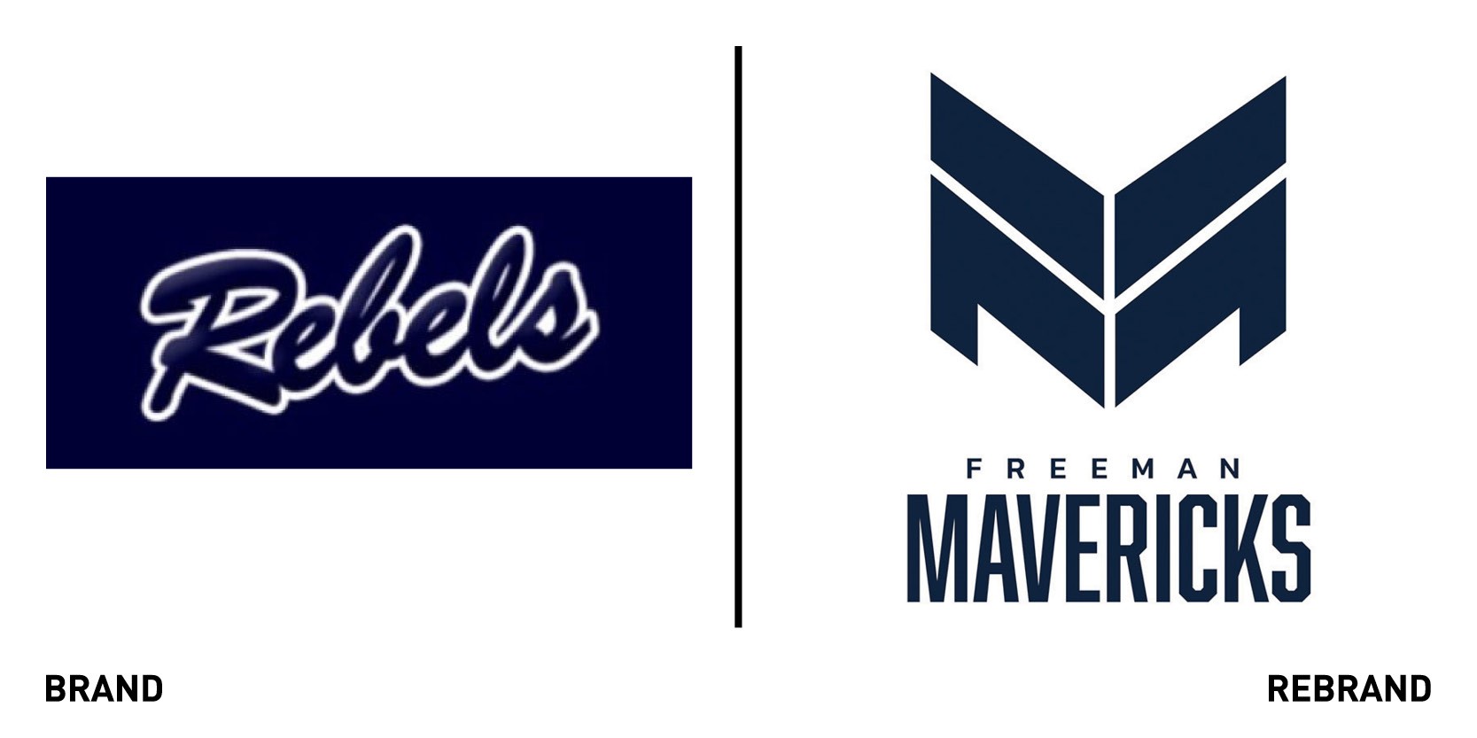
Douglas Freeman High School, located in Tuckahoe, Virginia worked with VCU Brandcenter, a master’s programme for advertising, branding and creative problem-solving, to change their mascot, the Rebels. For many, the name (a nickname for Confederate soldiers during the Civil War) evokes a negative association. VCU provided an identity development that ultimately sparked a multi-month volunteer project for a team of nine students and two volunteer mentors, which used interviews, focus groups and online surveys to create a fresh new identity for the mascot, the Mavericks. The maverick represents as a person who shows independence of thought and action, who breaks from the herd and stand out. The Maverick reflects the high school’s core values and what makes it special, from being a leader in the surrounding community, to challenging the status quo, to being a free thinking and inclusive place.
Ribena
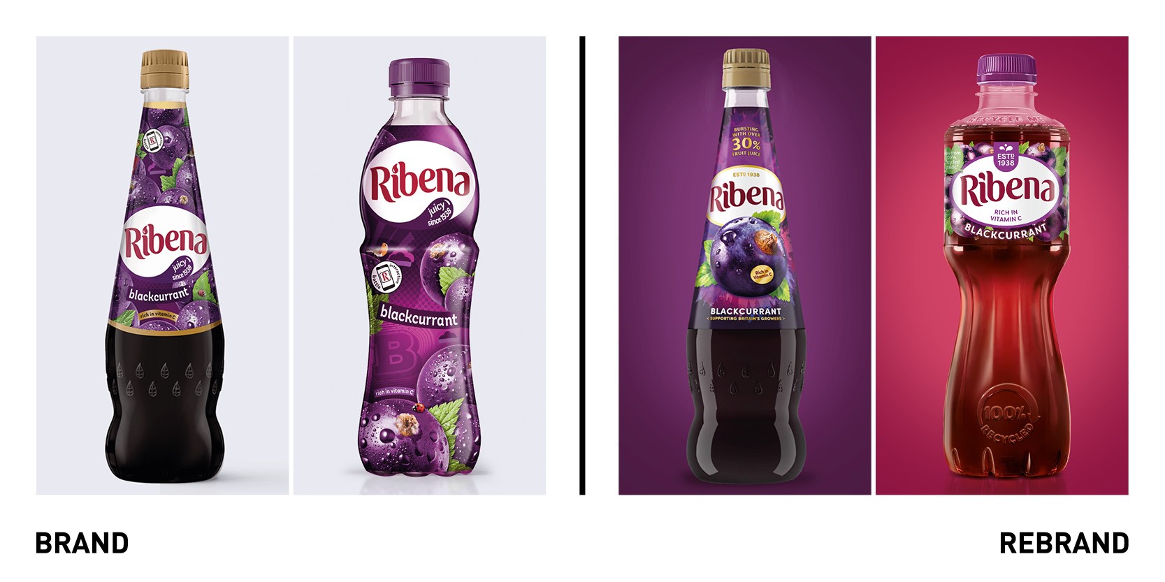
Design agency Seymourpowell partnered with Suntory Beverage And Food GB&I to execute a brand and packaging update across core product ranges of British drinks brand Ribena, as it seeks to differentiate itself in the minds of consumers and continue to lead sustainability efforts within the drinks sector. The goal was to establish how the brand could cement its future position within a competitive and dynamic drinks market whilst retaining the identity consumers know and love. Ribena’s Ready to Drink product was central to the portfolio of work and has undergone both a 2D graphic and structural redesign. The bottle shape, which evokes the idea of cut glass, adds greater elegance to the product, appealing to more sophisticated audience, while also maintaining heritage elements. Natural cues were enhanced to promote the fruity taste of the juice by introducing illustrations of fruit nestled around the Ribena brandmark, whilst the transparent, compact label reveals the colour of the liquid. The Ready to Drink product has seen its sustainable properties enhanced through a significant reduction in the size of the label and the lacing of sustainable messages throughout the pack.
“This launch is one of the most significant in our 80-year history as we look to tap into new and growing audiences and create ever-more sustainable packaging using a refreshed portfolio of drinks to do so,” says Charlotte Flook, head of Ribena, Suntory Beverage and Food GB&I.


