#NewBrandMonday: 14 December
Here are this week's selection of newly launched brands from around the world. For more from #NewBrandMonday, follow @Transformsays on Twitter.
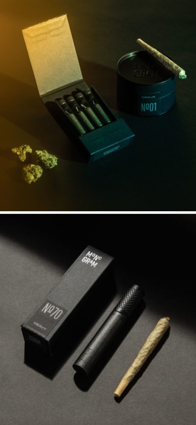
Monogram
Rapper and music mogul Jay-Z launched a new cannabis brand, Monogram, which include Jars of sleekly packaged flower, pre-rolled mini joints and a cigar-inspired pre-roll. The brand identity, from the name to the packaging, is slick and modern, reflecting the premium quality of the products. The premium look and feel is further developed in the website design, which includes black-and-white images of an indoor cannabis grow and a click-to-play ‘Sounds from the grow Room’ soundtrack. The strapline ‘Refining standards, redefining growth’ reflects the brand’s mission and purpose, of helping shape a more inclusive future in regard to drugs and all the stigmas surrounding it, including justice and equity. The website also has a dedicated section of ‘process’ that explores, through images and detailed description, the ethical ways in which the cannabis is sourced and the highest-quality standards that are followed.
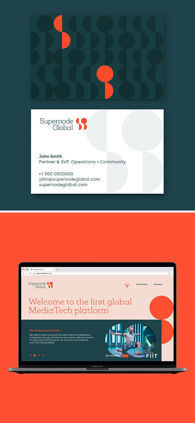
Supernode Global
Creative agency Interstate Team worked with media technology venture capital Company Supernode Global to create a new comprehensive brand that bring clarity to their offer to the media technology landscape and an aspirational platform for growth. The goal was for the brand to resonate with audiences in the innovate sector while also demonstrating the superior level of service offered by the team. To do so, Interstate designed a balanced expression of the visual identity, from the rounded slab serif typographic marque characterised by the monogrammed SG to the bold and bright colour palette which adds a timeless and fresh character. The Supernode Global logo and overarching brand style build a bridge between the forward thinking and contemporary aspects of the company and its business philosophy, and the maturity and knowledge that is inherent in the experienced investment and community teams.
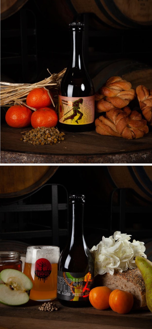
Tempus Barrel
Heineken’s London craft beer pattern Beavertown Brewery launched a new core range range with limited edition brews, the Tempus Barrel range. The new labels and bottles, designed by Beavertown’s creative director, give the packages a more refined style compared to the other range and adopt a more artistic flair, including the use of mythology and ‘druid imagery.’ Rather than centring around a collective theme, each Tempus bottle is different to reflect the wide-ranging flavours on offer, with each of the beer’s identity stemming from its name. The bright and bold illustrations on packs are up to interpretation, allowing drinkers to create a narrative for themselves out of the pictures they see, and are inspired by popular culture. They act as a mark of quality but also an effective marketing strategy, not only to attract customer’s attention but also to remain memorable after being drunk. The Tempus beers are not the ‘crowd-pleasing styles’ one would expect from Beavertown but will take drinkers into ‘a wide, wild palette’ away from the usual beer, the website reads. The planning, creation and release of each new beer is inspired by the ancient pagan wheel of the year, so each drink will be special, with some brewed fresh while others fermented over time. Each beer will also be produced by using local malt and hops, and a more organic brewing processes to create floral and fruity flavours.
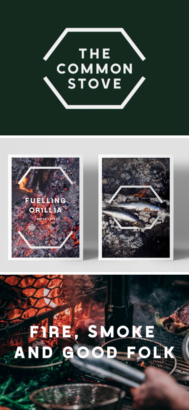
The Common Stove
Branding agency Lantern designed a brand identity for ‘The Common Stove,’ a high-end neighbourhood restaurant in Orillia Canada, which is based on the idea of a communal oven. This was inspired by the Slovenian kachelofen, a U-shaped wood burning oven built in a forest clearing as a place to cook, eat and come together. The U-shape design is what encouraged the chef’s counter and the booth design in the restaurant, with the cooking centred around a wood-fired grill, a reminder of the kachelofen’s warmth, conviviality and sense of community. The menu is also influenced by the wood-fired grill, with an emphasis on quality and simplicity using natural ingredients locally sourced from the forest and lakes. Lantern used the U shape for the booths and kitchen counter to create a flexible holding shape reflecting the traditional concept of the stove, which also inspired the typographic detail and physical elements such as menu holders. The design will help the restaurant stand out and firmly secure its places as a leading restaurant in Ontario’s Lake Country.