#TransformTuesday: 14 January
Here's this week's selection of rebrands from around the world, from a UK children's charity to global management consultants. For more from #TransformTuesday, follow @Transformsays
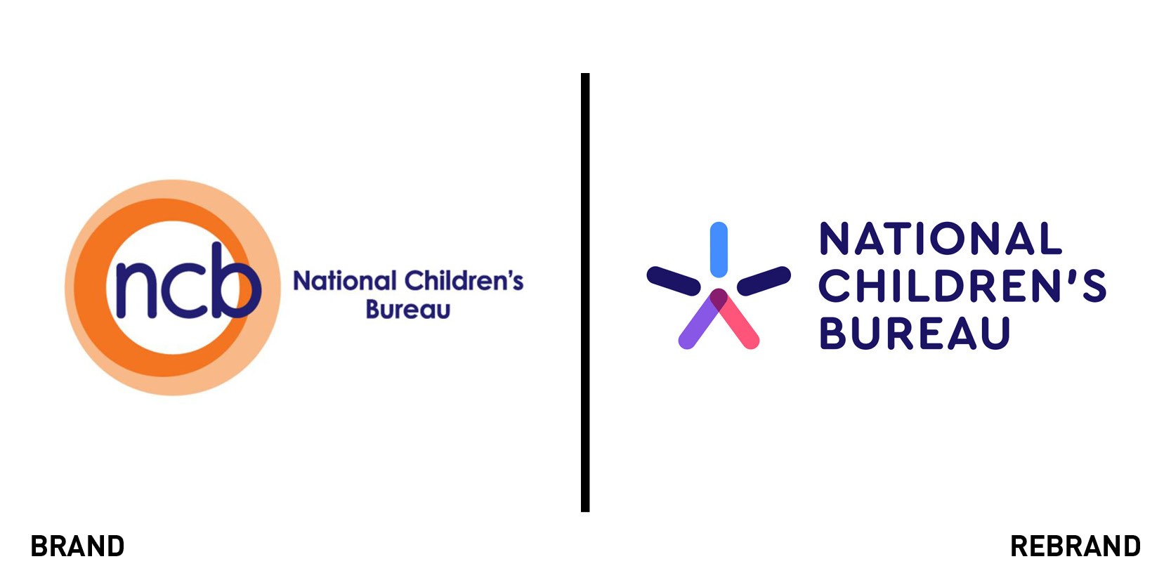
National Children’s Bureau
UK children’s charity the National Children’s Bureau (NCB) has launched its first rebrand in 12 years. The charity, which works across the issues affecting children to influence policy, needed to refocus its funding away from direct donations and government support to grants-based backing from trusts and foundations. It tasked brand consultancy Lantern with developing its branding to deliver a clearer message that could reach a wide audience, from pre-school children to government ministers. Lantern’s director, Ryan Tym, said: “NCB’s strapline ‘United for a better childhood’ was the springboard for evolving the story. The charity was doing a great job talking about how it was united internally, across its family of brands, but not about how it unites external partners. From parents and children to central government and even rival charities, NCB brings together the people and organisations who bring about the best for our children”. The new logo, which resembles a star, incorporates colourful shapes that are also used throughout the rest of the look and feel of the brand, reinforcing the concept of working together. Lantern worked with the charity’s internal marketing team to help launch the identity across applications including brand guidelines, office graphics and a new website.
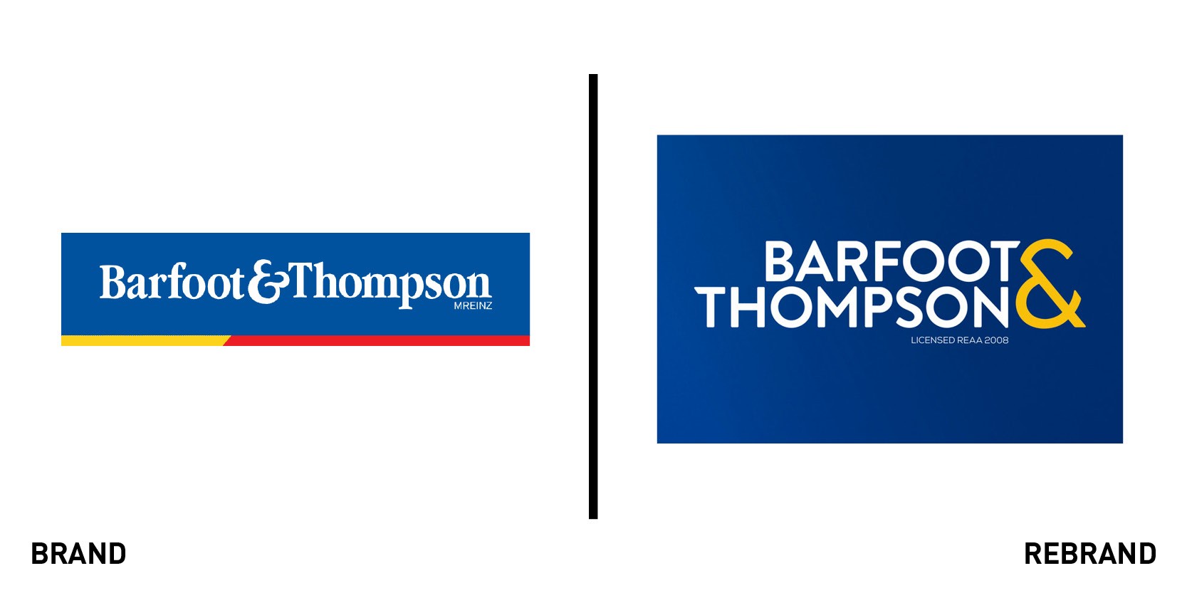
Barfoot & Thompson
One of New Zealand’s oldest real estate agencies, Barfoot & Thompson, has overhauled its brand for the first time in more than 40 years. It enlisted Big Communications and Simon Byers Design, who worked with the in-house team to develop the new look. The master logo has a fresh, sleeker look and a refined colour palette. It will be rolled out across digital and print, and also used in branches and on ‘for sale’ and ‘for rent’ signs posted around Auckland and Northland. Barfoot & Thompson managing director Peter Thompson said the new branding would give greater visibility to business divisions beyond residential sales, and better reflect the company. He added: “Our new logo and branding approach is about showing everyone who engages with Barfoot & Thompson that we are indeed the modern, sophisticated and progressive real estate professionals they know us as. We believe it is a new look that anyone would be happy to have on signage outside their home, on their commercial listing or even their local sports team jersey as part of one of our many community sponsorships.” The change will happen over several months, as thousands of assets are rebranded and new reusable signage is produced.
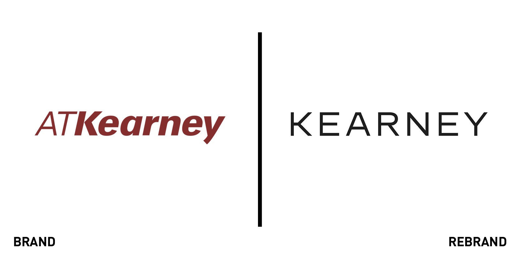
Kearney
Global management consulting firm A.T. Kearney has undergone a comprehensive rebrand, including a name change to Kearney. The new name is designed to reflect the company’s emphasis on community – by removing the initials of founder Andrew Thomas Kearney, it says it shows that the legacy of success is due to the global Kearney family of employees, alumni and friends. It tasked Siegel+Gale with shaping the new brand messaging, visual identity and a personalised, storytelling approach to communications. As well as the new name and logo, Kearney will no longer use stock photography, instead using crowdsourced images from its employees, showcasing their individual perspectives from around the world. Alex Liu, chairman and managing partner of Kearney, said: “The most exciting aspect of our new brand is that it so accurately captures our voice. Our firm is refreshingly real, relatable and original. To that end, we are eliminating industry jargon. Kearney people are always themselves. We speak plainly, listen closely, and build great working relationships. We take joy in each other, and in every success achieved side by side with our clients.”
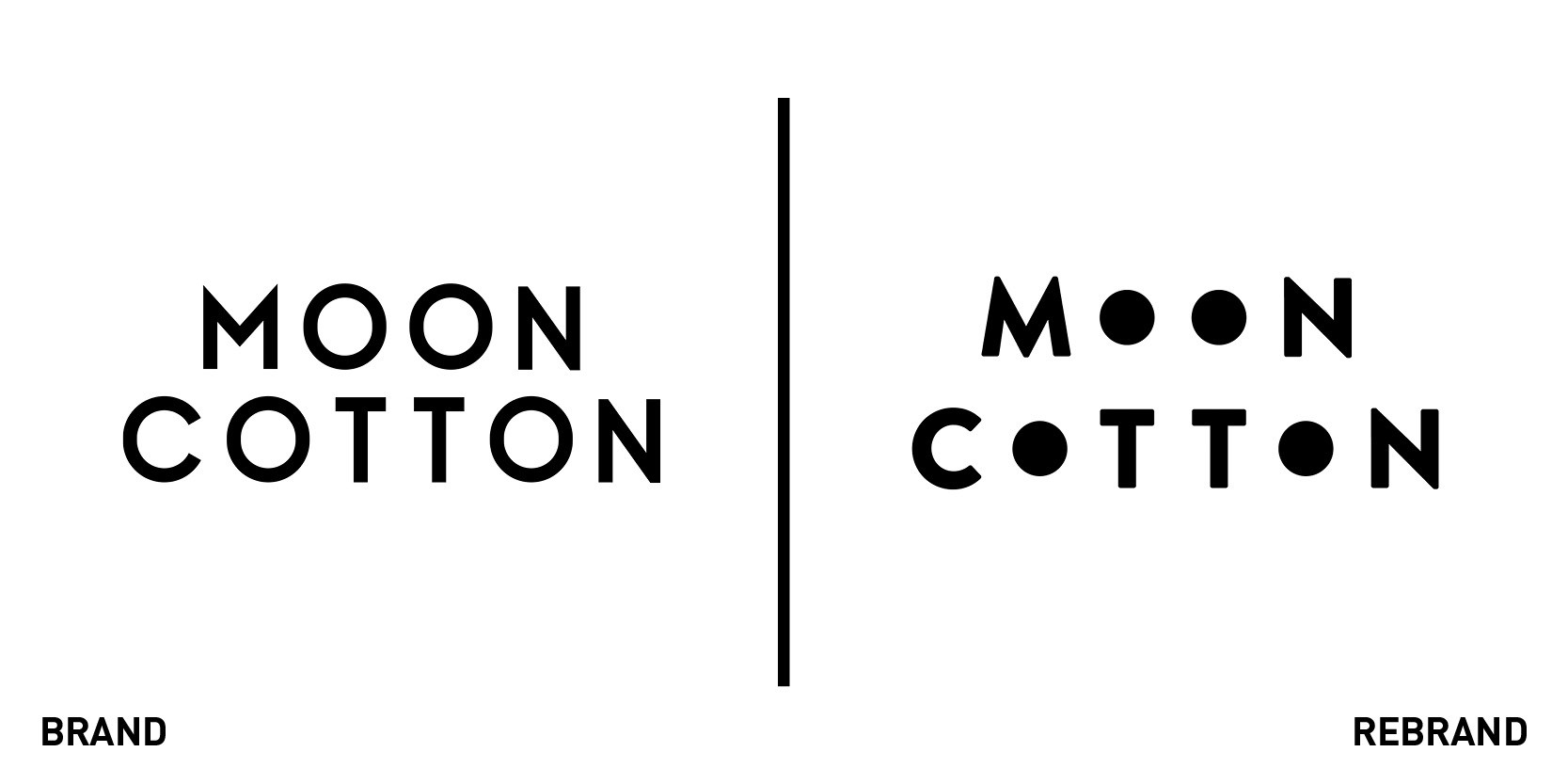
Moon Cotton
Slime brand Moon Cotton has been given a new look by Vault49. Launched in 2017, Moon Cotton has focused on a premium slime product as part of the IMGN Media portfolio. The company’s Gen Zaudience has encouraged an explosion in the slime category – slime being a form of play, escapism, stress relief and content generation. But, the challenge for Moon Cotton was gaining credibility in a primarily DIY-governed space. Vault49 partner and creative director Leigh Chandler said, “This DIY, almost ‘brandless’ aesthetic and belief is welcomed by the slime community – when big brands such as Walmart have tried to enter the space they are greeted with scepticism. They don’t have permission to play in this space.” Vault49 took that spirit to heart in its development of the Moon Cotton brand, focusing on craft, personality and joy. The packaging uses clear containers to highlight the products’ own colours with an easily animated logo emphasising the shape of the packs in four blacked-out Os.


