#TransformTuesday: 1 September

Here is this week's selection of rebrands from around the world. For more from #TransformTuesday, follow @Transformsays on Twitter.
Arbuthnot Latham

Arbuthnot Latham, a full-service proposition bank combining private and commercial banking, investment management and other elements, has launched its brand transformation. The bank’s iconic peacock logo remains a central feature but it, together with the visual identity, are being refreshed to better reflect Arbuthnot Latham as it is today. As part of the brand evolution, the brand also included a new strapline ‘always there for you,’ which reflects its relationship-led and collaborative approach.
“Evolving a brand without departing from the core elements which have made it successful is not always straightforward. We believe we have created a concept that will resonate with all of those who engage with Arbuthnot Latham,” says Virginie Dafforn-Gorgemans, head of marketing at Arbuthnot Latham.
“Much of the re-brand work has been done in-house by our talented creative team. This enabled us to react with agility to business feedback, ensuring we truly reflect how we see ourselves. You will see our distinctive peacock motif wherever you find the Arbuthnot Latham brand - it could be on the sail which powers a boat, or a child’s tent that provides protection –because it conveys the many advantages Arbuthnot Latham delivers to its clients,” she adds.
The bank is also relaunching its client-facing website with a range of new functionality.
Imax with Laser
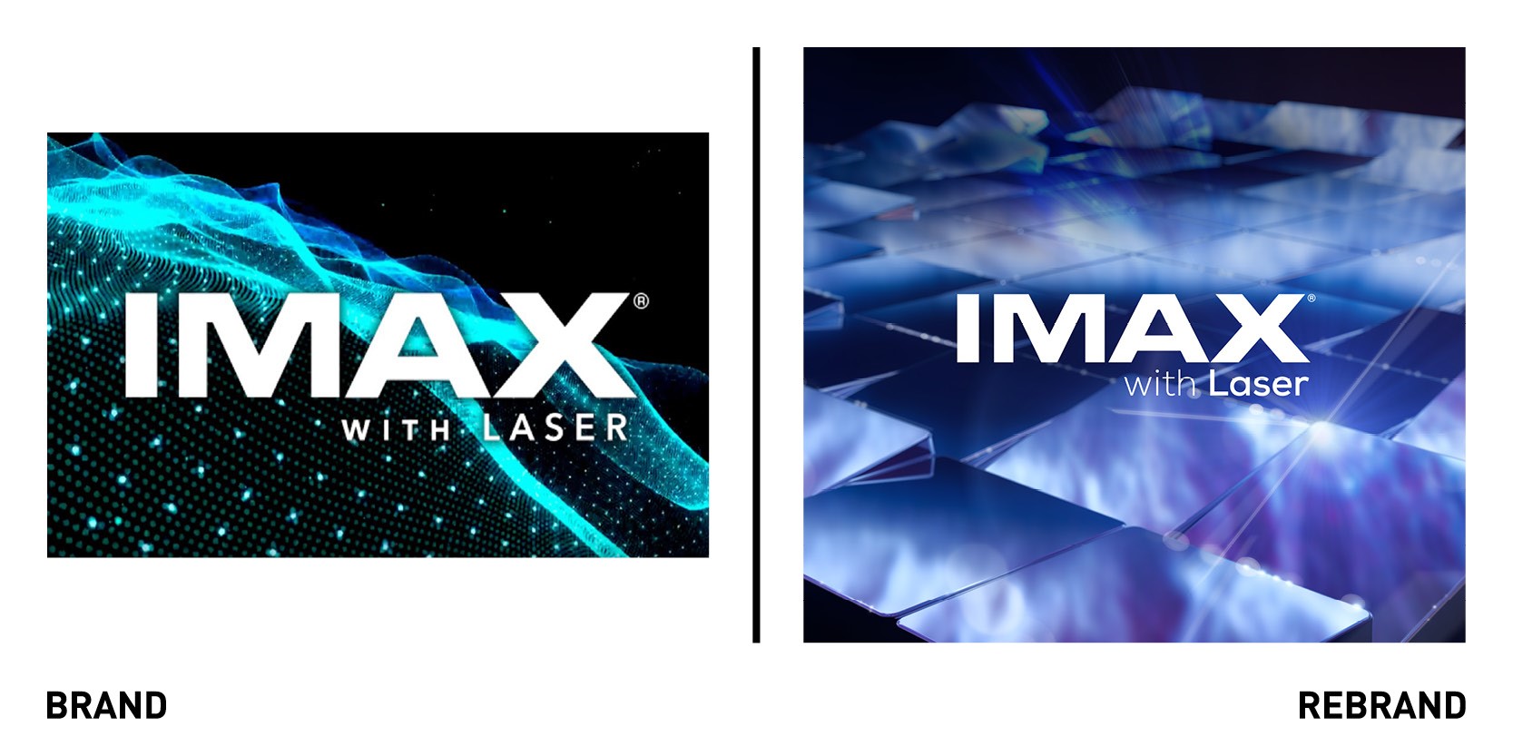
International design studio Trollbäck+Company rebranded IMAX’s top-tier technology offering, IMAX with Laser, an immersive movie experience. The rebrand includes an immersive pre-roll open for films viewed in IMAX with Laser that visually conveys the inside story of the company’s technologies. Using a combination of GCI, live and action photography and ultra high-rest digital imagery, the new brand shifts focus from format to experience, using for the first time in its history a consumer facing messaging around its newest commercial Laser technology.
“In the past, IMAX has focused messaging for IMAX with Laser primarily on B2B communications, highlighting the system’s unique specificity and value to filmmakers,” says Fran Roberts, creative director at Trollbäck+Company. “We wanted to flip the script in a way, by continuing to celebrate and promote the amazing opportunities the IMAX format offers the industry, but also showing off what IMAX with Laser has to offer consumers.”
Trollbäck+Company also produced a cinema-ready, 4K hero motion piece that features an immersive pre-roll open fro films viewed in IMAX with Laser, in addition to several high-res print and digital display ads. For each asset, Trollbäck+Company looked to the IMAX with Laser system for inspiration. To call out visuals, the team combined CGI footage of the millions of mirror chips inside IMAX’s advanced projection system with 6K high-speed motion clips they captured in-studio of the human eye. For audio, they augmented live-action footage of speakers playing sounds at different frequencies with custom CG sequences.
Jet Puffed

International creative agency Jones Knowles Ritchie (JKR) rebranded Jet-Puffed marshmallows, creating a playful and vibrant new visual identity. The smile-faced Puff Pals helped inspired the new branding of Jet-Puffed; on the packaging, the rainbow now unties to the bottom of the bag, allowing the Puff Pals to take centre stage. The new wordmark, which removes the black and blue outline from Jet-Puffed, appears more soft and fluffy, reflecting the texture of marshmallows inside. JKR also added new digital assets to the brand, like videos showing marshmallows sliding down rainbows, which adds to the upbeat and quirky brand personality and provide a more energetic and playful toolkit.
Mello
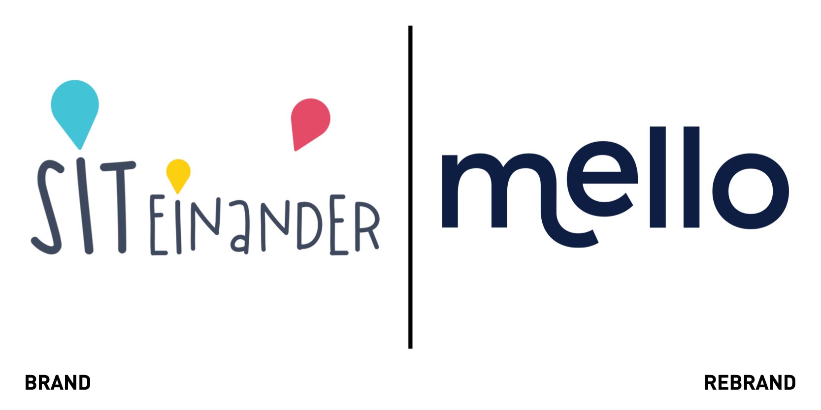
Berlin-based start-up Mello worked with Studio Skulptur to launch a newly designed app that aims to help parents build strong local support networks online and in the real world. Users can browse through profiles of parents who live nearby, connect via chat and organise meetups. As the brand expanded from being a childcare app that functioned as a digital babysitting co-op to one providing proper social support network, it needed a new focus and a new brand purpose- helping families find their village The relaxed and uplifting visual identity, which includes hand-drawn illustrations of a family of three, real-life photos of parents with their children, and a pastel colour palette of blues, yellows and pinks aims to convey the sense of joy that community support provides young parents.
“The new brand has re-energised us and allowed us to create consistent assets and present a stronger image to investors, partners and most importantly, parents,” says Adam Ferns, product manager at Mello.
Rolls Royce Motor Cars
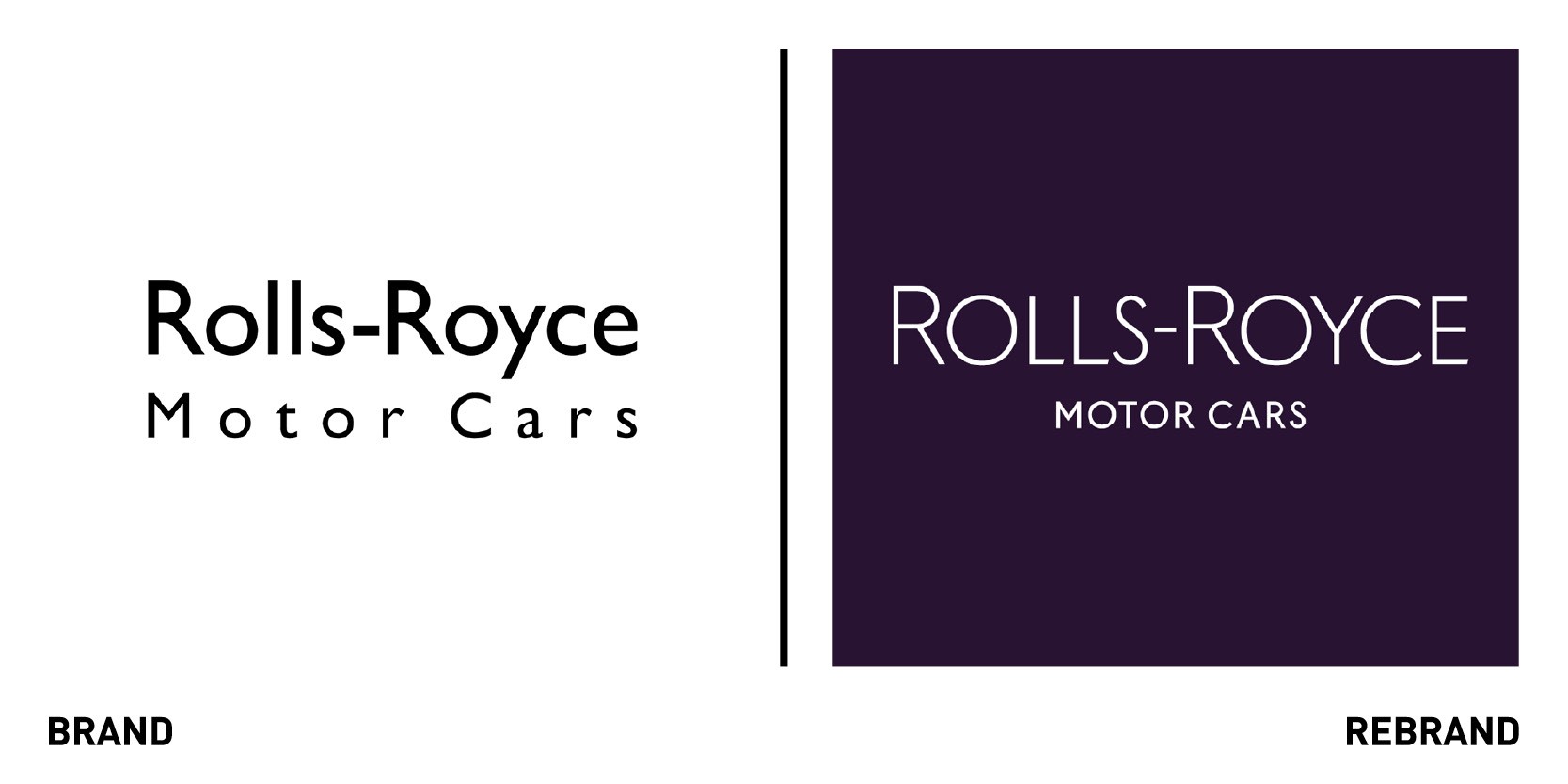
Iconic British luxury car maker Rolls-Royce worked with world’s largest independent design agency Pentagram to refresh its brand for a younger, more contemporary and digitally savvy audience. The new tone of voice presents Rolls-Royce as both authority and innovator, bringing simplicity and clarity to the brand with an increased emphasis on digital applications. However, it still preserves the company’s heritage, making it immediately recognisable as Rolls-Royce. The rebrand is centred around a vision that acts as a statement of purpose for the company: pioneering the power that matters. While it retained the iconic double R synonymous with Rolls-Royce, Pentagram simplified the company’s bade by removing the external wordmark and redrew the letterforms, finessing the details of the complex logotype to render it bold and clear. Throughout the branding, the use of white space allows elements to breathe and helps the brand feel open and accessible.
The rebrand also includes a ewly defined, vibrant colour palettes, specially commissioned custom typeface, Rolls-Royce Pioneer, and a new approach to infographics and motion graphics.
Stories & Ink
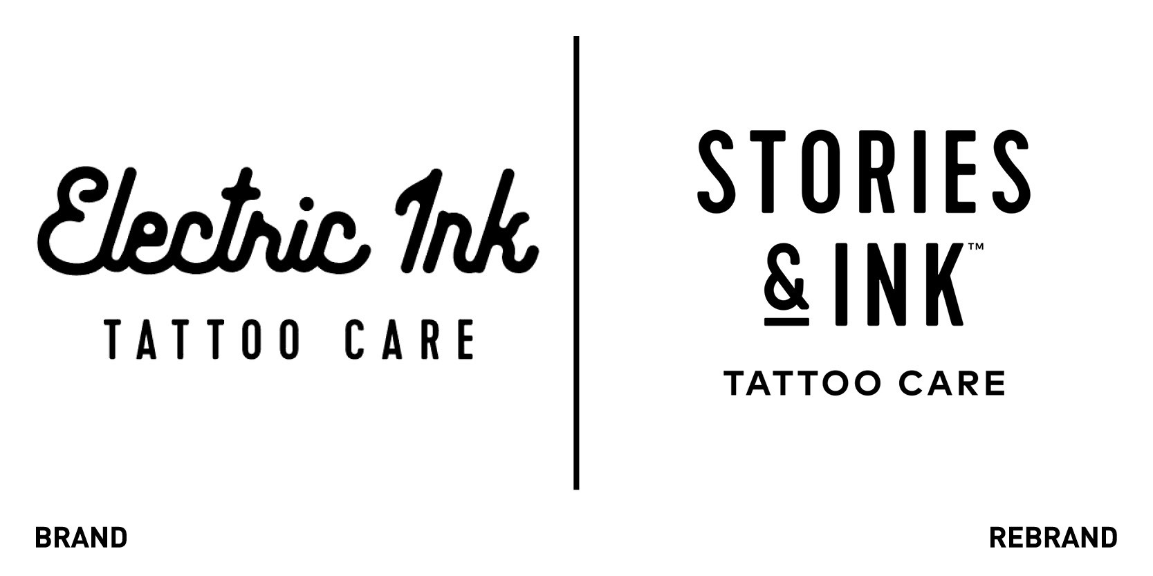
Leeds-based independent branding agency Robot Food rebranded Electric Ink to Stories & Ink, following a strategic shift online as a direct-to-consumer tattoo skincare brand. Three years since its birth, after validating the brand, product and consumer fit, it became clear that the largest potential for growth was online, connecting directly with customers and free from retail constraints. The new name is reflective of the brand’s new mission to facilitate meaningful conversations around tattoos and create an inclusive space where tattoo enthusiast could share their personal stories. The packaging was evolved to feel more akin to contemporary health and beauty brands, stripping the original illustration back to a single icon on each SKY for clear range navigation. Off pack, across everything from a bespoke Shopify web platform to social channels, a newly developed tone of voice and photography style was created to build a more completely story of the brand.
“Now more than ever, to be truly successful, brands need a compelling purpose behind their design. We saw the move to DTC as a necessary business decision, an opportunity to cement our position as a global brand, but also to add depth to the identity to take it beyond just product into a lifestyle," says founder of Robot Food and co-founder of Stories & Ink Simon Forster.


