#TransformTuesday: 1 December

Here is this week's selection of rebrands from around the world. For more from #TransformTuesday, follow @Transformsays on Twitter.
Everleaf
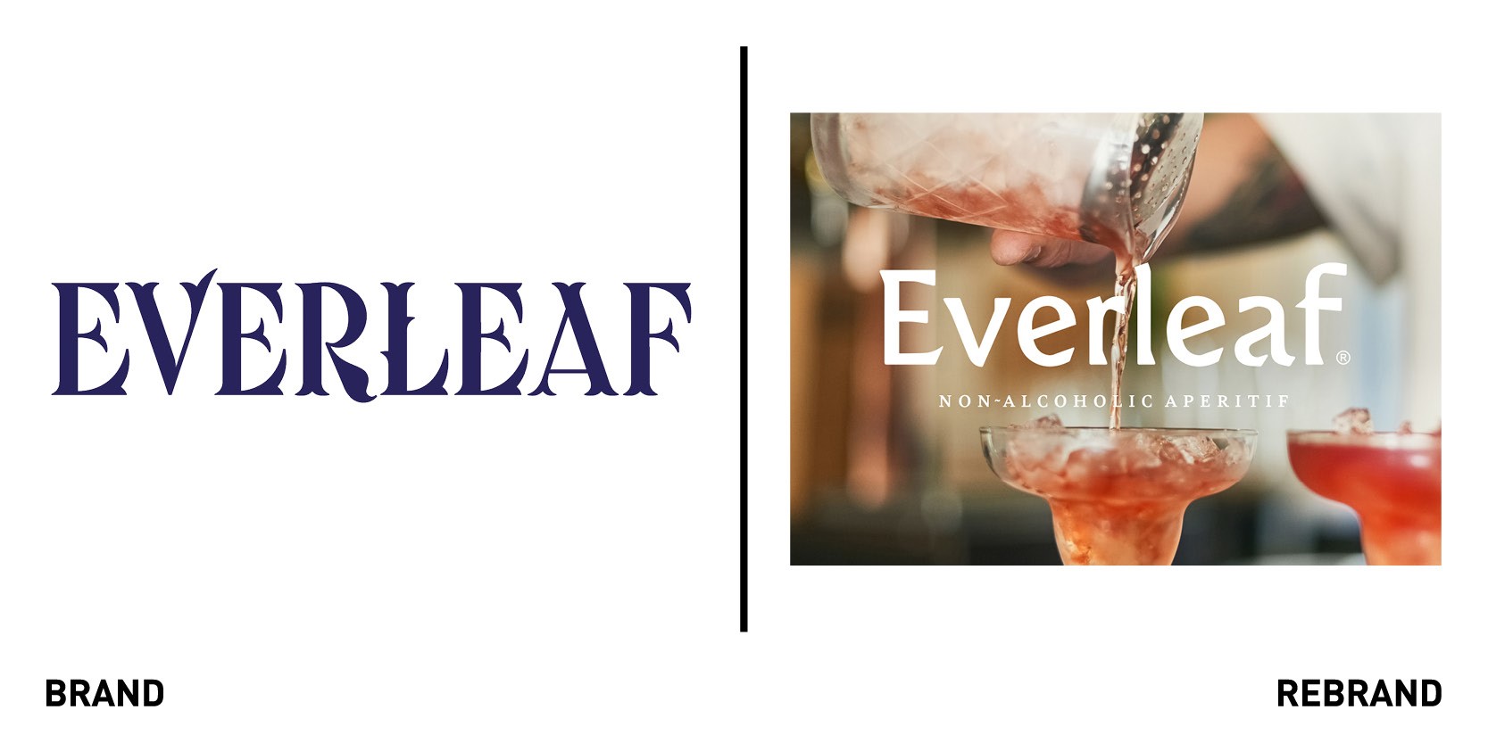
Non-alcoholic aperitif brand Everleaf worked with B&B studio to undergo a strategic repositioning and redesign as it seeks to grow its presence in both the on-and off-trade and launch a range of new products under its name. To create a harmonious range, each liquid in the aperitif is inspired by different biomes of the natural world, from forest to mountain, creating a strong platform for design that brings those ecosystems to life. Originally packaged in a tall bottle with a patterned label, the brand felt more in line with the world of cordials than craft spirits. The new bottles, with broad shoulders and sophisticated neck, make the product easily recognisable for what it is. The label designs express the essence of each biome in the background, while focusing on a single embossed botanical to tell the story of each ingredient. The abstracted photographic style brings a sense of realness to the product without being too literal, and the colour palette evokes naturalness, echoing the colour of the liquid within.
“The new range is harmoniously designed for real collectability, but each label tells the unique story of each liquid and its inspiration. While rooted in the natural world, the design is incredibly effective at communicating the taste, occasion and emotion associated with each drink,” says creative director at B&B studio, Claudia Morris.
Fime
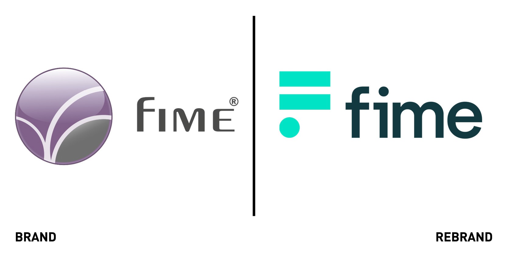
Fime, a tech company that enables clients to create user-friendly and secure solutions across payments, transport and more, worked with design agency Design by Structure to refresh its outdated visual identity, which was lost in its competitor arena. The brand assets and communications materials were not serving their purpose, there was no thematic brand consistency across the channels and the brand lacked clear messaging to its audience. Design by Structure created a fresh and standout visual language to help elevate the brand positioning , rethinking and harmonising all the brand’s touch-points and creating a suite of materials and toolkit to allow the in-house marketing team the flexibility to further develop the brand. The relaunch aligns with Fime’s core values and principles and informs its strategic approach, including the new tagline ‘Making innovation possible,’ which is at the heart of what the business does.
Seven Network
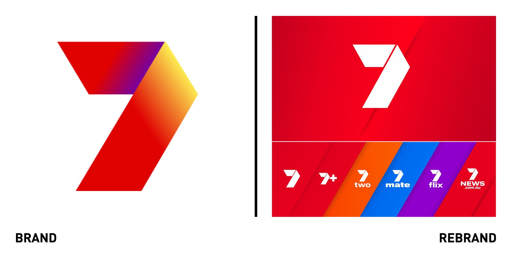
Australian television service Seven Network worked with creative agency Hulsbosch to create an engaging, entertaining and compelling identity that would build consistency across Seven Network’s broadcast and online channels and platforms to appeal to a target audience of 25-54 year olds. The new visual identity acts as a window for Australians, by bringing them closer to the moments that move them, whether that be news or sport. The brand reveals and connects content to viewers. The simple yet bold graphic system stems from the iconic ‘7’ logo, uniting the identity across all channels, from 7flix to 7mate to 7two and into key programming pillars of 7NEWS and 7Sport. The refreshed identity signals a renewed focus and energy within the network, with the identity reflecting what makes Seven, Seven: a contemporary content-led brand that is as relevant to Australian audiences now as it has ever been.
Sillages Paris
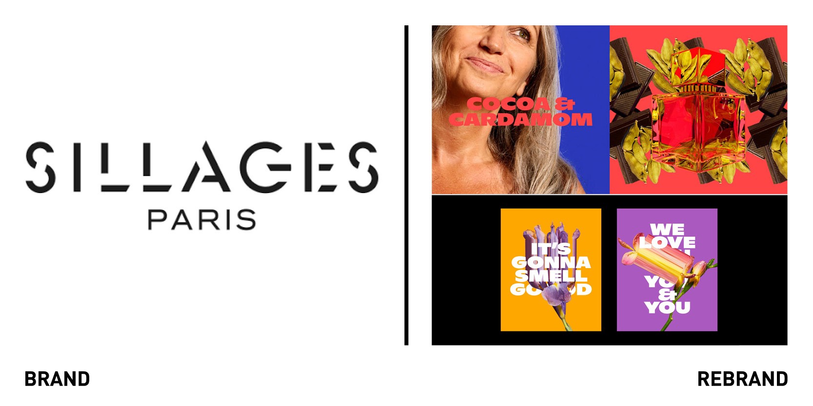
Online perfumery Sillages Paris worked with Netherlands-based design consultancy Dad to rebrand to make its concept and proposition more accessible across its customer base. Sillages is a digital first perfumery that matches clients with their signature fragrance based on the ingredients they love. DAD sought to translate the perfumery's product into an exciting online experience, elevating the playful nature at the heart of the brand while maintaining the luxury feel of a Parisian perfumery. The visual communication was was centred around the high quality ingredients that are the core of what Sillages does. The ingredients are also brought to life by the bold and contrasting colours on the packaging, from bright orange to lilac to hot pink, which together reflect the flexibility of the perfume’s offerings. The new identity also includes different illustrations that reveal the step by step process the brand undertakes to match the person to the perfume, which communicates the brand's unique business model clearly and is easy to navigate.
So Energy
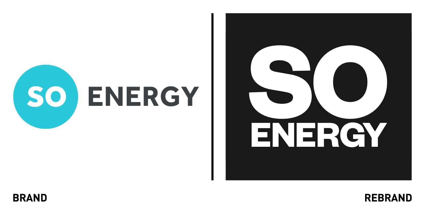
Renewable energy supplier So Energy worked with creative agency Studio Blackburn and comms specialists Common Industry to launch a bold new brand positioning and radical visual identity. To avoid the familiar tropes of energy brands like clip art and hands around the world, Studio Blackburn developed the new look and feel to reflect the ambitions of the business, resulting in a bold and clean black and white brand augmented by red, yellow, blue and green. Considering that customers mostly interact with energy brands, in comparison and aggregator websites, the team knew the brand logotype had to be impactful in the small area of pixels on those sites as well as in a wider comms context. The logotype consists of a large all caps SO in Founders Grotesk Bold, with the all caps ENERGY fitting to the same width. This lockup maximises the space available in small areas of use, but also impresses when used in large formats. The new website takes the user on a clear and easy journey to get an instant quote for their energy supply, sign-in to their account and access other data easily.
“We decided upon the positioning of ‘a force for positive change’, to enable a brand that strives to make change simple for everyone to achieve its goals as quickly as it can - we’re all depending on it,” Paul Blackburn, head of studio Blackburn.


