Taking flight
Crafting an airport experience that can both ground people in a sense of place while providing relevant information relies on semiotic-driven design to succeed. Brittany Golob investigates visual identity, architecture and wayfinding in airport design. Additional reporting by Alexis Noonan
A walk through the Vancouver Airport in Canada showcases native art, water features, wood elements and natural lighting. McCarran Airport in Las Vegas has busy carpets, neon lights, the odd palm tree and and slot machines. Lots of them. Abu Dhabi’s regional hub offers luxury shopping, dusty palm trees and ornate architectural features aligned in a long avenue. Amsterdam’s Heineken bars and easy chairs complement a wheel-and-spoke system to the interlocking terminals. Each sets a sense of place. It offers a glimpse into the character of that airport’s location. But it’s all carried out through symbols, sights and feelings; subtle cues that indicate to the traveler where they might be and what that might mean.
Any company in the hospitality industry can nail semiotics. Luxury island resorts the world over indicate elements of indigenous culture alongside refined senses of near-adventure. Train stations across Europe offer a similar architecture with clear departure boards and clock placements that discourage loitering and facilitate movement.
But when it comes to airports, all these things have to exist together in a massive, miniature city, with multiple layers of stakeholders, an often disjointed strategy and the need to process thousands of people through the system each and every day. Typically, there are competing goals between retail and restaurants, and process and information, with the former encouraging people to stay put and the latter encouraging them to keep moving.
If done poorly, it’s a recipe for disaster. Or at the very least several hundred queries at the information booth every day. With lives, time and money at stake, airports have to get it right. Those that do so most effectively unite a sense of place with clear signage and adept space and brand design. This approach can make an airport not just efficient, but enjoyable and even memorable.
Following the major brand development of DXB, the consumer brand of Dubai Airports, Matthew Horobin, director of brand engagement says of the new brand’s signature offset ‘x,’ “The idea there is to make something immersive, something you could pass through like an airport. Creating that space for us to then put on the show, to bring entertainment, to bring experiences, products and services that add to the journey, not just simply facilitate the journey.”
That’s the guiding ethos for most of the major hub airports. While Dubai takes it a step further – as it does in most things – to include everything from a monthly magazine to a trampoline park, its blueprint is similar to others like London’s Heathrow or South Korea’s Incheon International.
Sense of place is perhaps the most well-developed aspects of semiotic-driven airport design. Australian semiotics consultant and academic Gillian Fuller wrote simply in a journal article on wayfinding and transport, “Airport language is a spectacle, an interface for social relations between humans and machines.” At the academic level, the airport space is divided into places in which people want to be (retail, leisure) and places in which they have to be (security, border control). That’s further complicated by language and cultural indicators as well as the architecture of the space itself.
But on a subconscious level, showing visitors to Vancouver the art of indigenous people or a rainforest-inspired natural scene helps ground them in that place. Horobin says this was a key consideration for the redevelopment of the DXB brand and airport. “Part of launching DXB is formalising that connection with the city and that responsibility and again that’s a fantastic way to connect with the hearts and minds of our employees; to say we are serving our city. We have an obligation to bring the world to this city by showcasing just how special it is; that’s through experiences, that’s through service touchpoints. Dubai has a fantastic service reputation. It’s really trying to make sure that we do due diligence in terms of all of those elements to better represent Dubai on the world stage.”
This is capably done worldwide, though. Incheon in South Korea features a golf course, a Korean spa and seven indoor eco-gardens. Changi Airport in Singapore – the seven-time recipient of the World Airport Awards’ ‘World’s best airport’ prize and one of Skytrax’s highest rated in the world – offers free tours of the city-state, the world’s largest indoor waterfall and different gardens in each terminal. This focus on urban-integrated nature reflects Singapore’s own outlook on sustainable urban living. Munich, another highly ranked airport, has an onsite microbrewery, a Christmas market and an ice rink, giving travellers a glimpse of what they can expect from the city itself.
Amadeus, a travel tech company, found in its ‘Reinventing the airport ecosystem’ report that 62% of respondents hope that by 2025, companies will “make the airport and flying part of the experience rather than a means to get to the experience.” With 56% arguing for more culturally aligned experiences within airports.
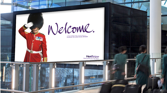
At Heathrow, London-based brand studio Chaos Design, took a subtler approach. The airport branding was crafted to sit outside of the norms governing much of airport insignia, offering a fresh and eye-catching purple to weary travellers. But the welcome campaign is where it has been most able to ground the airport in a sense of place.
“It’s about a visually distinctive design that forms a bit of a breadcrumb trail for people when they are looking for information. There’s a consistency throughout the environment. Once you’ve picked up the signals, you always know what you’re looking for”
Throughout the airport are signs depicting “quintessentially British” individuals or representatives – the likes of Tim Peake, a Notting Hill Carnival performer and the yeoman warders of the Tower of London – with their arms spread wide, declaring welcome. “That’s our way of introducing a little bit of Britishness,” says Chaos’ founder Peter Campbell. Using this light touch, and an adaptable visual identity allows the brand to be rooted in its British identity.
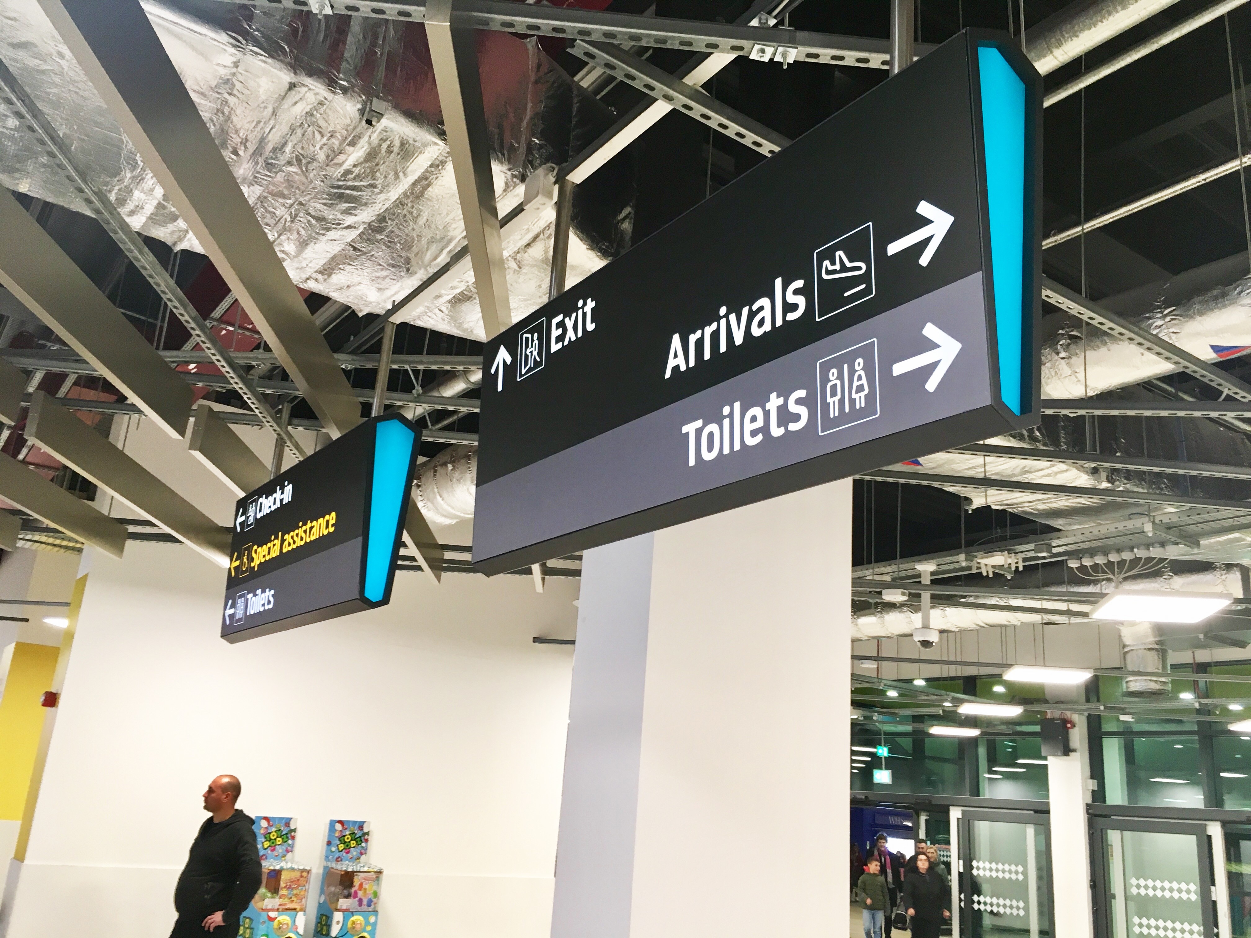
Heathrow’s signage, too, uses semiotic cues to ‘Make every journey better’ – as its strapline proclaims. Part of that task has been taken up by wayfinding and signage consultancy CCD Design & Ergonomics, which is working with Heathrow on accessibility signage. Managing director David Watts says Heathrow’s signage is up to the task already, “It’s about a visually distinctive design that forms a bit of a breadcrumb trail for people when they are looking for information. There’s a consistency throughout the environment. Once you’ve picked up the signals, you always know what you’re looking for.”
But, to improve it for better accessibility, CCD is working to change the way airports think about accessibility needs and provide wayfinding solutions – like an adapted set of pictograms – to better clarify essential and important information to people with different needs.
Signage is also evolving rapidly as digital makes personalisation and translation simpler. At London Luton Airport, which has recently poured £160m into a much-needed renovation, the new signage developed by CCD was crafted with a future integration with digital in mind.
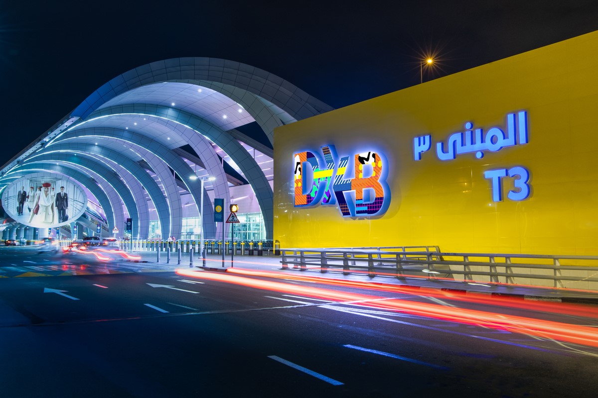
At DXB, the core brand expression is delivered through a large sign outside Terminal 3. This sets the tone for the airport experience. The giant digital letters allow the airport the opportunity to showcase different things, like its celebration of Bahrain National Day last December. “It celebrates what’s going on in the world and what’s going on in our buildings,” Horobin says.
However, signage remains a challenge as an airport – or an ‘airopolis’ as Campbell calls it – is inherently a busy place. Competing information means airport signage has to stand its ground against retail and transport communications. Airports, Watts says, do a good job of informing people about the process through which they are proceeding. However, where there is room for creativity and improvement its in supplementary information, telling people more about that process. And that has to be delivered to a potentially multilingual, multicultural audience. “We’re not expecting everyone to speak English,” says Watts. Which is why CCD works with internationally recognised pictograms to avoid the loss of meaning in key messages.
More pragmatically, signage in an airport is about placement. “The conversation with the airport teams and the commercial teams is how we provide information separation so that we keep the core of the wayfinding where it’s not having to compete with commercial information,” Watts says. He often asks the question, “At that point in decision making, are passengers really looking at advertising?” Horobin too says this was considered in the redevelopment of DXB, in which key entertainment assets like Time Out or the placement of a live events venue had to be in places where people would not be looking for functional information. He says, “I remember a bunch of different entities thought we should [distribute Time Out] when people are standing to go through security. Of course, the last thing you want when you go through security is another thing to hold. It was all about recognising and mapping behaviour and recognising as soon as they got their shoes back on, as soon as they’re ready to go again, that’s when the magazine should be sitting there waiting for them.”
This draws into consideration the conflict and harmony of brand and space design. Watts says, “There is always that tension between the architects and wayfinding designers because architects don’t want their beautiful buildings to be covered in signs. And the reality is that we don’t want to put signs everywhere either. But what we do want to do is help people find their way. If we can integrate that more into the environment, then that’s great.”
Successfully integrating signage at the right points in the process, in the right way to complement the building’s essential structure requires a flexibility of the visual identity.
Campbell says Heathrow’s brand was designed to be intentionally flexible. “We had something that would be internationally recognisable because we’re not just talking to the UK passengers, we’re talking to all the other passengers from the different nations and continents travelling through it. The logo had to be something that could be interpreted by people from all over.” In doing so, it crafted a brand that could be implemented across the many digital and physical touchpoints present in a space like Heathrow’s airopolis.
Horobin and DXB achieved this harmony between brand and space by providing unexpected experiences. He points to the Bounce trampoline park as an example of understanding the mindset of passengers, the experiential nature of Dubai and the progression of the DXB brand strategy. By inserting that park into the central spine of concourse B, he says, “there’s no better way to convey that sense of unexpected.”
Airports the world over are recognising this and integrating experiences that use previously dead space in their airports, or simply construct elements to add to the experience of travellers. The now-popular gardens and museums present in many hubs is exemplary of this. Similarly, creating spaces using natural materials, with 360 degree viewing points or open air observation decks, like Munich, Hong Kong and Tokyo Haneda, respectively, helps deliver culturally relevant experiences that are cognisant of the time pressure and stress of the process of travelling through an airport.
Everyone will eventually leave the airport. The work put into funnelling people into, through and then out of the space must always be mindful of that. It’s a process, but it’s also a gateway to a location. The airports that can unite that sense of space, with a pragmatic, creative approach to signage and a flexible, culturally adept brand are the ones that will soar.