Spotlight on Samaritans
The UK’s Samaritans brand had been positioned for over 50 years as a single-product service existing to operate a single function. With an updated brand and positioning, it is now working to change the conversation around suicide and build change throughout society.
Brittany Golob reports
Modern life is hectic and full of distraction, and time is at a premium. For most people, the only interaction they may have with suicide is a story in the news or an announcement over a public transport tannoy. For most people, the only interactions they may have with strangers are impersonal and brief.
Yet people who may be considering taking their own life might, in that moment, need someone to turn to, stranger or not. They might need a conversation on the bus or a cup of tea in a cafe to help them think differently. Samaritans, the charity focused on suicide prevention, has, for 66 years, offered that resource. It has been the proverbial shoulder to lean on. It has had the difficult conversation with those considering suicide.
Now, it is calling on everyone else to do that too.
“For Samaritans, this isn’t a mental health issue,” says Max du Bois, creative director at brand agency Spencer du Bois. “It is a social and personal issue.” And that means people in that situation are responsive to changed mindsets. Samaritans exists to disrupt the thoughts that might lead someone to suicide, at the moment in which they are thinking it. It doesn’t, as many perceive, provide ongoing, long-term mental health services. But its key role in disrupting suicidal thoughts and actions is not exclusive to its service. In essence, anyone can do it.
Its brand, however, didn’t say any of that. It didn’t show the breadth of Samaritans’ work. It didn’t communicate the brand’s history. It didn’t position itself as a social change charity. It failed to entice volunteers. And it didn’t engage with its most crucial audience: people considering taking their own lives.
The organisation was in the midst of change, too, with the departure of six-year CEO Catherine Johnstone in January 2015 and the arrival of new chief Ruth Sutherland. Sutherland oversees the organisation alongside chair of trustees Jenni McCartney, the organisation’s senior-most volunteer. Sutherland’s long-term strategy for the organisation sought to reframe it for the public and develop a more nuanced communications positioning. To do so, Samaritans turned to brand consultancy Spencer du Bois for a brand redevelopment. The agency has extensive experience in the charity sector, allowing it the insight necessary to examine such a well-recognised and complex brand as the Samaritans.
The overarching goal was to reposition Samaritans from being perceived as a single product service – as its Listening Service is its most well-known offer – to a broader organisation that makes positive intervention to ensure fewer people die from suicide. “Whilst we continue to be here for people in moments of crisis, we hope to reach more people earlier who are struggling to cope too. We are working in many different ways to reach more people. That includes campaigning to make suicide prevention a priority with government and working with other relevant organisations,” says Paul McDonald, executive director of external affairs at Samaritans.
Samaritans wanted to encourage people both within the organisation and in the wider public to recognise the positive interventions they can make. This might be on the rail lines, to help empower public transport workers to help those considering using the railways to take their lives. This might be through resilience training, to ensure those who have considered suicide have the tools to cope in the future. And it might be through motivating young people to become volunteers with the organisation. But it’s biggest goal was to make suicide more than just a personal issue, by encouraging systemic change at the societal level.
“So I’m sitting there going, ‘You’ve got a brand that’s known for a helpline and you want to do this,’” says du Bois.
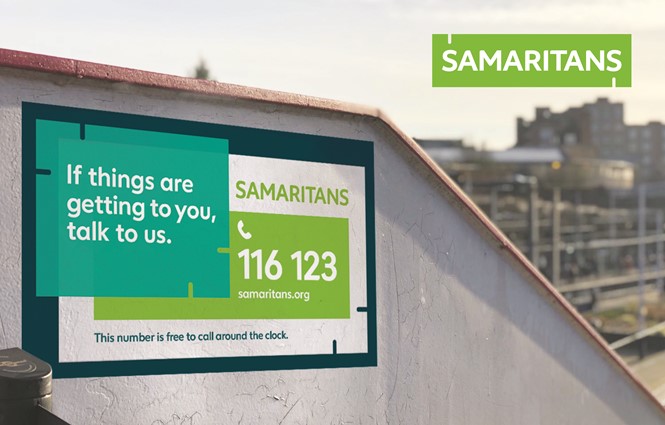
The goals may have been lofty, but the practicalities of those objectives were straightforward. “What they needed to do is actually carve out their space in a crowded sector,” says du Bois. “Say, ‘We are for everyone.’” Samaritans needed to reposition out of the landscape of mental health support charities and into its own niche. In reality, achieving these objectives required a rebrand. Samaritans had a few things going for it. It used a recognisable and ownable lime green and it had widespread awareness across the UK. But, on the visual identity front, that was about it.
Previous campaigns had made an impact, but only with specific audiences, and none to the point where they were able to set out the charity’s positioning beyond ‘suicide helpline service.’
Yet, there were things the brand had in its arsenal that could be deployed in a rebrand. One was its increase in government funding. The charity was given £1.8m in public funds by prime minster Theresa May to ensure its work can continue. The trust placed in Samaritans shows that its work in suicide prevention is making a difference while establishing itself as a leader in this space. It also had an inspiring origin story, beginning with a single Anglican vicar in 1953 and growing steadily ever since.
In the midst of this, Spencer du Bois started with internal research. It spoke to volunteers and employees, service users and potential service users. This helped the agency understand how it could create a brand that would appeal to those audiences, but still broaden the positioning of the charity itself. Then, donors and potential volunteers were engaged, which uncovered a contradiction in the brand’s messaging. Samaritans needs to encourage donation and voluntarism, but it couldn’t simultaneously, engage with service users to help prevent suicide. This posed yet another challenge for Spencer du Bois, this time in terms of the tone of voice and messaging of the brand.
“This brand is for the long haul. It needs to immediately have an impact, but actually it’s for broadening Samaritans out from there to broader services, deeper connections with people and deeper audiences”
The agency took it down to basics. “The heart of it is about the life-affirming power of human connection,” says du Bois. “That’s the heart and soul of the brand. And its essence is ‘bringing hope to life.’” The latter phrase became the Samaritans’ new strapline.
Breaking the positioning down into three elements helped enable Samaritans to address its different audiences in slightly different ways, with the same voice. First, the message would be about presence, and the always-there nature of the Listening Service. Then, prevention of suicide – including resilience work and work with partners – then, campaigning and public affairs.
The messaging is divided this way because, for example, the phrase, ‘bringing hope to life,’ would be inappropriate to someone calling the Listening Service. At that moment, they might require hope, but they would not necessarily engage with that particular sentiment. But, with the common foundation behind them of the power of human connection, the messages are still unified behind the same purpose.
The development of the brand messaging took 14 months. It was presented to volunteers to ensure they were brought on board with the change. Some volunteers had been working for the charity for decades, many of whom remember the founding individuals. “Initially, they were quite polarised, because they were very much about the Listening Service and their role in that,” says du Bois of the volunteer audience. “They’ve been on a journey to broaden that. We’ve built the brand with them quite genuinely.” Spencer du Bois worked with the volunteer council to discuss the rebrand and take their feedback into consideration. In the process, the volunteers’ role has been broadened beyond simply the Listening Service.
The last thing Spencer du Bois did was examine the visual brand. “How do we create a broader brand that doesn’t alienate or push anyone away, but attract new users?” du Bois asks. “As we were going through it, it became quite clear that the old brand was a very corporate brand. It was very single-minded. It had served them quite well for a couple of years, but it didn’t have the brand assets to wrap around younger audiences or more audiences. It was very narrow in its application.”
It also couldn’t address the resilience messaging or fundraising audience. In short, it was static, acting as more of a label than a brand.
The new brand had to be vibrant, social media-ready and communicate the core messages developed as part of the rebrand. The agency considered simply refreshing the visual identity, but retaining the recognisable green logo. But, the first round of research found that under-45s didn’t particularly engage with the brand. It was also, “hell on earth in digital.”
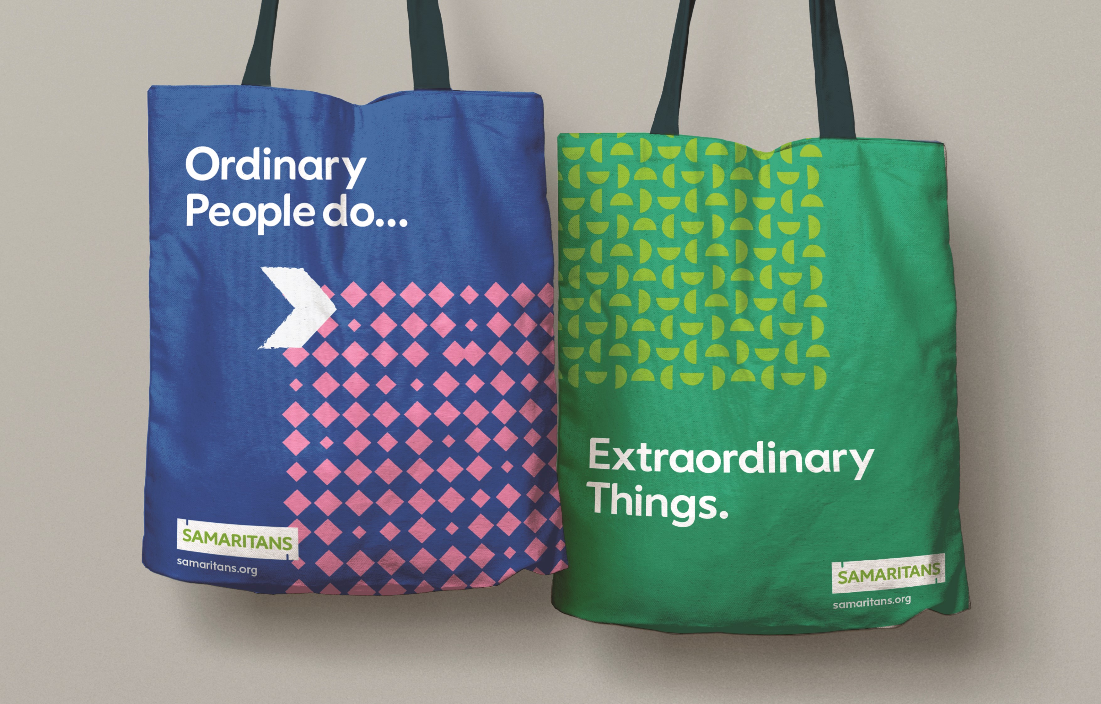
Spencer du Bois crafted a handful of options for further testing. It wanted the new brand to be distinctive, relevant and capture the imagination of its audiences. The resulting winner has points of connection built in. It can be layered across the visual identity and it can interact with content in an every-changing way. Yet, it also visually evokes the brand ethos, ‘the power of human connection.’ The logo is flexible enough to be used simply with an ’S’ and the connection points for social profile icons. It can also interact with the number of patterns and icons developed by Spencer du Bois. The illustrations avoid the now cliché faceless people drawn by hand trope popular among digitally focused rebrands. Instead, the icons are for objects and ideas, while people are depicted in photographs.
The brand is multifaceted, too, in its visual applications. There are illustration and pattern-based communications. But there is also a photography-heavy approach that inspires people to reach out to those who might need a conversation. It inspires volunteers. It inspires the change that the Samaritans wants to provoke. This is where the rebrand truly shines as it diverges from the earlier approach of a brand comprised of a “series of tactical campaigns.”
“Ordinary people can do extraordinary things,” says du Bois. “This brand is for the long haul. It needs to immediately have an impact, but actually it’s for broadening Samaritans out from there to broader services, deeper connections with people and deeper audiences.” The brand has been designed intentionally to allow for experimentation and exploration. It’s designed to allow the flexibility – and with the built-in strength – to withstand new strategies in marketing, use of photography and communications. By building a versatile brand to begin with, then allowing for freedom within its scope, Spencer du Bois has built longevity into the new visual identity.
But the key challenge was developing the resilience and versatility of the organisation into the brand from the inside out. “One of the key challenges was identifying how do we branch this out from the Listening Service.
The other challenge was to bring the volunteers along, because they are very passionate people,” says du Bois. But, through internal engagement over the course of 14 months helped encourage volunteers to take part in and take ownership of the rebranding process. Similarly, by developing a flexible brand that positions the charity as one committed to changing the societal engagement with suicide and issues related to it, Spencer du Bois has ensured the brand and the charity is able to communicate about its work beyond the Listening Service.
It’s all wrapped up in the brand message, ‘the life affirming power of human connection.’ Du Bois says, “I was listening to one of the guys from Network Rail who is a trainer. They came up to me and said, ‘Spot on. You’ve absolutely got the connection right.’ And I thought, you are a guy who’s been on the ground, who’s seen it work. If you’re saying that works, that really helps.”
Samaritans now is on track to making that systemic change, to ensuring fewer people die from suicide. There are few things more hopeful than that.
Peer review
Jacinta Lippold, creative director, Jac&
First impressions, there’s a lot to love about the Samaritans rebrand.
The humanistic approach to language has purpose and impetus. It’s one of the most accomplished elements of the brand. Through the use of character-rich yet straightforward language, the brand feels instantly warm and welcoming.
In addition to the copywriting, the connectivity focus in the logo and across touchpoints is clear and aesthetically pleasing. I’d like to see it play out across print or product.
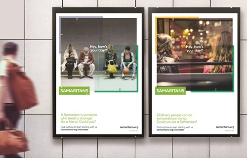
However, they could go further (by doing less). In my eyes, the brand might be stronger without some of the playful touches, pattern and layering. The colour scheme and typeface alone are approachable and distinct enough. The ‘Hey, how’s your day?’ poster concept is flawless in approach.
This type of sincerity and clarity is compelling enough to stand on its own as the hero of the brand.
That said, I’m looking at everything all together, which can be overwhelming. This isn’t how it would be in the wild.
I think Spencer du Bois have nailed it. All in all the messaging and execution is powerful, communicating values that transcend a ‘religious’ brand. From what was clearly a considered and collaborative process, the outcome is a real success. As a person who isn’t religious, the rebrand does a great job of providing space for people like me. It’s a beautiful reminder of what it means to coexist as humans with compassion and care.


