#NewBrandMonday: 28 September
Here are this week's selection of newly launched brands from around the world. For more from #NewBrandMonday, follow @Transformsays on Twitter.
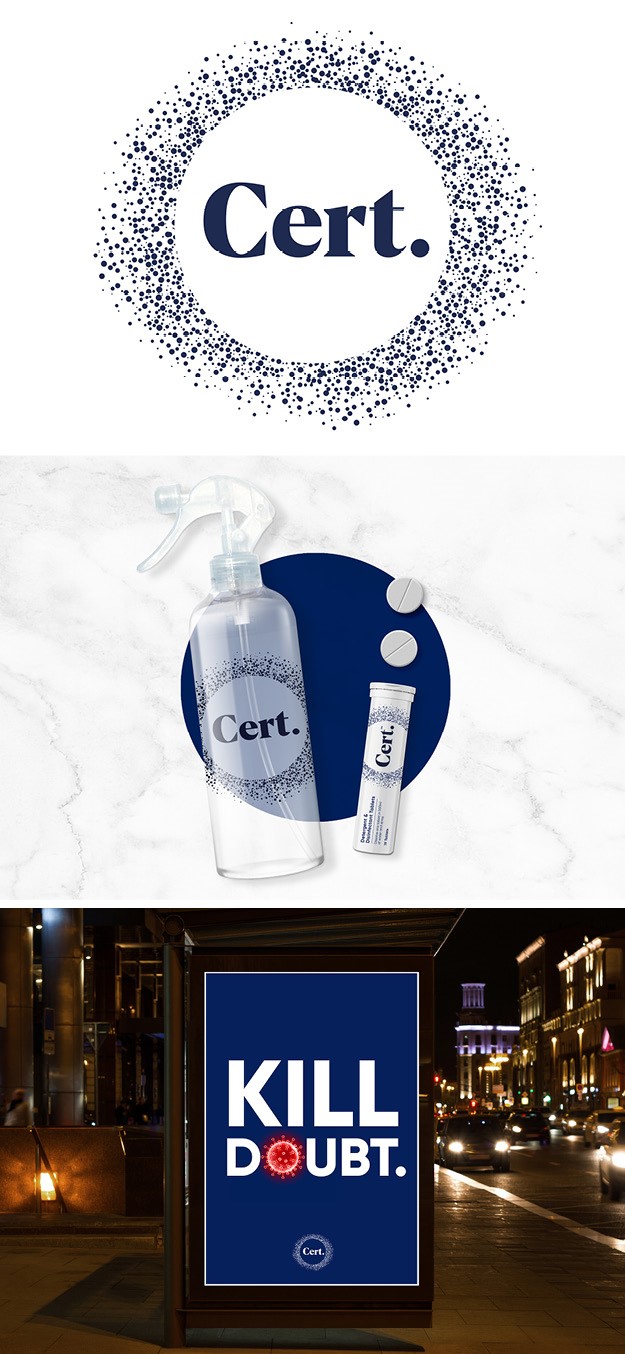
Cert.
Packaging and identity design agency Free The Birds worked on the creation of a new DTC disinfectant brand, Cert, which is believed to be the first domestically available cleaner of its kind. Cert. is the first direct-to-consumer launch from disinfection production company Hydrachem the leading suppliers of hospital standard cleaning and disinfecting products for the NHS – to provide a dissolvable tablet which provides effective surface cleaning against the Covid virus, by using detergent and disinfectant. The name, Cert., devised by Free The Birds, plays with the words certainty and certified to add trust – while using a contemporary device of short-form to stamp the brand clearly into a protective circle. The circular logo tells the story of the product, symbolising a simple, authoritative zone of certainty outside of which germs dissolve. It also echo the look of the Covid-19 virus itself.
The agency’s rapid move to understand the market, their insights into packaging helping to create a cleaning brand that you are proud to have on your countertop, has set a benchmark for us going forward,” says Robin Rough, managing director of Hydrachem.
The brand’s social and digital campaign will introduce its messaging to a broader audience, emphasising the sense of wellbeing associated with Cert and communicating the idea that “Clean is not enough,” as we seek out the Covid-era trinity of hygiene, health and happiness. The brand identity also embraces the concept of being strong on the virus but soft on the planet attracting consumers who are seeking eco-friendly and sustainable cleaning solutions.
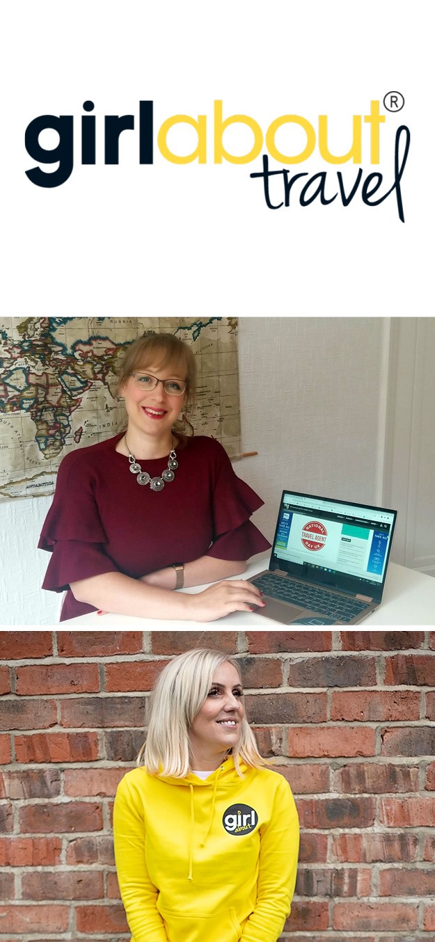
Girl about travel
Yorkshire-based lifestyle brand Girl About has announced the launch of a new sub-brand, Girl About Travel, an online community for travel-loving women led by a team of travel industry experts. The brand, designed to empower wanderlust women who want to make memories with their families, puts the power back in the hands of consumers, providing research, resources and a real-life community to save time and cost in the post-Covid19 era. This new approach to travel is set to disrupt the travel industry by moving away from a one-size-fits-all approach, where travel companies set the agenda, to empowering women, especially mums, to create their own personalised adventures which aren’t expensive for expensive’s sake.
“We believe travel, experiences and adventures are essential to families, and an overriding theme from the thousands of women in our community is that people don’t just want your standard ‘fly and flop’, ‘out of the box’ stereotype. These women want more. More for them and more for their families, but they don’t know where to start.“
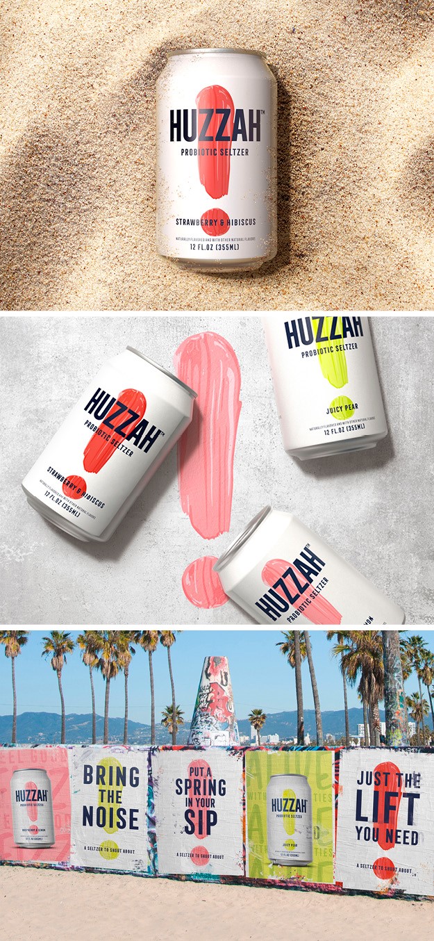
Huzzah
Global brand-led creative agency BrandOpus launched a bold identity for its latest branding project HUZZAH™ Probiotic Seltzer, the first non-alcoholic innovation from Molson Coors Beverage Company in partnership with L.A. Libations. With the goal of targeting consumers that live life out loud, HUZZAH™ is energetic and enthusiastic in its branding – from its celebratory name to its bright, neon color palette. The bold-brushstroke exclamation point symbol front and center and the blend of straightforward graphics and photography creates a brand world that aims to break through in the seltzer aisle, which will definitely attract shoppers’ attention.
“With a bold, graphic style and energetic tone of voice, HUZZAH™ has the ability to make the consumer look and drink twice and make waves in a sea of seltzer sameness.It was important that HUZZAH™ brought the energy and dynamism into consumers’ lives in a premium way, with a punch of color breaking out of the simple white canvas,” says creative director at BrandOpus John Ramskill.

Royal Salute
Scotch whisky brand Royal Salute collaborated with London-based design agency Boundless Brand Design to launch a signature Blend 21 YO Whisky, created for year round celebration and inspired by the historic splendour of the Queens Royal Garden Parties. The design brief was to create a gifting proposition that was relevant for all year round and all occasions. Enchanting and extraordinary, this needed to be the ‘King of Gifts’, creating dazzling impact on shelf, meeting the expectations of even the most discerning Royal Salute customer. The limited edition Whisky needed to reflect the highly social nature of the garden party, encapsulating both theatrical celebration and a sense of unity that would bring people together. the packs include florals that hero the extravagant royal gardens themselves and trumpets that represent the famous brass band, perpetuating the joy of fan fair. Depictions of bunting represent Britishness, with classic icons such as the Queen's Corgis adding to the classically English design.
“Driving celebration and perpetuating indulgence and luxury, we created a pack that not only delivers boldly on shelf but exceeds typical gifting expectation,” says Hamish Shand, founder and creative director of Boundless Brand Design.
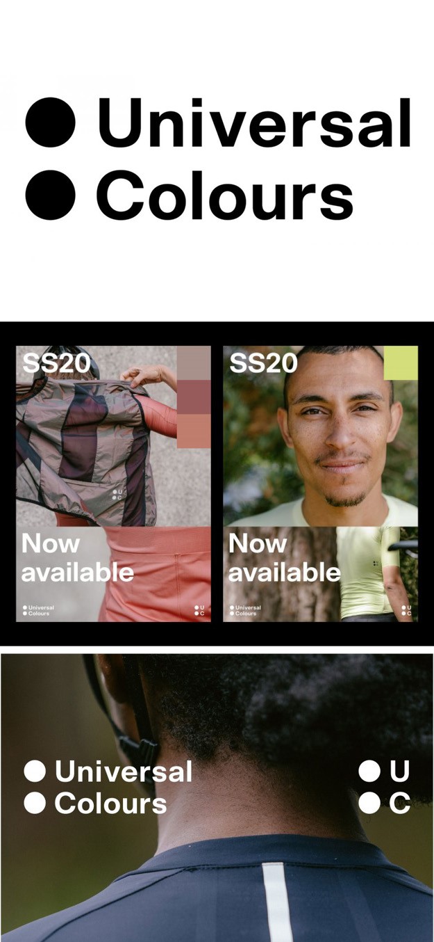
Universal Colours
Graphic designer William Lyall worked on the visual identity for new cycling apparel brand Universal Colours, challenging current conventions through progressive design and considerately sourced materials. Craftmanship behind the pieces set them apart in a heavily saturated market; the brand has partnered with factories that are internationally audited for social and environmental good practice. The brand intertwines premium performance with ethical construction, and the waste is minimal, with a use being found for leftover materials in the unisex gilet, musette and mitts. The visual identity of the brand reflects just this adaptability and versatility: a set of interchangeable workdmarks and logos were created for the identity to be applied across a range of different garments. The versatility of the identity allows its application to evolve over time alongside the development of the forward-thinking nature of the brand itself. The bespoke typeface, UC Scto Grotesk, supports circled numbers at the same scale as the circles used throughout the identity set. The typographic relationship between the garment details and the visual identity of the brand highlights the quality and technicality of the garments. The care given to the structure and use of typography throughout the identity reflects of the thought process given to the design of each collection. Colour swatches, each of which reflect the fabrics used through the collection, are also used as an asset to apply on imagery and digital applications. Highlighting the colours used builds a graphic relationship with the garments, and also reinforces the idea behind the naming of the brand.