#NewBrandMonday: 15 June
Here are this week's selection of newly launched brands from around the world. For more from #NewBrandMonday, follow @Transformsays on Twitter.
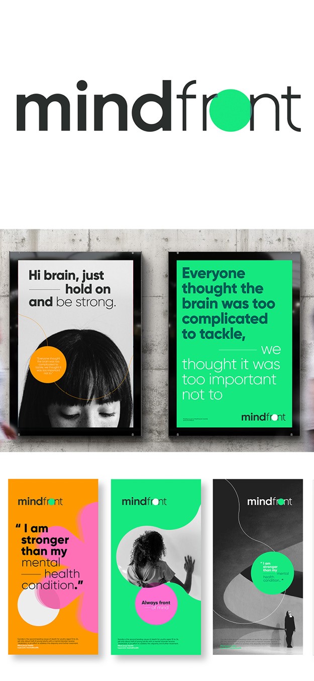
Mindfront
Global brand agency FutureBrand worked with Aisa-Pacific healthcare provider Luye Medical Group to create Mindfront, a new global mental healthcare brand launching in China. Mindfront’s network of private, dedicate hospitals will respond to an increasing demand of mental healthcare in the country. The agency focused on the name Mindfront and the concept behind it: Mindfront always has their patient’s need and care at the top of mind, and it also aims to be at the forefront of innovation in the mental health sector. This is symbolized through the visual identity, which has a bright green dot (taken from Lye Medical Group’s logo) in the front of the letter ‘O.’ The visual motif of the overlapping dot is used throughout the visual identity to create bold graphics, icons and visuals that are bright, optimistic and uplifting while consistently conveying the ‘always front of mind’ sentiment.
“Our solution was to draw inspiration from the brand idea “always front of mind” to create a dynamic new mental healthcare brand that stands out in both a local and international context while leveraging on the positive reputation of its parent company, Luye Medical Group,” says Sam Yang, creative director in FutureBrand’s Greater China branch.
FutureBrand also developed an inclusive suite of brand photography that confidently reflects the whole range of Mindfront’s patient groups: teenagers, elderly, and everyone in between.
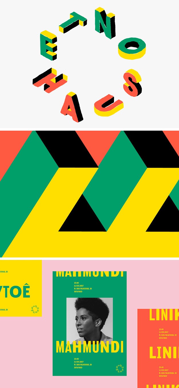
Etnohaus
A collective group of designers based in Rio de Janeiro, directed by Leandro Assis, Paula Cruz, Nicolas Martins and Eduardo Massa worked together to create a visual identity for Etnohaus, a creative centre located in the south of Rio de Janeiro. The designers aimed at creating a brand identity that translated the core mission of art and freedom of Etnohaus. The bright colour palette takes inspiration from the colours of Brazils, while also experimenting with a range of tones that would harmonise with one another graphically. The logo is created by the letter that make up Etnohaus, placed in a circular shape to symbolise all the people coming together in the creation of the project, a place with no hierarchy where everyone is equal. The design centres around three typefaces (Local Gothic, GT Walsheim and Basis Grotesque), which were chosen for specific reasons and not only for aesthetic value.

Little Blossom
Little Blossom, a Singapore-based organic baby food brand, worked with global design agency 1HQ Singapore to create a new visual identity. Little Blossom is curated for the South East Asian palette with a range of localised flavours and is sourced close to home, to honour the flavours of Asia and benefit local farming community. To convey all this, while also simplifying the shopping experience with easy to navigate packaging design, 1HQ created a visual identity that is both versatile for physical shopping, and would stand out in the aisles, and for the online store. The logo, which includes a petal in the last ‘O’ of blossom, adopts a playful, kid-friendly typeface which attracts a specific target audience. Similarly, the graphic (flours, fruits, vegetables etc) , which looks hand-drawn, on the packaging further emphasises the all-organic and natural ingredients of Little Blossom food’s, visually placing the brand in that ever-growing market.

Mumkin
Mumkin (‘possible’ in Hindi), a movement by Bal Asha Trust, one of India’s most trusted charitable organisations committed to providing life changing quality care to abandoned and destitute children, worked with Mumbai-based design agency Rocking Company to create a visual identity. Mumkin seeks to create actionable change across the country towards child protection, rescue, and positive integration with a caring family. This mission is reflected through the visual identity, which adopts a bright orange colour palette and where the letter ‘U’ of Mumkin resembles the wide smile of a child. It engages the viewers and evokes a positive, hopeful feeling without lessening the sincerity of the subject. The same idea is brought through the other brand assets, like the posters which include the smiles of different children and the straplines like ‘every child deserves to feel safe’ and ‘every child deserves a childhood. The identity is digitally versatile and retains the same strength in design on smartphones as well.
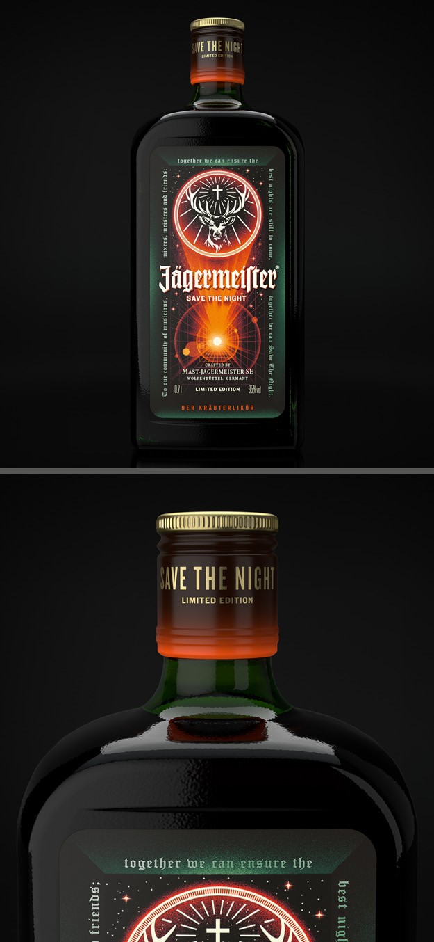
Jagermeister
Digestif alcohol Jägermeister worked with London-based creative agency Here Design to change its front label for the #SAVETHENIGHT Jagermesiter Limited Edition Bottle, which launches as part of an initiative to support nightlife communities during the Covid-19 pandemic. The limited edition bottle aims to encouraging other drinks brand to follow suit to save the night life industry, which has carried it throughout the years. By reinterpreting the core Jagermeister label, Here Design shaped the idea of ‘save the night’ by focusing on and celebrating the positive aspects of the night, including high energy, allure and playfulness. To do so it partnered with illustrator Max Löffler, a German artist known for his connections to music and underground culture. The new illustration includes a portal of escapism on the front label, with a shining light beam representing a beacon of hope and positivity in dark times. The label inverts the classic Jägermeister greens and oranges, amplifying the night-time vibe while continuing to honour the original, iconic Jägermeister design. The graphic artwork is framed by an archway portraying the ‘gate to the night,’ with the frame being a poem written by Here Design, dedicated to the nightlife community to create hope and solidarity. It reads: ‘the best nights are still to come and together we can save the night’. The back-label builds on the story and the cause.
"Here Design has helped us bring this exceptional project to life with a new bottle symbolising the spirit, the strong cohesion and the high devotion that the global nightlife community stands for, and that Jägermeister has been an integral part of for decades,” says Gunar Splanemann, head of global innovation and design at Jägermeister.