#TransformTuesday: 7 May
Every week, Transform examines recent rebrands and updated visual identities. This week's picks are below. For more from #TransformTuesday, follow @Transformsays
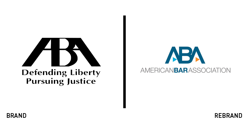
American Bar Association
The national professional body for lawyers in the US is upping the bar on its branding. The American Bar Association (ABA) faced a difficult challenge in which it had positive brand recognition – based on its logo – and strong heritage associations, however, the use of the format American X Association has become more popular. This has resulted in brand dilution for the ABA. It thus worked with New York-based creative firm Finn Partners on a brand update that would emphasise the word ‘Bar,’ thereby distinguishing the brand. Executive director Jack Rives noted that the ABA’s previous logo had become a well-recognised icon. However, he says, it wasn’t particularly well-crafted from a design perspective anyway, thus making the introduction of a new, purpose-built wordmark easier. The updated logo uses colour and bold type to emphasise the word ‘Bar.’ The update will also feature changes to the member experience and the introduction of a new membership model to better cater to modern perceptions of dues-based structures.
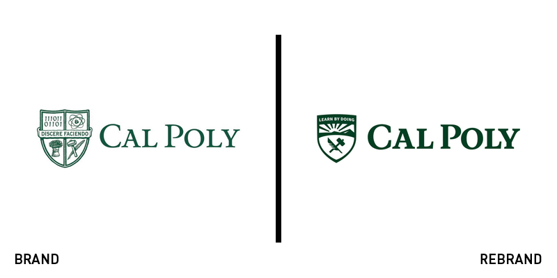
Cal Poly San Luis Obispo
The California state university system is home to two public polytechnic colleges with national renown. Its technology and engineering capabilities are significant, but its brand failed to deliver. Featuring, like many university brands, a crest icon that is incapable of meeting the demands of digital communications. On 30 April, it unveiled a new brand and logo, retaining its ‘learning by doing motto,’ but revamping the college crest. To conduct the rebrand, the university worked with marketing agency SimpsonScarborough and undertook research with stakeholders while also working with the university’s own marketing students. The new brand will roll out this autumn. Director of media relations Matt Lazier says, “The refreshed brand aims to help Cal Poly keep pace with competing institutions and ensure that the university can continue to live out its mission to serve the state of California with the best education possible.” The other Cal Poly university, Cal Poly Pomona, rebranded in August last year, introducing a 3D rendered octagonal icon.
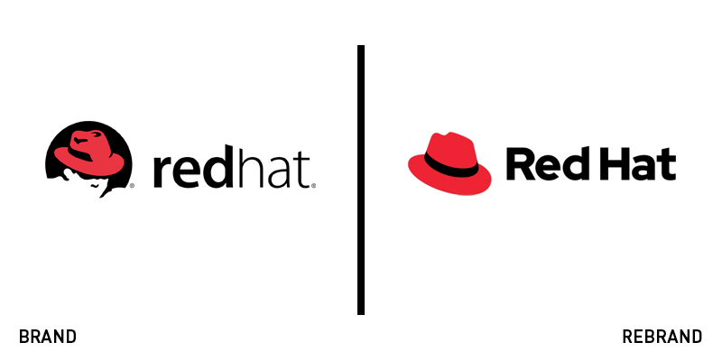
Red Hat
The Linux operating system is associated with a specific ethos of a free and open world of computing and networked connectivity. For Red Hat, which provides software on the Linux platform, this commitment was reflected in a decision to develop a new brand with the support of its community. The ‘open brand project’ needed to update the brand for new digital formats and create more positive associations with the icon itself. Tim Yeaton, the company’s CEO wrote in a blog, “Red Hat has always been the champion of the ‘open source way:’ open, collaborative and inclusive community innovation. Yet our iconic logo – including the partially veiled, fedora-wearing ‘Shadowman,’ as we Red Hatters affectionately call him – wasn’t squaring with the values we firmly believed the logo stands for.” Since 2017, the open brand project has been working with the team at Red Hat and with consultancy Pentagram to examine the brand’s design. The new approach is clearer, visually, but also introduces a red hat icon that is cheerful and avoids the shadowy connotations its previous mark bore. The project was supported in open source style with an ongoing blog and social media conversation around the changes to the brand, ensuring the company’s dedicated community was brought along on its brand journey.
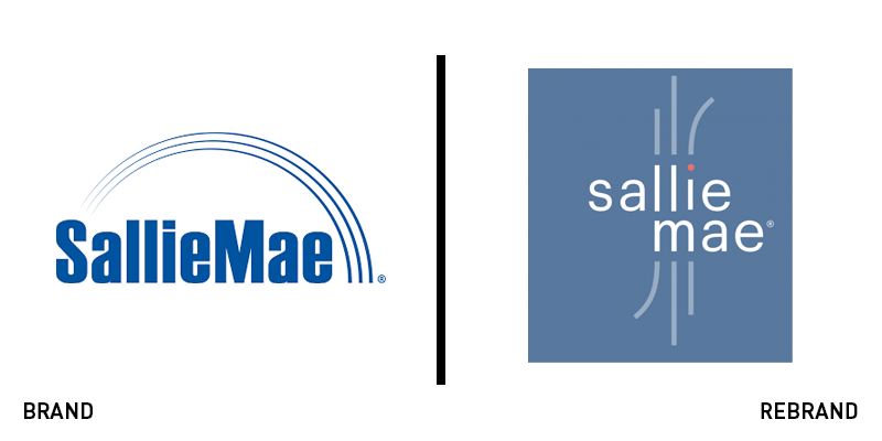
Sallie Mae
Student loan companies face an identity challenge in the US. They are necessary for many prospective university students and help provide opportunities to thousands every year. But, they need to operate as a responsible financial institution, seeking repayment for their investments. Sallie Mae, one of the most prominent loan companies is introducing a new brand to support its customer-centric strategy. The new wordmark replaces a semicircle icon and represents the life journeys of the bank’s customers. “At Sallie Mae, we are in the business of creating opportunities, opening doors, and providing access to what’s next,” said Donna Vieira, executive vice president and chief marketing officer, Sallie Mae. “Our new brand experience and identity represent those new possibilities. Our logo illustrates that we’re all individuals, each with our own story and path. Our renewed brand and purpose will build prosperous futures for our customers and unlock value for our business along the way.” The visual identity update will be complemented with a refreshed brand experience that will see upgraded apps, chat functions and customer service platforms.
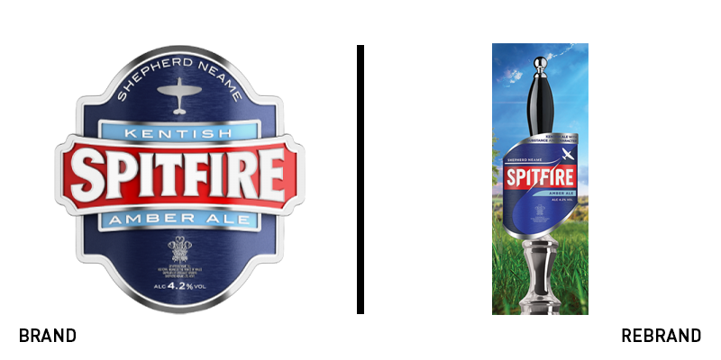
Spitfire
Shepherd Neame Brewery’s Spitfire ale is a product with protected designation of origin status, given to products in the EU that can only be produced in a specific place, by specific regulations, like champagne or Parma ham. The brewery is Britain's oldest, located in Faversham, Kent, and Spitfire uses local Kentish hops to produce its distinctive flavour. Reflecting the beer's heroic status in the Shepherd Neame portfolio, and its continued relevance to the British public, a new look for the Spitfire brand is to be rolled out in June this year. Sold in over 40 countries, the ale’s new look is slicker and sleeker, retaining its colour palette, but updating the typeface and logo design. The new approach moves away from the nostalgic approach taken with its previous branding, preparing the brand for a brighter future. Spitfire brand manager Will Upfield says, “Spitfire is a genuinely classic British brand and with such an iconic name, the new design encapsulates its spirit perfectly.”
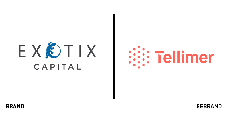
Tellimer Group
Formerly known as Exotix Capital, Tellimer Group is an investment firm focusing on developing markets. However, with 20 years of operations behind it and a new focus on building connections between markets, its name was no longer fit for purpose. London-based brand language consultancy Reed Words was commissioned to develop a new name and proposition for the company. The new name was developed to reflect the firm’s ability to combine expertise with technology and its positioning as an expert in developing markets. Tellimer Group was chosen after a three-part process that examined themes of expertise and exploration, while still simple and authoritative enough to work across multiple markets. The new strapline, ‘Developing markets, connected,’ supported this positioning. Mike Reed, creative director at Reed Words, says, “Tellimer is a made-up word, but it has the right sense of established gravitas and authority, while the echoes of ‘intelligence’ and ‘tell’ hint at the nature of the offer. The client was also keen to have a dotcom URL, which is challenging to secure these days, so we were delighted to find a great name that also had an available dotcom.”


