#TransformTuesday: 30 July
Every week, Transform examines recent rebrands and updated visual identities. This week's picks are below. For more from #TransformTuesday, follow @Transformsays
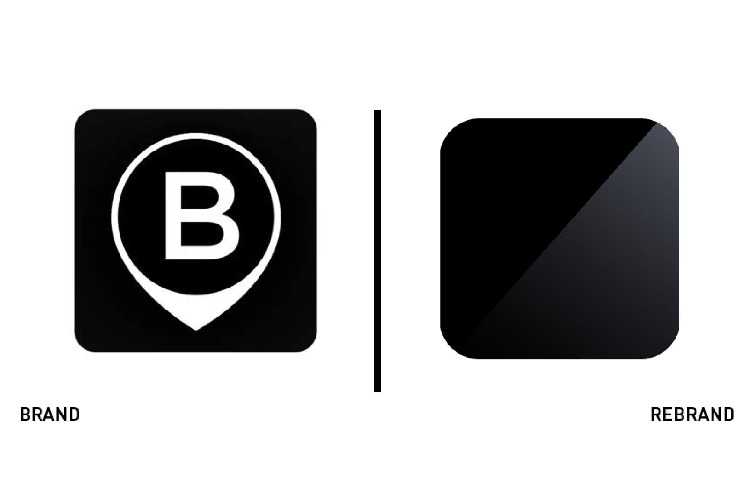
Blacklane
With the premium of on-demand limousine and chauffeur services, Blacklane’s clientele is a discerning sort. It recently launched an updated brand that has rolled out across its digital touchpoints, specifically focusing on new imagery, a global business model and an updated user experience. The app icon itself has shifted from the letter ‘B’ inside a place marker icon to a simple black and charcoal block with a diagonal line running across it. The somewhat abstract approach is designed to evoke the feeling of a black luxury car or a chauffeur’s black suit. Its simplicity helps it standout. It’s a bold move as most apps seek to include some element of their wordmark or brand in their icon. To focus entirely on the emotive nature of the colours and the sleek diagonal cut, Blacklane is relying on its user experience and quality to carry its business. “There’s no better way to show the guest experience than with the actual global crew who provides it on the ground around the world. Our new brand identity uplifts our communication to evoke the peace of mind that follows from our premium service. We have fine-tuned this over seven years, and now is the time to showcase it,” says Norbert Richard Meinike, Blacklane’s director of marketing. “We are infusing the premium experience throughout all guest touchpoints across digital and physical services, marketing messages and guest communications.”
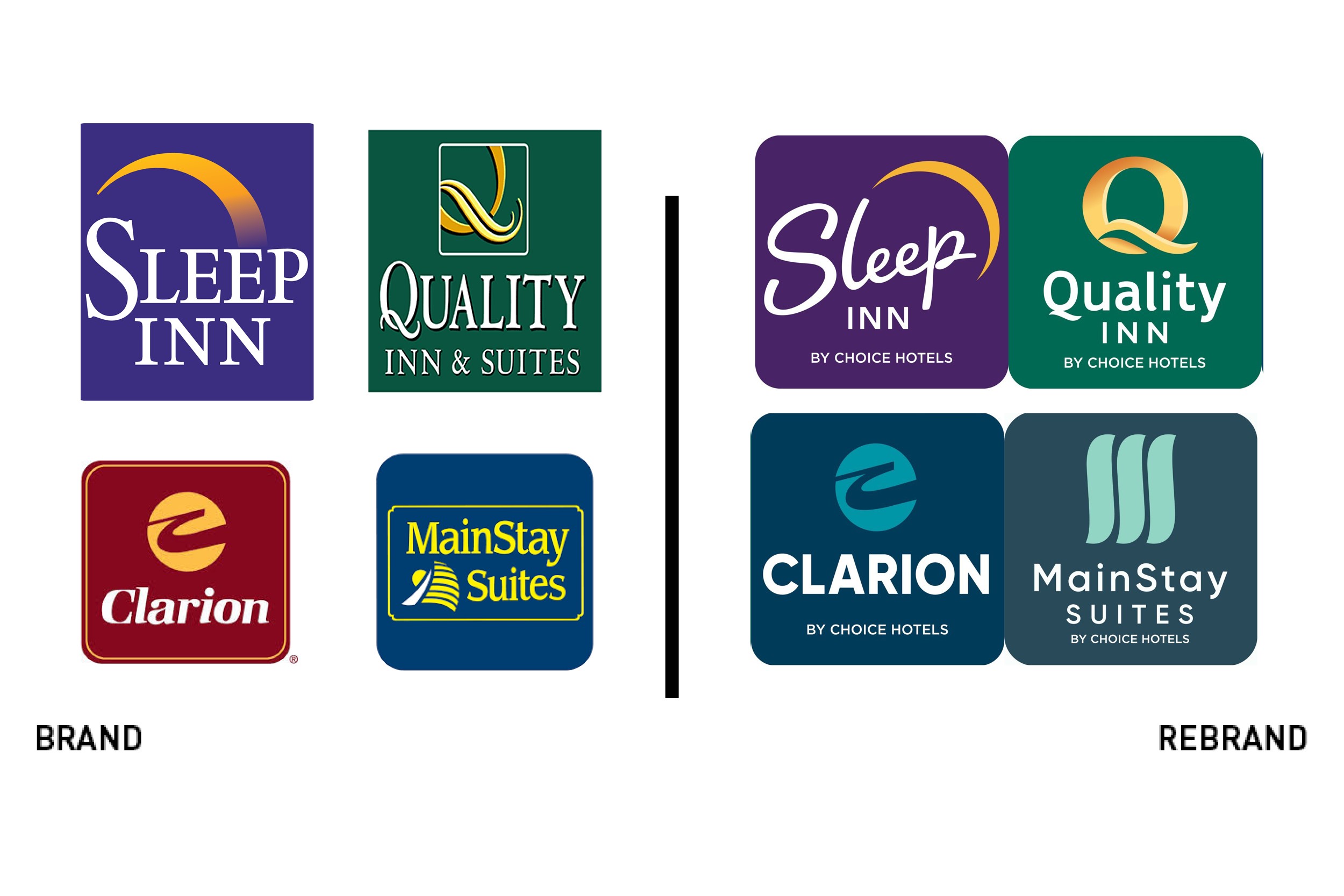
Choice Hotels
Celebrating its 80th anniversary, Choice Hotels unveiled a rebrand across its collection of mid-range brands. Alongside a suite of new logos, the brands will all feature the strapline, ‘By Choice Hotels,’ uniting the sub-brands more effectively than in the past. “We never stop innovating at Choice, and the new brand identities embrace a modern look and feel without sacrificing the brand equity and rich history guests value today,” says Anne Smith, vice president of brand management, design and compliance at Choice Hotels. “The 'By Choice Hotels' endorsement on each logo received overwhelmingly positive feedback from consumers. And owners told us that the connection to our master brand is a value add for their business.” The update helps to premiums the offering, particularly for the Clarion flagship, which uses the same icon, but updates the colour palette and logo. Sleep Inn undergoes the most drastic redevelopment, to its benefit, with the introduction of a fresher purple and a clean, cursive typeface that helps distinguish the brand.
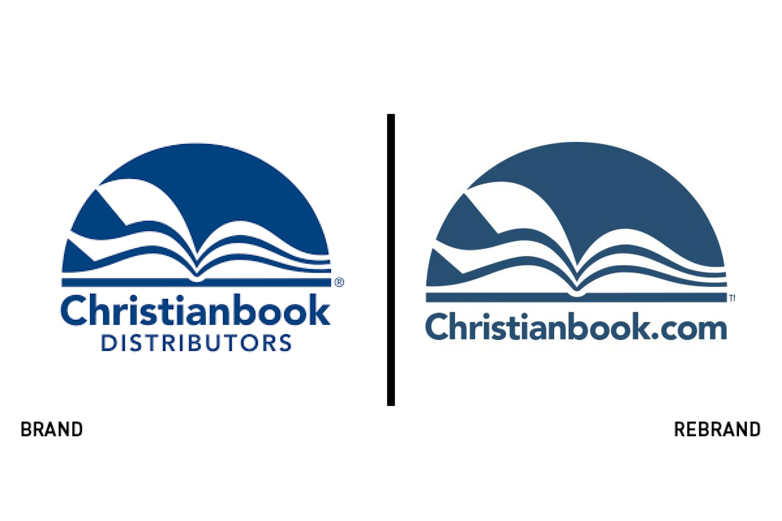
Christianbook
With a name like Christianbook Distributors, the rise in prominence of CBD – or cannabidiol – has not been a blessing. The publisher, affectionately known as CBD has had to fend off requests outside of the realm of Christian literature. The rebrand has caught the attention of media outlets ranging from the Cannabis Herald to the New York Times. Further complicating matters for the publisher is its ownership of the cbd.com URL. “The problem is the other CBD is just so popular at this point in time that it just kind of overwhelms our brand,” founder Ray Hendrickson told the New York Times. In terms of its visual identity, the logo remains much the same. The company has dropped the ‘Distributors’ from its wordmark and integrated its longer URL – christianbook.com – into the logo. The renaming reflects a similar phenomenon a few years ago in which numerous businesses named Isis – after the Egyptian goddess – were forced to rebrand to avoid unwanted correlations to the terrorist organisation.
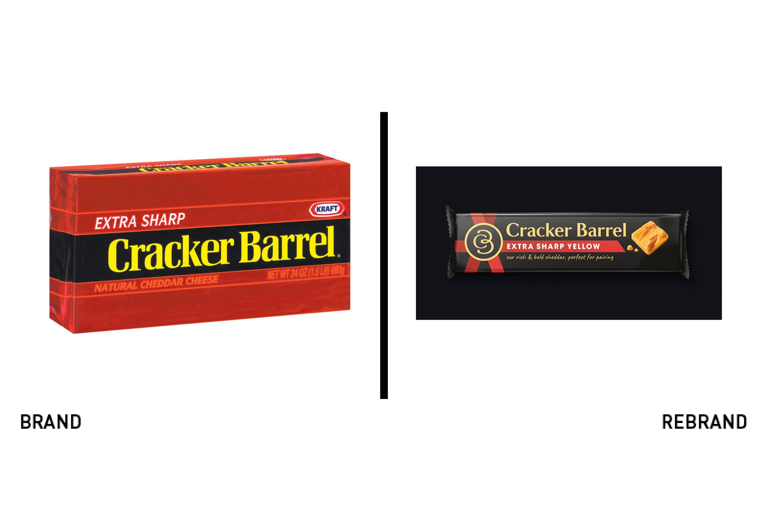
Cracker Barrel
A UK staple, the Kraft-owned Cracker Barrel Cheese has focused on high quality products for over 60 years. While its brand was widely recognised, its brand was not flexible enough to extend to new ranges and provide brand architecture cues across the range. It turned to packaging specialist BrandOpus to redevelop its brand, using a black pack with colourful accents, replacing a more colourful system. The new approach allows for more consistency across the brand as it expands further from its signature cube-shaped blocks of cheese. BrandOpus introduced a ribbon device that allows for the use of colour across the brand architecture. A new, bespoke typeface also allows the brand to position itself as a more premium product. Nir Wegrzyn, CEO at BrandOpus, says, “Transforming from practical to emotional, it was important that we helped Cracker Barrel communicate that it was not only a deliciously rich and bold cheese, but a brand that can help to elevate the everyday.”
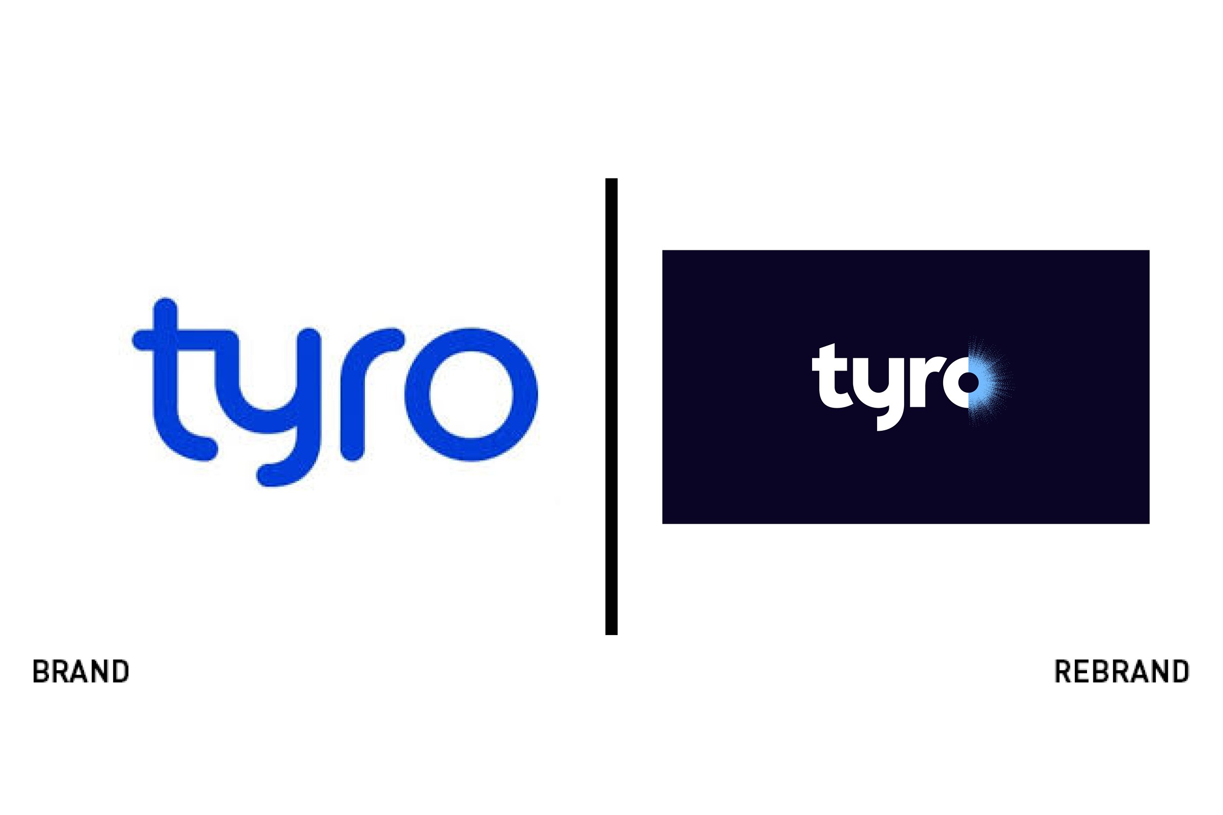
Tyro
Startups and upstarts in the financial services sector have been focusing their efforts on standout brands that will achieve cut-through in an evermore crowded market. Australian business banking and business loan provider Tyro Payments wanted to capitalise on its launch success in 2003 while repositioning its brand to focus on banking, not only loans. It turned to Sydney-based consultancy Hulsbosch to develop a consistent brand that would capitalise on the company’s research focus and passion for working with businesses. The new brand uses a simple wordmark, in navy blue and white, but deploys a creative device in the ‘O’ of the word ‘Tyro.’ The O has been halved, then rendered in multiple colours, patterns and styles, integrating photography and collage into the logo. This offers a vibrant alternative to a typographically led previous logo. Robbie Cooke, CEO of Tyro Payments says, “[Hulsbosch] have delivered a strategic brand positioning, brand identity and a comprehensive set of guidelines that anchors our ambitious business plans.”


