#TransformTuesday: 3 December
From corporate finance to Italian liqueurs, here is our pick of the latest rebrands. For more from #TransformTuesday, follow @Transformsays
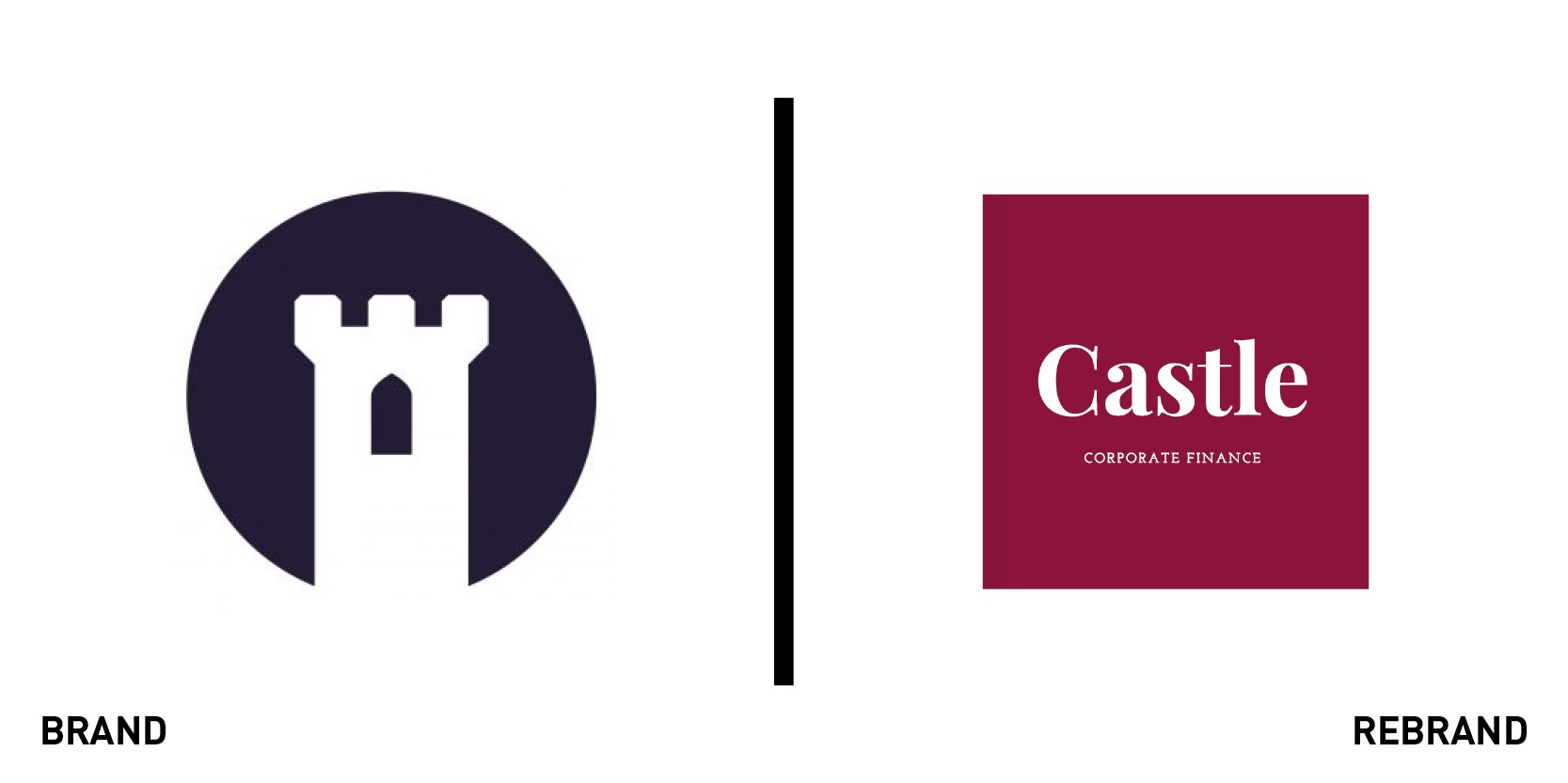
Castle Corporate Finance
Castle Corporate Finance was rebranded by London-based Zest to give it a more human and boutique feel and to sit at the heart of the business’s three-year growth plan. Stuart Stepney, Castle Corporate Finance’s managing director, says, "We have worked hard to identify what sets us apart from our competitors and it has become clear that the close bond we share as a team also extends to the long-standing relationships we build with clients. People respond to our human and direct approach while appreciating the personalised service they receive, and I wanted our new brand to reflect this ethos.” Zest created a brand that spoke of quality while keeping the wit and sense of humour of the Castle team, which would stand out in what is a traditionally dry business market, it says. The visuals are designed to convey humour without detracting from the serious message being delivered. The new brand uses a rich colour palette, sophisticated typeface and a clean and classy logo and hallmark, the agency adds. The illustrations were created by award-winning artist Nishant Choksi.
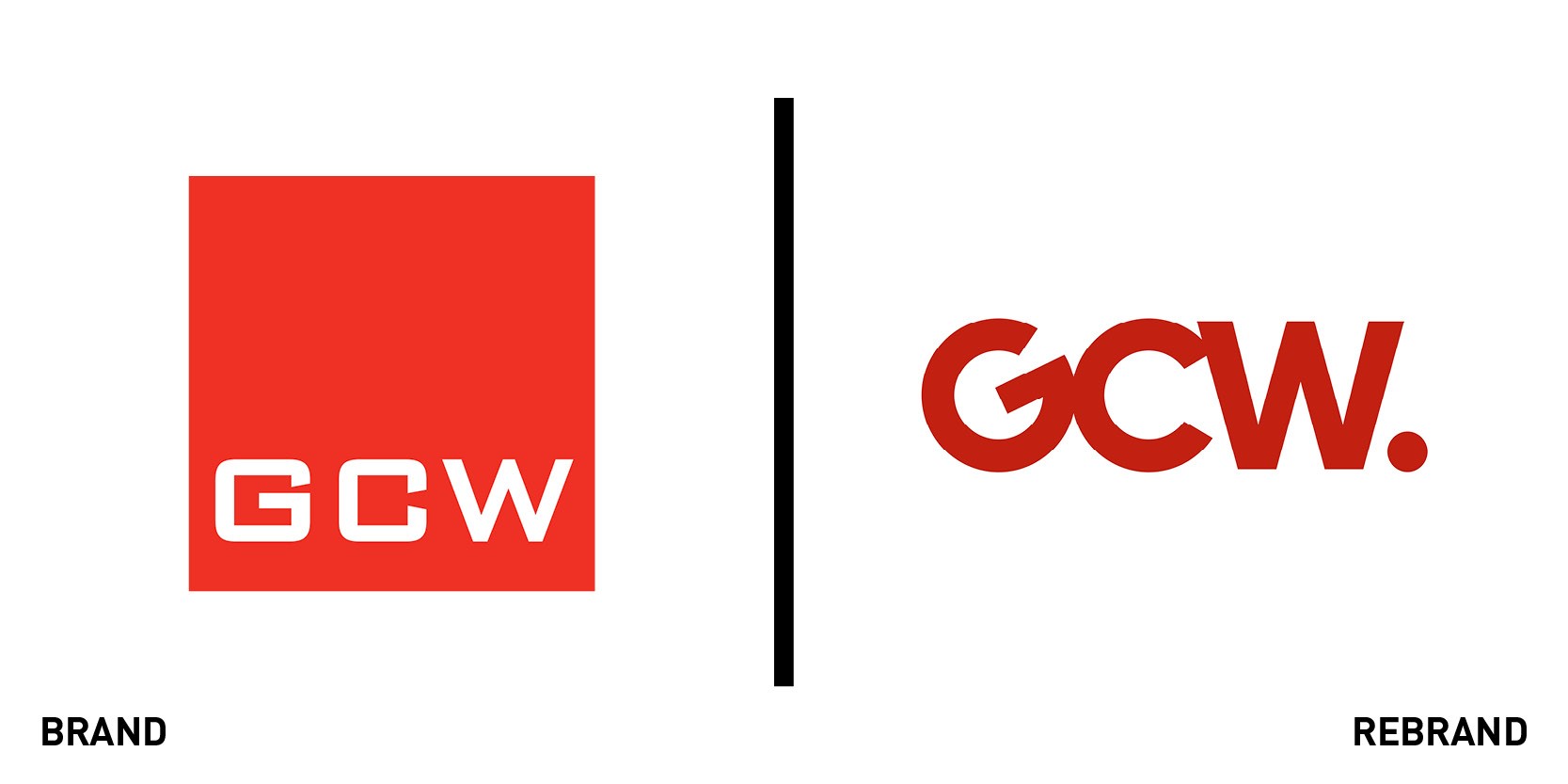
GCW Consulting
Manchester-based brand agency Squad rebranded property consultancy GCW to reinforce the perception of the brand as as an expert in town centre properties. Following research to pinpoint the ethos of the business, Squad crafted a visual identity focused on people, rather than properties. The resulting visual language was inspired by data visualisations of people moving across and towards towns, in a graphic pattern dominated by coloured circles. “All the competitors in this industry adopt very similar positions. GCW wants to be bold and different,” David Barraclough, creative partner at Squad, says. “We’ve sought to capture this personality in how we’ve brought the position to life across all their communications.” The new identity and brand guidelines have been rolled out across GCW’s exhibition stands, stationery, website and office interiors.
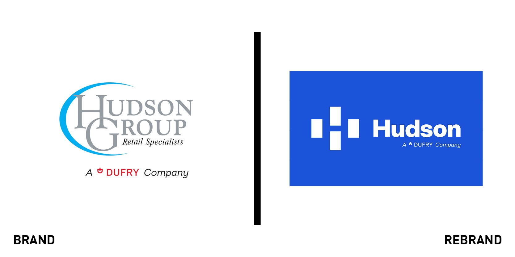
Hudson
Following asset acquisitions from the OHM Concession group, travel retailer Hudson has introduced a new look and identity to strengthen its foundations. Siegel+Gale worked on the Hudson voice to connect the brand with its purpose: being seen as the ‘traveller’s best friend.’ The new identity was created to “capture the vibrancy and enthusiasm of Hudson,” senior designer Fernanda Canellas says. The logo represents the company’s multifaceted nature and highlights its employees, brands, locations and business ethos by focusing on travellers and their experiences. A reworked colour palette was introduced to enable the refreshed brand to stand out, with a logo acting as a window frame to enclose meaningful moments in travellers’ journeys.
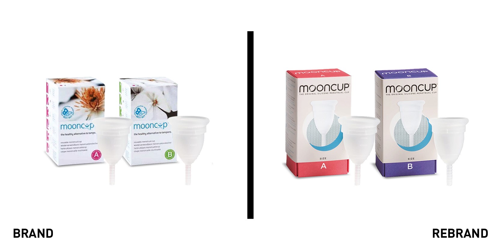
Mooncup
Operating as a pioneer in the growing market of menstrual cups, Mooncup has partnered with Bluemarlin in London to launch a new identity, shifting the brand positioning from a discreet alternative to a confident category leader. The first reusable Mooncup was created in 2002 to challenge the status quo and make the experience of periods more positive, healthy and eco-friendly, but Mooncup has seen a rise in competitors and imitators, and the brand challenged itself to adapt. Bluemarlin says the rebrand is a contemporary, captivating and conscious identity, premium without pretentiousness, which communicates Mooncup’s leadership in the category. “How do you compete when you’re used to operating in a vacuum, which is what Mooncup has done until now?” Kath Clements, company director at Mooncup, says. “For us, it feels like our authentic territory, it’s our true driver.” Bluemarlin’s solution reaffirms Mooncup’s authority with simplicity and intuitiveness, the agency adds, while demystifying a subject prone to apprehension and misinformation.
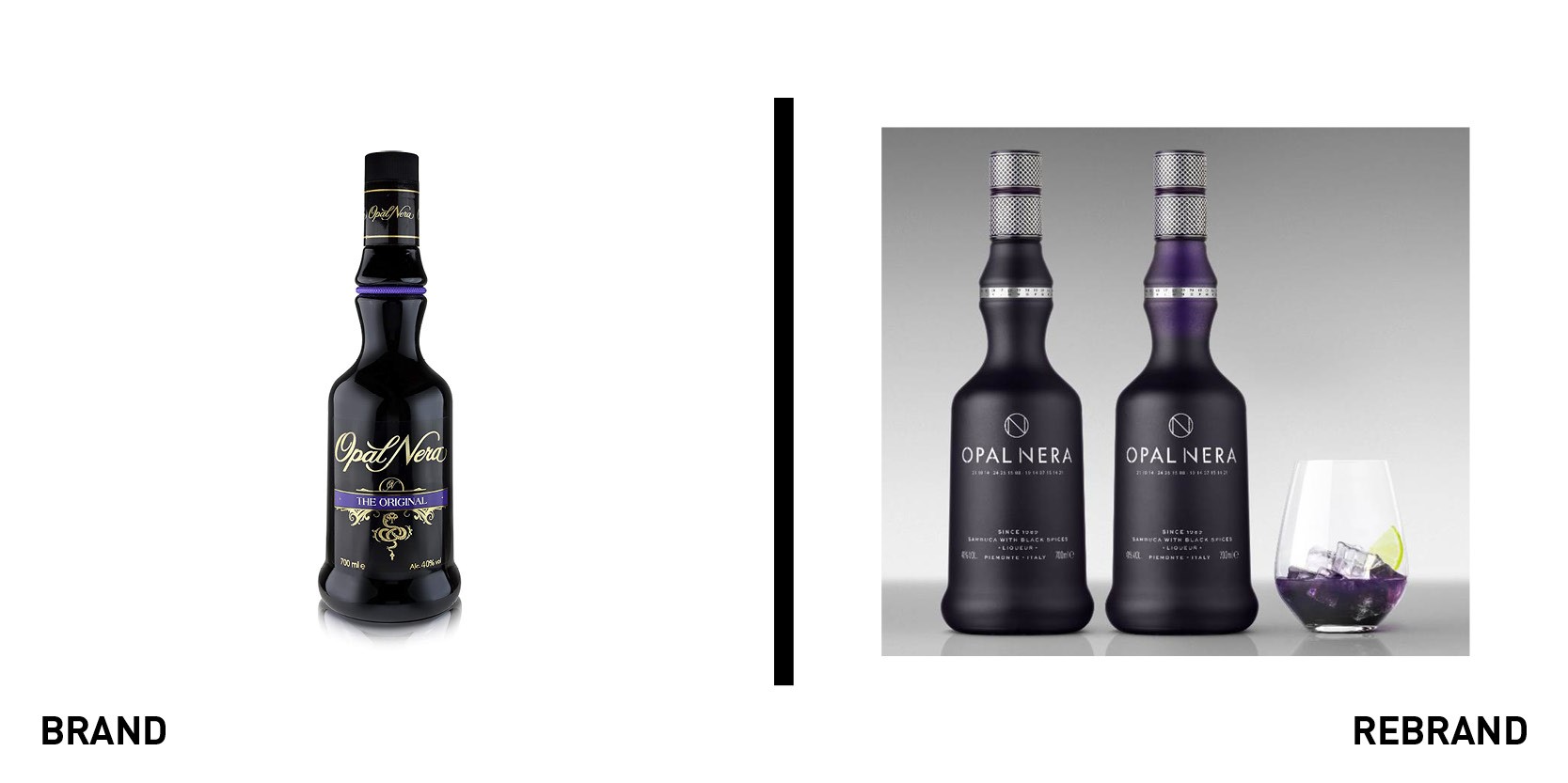
Opal Nera
Premium Italian liqueur Opal Nera was created by Distillerie Francoli in the 1980s and it has rapidly reached and maintained global popularity ever since. However, the Opal Nera brand and packaging has remained the same since its birth. To tackle the challenge of rising competitor brands, the distillery partnered with London-based drinks design agency Denomination, to create a modern look for the liqueur and reposition the brand as the leading product of its kind on the market. The bottle’s shape was maintained as a tribute to the brand’s heritage, while dark and purple tones dominate the identity. Beneath the logo, a ciphered string appears which can be decrypted through a sequence of letters and numbers on the rim of the bottle. The message reads ‘dark secret,’ and it refers to the liqueur’s capability to turn purple on contact with ice. “We modified the bottle to reflect that,” CEO of Denomination, Rowena Curlewis, says. “At first glance, it looks like black frosted glass. But, on pouring, a purple colour that matches the liquid is revealed.” The resulting brand befits the premium core of Opal Nera while refreshing its look to attract new customers.


