#TransformTuesday: 29 October
From abstract blocks to clapperboards, here’s our pick of the latest rebrands. For more from #TransformTuesday, follow @Transformsays.
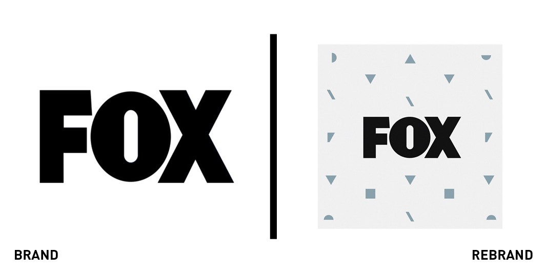
Fox
Entertainment group Fox launched a new look ahead of its 2019-2020 season of shows. Created by Trollbäck+Company, the new visual identity and tone of voice is designed to reposition Fox as “a source of breakthrough entertainment,” the agency claimed. The slightly reworked logo has been employed to create patterns using negative space and broken lines of letters. FOX EVP and head of creative advertising, Scott Edwards, said, “Some leave the past behind. As the original disruptors, we embraced the best parts of our past to move forward. That’s why, as we re-establish ourselves in this new marketplace, our brand was deconstructed and rebuilt, representing the best of who we are at our core.”
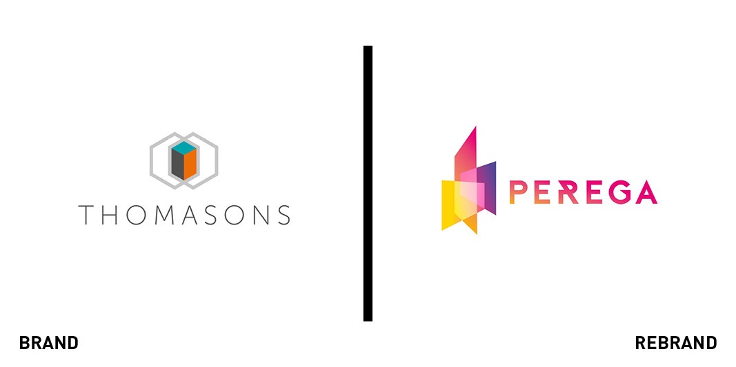
Thomasons
Structural engineering practice Thomasons has changed name for the first time in 72 years, rebranding to Perega. The new brand builds on the practice’s recent move to become an employeeowned trust and was created by brand consultancy Urbane. The name takes inspiration from the Latin words for team and experts and was designed to strengthen the brand's focus on its employees and clients, the agency said. “We also wanted a word that felt unique and international, so we started with Latin words. What was important for us was to find a word that was short and sharp, that we could take ownership of,” Andy Freeman, creative partner at Urbane said.
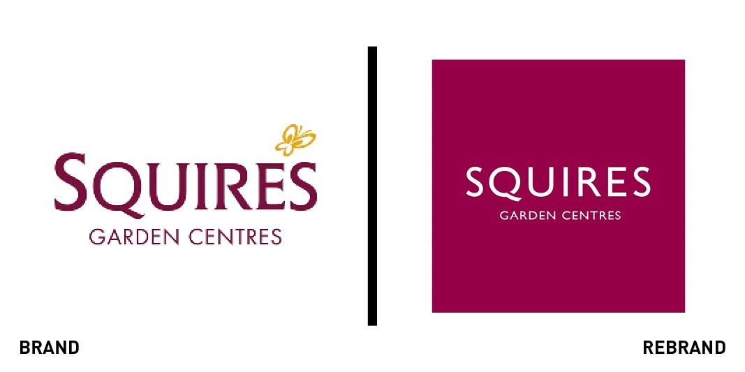
Squire's Garden Centres
Squire’s Garden Centres is rolling out its new brand, designed by Perq Studio, across its 15 sites. The project included a reworked logo, typeface, colour palette and art direction, as well as improved communications in store, the agency said. The brand colour was updated, while existing plant-related imagery on the website was replaced with new photography, to include the updated range of products, and to depict moments of customer experience in store.
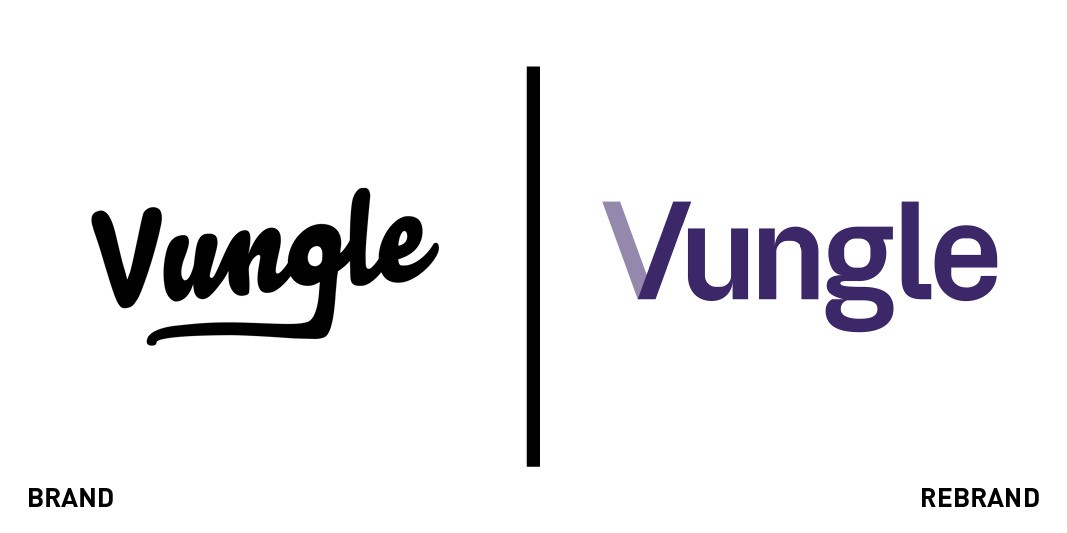
Vungle
In-app mobile advertising company Vungle has unveiled a new identity by design agency Multiadaptor. The identity was inspired by the world of apps and games, combined with the analytical precision of data, according to the agency. The V symbol, visible in the new logo, is at the centre of the identity. The left half of the letter is used in animations to display a range of visuals and patterns, while the right side remains unaltered in all designs and symbolises progression and growth, Multiadaptor added.
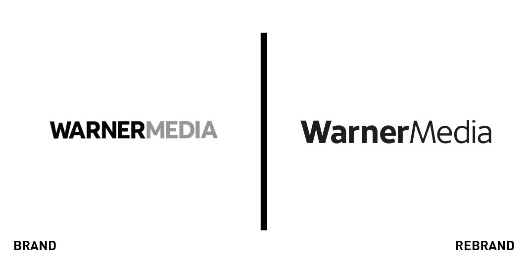
WarnerMedia
WarnerMedia rebranded with a new logo and identity designed to unify employees and stakeholders at all levels. The new look was devised by branding agency Wolff Olins. The identity includes a range of animations inspired by film clapperboards, which act as a symbol of media production, while the logo features matching angles for the letters W and M. The new design was made responsive across all devices, according to Wolff Olins. “Since its inception in 2018, WarnerMedia had been utilising a limited interim solution. In time, it became clear it needed something more substantive, a system to hold together an ecosystem of historic entities. [We] designed a set of flexible tools and gestures that would help it create meaningful and expressive communications on every screen surface imaginable." the agency added.


