#TransformTuesday: 27 August
Every week, Transform examines recent rebrands and updated visual identities. This week's picks are below. For more from #TransformTuesday, follow @Transformsays
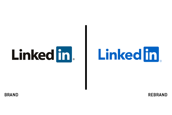
After two years LinkedIn has rebranded with the help of global creative agency Wolff Olins. The global professional network wanted its external branding to better reflect the welcoming and inclusive nature of the company internally and, “highlight the humanity that we see every day on our platform.” Its new brand system aims to communicate trust and authenticity in its communications and visuals, through commissioned images of users in varied, real workplaces, to establishing a varied warm palette that is complemented by, not led by, its signature blue, a new custom text font called Community and a new logo. The new logo is stripped down to one colour instead of three and reads more easily as one word than its predecessor.
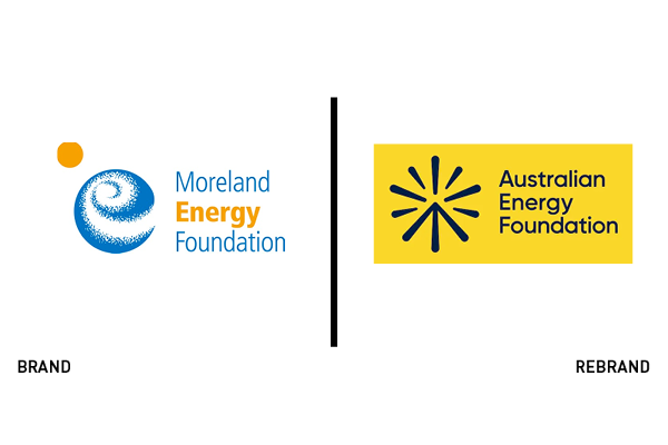
To expand outside the Melbourne area, Moreland Energy Foundation has renamed and rebranded as the Australian Energy Foundation. The organisation helps communities lower their greenhouse gas emissions and was launched in 2000. As climate solution leaders, they have expanded nationally with the help of leading Australian agency Principals. Where its previous visuals were ambiguous, its new identity is more confident, polished and approachable. Maintaining its core vision of cooperation, its new logomark appears as a bright spark coming together with positive upwards movement. It is simple, recognisable and scalable, reflecting an appropriate call to action for Australian communities, governments and businesses.
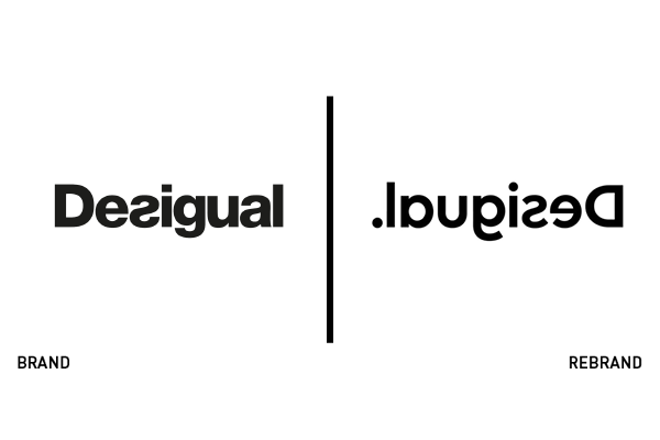
Thirty-five year old international fashion brand Desigual recently rebranded its identity in-house to reflect its ongoing “rebellious, disruptive and fresh spirit.” Presented across five continents, the brand wanted to stress continuation, authenticity and transformation. The new logo appears reversed – the first permanent logo reversal in the world, according to Desigual – but isn’t a carbon reversal. Its team reversed a new lighter sans typeface with accented terminals that begins with a period and ends with a capital ‘D.’ The new brand identity has been launched across all Desigual platforms and coincides with its wider internal branding work that’s expected to finalise in 2021.
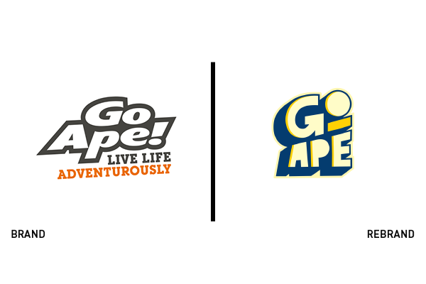
As the UK’s top forest adventure company, Go Ape wanted to keep growing its base while maintaining the identity that its core audience has grown to love. Hiring hit London-based indie agency Littlehawk to freshen its identity, it has relaunched a visual identity that continues the enthusiastic and sporty traits of its predecessor while feeling completely reimagined. Its new wordmark is active, growing upwards from left to right with custom characters and a clever arrow hidden in the ‘G’ pointing towards new heights, possibly as a nod to its extensive ropes courses. Furthermore, the logo in eggshell with indigo shadowing accomplishes the rare feat of working on both light and dark backgrounds. The new logo now appears across Go Ape’s online, print and merchandising collateral.
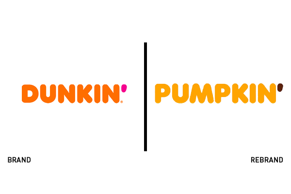
Capitalising on the popularity of its pumpkin flavoured products, US-based Dunkin’ Donuts has temporarily rebranded eight of its restaurants across the USA as Pumpkin.’ The temporary identity swap uses Dunkin’s existing typeface and will coincide with its limited autumnal run of products. The doughnut chain notes that according to Nielsen data, pumpkin flavoured products are up in popularity by over 15%.
For more from Transform magazine, sign up for the Transform newsletter here and follow us on Twitter @Transformsays.


