#TransformTuesday: 24 September

Every week, Transform examines recent rebrands and updated visual identities. This week’s picks are below. For more from #TransformTuesday, follow @Transformsays
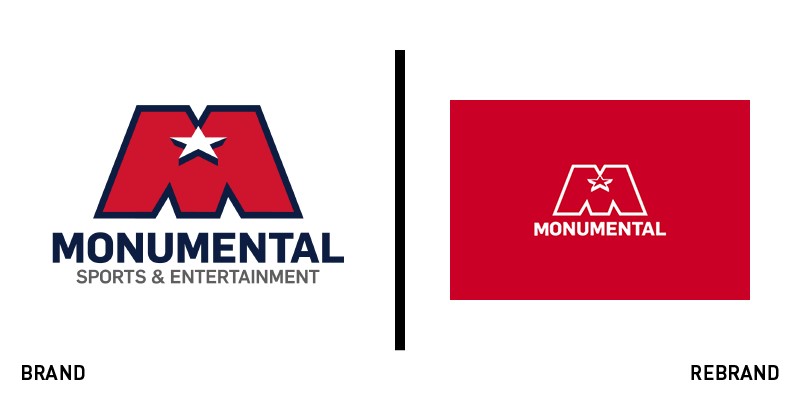
Monumental
After financing the Capital One arena renovations in Washington DC, Monumental Sports & Entertainment has partnered with creative agency BrandPie to announce a renovated brand strategy. The identity, embracing digital with a new company website, looks to reposition the group as the US’ leading sports and entertainment family, and is centred around the tagline ‘Raise the game. Be Monumental.’ The organisation is working to invest and finance the rise of esports through several partnerships, and the renovated brand positioning is a confident push towards digital, allowing Monumental to stay true to its roots while striving for a new beginning in DC’s business communities.
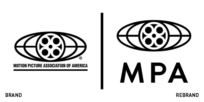
Motion Picture Association
The Motion Picture Association of America has been operating for nearly a century, protecting the interests of movie studios since its foundation in the 1920s. Over time, the organisation’s interests have become more global and focused in different areas of the world, which called for a unified brand to englobe all of MPAA’s branches. The new identity, albeit similar to the old one, drops the letter ‘A’ from the name of the brand, breaking free of the America mention and becoming clearer to outsiders. A three-letter logotype accompanies the iconic movie reel logo in a planisphere-like ellipse – now reminiscent of the global identity achieved by the MPA over time.
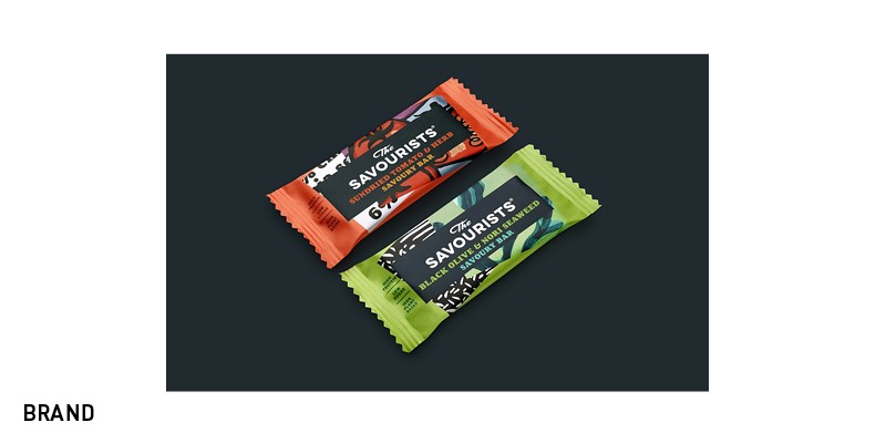
The Savourists
Snacking brands often evoke pictures of bright packaging with vivid colours, studded with sweet and savoury snacks all around the pack. The Savourists’ approach is different from the onset, with warm palettes and stylised textures inspired to the snacks themselves. The Savourists’ research has shown shifting trends in consumers, increasingly leaning towards healthier snacks and less sugary quick fixes; the new brand, designed by branding agency B&B Studio, positions the Savourists’ bars as a snack for both children and adults, quickly recognisable as healthy and vibrant enough to stand out on a shelf.
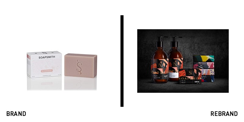
Soapsmith
With a pre-existing industry-standard identity with clear palettes and fonts, Soapsmith saw an opportunity to bring colour and personality into the body care category. With brand design agency Bulletproof’s help, Soapsmith has relaunched with a refreshed tone of voice and a fashion house style identity, accompanied by gold foil logotype and monograms. Each pack of soap now features an urban style of illustrations designed by Tom Abbiss-Smith, to keep the brand accessible despite its new premium coat. The refreshed Soapsmith identity tells a brand story with confidence and through a creative tone of voice, bringing together premium flavour and accessibility to push the company into the future.
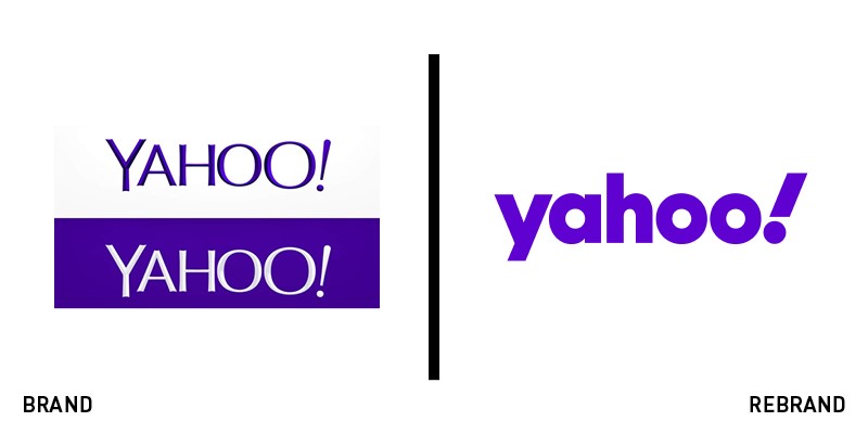
Yahoo
With a past as one of the early pioneers of today’s web, Yahoo has experienced an increasing loss in relevance over time, with search and email adoption gradually shifting towards Google and other tech giants’ services. To relaunch the brand with an array of new digital products, the company has announced a revamped visual identity by New York-based design agency Pentagram, centred around amplification and reflected by the iconic exclamation mark in the brand name itself. The company wishes to cut through the noise of the web by offering featured and more relevant content to users, and the new identity is the first step to kickstart its rise, with a round, sans-serif font fully embracing the playfulness of the brand.
For more from Transform magazine, sign up for the Transform newsletter here and follow us on Twitter @Transformsays.


