#TransformTuesday: 16 July
Every week, Transform examines recent rebrands and updated visual identities. This week's picks are below. For more from #TransformTuesday, follow @Transformsays
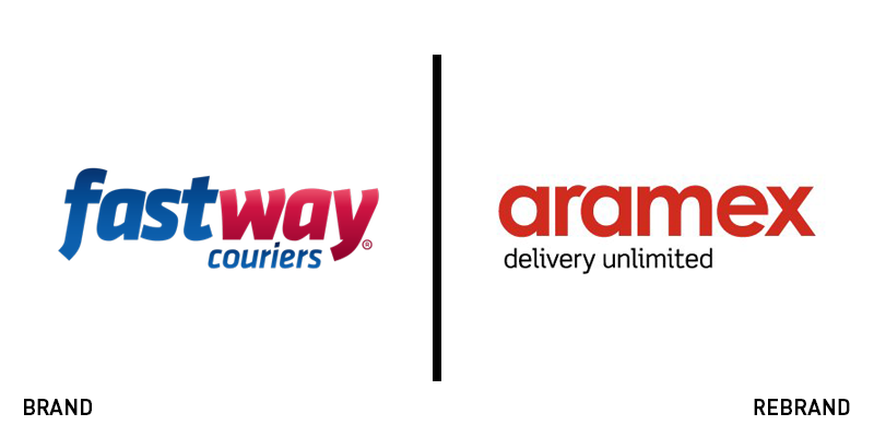
Aramex
Kiwi company with operations in six countries, Fastway Couriers has been in operation since 1984. However, it was acquired by Dubai-based Aramex, a global courier and mailing company listed on the Nasdaq exchange. It will now be formally rebranded under the Aramex banner. The rollout will take until 2020 as the franchisees across the network take up the new branding. CEO Peter Lipinski says the company will remain committed to serving its local communities. He says, “This is an exciting evolution for our brand, our business, our franchise partners and our customers which strengthens our shared ability to capture more of the rapidly growing e-commerce market.” The Aramex red and white branding will replace Fastway’s blue and red colour palette across all touchpoints.
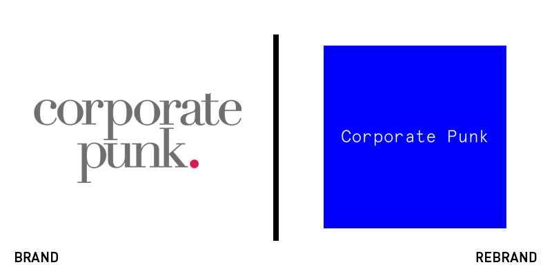
Corporate Punk
Management consultancy is a field that often features uninspired, corporate brands. However, for a company called Corporate Punk, a different kind of approach was required to follow through on the brand’s promise. The London-based company turned to Studio Smith to reexamine its brand. Studio Smith distilled the Corporate Punk ethos down to a single concept: that excellent consultancies need only focus on enabling their employees to achieve their best. The success of the business will come as a result of that. To that end, the consultancy did away with its brand, introducing only a signature typeface and electric blue. The utilitarian approach makes the website typographically driven, but also easy to navigate. The copy, crafted by Scarlett, is complemented by a suite of employee films produced by Jist. These enliven the brand’s website, while also explaining the company in more detail without becoming overly reliant on written content.
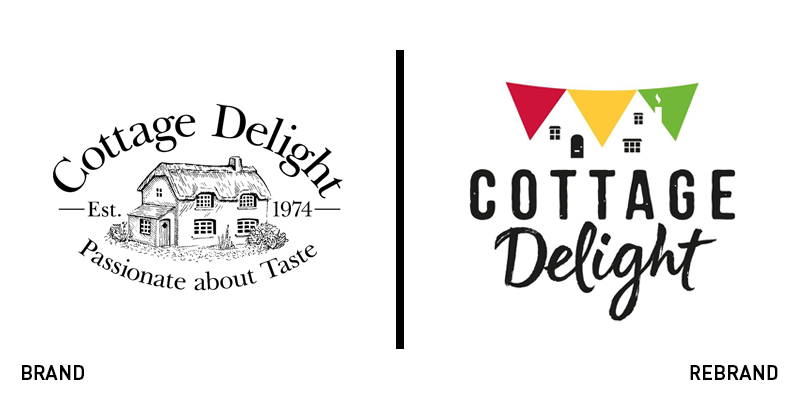
Cottage Delight
Forty year-old UK brand Cottage Delight has focused on producing gourmet canned and packaged foods distributed solely through local retailers. However, the brand’s story wasn’t being told as effectively as possible with its existing brand. Its packaging was quaint, but didn’t have standout in an increasingly crowded category. Its logo was a lovely illustration, but a complex one, that didn’t allow for ease of recognition or use across digital platforms. To rectify this, Cottage Delight turned to London-based consultancy BrandOpus, which highlighted heritage cues while repositioning the brand to a younger audience. The new approach is charming and celebratory, focusing on nostalgic cues in the wordmark and introducing colour and flavour across the packaging. The packaging is where the brand really comes to life, with the introduction of unique patterns, consistent package shapes and colourful elements that make the homegrown brand competitive against any larger retailer. Ellen Munro, creative director at BrandOpus says, “Our collaboration with Cottage Delight involved moving away from the ‘one size fits all’ approach and the limited differentiation between its range, creating a harmonious, yet vibrant varied assortment, perfect for proud display in any kitchen.”
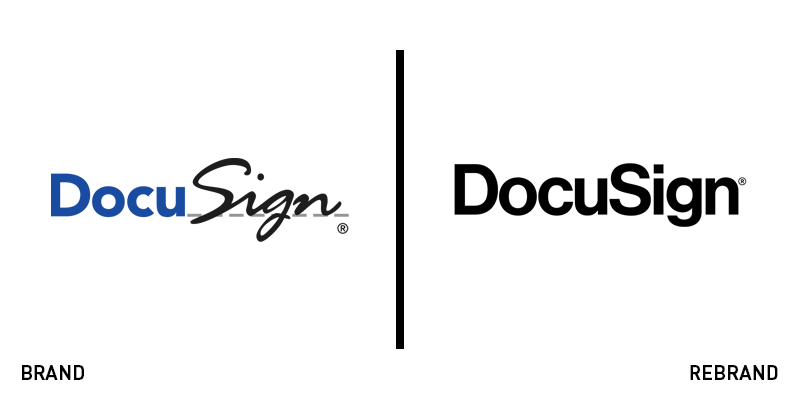
DocuSign
DocuSign, a San Francisco-headquartered company that offers support for digital documentation, has unveiled a new brand. The fresh logo replaces a blue, black and white wordmark that featured a sans serif ‘Docu’ and a cursive ‘Sign.’ The new approach is monochrome and uses only the sans serif typeface for the the entire wordmark. While it has been released across the DocuSign website and social media, its online brand guidelines have not been updated. Presumably, the rebrand is still being rolled out. The change comes on the heels of business growth and expansion for the company, which has been steadily increasing revenue, staff numbers and customers. The mobile app has yet to be addressed and still bears the original branding. However the new approach seems digital-ready and yields a cleaner result when deployed across the DocuSign website and social presence.
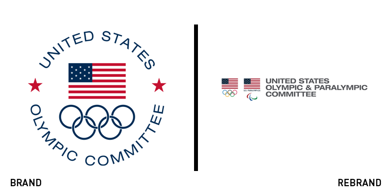
United States Olympic and Paralympic Committee
The Tokyo 2020 Olympics are rapidly approaching and the organising committees in Japan and around the world are ramping up their activities ahead of the Games. The United States Olympic Committee announced in late June that it would be rebranding ahead of the Tokyo Games to include the Paralympic movement within the Team USA master brand. The new name – abbreviated to USOPC – was voted in unanimously by the organisation’s board of directors. The change is also prescient in light of the upcoming 2028 Olympic Games in Los Angeles. USOPC chief executive Sarah Hirshland says, “Paralympic athletes are integral to the makeup of Team USA, and our mission to inspire current and future generations of Americans. The new name represents a renewed commitment to that mission and the ideals that we seek to advance, both here at home and throughout the worldwide Olympic and Paralympic movements.” Team USA is one of only four national governing bodies that oversees both Olympic and Paralympic sports.


