#TransformTuesday: 12 November
From pink car hires to green straplines, here is our pick of the latest rebrands. For more from #TransformTuesday, follow @Transformsays.

Go Rentals
New Zealand car hire company Go Rentals rebranded in pink in 2013, introducing a revamped website to modernise the brand. The company unveiled a new logo last week, retaining the pink of the previous iteration but opting for a bold, rounded sans serif typeface. The website was updated as well to pair with the launch of the new logo and offer a renewed navigation experience. In an Instagram post announcing the new look, the company said, “We’re on a mission to make renting a car ridiculously easy and enjoyable. So things might look a little different the next time you’re in a branch or on our site.”
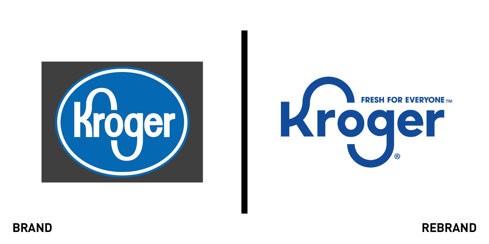
Kroger
US supermarket retailer Kroger donated $192m in 2018 to fight hunger in local communities, indicating its updated purpose. The company is no stranger to humanitarian efforts, but the Kroger brand still lacked a clear reference to its value proposition, which is to guarantee ease of access to fresh and affordable food for everyone. With its rebrand last week, Kroger has added the ‘Fresh for everyone’ tagline to its logo, still retaining the movement of the letters ‘K’ and ‘G’ as a tribute to the company’s heritage. The rebrand was crafted by design agency DDB and introduces a colourful range of animated characters, the Kroji (Kroger + emoji), which represent typical Kroger customers in a range of contexts. The Kroji were employed across posters, in-store signage and online.
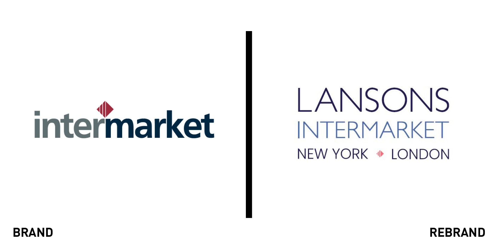
Lansons Intermarket
Earlier this year, UK reputation management consultancy Lansons acquired New York-based communications firm Intermarket to expand into the US market. As part of the acquisition process, Intermarket has now adopted its parent company’s name, rebranding to Lansons Intermarket. The logo retains the red diamond from Intermarket’s previous logo, while the new name symbolises the partnership between London and New York. “Our rebrand to Lansons Intermarket at this time reflects that fact that we’ve now brought our firms together into a cohesive unit,” says Lansons Intermarket president Martin Mosbacher. “We are eager to offer our clients a seamless package of communications services linking two of the world’s most important centres of finance and media: New York and London.”
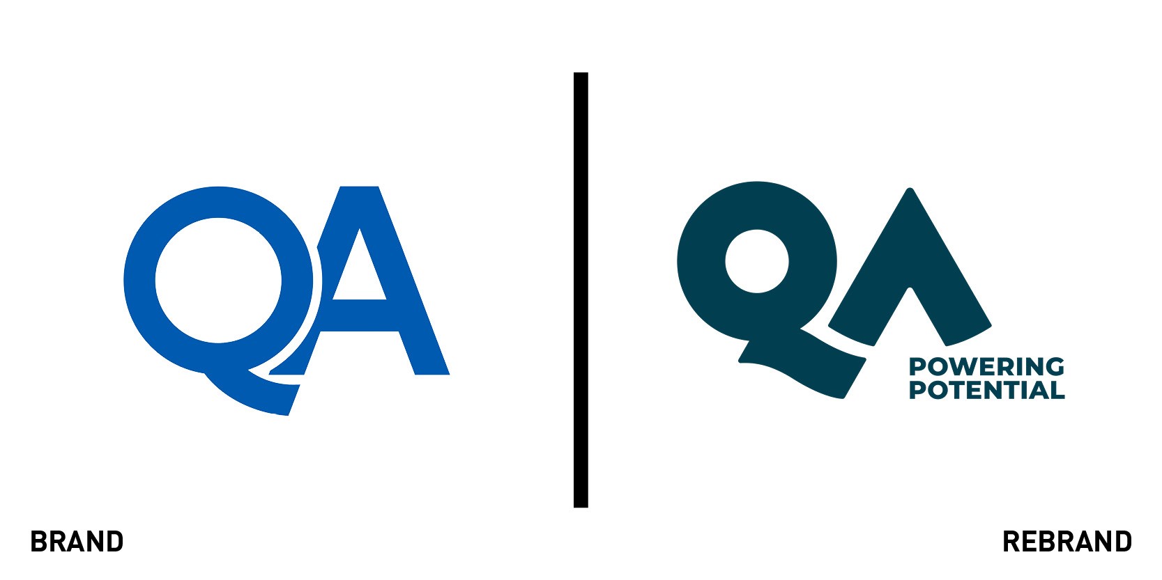
QA
When a business is as multilayered as UK IT training provider QA, its brand needs to reflect what the company means to all the stakeholders involved. Creative agency Missouri was challenged with creating a new positioning for QA, with reworked brand values and a visual identity able to reflect the personality of the business. The agency opted for the alliterative tagline ‘Powering potential,’ shifting the focus of the brand to people rather than the business. The brand’s narrative now focuses on people wishing to unlock their potential, an overall attitude reflected in the updated visual identity.
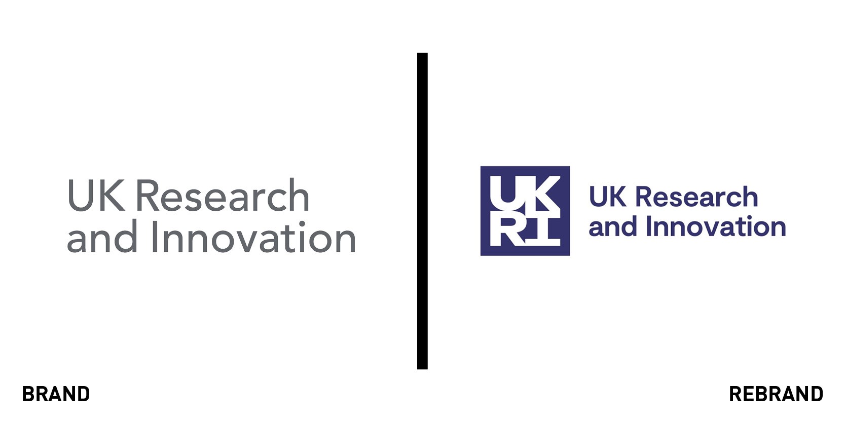
UK Research & Innovation (UKRI)
On 1 April 2018, the British government unified nine of the UK’s research and innovation funding councils under the Higher Education and Research Act. The new body was dubbed UK Research & Innovation (UKRI), and it has worked ever since to build the UK’s reputation across all sectors of research. Dragon Rouge was tasked with the design of the UKRI’s new brand, which brings together the nine councils under one common design system. At the same time, the new brand aims for individuality and guarantees the identity of each research body. Each individual council's logo is a part of the of the wider UKRI brand architecture, which features a varied colour palette, bold typeface and graphic patterns.


