#TransformTuesday: 12 March
Every week, Transform examines recent rebrands and updated visual identities. This week's picks are below. For more from #TransformTuesday, follow @Transformsays
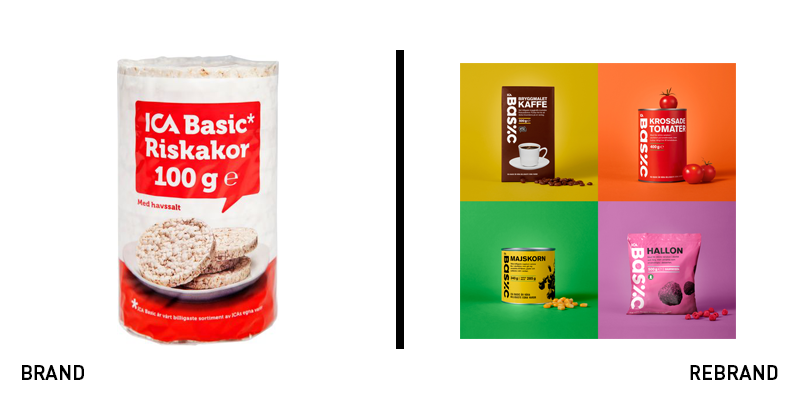
ICA Basic
Supermarket own brand packaging ranges from dire to delectable, based on the supermarket. Those that focus on their white labels often see an increase in sales, as Tesco learned on the redevelopment of its portfolio. Now, Swedish retailer ICA has introduced a new system for its ICA Basic white label. The previous packaging was indeed basic, with white backgrounds, a single product image and red labels, it didn’t offer much beyond consistency. The new approach, developed by Stockholm-based Silver, is being rolled out across the group. The Basic range has been reimagined in colour, with a Scandinavian simplicity to it that is innately appealing. Other white label ranges have been rescued from a red-and-white death through colour, exciting imagery and attractive elements that allow for consistency and recognition across the range.
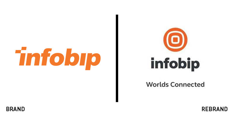
Infobip
Corporate cloud communications companies aren’t necessarily synonymous with excellence in creative branding. However, as the sector matures, branding is becoming a key differentiator. Croatia-based Infobip has recognised this and its own in-house team worked with Fabular Agency to develop a new brand. The new positioning, ‘Worlds connected’ is supported through a circular, world-like icon that retains the company’s signature orange. The new wordmark is cleaner and bolder. “The magnitude of innovation within our industry enables new opportunities. Along with Infobip’s exceptional growth, our fresh, new visual identity furthers our momentum in providing the broadest portfolio of messaging solutions enabling business growth worldwide,” says marketing director at Infobip Sanja Buterin.

London Business School
The London Business School has become a well-known institution across the UK capital and farther afield as students flock to the university from over 60 countries. The university had a static brand that worked well on campus signage but offered little in the way of a visual system. Now, with the support of a new campaign, ‘Minds Alive,’ the business school has unveiled a new logo and the beginnings of a brand system. Retaining the square shape that is synonymous with the university, the new logo is a darker, midnight blue and uses a deeper red than its previous iteration. The font has been streamlined and simplified and the red line device has slimmed down. The red line is now used as a moving image threading through the business school’s communications and offers a more vibrant digital experience.
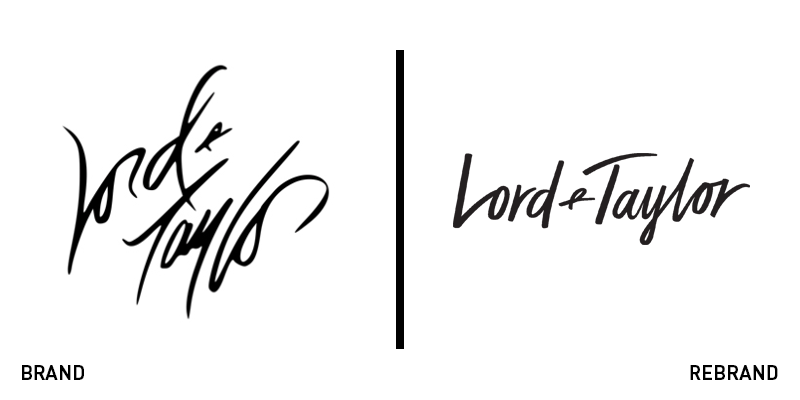
Lord & Taylor
As with most department stores, Lord & Taylor has had a difficult time of things lately. Owned by the Canadian heritage brand, the Hudson Bay Company, the American retailer has faced store closures and declining sales, but has found a home in outlet malls and through retail partnerships. Now, it has unveiled a brand and simpler website. The announcement tweet proclaimed, "You spoke, we listened! Check out your new L+T – a smarter way to shop!” The new logo uses a plus sign device in place of the ampersand and introduces a fresh, modern secondary logo that eschew’s the company’s iconic script. The yellow, white and grey square icon introduces a younger, more digital-friendly logo to a company that had been steeped in tradition and heritage. This may support the brand through its partnership with walmart.com.
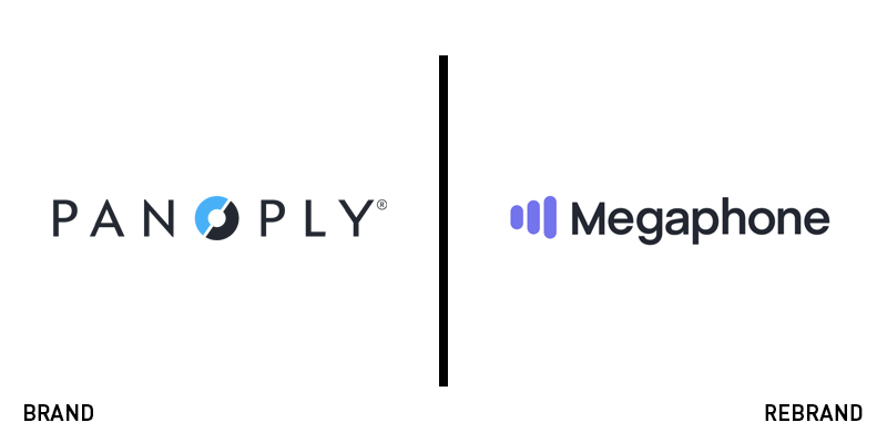
Megaphone
Moving away from content production and toward technological products, Panoply Media has rebranded as Megaphone. The company, which has begun working with numerous partners that are content producers in their own right, has dropped its content team and amped up its tech platform. “We’ve gained tremendous momentum in the last year, and have helped to bring many new podcast publishers and major brand advertisers into the medium for the first time,” Brendan Monaghan, CEO of Megaphone, says. “To build on this success, we’ve chosen to rebrand the entire company with a name our clients already know and trust, providing clarity and simplicity to our business.” The new look is a simple megaphone crafted from three lilac bars. This replaces the vaguely unforgettable blue-and-black Panoply wordmark with a CD-like O device. The company will now focus its efforts on developing its platform and providing support and services for content creators.
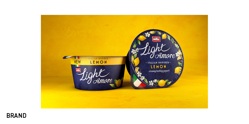
Müllerlight Amore
Greek yoghurt is well-known, as is kefir, a fermented, yoghurt-like drink. Yoghurt is one of those staples of the dairy aisle with versatile uses and multiple benefits. But Italian yoghurt is a new player, making packaging a key to the success of Müllerlight’s new Amore range. The snacking giant Müller is offering a more health-conscious option through the Amore range. Its three Italian flavours, hazelnut, lemon and Morello cherry, offer three styles of packaging – all of which draw on the Italian ceramics tradition for inspiration. The Amore range uses the best perceptions of Italy across its visual identity, and offers the seamless integration of the products’ ingredients into the imagery. Andy Wallace, associate creative director at Coley Porter Bell, which carried out the brand development, says, “It was a joy to create a premium design inspired by Italian artistry and the country’s associations with creaminess – from gelato to mascarpone to mozzarella. We wanted the customer to fall in love with the product and see it as a delicious creamy indulgence they can treat themselves to more often.”
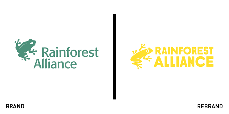
Rainforest Alliance
Rainforest Alliance, the certification organisation that campaigns for environmental, social and economic sustainability has unveiled a new logo and website, with the help of London-based creative agency Futerra. In 2018, the organisation merged with UTZ, a charity that works with sustainable agriculture. As part of the newly united business, the Rainforest Alliance has revamped its iconic frog logo. The announcement says, “Through the years, our frog has changed and adapted along with the growth of our organisation and the evolution of our identity. We are now working to refresh and modernise our green frog seal as part of the development of our new agricultural certification program, while making the most of existing strong consumer recognition and brand value.” The new approach is colourful, vibrant and digital-ready. The certification programme and seal is due to be redeveloped as well.


