Tillamook launches rebrand sharp as blue cheese

The dairy cooperative keeps its signature Morning Star ship icon, turning it into a weather vane and introducing a new logotype.
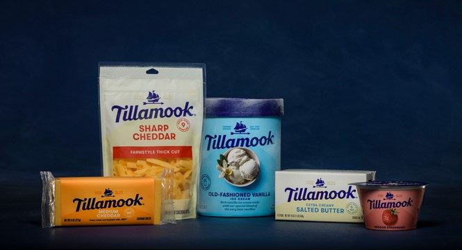
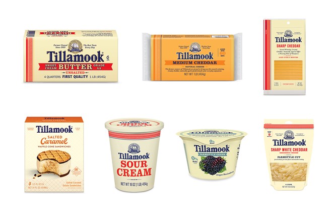
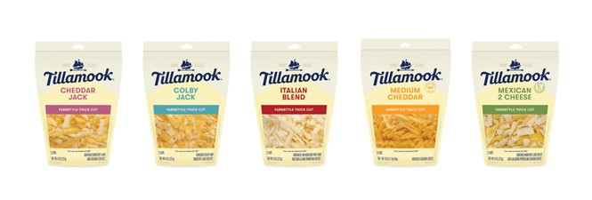
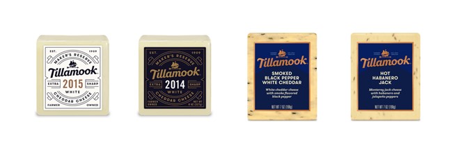
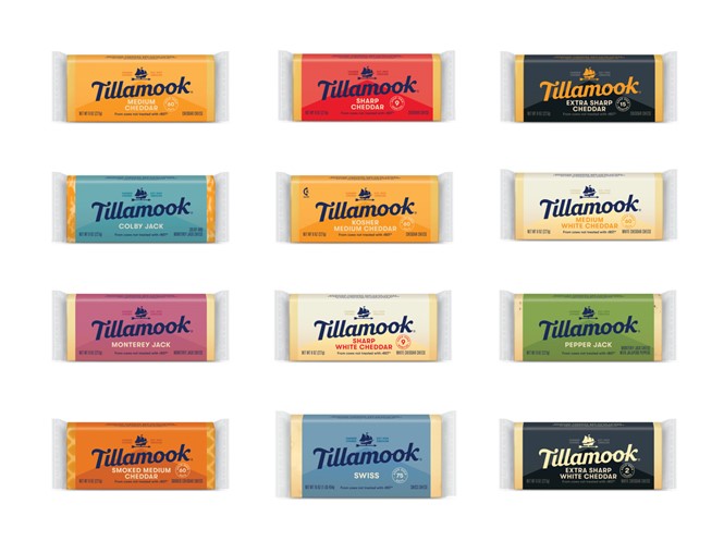
US Dairy cooperative Tillamook has announced a new visual identity that refers to the company’s beginnings while introducing new design elements. The new brand, showcasing a hand-drawn, white wordmark on a blue canvas, has already been applied through all of the company’s products and is a nostalgic wink to Tillamook’s past.
The rebrand embraces old and new, blending them into an identity proud of the company’s humble beginnings, yet still looking toward a bright and hopeful future.
Where the previous logo had old-school, vintage appeal and charm, the new one, conceived by designer Jeremy Mickel, drops all superfluous elements from the company’s iconic Morning Star ship, turning it into a weather vane to combine Tillamook’s coastal past with its farming roots. The ship is a reference to the company’s origins, as the Morning Star was built by the pioneers of Tillamook to transport their dairy goods to the market.
Vintage style and design were strong elements in old Tillamook packaging as well. Although that charm has been lost in the transition to the new identity, the company has embraced its renewed packaging with confidence, putting its products at the heart of each design with close up images and eye-catching colours.
Tillamook's confident design choices show it is a brand embracing its past, without compromising a strong identity for the future.
For more from Transform magazine, sign up for the Transform newsletter here and follow us on Twitter @Transformsays.


