Spotlight on IET
For the Institution of Engineering and Technology, any new brand would have to be flexible, impactful and relevant for multiple audiences around the world. Brittany Golob reports on the organisation’s fresh approach to brand and communications
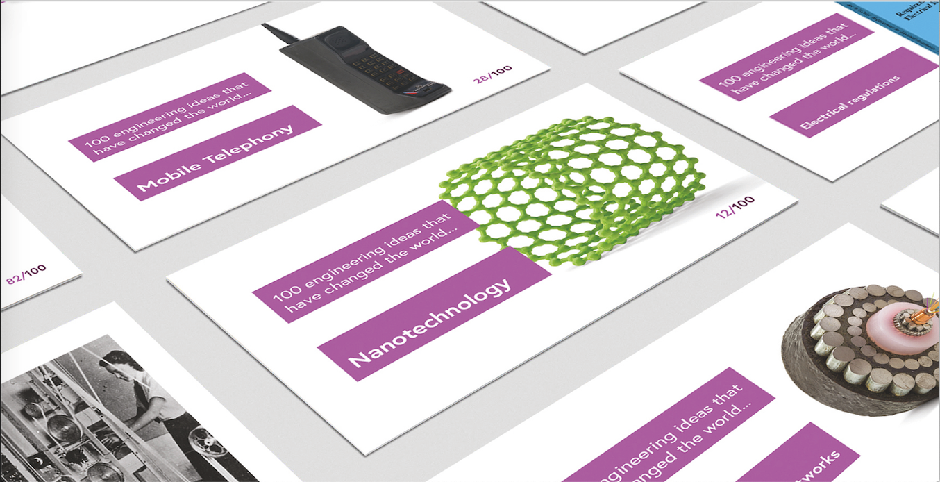
On the back of Simon Timmis’ business card is the photo of a first generation iPod and the phrase, ‘100 engineering ideas that have changed the world.’ The iPod is one of 100 inventions being highlighted by the Institution of Engineering and Technology (IET) in a new exhibit. Among other ideas, it focuses on contributions such as the bicycle, code breaking, the microscope, particle physics and space exploration as a way of documenting the value engineers and technology professionals have in the modern world.
The institution similarly has examined its brand and communications to better express the opportunities in and value of science and engineering, as well as the IET’s role in supporting those industries.
Timmis, the brand, digital and impact marketing lead, at the IET says, “The old brand worked well for some of what we do, but it wasn’t the whole picture. A lot of what we were doing was being lost” The institution had an existing brand dating back to 2008 which was professional and representative of many members. Its logo was nicely rendered and its commitment to heaps of white space helped communications. But in almost every other way, the brand was failing to adapt to the changing needs of the institution’s communications.
Change was imminent, as it almost always is in engineering and technology.
The institution, on this communications precipice, took a considered approach. The deliberation it has undertaken at every point of the transformation of its brand has resulted in a fit-for-purpose brand, a clearer mission statement and the potential for better communications with all of its audiences.
But the early stages of the development were not entirely straightforward. “Initially, we were just going to focus on the strategy,” Timmis says. The focus would then move onto the visual identity, but it soon became apparent that a bigger change to the brand was required to fulfil the objectives set out in the IET’s strategy. To carry this out, Timmis enlisted the support of branding agency Frank, Bright & Abel, an organisation with existing experience in the branding of membership organisations.
Frank, Bright & Abel built upon research the IET had commissioned into its brand persona and member needs with a Manchester-based research agency called Mustard. It found that the IET’s existing brand was professional and corporate, but that it was failing to flex across all the various activities, audiences and needs the IET’s communications had to meet. “If you’re a member and you didn’t necessarily understand the breadth of what the IET does, it couldn’t necessarily help you to the best of your ability in your career,” says Frank, Bright & Abel strategy director Nick Thomson. The IET is astonishingly broad, with operations across 150 countries and in areas ranging from education support, creative partnerships, event space, academic publishing and member services. With various types of revenue streams and areas of focus, the brand had to be flexible, but still present the IET – in all its guises – as one organisation with a single purpose.
Most organisations would start by examining colour palettes, logos, imagery and other assets. For the IET, with its engineering focus, a measured approach was required. Every decision had to be rationalised – not only to an audience base of 170,000 people, many of whom have logical, scientific mindsets – but to the trustees that set the direction for the organisation.
The first step was conversation. Frank, Bright & Abel talked to the trustees. It talked to members and non-members, UK residents and global members, prospective engineers and veterans. It talked to employees and volunteers. And most important, it talked to students. Timmis says, “In the past, the old brand couldn’t flex to those different communications. The hardest part of getting the look and feel right was to do with education.” The IET is committed not just to existing members and existing professionals, but to encouraging the next generations of engineers and technology professionals by working with universities and schoolchildren to encourage young people into STEM subjects, offer educational support and provide member services for young professionals.
As a major objective of the brand’s strategy, the visual identity had to appeal to that audience too, but without alienating more senior members. It also had to ensure it could communicate professionally with government audiences and academic stakeholders.
“The flexibility of the branding was absolutely crucial. One of the crucial things when we got onto the visual brand was how to take that overarching brand, but then skew it for all of the many, many different audiences”
The challenge was fairly acute. Frank, Bright & Abel had to create something that was backed up by research, approved by trustees and employees, supported by members, appealed to young people and was flexible enough to communicate with a panoply of different audiences.
John-Paul Skyes, creative director at Frank, Bright & Abel, says, “The flexibility of the branding was absolutely crucial. A lot of times when you do a brand, you’re quite fixated on the corporate brand or the core brand and how the website looks; how you communicate through an annual report. That’s such a thin veneer throughout the huge amount of things the IET does. One of the crucial things when we got onto the visual brand was how to take that overarching brand, but then skew it for all of the many, many different audiences.”
He adds, “The key was having a really flexible brand. The whole idea of the IET meaning many different things to different people was absolutely at the heart of it.”
That put Skyes and his team to work on not one, but three different options. That approach helped the IET narrow down its ideas, but also test its ideas throughout, ensuring that the resulting brand would be the result of a consultative, well-researched design process. The initial ideas included one that was about the connections inspired by the IET. Another was about the reimagining engineering. The third – and ultimately the one that was developed into the new IET branding – looked at impact. But the initial creative ideas were focused on a young audience and couldn’t flex to the more professional and official requirements of the brand.
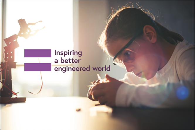
However, with the impact approach a suitable one, Frank, Bright & Abel was able to develop the concept. The result is unexpected. It is youthful, but classic, quirky, yet formal and colourful, yet professional. And it is nothing if not adaptable. The focus of the brand is an equals sign that forms the ‘E’ in IET. That device can be enlarged or altered to form other visual elements and delineate differences in communications. Journals take a different approach to educational programmes and digital communications look different than those for an events audience.
Another element Frank, Bright & Abel had to consider was the fact that the IET is a single organisation, but owns a number of sub-brands. Previously, this led to countless individual brands and logos floating around the organisation as volunteers and employees crafted new identities for each type of communication.
Now, with a strong central brand, the ability to unify sub-brands was simplified.
A crucial addition to the brand guidelines helped in this process: a decision tree. Timmis cannot thank the decision tree enough. And he’s right to do so, as it seems to be just the thing a rational, scientifically minded organisation with a widespread membership and employee base required to successfully manage its brand. This has helped those working with the brand determine if and when to use a sub-brand logo and when it is unnecessary.
The brand guidelines don’t just delineate the requirements around visual assets, though, they offer support based on the type of communication required. The image library – comprised partially of stock and partially bespoke imagery – is categorised by communications objective, not by topic. That has helped those crafting brand communications to implement the right assets for the audience they are trying to reach and the type of communication they are using.
The colour palette is primarily purple and white, but there are secondary palettes in a range of colours as well.
Because everything was tested, examined and proved, it has been met with a largely positive response since the 28 January brand launch. “One of the dangers of doing too much testing is the idea gets more watered down, but I think we managed to keep strong on that central idea of the result and impact [of engineering]. Everyone bought into that idea rather than buying into a colour or a typeface. It was the idea that kept it strong,” Skyes says.
Timmis adds that it was exactly this consultative process that made the brand successful with the IET’s key stakeholders. “It helped to communicate [the brand], to sell it in, because it’s all based on evidence,” he says, emphasising the role evidence support has had on the creative process.
The creative was well-developed and addressed the IET’s communications needs. But, says Thomson, “One of the key challenges of the project specifically is that the IET is not strategically changing as an organisation.” The mission and vision were clarified in the process of developing a new brand, but the core strategy of ‘helping engineer a better world’ was unchanged. “The brand is kind of heroing the strategy,” Thomson says. “It’s really giving the brand a role to play in terms of how it’s going to help achieve that direction moving forward.”
Part of these shifts was a new tone of voice. The IET’s previous tone of voice was formal, rendered in the third person and numbers-heavy. “Now, it makes it all about the output; what’s actually been achieved,” Timmis says, adding that understanding the personality of the IET has helped it communicate more informally. The copy style now puts the impact of the communications at the forefront, a shift mirrored by the visual brand.
The rollout of the new brand has been managed over the course of almost two years. With many members and volunteers consulted along the way, the IET’s newsletter has been seeding information about the rebrand throughout the process. The internal launch occurred first, followed by the external on 28 June.
But, astute members may have noticed something in the works as far back as 2015. The IET’s London headquarters at Savoy Place had been wood panelled, elegant and “quite an intimidating space,” says Timmis. Its facilities were used by around 30 members per day.
The IET wanted the space to reflect the organisation more accurately, and to reflect engineering more accurately. It modernised, lightened and adapted the spaces to become more open, more digital and more collaborative. It now sees upwards of 300 members per day using the space. “That worked really well for us,” Timmis says. “And we had that in our minds. it was a good analogy for us when telling people why we were doing this project.”
Every great idea in engineering, from wind power to refrigeration to nuclear power, has been developed as a result of a great idea and a lot of testing.
That was no different for the Institution of Engineering and Technology. A consultative process ensured a brand supported by evidence. But a creative approach allowed for a more flexible, effective result.
Peer review
Sholto Lindsay-Smith, director, Industry
The new brand is lighter and brighter and certainly feels less leaden than the old identity. Fitting for a business promoting engineering, the new identity is also more structured. The logo is simple, but it lacks gravitas and the mathematical precision of engineering. Its blocky feel would be better suited to a construction business.
I wonder if a trick has been missed in not changing the name. The institution has Royal Chartered status. Could it have changed its name to the Chartered Institute of Engineering or the Royal Institute of Engineering?
The formal vision statement, ‘Working to engineer a better world,’ has been adopted as the headline message. It is a bit clunky. A call to action like ‘Let’s engineer a better world’ or something more aspirational that could sit with inspiring images of engineering brilliance could have added more punch.
Are the three different logo colours needed, and what do they symbolise? Is their use arbitrary? When do you use the purple logo and when the others? In a crowded field of other engineering bodies, the institution needs to own a colour. The equals device is more powerful when used at smaller scale, for instance next to a title or statement. Its potential power and meaning risk being undermined through overuse as a graphic element and when crammed full of text.
It does feel like the rectangle shapes derived from the equals signs have been crowbarred into the icons. The icons could be more elegant and better engineered. Most importantly, with a subject like this, could more inspirational photography have been used to express the wonder and feats of engineering?


