Spotlight on Coty

Cosmetics master brand Coty recently acquired P&G’s Beauty division, prompting the need for cultural change and a brand repositioning. Melina Thalassinou reports on the resulting affirmation of diversity, beauty and transparency
The world is a beautifully diverse place. Every person thinks, acts, looks and speaks differently. And that’s how it should be. In times of political and social turmoil, it is important the beauty of diversity is recognised, highlighted and celebrated. Recognising this, companies are working to shift their brand positioning to better represent much wider audiences.
Despite beauty being in the eye of the beholder, the beauty industry isn’t known for representing diversity. On the contrary, beauty advertisements are often dominated by Jennifer Lawrence lookalikes, with fair complexion, blue eyes, blond hair and slim waistlines.
Against that lack of representation, Coty, one of the world’s largest beauty companies with a network worth over $9bn, has rolled out a refreshed brand identity, designed by London-based strategic brand consultancy Workroom, to show the beauty in everyone. Coty holds an impressive portfolio of established brands – both high-street and high end – such as Covergirl, Max Factor, Sally Hansen, Rimmel, Calvin Klein, Marc Jacobs, Hugo Boss, Gucci, Wella Professionals, OPI and ghd; diversity is in its blood.
Coty recently purchase the Procter & Gamble (P&G) beauty division and is now faced with a beauty industry that is one of the most profitable, but most saturated business sectors. It swiftly became apparent that Coty was in need of a refreshed brand identity. To carry through this task and articulate what the new face of Coty is all about, the it appointed Workroom. Brigid McMullen, managing director of Workroom says the agency had an established relationship with Coty’s CEO at the time, Camillo Pane, who worked with McMullen when he was at Reckitt Benckiser. “They knew what we could do,” says McMullen.
Coty had a clear brief: it needed to align two drastically different cultures. Coty and the P&G Beauty division had completely different cultures. Coty was tasked with essentially bringing two totally diverse teams together with 10.000 employees each, to create a new entity. Camillo Pane, former CEO of Coty, says, “We have several brands that are being re-launched and several new innovations and I believe that when this work is truly inspired by a great Purpose it allows us to connect with our consumers – to drive big reappraisals of our brands by our consumers.”
Coty was considered to be entrepreneurial, creative, full of good ideas and heavily based on oral tradition. P&G was almost the polar opposite of that; rigorous, data-focused, consumer insight-driven and purposeful. Despite their fundamental differences, however, both teams were excited to work with each other, “What was very interesting is that P&G people were very excited about having the ability to have more ownership, more flexibility, recognition for doing great work with fewer ‘shackles.’ Coty people on the other hand, wanted more discipline, more rigour, more process. So, it was a good combo,” says McMullen.
Before initiating the process of rebranding, both Coty and Workroom conducted research to ensure targeted and purposeful results. McMullen says, Coty used the Bain & Company Culture Pulse Survey, says McMullen, to discover more about the working practices that comprise corporate culture. This was deployed to understand more about ways of working, how decision making processes worked and the entrepreneurial nature of the culture, in addition to the aspirations of each business. The results from the research showed that both P&G’s beauty division and Coty shared the same aspirations regarding what the company should stand for and the goals it should have, and that was a strong starting point. Workroom’s research was carried out by interviewing people across the two businesses. “Of course, additionally we were looking outside the businesses, doing a peer review of the top 20 beauty companies, which we interrogated. We looked at their positioning and how they present themselves and their values. We made sure that what we were creating was going to be distinctive,” says McMullen.
“What we noticed when we did our research in the marketplace was that almost all of the beauty brands are black and white. We made a decision early on that if we try to represent diversity, it’s not going to be with one colour”


To build the new visual identity, Workroom started by defining the purpose of the new brand, which was to ‘ to celebrate and liberate the diversity of beauty.’ That strapline became the driving idea for everything implemented in Coty’s new brand. McMullen says, “When you see the visual identity, you can see that it’s a direct reflection; a visual translation of that idea. We identified creative coordinates that we defined, that came directly from what we thought the purpose meant, and used that as our guidance to create the visual identity. The visual identity represents the idea of beauty, diversity and transformation.”
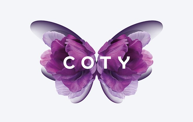
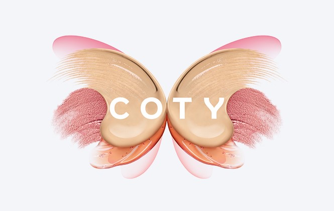
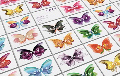
Coty’s new visual identity uses illustrations of butterflies in different shapes, textures and colours across the brand, conveying in a clear, creative and aesthetic manner the message of diversity. The unlimited colour palette was a conscious choice for Workroom. “What we noticed when we did our research in the marketplace, was that almost all of the beauty brands are black and white. Chanel, L’Oréal, Estee Lauder, all of them. We made a decision early on, after we had defined the purpose, that if we try to represent diversity, it’s not going to be with one colour,” says McMullen.
For the new logo, Workroom crafted a bespoke typeface, which it named Coty Sans, to achieve consistency, but at the same time flexibility, across the brand, while enhancing its distinctiveness and recognisability. The wordmark, written in Coty Sans, features curves that mirror the symmetry of a butterfly, with the ‘Y’ resembling its antennas. In a secondary visual language, the illustrations of the butterflies are designed using Coty’s beauty products, such as nail polish, mascara, foundation, eyeshadow and lipstick, a unique way to connect the visuals with the products it offers. Furthermore, every butterfly corresponds to a different model that is unique and beautiful in their own way.
Undertaking such a huge task doesn’t come without challenges, and the Workroom faced quite a few. McMullen says, “From a creative and strategic point of view, one of the most difficult things with every rebrand – and this is no different – is to keep the integrity of the idea on track all the way through the project. There so many factors fighting for attention, but you’ve got to constantly keep people focused on the idea that you started with.”
Pane says, “Our purpose and identity are at the core of our transformation into new Coty - it is visible in the work we do everyday. It is inspiring the work we do with our brands; CoverGirl, Max Factor, Clairol, the work we do in luxury, the way we work with our partners, the fashion houses, the way we embrace diversity, the way we represent diversity and also radical inclusion inside the company which has been raised in a very significant way since the creation of the new Coty.”
Whereas the brands Coty owns are established and popular, Coty itself isn’t as well-known to consumers. But, putting Coty at the forefront was not the primary objective, but it is an inevitable change McMullen things will happen. “As a corporate business with lots of brands in your portfolio, it’s important that people know who owns the brands and it is even more important for the people to understand what that corporate business stands for. Otherwise, it’s just a holding company, just an umbrella, just a shell, and they didn’t want it to be that. I wouldn’t say that their number one objective was to make Coty famous, but it is a really important factor in growing a global business, because if you want to recruit the right people, people need to know who Coty is,” she says.
To make Coty stand out as a corporate brand required the Workroom to make it competitive in the beauty industry; one of the most competitive and saturated industries. “All of the decisions we made were with the idea of differentiating the brand from its competitors in mind. There is no point in creating a new company, which is essentially what they’ve done, unless you want to disrupt the marketplace,” says McMullen.
Coty’s new brand is different in every in almost every way. Unlike most corporate master brands, Coty is mindful of issues ranging from diversity to racial inclusion to freedom of self-expression. That purpose is similarly espoused by some its sub-brands, like CoverGirl which puts diversity and self-expression at the heart of its positioning.
“When I think about our purpose ‘to celebrate and liberate the diversity of your beauty’ I find it incredibly powerful. The rebranding of CoverGirl is a classic example of how an inspirational Purpose can drive great work to impact society. CoverGirl is about the freedom of self-expression - we moved from ‘Easy Breezy Beautiful’ to ‘I am What I Make-up’. ‘I am What I Make-up’ is a great Purpose and it wouldn’t have happened without the rebranding of Coty and the inspiration of our new corporate Purpose, which drives us every day,” says Pane.
“It’s all about self-expression; it’s all about using makeup where I want, when I want and how I want. It’s not about someone else telling me how to wear it, when I should wear it and what I should look like,” McMullen adds.
Due to its ethos, the rebrand was well-accepted both internally and externally. “When we revealed the new Coty, I don’t think I have ever felt that way any other time in my career. The reaction from our top 500 leaders was extraordinary. I’ve never had so many people coming to me so proud to see a transformation,” says Pane. “When I look at the butterfly, I’m inspired because butterflies are the symbol of liberation, a symbol of diversity and this is exactly the type of beauty that I want Coty to represent and I can tell you that all the employees are inspired by it too.”
Straying from convention in a beauty industry that regularly avoids issues like diversity and racial equity has allowed Coty to make a name for itself as a corporate brand. Doing so through a visual identity that itself is diverse, beautiful and transparent will help it integrate its new acquisitions and become a major corporate player going forward: differently, beautifully, colourfully.
Peer review

Marie-Therese Cassidy, executive creative director, consumer brands, Futurebrand
Given the need to reappraise and modernise consumer perception of the iconic Coty brand, what better time than after the business’ 360 degree restructure and huge organisational reshuffle. To unite 20,000 employees under a wholly new identity is no small task. And as the third largest beauty company in the world, it’s positive to hear that the new identity should ‘revolutionise the brand,’ to ‘celebrate & liberate the diversity of beauty.’
So was it somewhat of a disappointment to find this grand vision realised as a butterfly? While the symbol has connotations of a transformation, it feels a rather residual code for a brand that is trying to be revolutionary.
With its overly visualised styling and perfect symmetry, it speaks more of unattainable perfection, rather than liberation. Coty has embraced a dynamic branding approach, so there are many different butterflies that sit behind the mark. But rather than convincing me of the brand’s diversity, it takes me to a glass case full of butterflies, fettered and contained, their only purpose to be observed and looked at in awe.
The refreshed wordmark was also inspired by our winged friend, but to a much lesser degree. While the curved arms of the ‘Y’ clearly take their inspiration from lepidoptera wings, for me this places too much attention on one character, creating an aesthetic imbalance.
You can’t argue that through this redesign Coty now has a much more distinct personality, or one that is easily applied to many touchpoints throughout the brand’s ecosystem, however. From an employee perspective, it has created a family, a proud sense of belonging.


