Rockwell Automation rebrand fails to convey brand’s message
US-based Rockwell Automation has unveiled a new logo and brand promise for the company – but the design fails to integrate with the brand’s ideals.
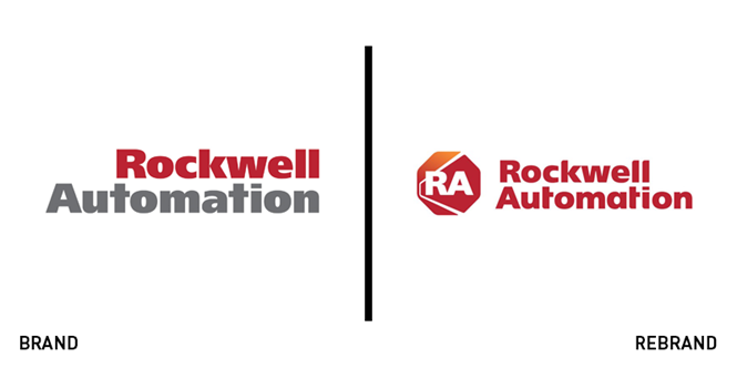
With a bold font monogram against an octagon-shaped background, Wisconsin-based Rockwell Automation unveils a new logo and pairs it with a renewed brand promise.
Discarding the dichromatic wordmark in exclusive favour of shades of red and orange, the new logo features slab serif typeface and what looks like a red ‘stop’ sign, acting as the background for an ‘RA’ monogram. A white line slashes through the octagon, but reason and concept behind this new design remain obscure and unclear.
On the surface, the new logo seems to inspire industrial rigour, which connects with the manufacturer. At the same time, such rigour does not inspire trust, and the lack of connection between the logo and the brand itself undermines the brand’s identity.
On the other hand, Rockwell Automation’s new brand promise talks about “expanding human possibility by combining the imaginations of people with the intelligence of machines.” However, this message is not supported by the company’s logo, which looks too anonymous to let such a statement come through.
As it is, Rockwell Automation’s new logo lacks identity and crisp. Better integration between the new brand promise and the logo could have been thought and planned differently in the design phases, to allow for a stronger, clearer statement right from the first impact with the company.


