Peer perspectives: Kate Spade
Fashion house and lifestyle brand Kate Spade has announced a new identity with the launch of its spring 2019 collection, blending pink and the brand’s iconic spade. Created in-house, under the guidance of new creative director Nicola Glass, the brand reimagines the world of Kate Spade
Project: Kate Spade rebrand
Reviewer: Katy Peck, brand strategist, Future Kings
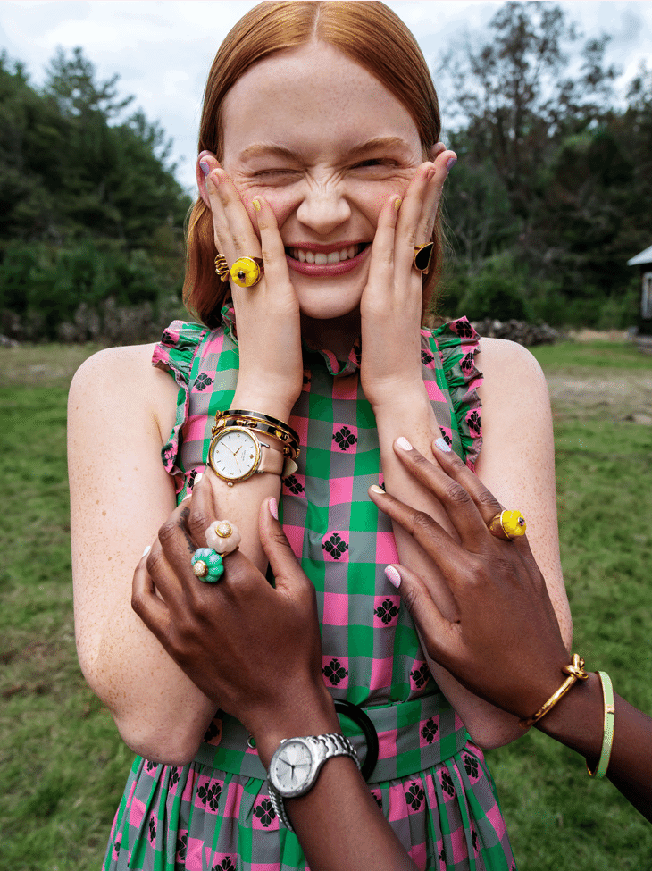
The power of pink: The Kate Spade rebrand is refreshing, sophisticated and bright. It injects much needed energy into the brand and nicely articulates a vision of ‘optimistic femininity.’ However, I did have to get past my initial negative reaction to the pink. But my fourth-wave feminist knee-jerk aside, the pink, a rouged watermelon, looks smart and positive – it’s just let down by the name. ‘Pink kiss,’ coupled with other sickly sweet palette labels like ‘honey bee’ yellow, leave an unfortunate aftertaste. Women buy your products, Kate Spade, not little girls.
A bold wordmark: The new wordmark balances the old and new nicely, elevating the design while protecting brand equity. Unlike many rebrands that try to simplify typefaces during rebrands, Kate Spade chose to keep their serif font, straightening the accents for a cleaner, sharper look. It also softened the wordmark with ‘clover’ green lettering – this green on pink pairing is carried through to their website and product designs, and I am sure will soon become synonymous with the brand.
Dropping the spade symbol from the logo allows the brand name to take centre stage. Simplifying the design also allows it to use flourishes of new patterns in brand communications without looking excessive.
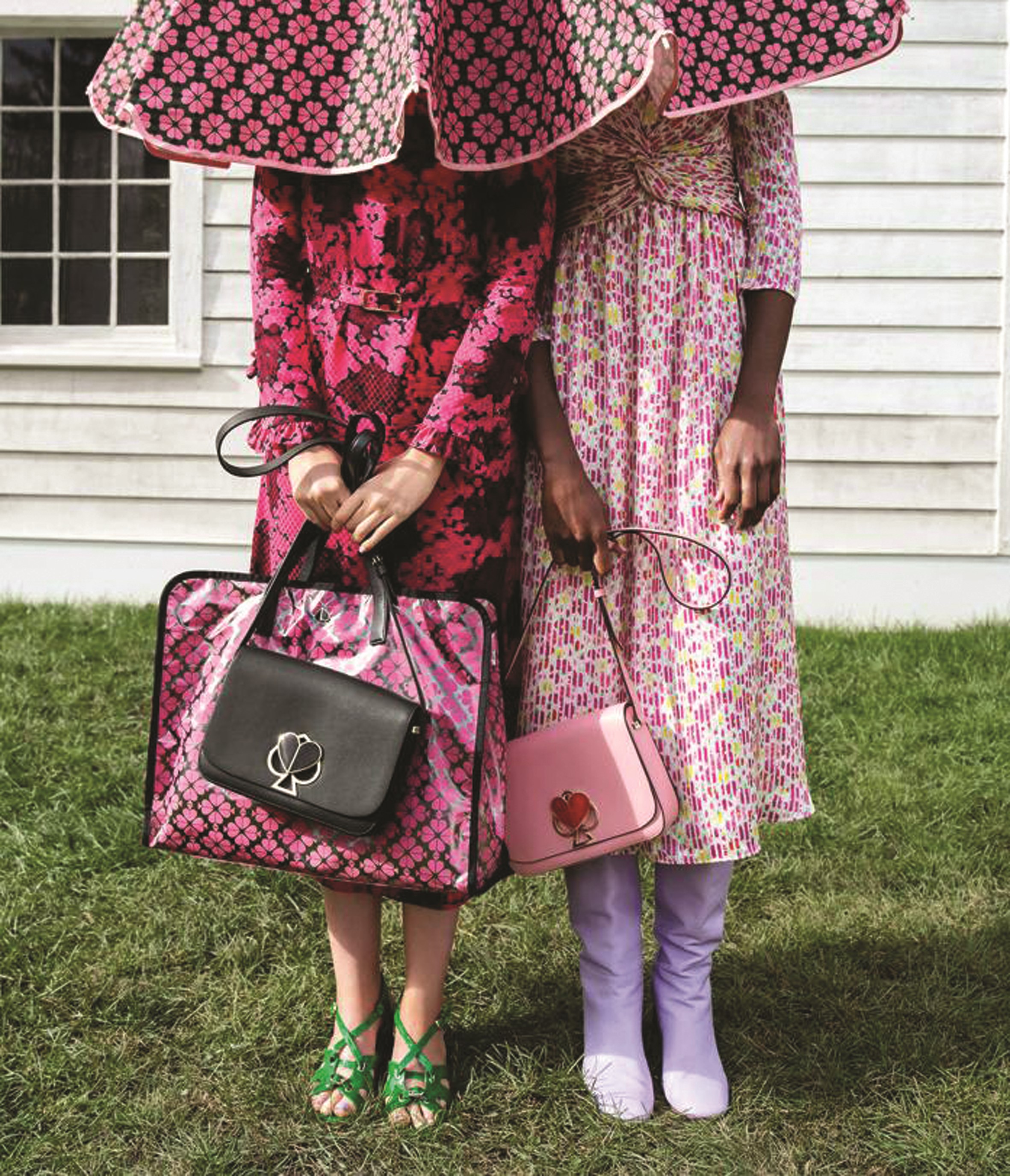
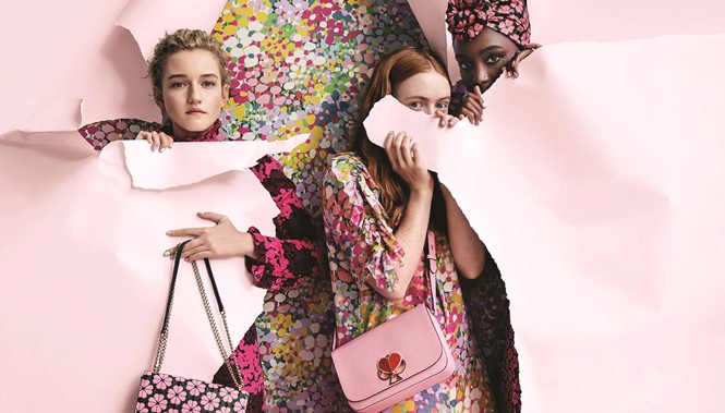
The many faces of the spade: By far the best part of this rebrand is the clever reimagining of the spade. First, Kate Spade updated its icon by enlarging the indents and shortening the stem to create something unique and ownable, and recognisably different from the spades seen in the average pack of cards. It then simplified the design further into halved heart shapes arranged in groups of four to create a gorgeous floral pattern.
Paring it back to three colours keeps it from looking kitsch and the closeness of the shapes stops it looking like wallpaper. This is a clever addition to their brand assets that can be used across both communications and product lines. Taking full advantage of the heart shape in the centre of the spade, the icon was reimagined as a twist-lock for handbags. The commercial savvy behind this rebrand is quite remarkable.
Mediocre messaging: For me, the biggest disappointment of the rebrand is in the messaging. Beyond the ‘pink kiss’ rubbish, some
of the brand’s messaging, particularly on its social media, tries to
take advantage of the female empowerment movement in the
public consciousness.
Kate Spade is, of course, not the only brand to exploit this and create what’s been coined ‘femvertising,’ but phrases like, ‘We are all the heroines of our own stories,’ ‘Speak your truth,’ and, ‘Discover your purpose,’ feel out of place for a handbag and clothing retailer. Stick to the products – I don’t need your heart-shaped twist-lock to feel powerful.
Final thoughts: Despite the imperfections, the rebrand is well considered and beautifully executed. It feels bright and joyful, it aligns with the brand’s vision, and it’s brilliantly commercial. The wordmark, the icon and the patterns all double up
as great details for designs and help differentiate Kate Spade in a saturated marketplace.