Organic ingredients inspire new packaging design for tea brand
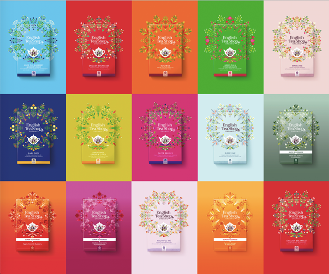
A new design for the English Tea Shop delivers a consistent look and feel across the 55 countries in which it trades, showcasing a strong, unified brand against a backdrop of sustainability.
London-based innovation, brand strategy and design agency, Echo, recently revitalised the brand identity and packaging for the sustainable organic tea brand, English Tea Shop.
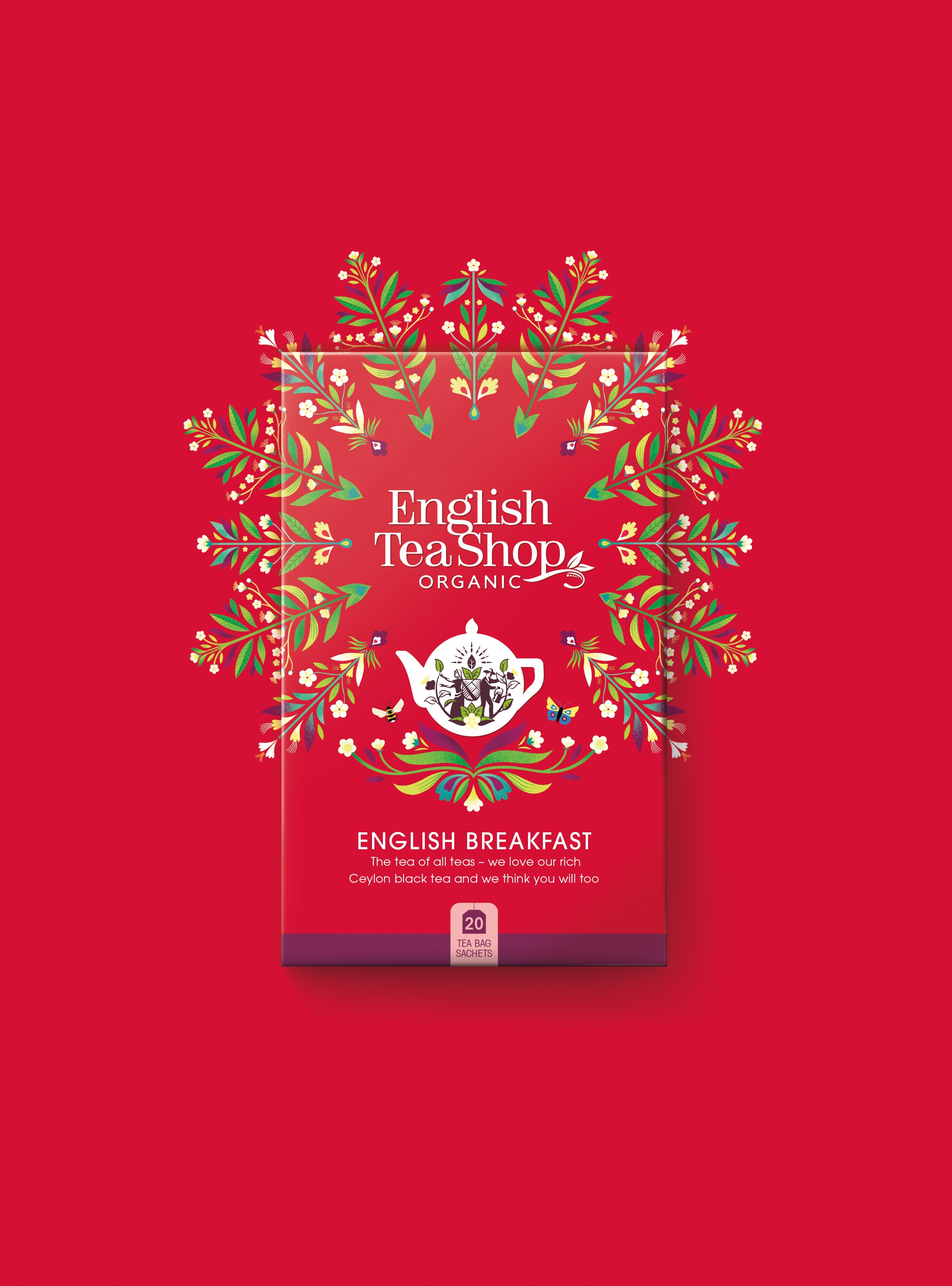
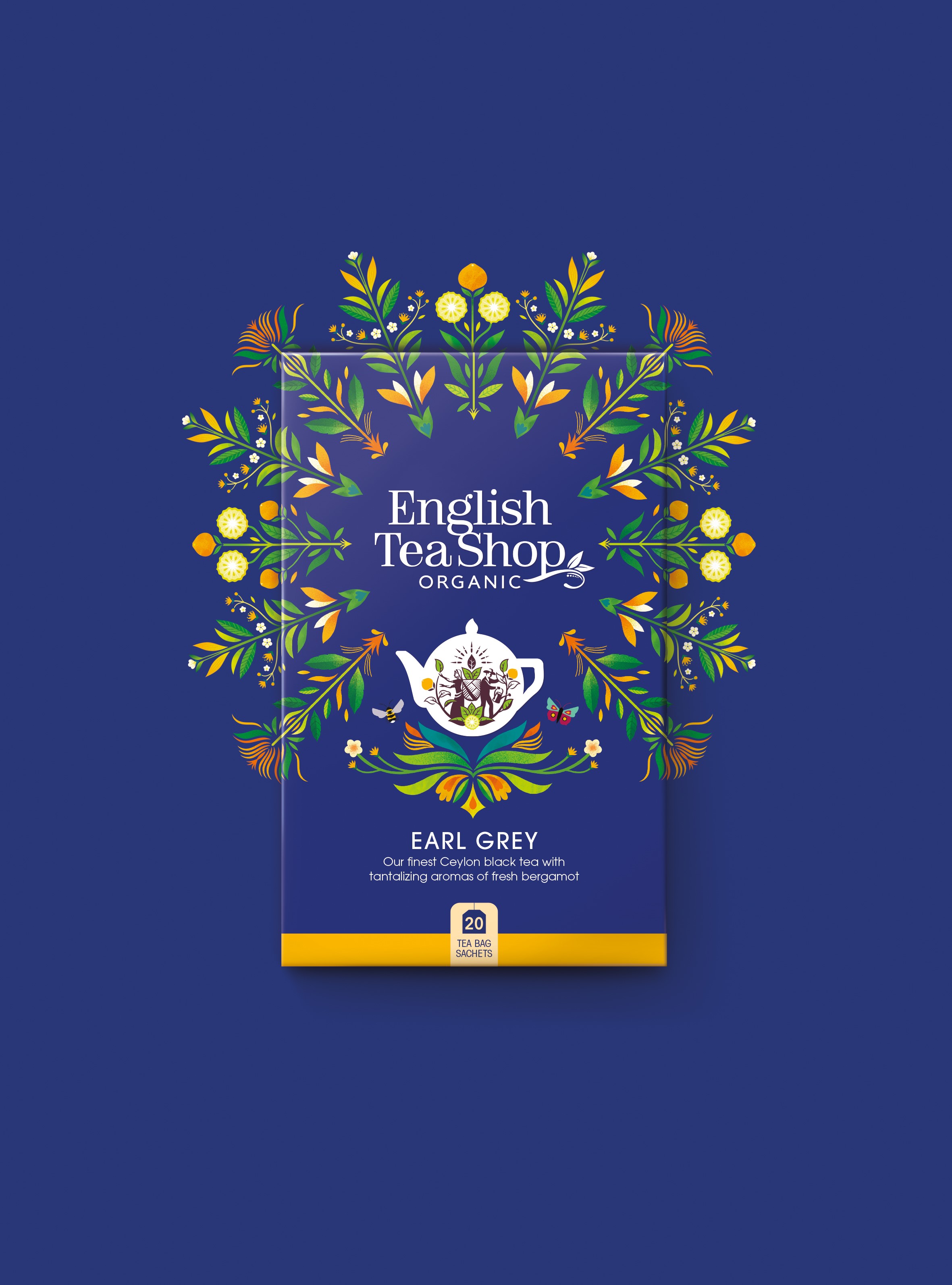
Nigel Ritchie, founding partner and creative director at Echo, explains that the vibrant, eye-catching colours were selected “to reflect the Sri Lankan tradition of celebrating colour in all its glory,” as well as to build a strong colour code to define the various lines. The new brand mark features the word ‘organic,’ a mandala design celebrating sustainable ingredients, a new teapot icon and on-pack illustrations telling the brand’s farm-to-cup story.
The new teapot icon – a classic round English teapot shape – contains the figures of a man and a woman nurturing tea plants, while the intricate mandala designs, created by French illustrator Margaux Carpentier, blooms from the centre of the packs, celebrating the product’s organic ingredients. The on-pack illustrations show an ocean connecting a farm and factory on one side, and an English tea shop on the other.
CEO of the English Tea Shop, Suranga Herath says, “Our brand has become synonymous with a taste and values that people want. We wanted to create a consistent visual identity across the globe, to help people recognise the products more easily, and during this process we’ve come to recognise that our farm-to-cup story is not simply an ethos we believe – it can become the unifying concept for the brand. Our rebrand goes beyond revitalising our packaging; it changes how we communicate and connect with all our customers.”