On my honour
The Scouts in the UK recently unveiled a major rebrand. But its success hinged on the effective development and implementation of a brand asset management system that could facilitate use by all of the organisations thousands of stakeholders. Brittany Golob reports on Brand iQ’s work with the Scouts
Robert Baden-Powell set out the ideals and ideas behind the Scouting Movement in his 1908 book, Scouting for Boys. His wife, Olave, and sister, Agnes, helped establish the Girl Guiding and Girl Scout organisations shortly thereafter. The movement flourished throughout Britain and the empire, now operating globally, through independent, local organisations. But the Scouts’ spiritual home is England.
For that reason, any changes to the UK’s Scouting brand would be scrutinised not just by the massive organisation across the UK and Northern Ireland, but by Scouts around the world. The new brand – and its implementation – had to be flawless.
But, with a brand comprised of thousands of groups, four national sub-brands and countless stakeholders, getting it right meant ensuring that from the time of launch, the new brand would be ready to use across print and digital touchpoints. To do so, asset management firm Brand iQ worked with the Scouts and with the design agency that created the visual identity, Not On Sunday, to make the brand ready.
“Day one, the quickest way of implementing the brand was going to be digitally, to get it online. And we saw that within minutes,” says Stuart Cripps, director of Brand iQ. The portal launched at 6am on 15 May and by lunchtime, there were 3,000 registrations. The agency has worked with the Scouts for a decade, so it had existing users and a thorough understanding of how the complex organisation runs. That knowledge proved invaluable to implementing the new brand. One of the key challenges was redeveloping the digital asset management portal to incorporate user-friendly design elements and ensure smooth adoption and acceptance of the new brand. If the portal didn’t work as promised from the beginning, users would lose faith and perhaps reject the new brand.
This required a two-pronged approach. First, was for the Scouts to work with its audiences throughout the rebrand process, ensuring buy-in from the beginning. Second, was for Brand iQ to have a redeveloped, fully functioning portal ready to go from day one.
When it first decided to examine its brand, the Scouts organisation posed some questions at a summit meeting with 6,000 volunteers and young people. It also conducted research with an addition l5,000 volunteers. The consensus was that the brand needed to be updated to “remain visible, relevant, trusted,” says Chris James, brand and ambassador manager for the Scouts.
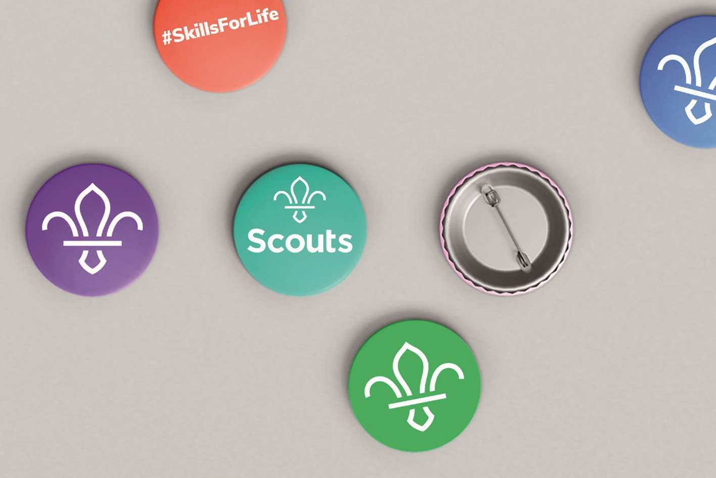
The summit provided further indication that the community desired change. “One of the buzz phrases which we circulated and which became a real catchphrase at that conference was ‘Skills for life,’” James says. “That really captured the benefit of Scouting. When a young person went through scouting and went out into the world, they’d be equipped with the practical skills, the employability skills, the character skills they needed to succeed. This really struck a chord and everyone said, ‘Yes, that’s what we do, we deliver skills. Let’s communicate this far and wide.’” The mandate was approved by the board, signed off and turned into not just a mandate, but the new brand positioning.
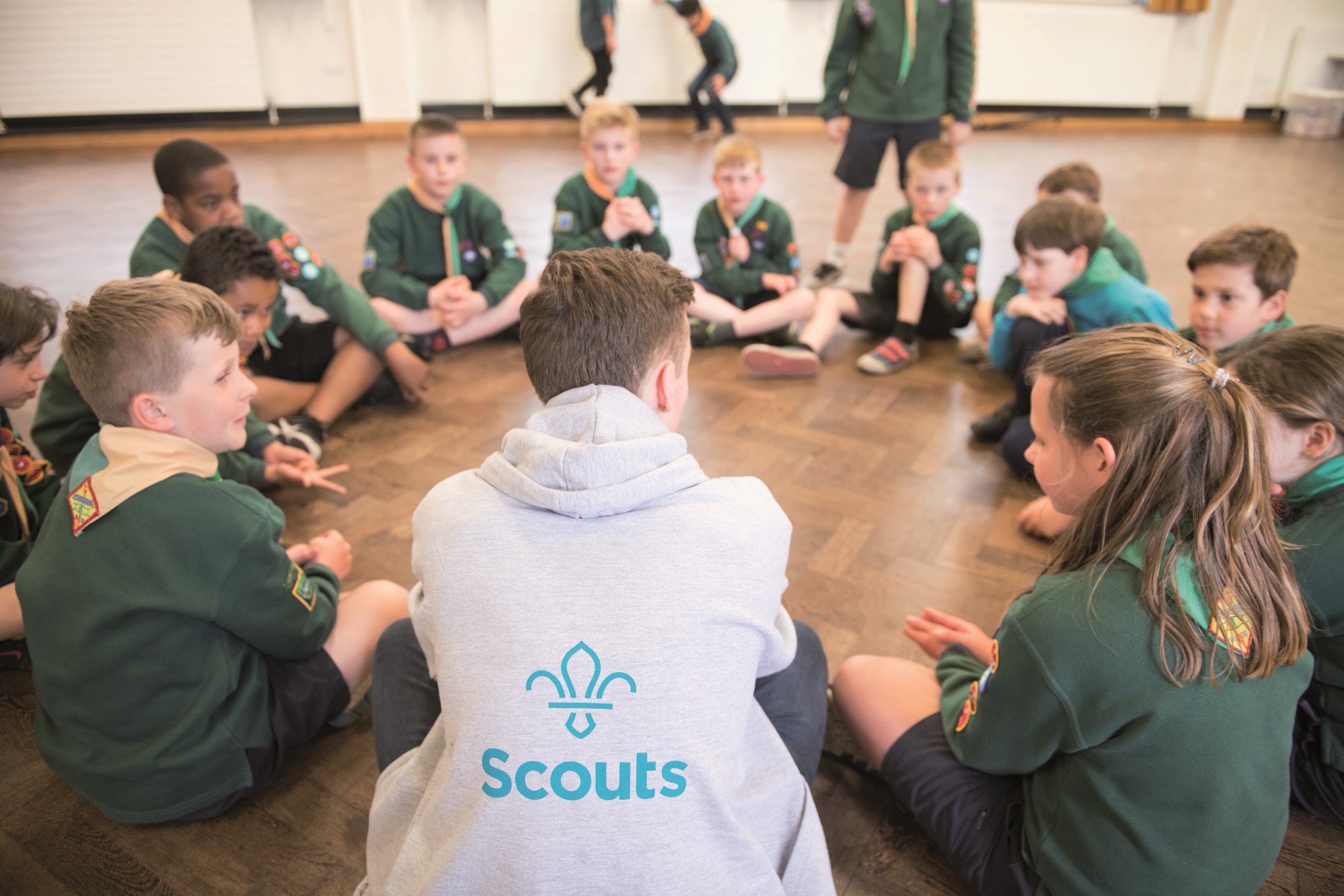
The process of implementing the brand had to follow a similar route. Scouting is no one organisation, but a movement driven by its volunteers, its young people and its brand ambassadors. Each of those groups had an interest in the new brand’s rollout. “All the components are centred around delivering this for 10,000 plus groups in the UK. They’ve all got different needs, they’ve all got different budgets, they’ve all got different signage requirements, they’ve all got different member bases,” says Cripps. “That has to be factored in.” To do so, Cripps and the Brand iQ team worked closely with the Scouts and with Not On Sunday to incorporate the brand’s ultimate representation on physical and digital touchpoints into the design of the new identity.
That led to a more inclusive brand, an updated image library and a localised visual identity that could be owned by each of the regions participating in UK Scouting. The new visual identity would have different core colours for each of the participating nations: purple for England, red for Wales, blue for Scotland, green or purple for Northern Ireland. Cripps says the core questions around that level of localisation were, “How do we actually deliver that and how do we make it work? How do we make the templates still intuitive and easy to use, but give the brand some options?”
The first step was making sure each group’s logo would be available for download, with minimal fuss, on day one. That simple step enabled registrants to enrol in and enter the portal on 15 May and proceed to download the pre-made logos already uploaded onto the system.
“All the components are centred around delivering this for 10,000 plus groups in the UK. They’ve all got different needs, they’ve all got different budgets, they’ve all got different signage requirements, they’ve all got different member bases”
But it also meant that the platform had to have an intuitiveness and ease of use to it. Brand iQ deployed a system that was straightforward and simple even for the least design-savvy user. Its e-commerce style helped with navigation and its immediate previews allowed users to make real-time changes to designs.
“We see onboarding as one of the biggest barriers to entry to the platform. The functionality becomes secondary if you cannot onboard your users. It’s about the mentality of the people using it,” says Cripps. Working with key stakeholders within the Scouts, existing users and good communications at the time of launch, the barriers were rendered virtually invisible.
The next step was getting the designs to print. Digital assets were easily available for download immediately, but Brand iQ also provides print support for everything from signage to t-shirts. That level of end-to-end production was crucial for the massive Scouts organisation. Image use was easily facilitated by the automated system as it could instantly check photo quality and direct users to alter their images if needed, based on the asset being developed. With so many volunteers and individual groups, the brand could have become diluted quickly with personal interpretations of the brand guidelines and poor print quality. By using templates, straightforward design strategies and providing quality print, the Scouts brand could be implemented across all touchpoints with the brand guidelines intact.
“There’s never a good time to rebrand,” James says. “Resources in a charity and at a local level are always stretched. It was really important we had quite a wide range of free resources ready to be used on day one so that if people wanted to update their social media really quickly and easily they could.”
Cripps agrees, “Gone are the days that you could just make something look good and not worry about how it’s going to work. We do spend the time with the agency that’s rebranding or the internal team that’s rebranding. Design for web-to-publish is very different than design for print because it’s got to work. I think one of the key things with the scouts brand that really brought that to life was the colour variation.”
The simplicity built into the process facilitated a successful brand launch. And the results are staggering. Not only has Brand iQ doubled the number of users from 4,000 to 8,000 on the brand portal, but the Scouts is stronger than ever before.
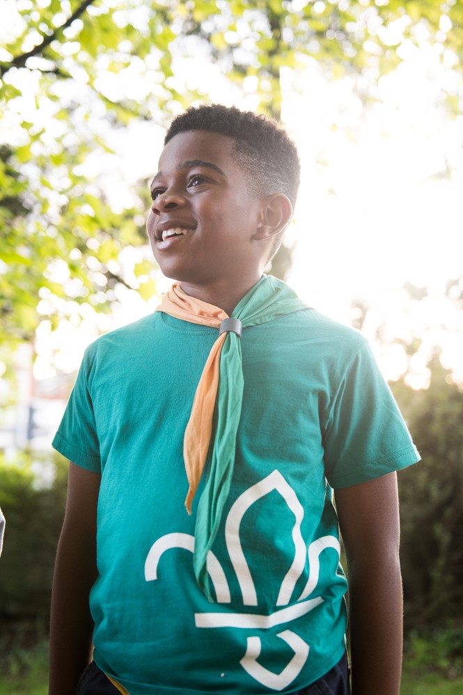
The ‘Skills for life’ positioning is taking root across the UK and target audiences are responding. Testing on non-traditional Scouting groups like black and minority ethnic young people and parents has revealed a change in the perception of the Scouts. Parents said they were 44% more likely to volunteer and teenagers said they were 33% more likely to join. Parents from BME groups said they were 69% more likely to send their children to Scouts. That has come as a result of a well-developed brand and positioning – including an updated tone of voice, typography, modern wordmark and fresh, active photography – as well as a seamless rollout and instant adoption by the majority of existing Scouts.
In the end, the biggest challenge from the major rebrand was acceptance for the modernised fleur-de-lys icon. Some claimed it was going against tradition to render it so simply. But then, searching through the brand archives, James and his team found one of Baden-Powell’s earliest sketches of the fleur-de-lys. It’s almost a near match to the one now being deployed by Scouting groups from John O’Groats to Lands End and from the Welsh coast to the shores of Northern Ireland.


