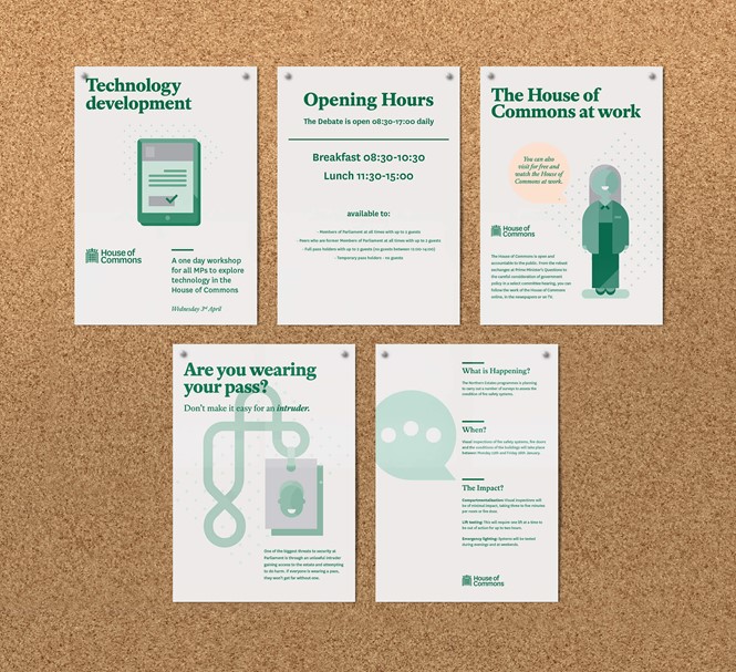
A new visual operating system for the House of Commons.
It’s a time when the UK’s House of Commons needs to communicate its work in a better way, as the house’s difficulty to find common ground on Brexit generated criticism of representative democracy.
The House of Commons had changed its visual identity in 2009 but the fact remains that this rebranding was insufficient, since it consisted merely of putting logos on printed publications or office supplies. A bolder rebrand is taking place since 2018, conducted by London-based design agency SomeOne, to make the House of Commons’ design system more efficient.
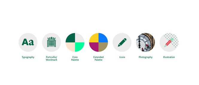
"A rigorous audit conducted by SomeOne of the current visual identity in use across the House of Commons highlighted particular challenges and opportunities for the new design systems," says Simon Manchipp, founder of SomeOne. "The new connected identity system will help the House to communicate far more effectively on digital platforms." Unlike the old one, the new design system is also meant to encompass signage, merchandise and digital communication. SomeOne conceived three different sized crowned portcullis designs - symbol of the UK parliament - and a new typeface to be used by the house on any format.
"The operating system we’ve developed for the House of Commons remains respectful of the past while welcoming current and future demands," adds Cosmo Jameson, design director at SomeOne. "Surrounding the central design elements are new aspects created to build greater engagement with the public and help them to stay in touch with the parliamentary landscape." The new visual identity of the house is also linked to a new colour system. Indeed, the house’s brochures, publications, assets and ads are now tinged with dark green.
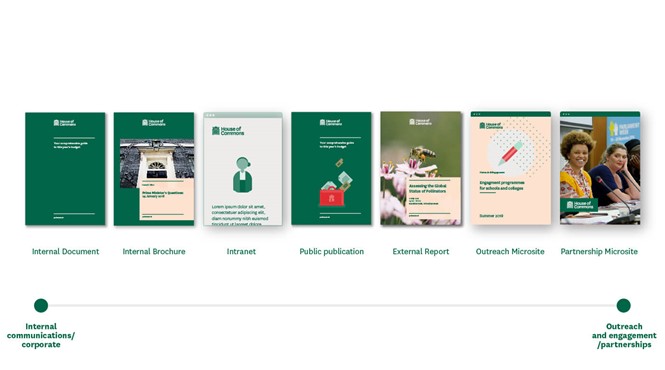
Jameson adds, "We looked to deploy an identity designed to work seamlessly across digital and print, while also supporting house teams in their work through the delivery of robust design systems, including lock-up structures, and communication materials. Enabling them to concentrate on the content, now matters of design are taken care of."
Eventually, the House of Common’s rebranding is likely to improve the way it communicates with its members and with citizens, as the house’s visual identity is more adapted to digital use and designed in a harmonious way.
For more from Transform magazine, sign up for the Transform newsletter here and follow us on Twitter @Transformsays.


