Molson portfolio draws on heritage, visual equity in rebrand
Branding Canadian national icons can be so straightforward as to lead to cliché. The country’s simple, iconic maple leaf flag allows its companies to tap into that brand equity with ease. Yet, everything from its sports teams to the beloved Canadian Tire to national flagbearer – literally and figuratively – Air Canada, uses some form of maple leaf-and-red logo.
Thus, the task of redeveloping a national brewing icon, Molson, without straying into stale design, was taken on by London-based agency BrandOpus. The designers had the additional challenge of updating a 233 year-old brand high levels of market penetration.
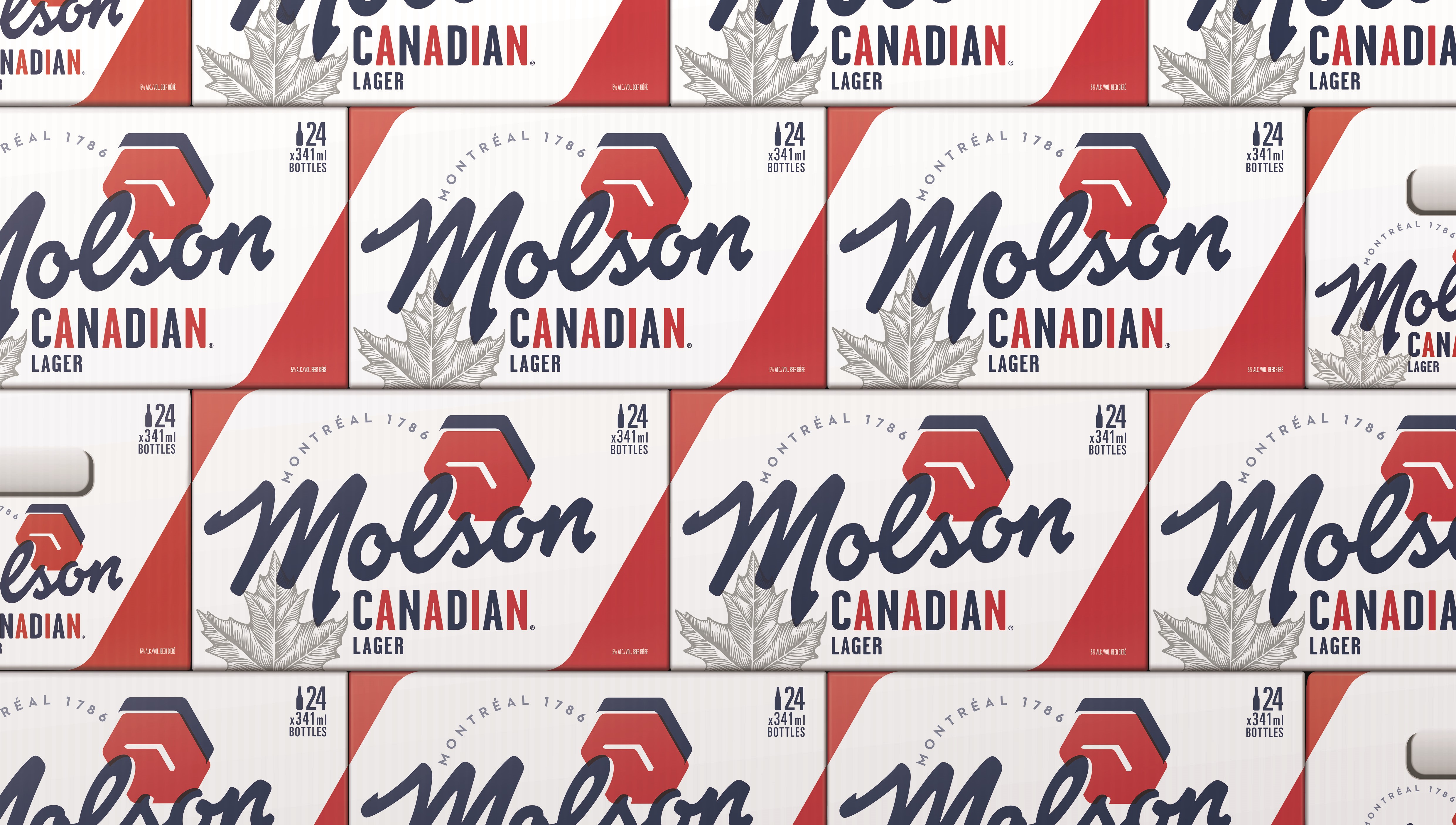
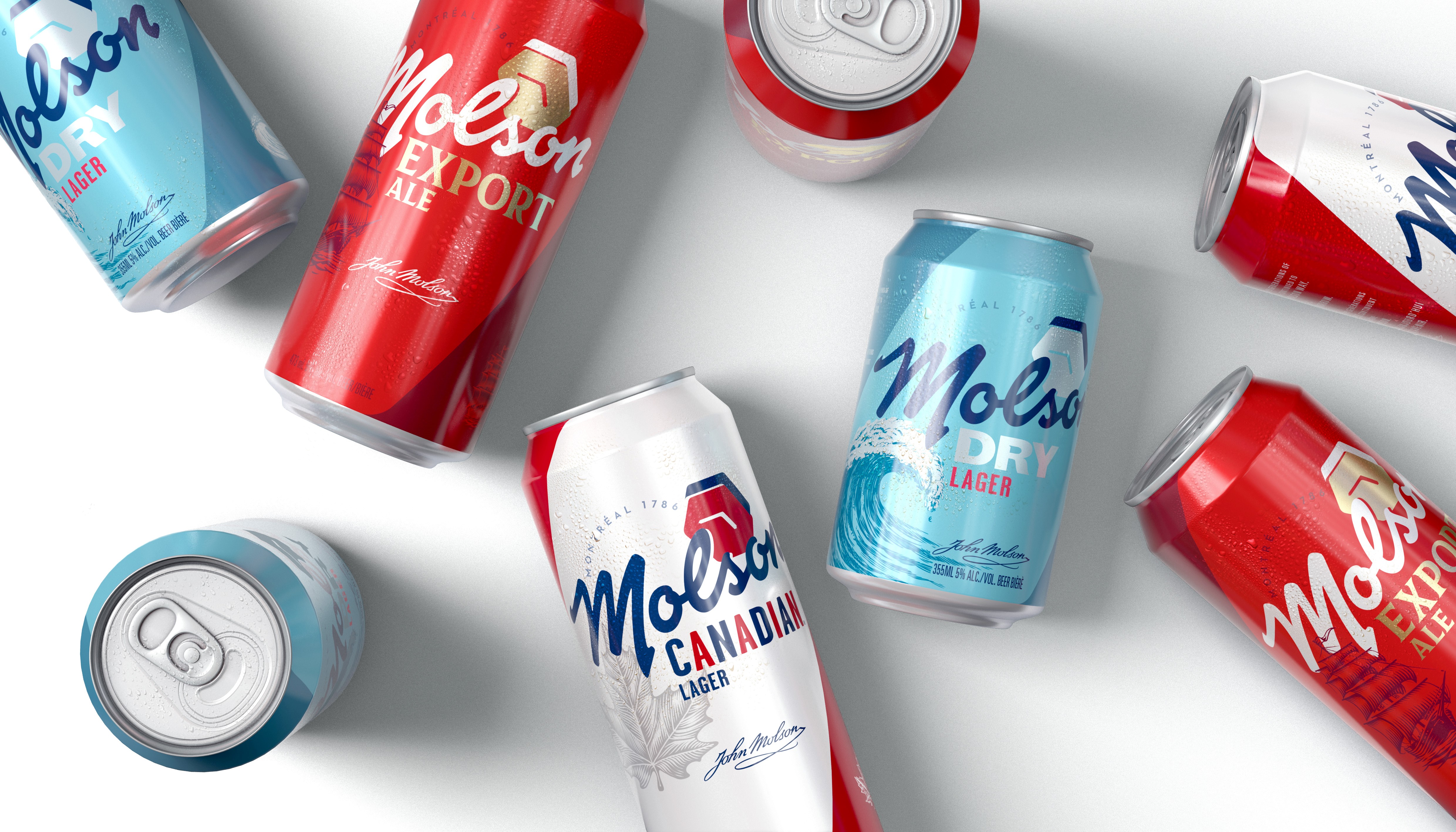
The result is a subtle, proud new brand that can be creatively applied across the company’s portfolio of beers. The portfolio is anchored by two key elements – a signature-style wordmark and a colour palette that blends Canadian branding with modern beer packaging.
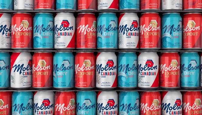
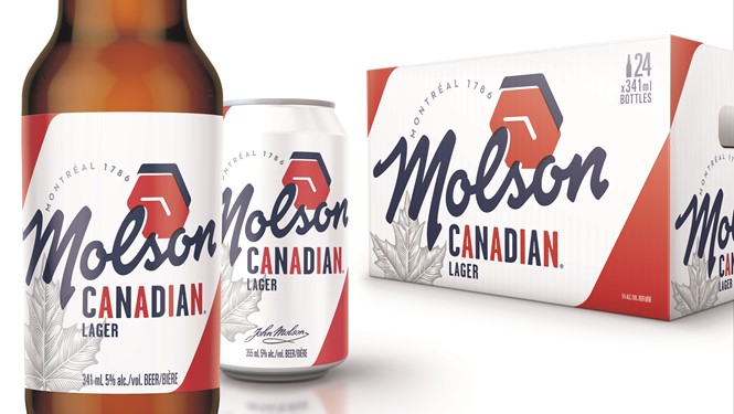
Each sub-brand carries the Molson script logo and a unique hexagon icon, but each has its own colour palette and secondary illustrations ranging from a cresting wave to a hand-drawn maple leaf. On flagship lager Molson Canadian, BrandOpus retained the iconic red and blue lettering from the previous branding, but it has now been deployed more cleanly.
To achieve this, BrandOpus went through the archives. It took its cues from visual equities once lost to history, Molson’s impact on Canadian culture and founder John Molson’s legacy. Nir Wegrzyn, global CEO of BrandOpus says, “By diving into Molson’s past we were able to leverage a new identity which reflects Molson’s future whilst ensuring it feels relevant to today. The new masterbrand creates a unified portfolio in which each product plays a clear role in the consumers lives.”
The branding may also help Molson’s beers stand out from their peers of craft heritage. Canada is no stranger to the craft movement and its customers are passionate. But for a brand of such national prominence as Molson, an update may prove successful in terms of financial performance and brand awareness. Joy Ghosh, senior director of marketing at Molson Coors Canada says, “This new visual identity is not just about commemorating our 233-year history, but it’s about our drive to keep the legacy going. To act today and inspire tomorrow.”


