Heal’s uses brand design to stand out from the crowd
British furniture and interiors brand Heal’s has unveiled a new brand identity applied across clicks and mortar, designed to position it as an arbiter of style in an increasingly competitive market.
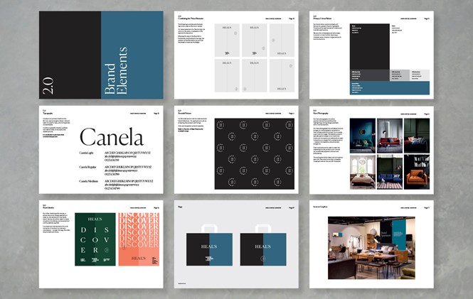
Created by London-based design agency Deep, the rebrand includes a new roundel and a more "expressive and engaging tone of voice, a rich interiors-led colour palette and a modern typographic style inspired by Heal’s past," according to Deep creative director Grant Bowden.
Heal’s head of marketing Ruth Cotterell commented, "We strongly believe that the new brand will give us that edge that allows us to stand out from a crowded market."
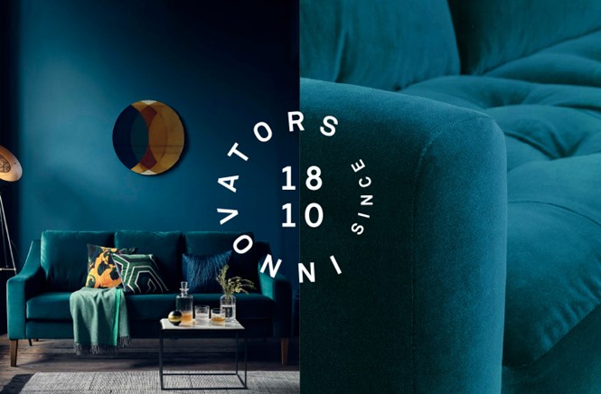
The new brand is intended to underscore the brand’s position as inspirational, design-led and dynamic, whilst being sympathetic to its British heritage and the pioneering spirit it has had since 1810.
"The Deep team was fully immersed in the abundant history behind Heal’s but we all wanted to push its modernity as a leading contemporary furniture and homeware offering. Deep worked with our internal teams to embrace a new brand position and to guide us into a new creative feel that we could take forward," Cotterell added.
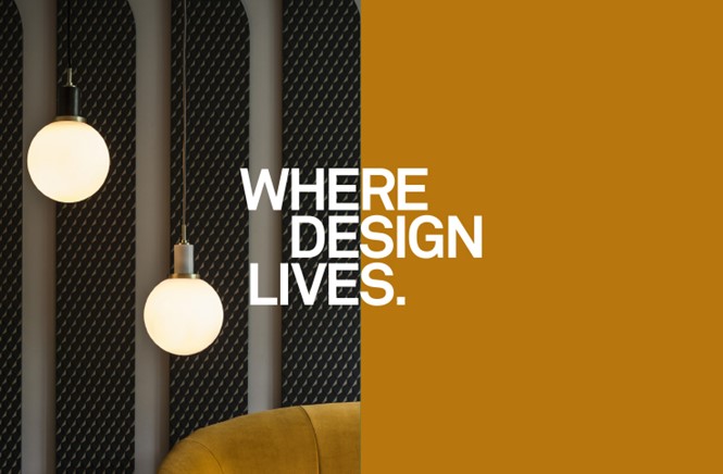
Charlie Eiles, brand and digital strategy director and partner at Deep, observed, "There is no doubt it was a pioneering business that lives and breathes design but this was underplayed and we needed to strengthen its voice and give the brand the personality to make it heard. We wanted to get into people’s minds and inspire customers to step into Heal’s and return again and again — it truly is an arbiter of style."
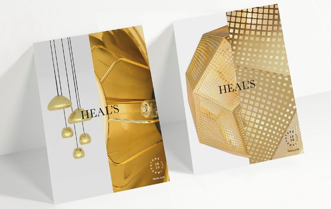
As part of the visual identity, Deep developed a recognisable ‘split’ as a key graphic to allow flexibility and creativity to a broad range of creative outputs. An extensive brand book was to explore the versatility of the design language and messaging, to set photographic guidelines and rules for the brand in-store and across digital.
"The new visual language and tone of voice defines Heal’s modern proposition, whilst being sympathetic to its rich design heritage. The graphic split allows the identity to be hugely flexible whilst retaining consistency across all the brands communications," Bowden added.
For more from Transform magazine, sign up for the Transform newsletter here and follow us on Twitter @Transformsays.


