Culture, colour and archaeology in Lanzarote museum brand
Across the Mediterranean, archaeological museums share the hidden histories and treasures of the people and cultures that came before. For the Canary Islands, which lie in the Atlantic off the west coast of north Africa, that is no less true.
With a heritage shaped by the Mediterranean societies of the Roman empire, the Greeks, the Phoenicians, the Spanish island of Lanzarote has archaeology indeed. Its Ottoman heritage further left traces of the people who once lived there.
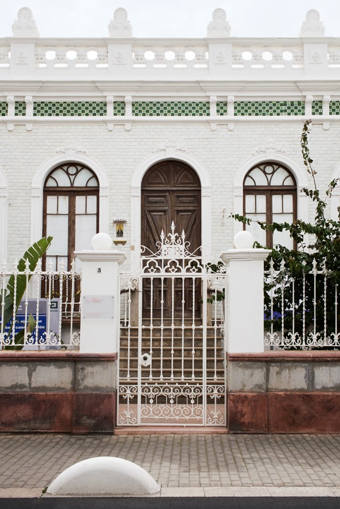
Now, the Museo Arqueológico de Lanzarote is sharing that cultural heritage with visitors and locals alike. After five years of development, the city council is opening the museum this spring. It worked with Barcelona-based Folch Studio to craft an identity that would be both modern and heritage-driven.
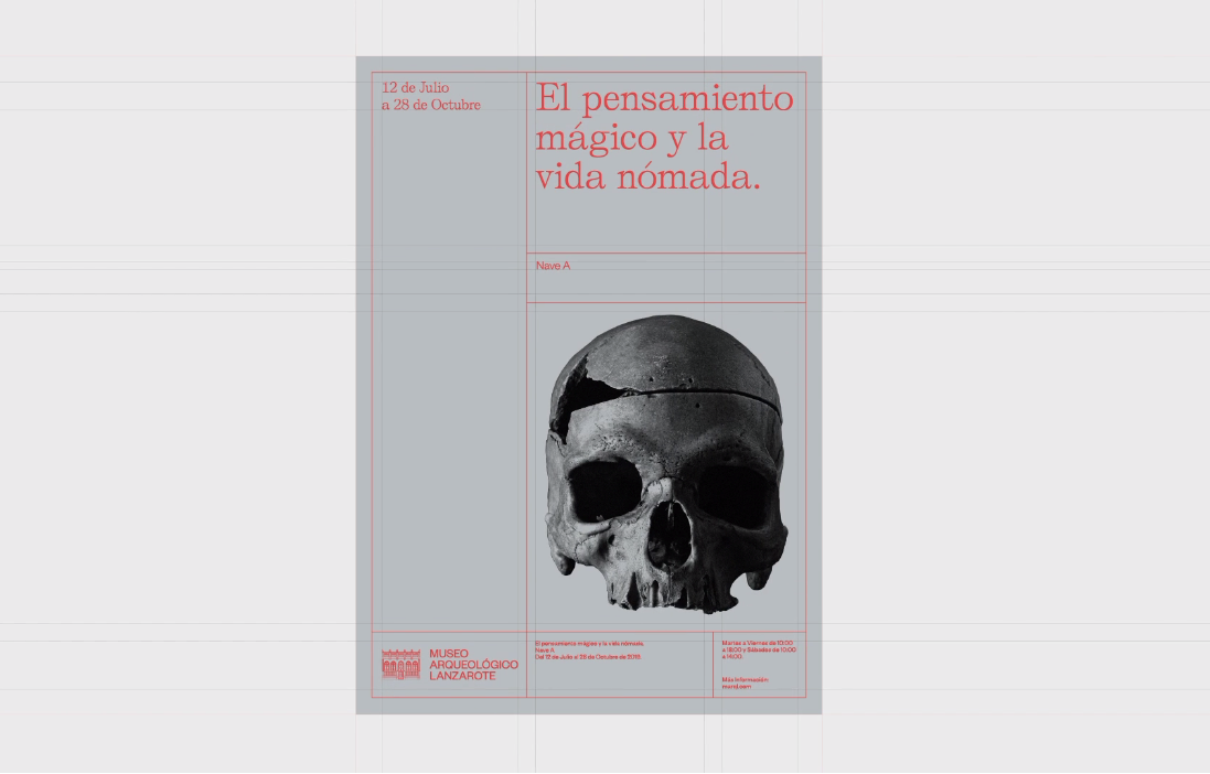
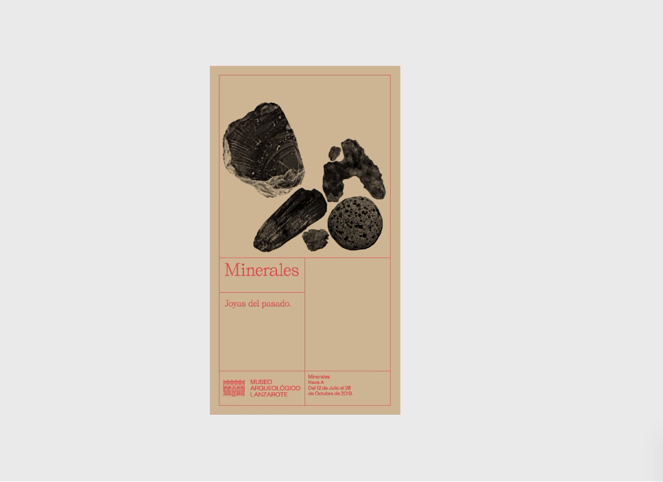
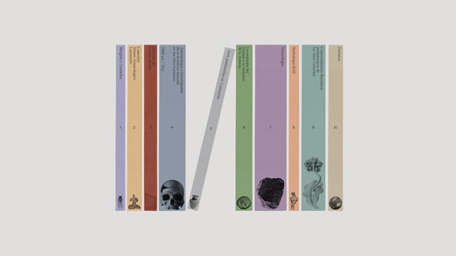
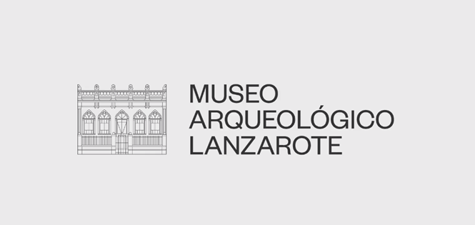
The strategy relies on a simple, typographic-driven brand, with a colour palette that reflects the islands themselves and hero photography of the museum’s treasures. The light-handed logo includes a line drawing of the museum’s villa locale.
“The challenge was to brand such a long name and/or a contraction of a difficult pronunciation and verbalisation,” says Albert Folch, creative director and founder of the agency. The result was a simplified MAL monogram used on building signage. The visual identity also relies on two complementary, elegant typefaces to bring a sense of modern distinctiveness to the brand.
But, says the agency, “The otherwise stripped identity needed an interesting pairing in terms of colour. The black text treatment is paired with the secondary colour – a warm coral to reflect the temperate soil, alongside a wide earthy palette based on the pigments of the building, its archaeological elements, and the surrounding environment.” The colour palette is further developed through the use of an animated icon that may provide valuable for digital touchpoints.
Finally, the brand uses an archaeological grid system that reflects the way scientists mark out digs in the field. This acts as both a rigid grid to help orient marketing materials, but also works as a visual device linking the artefacts and colours to the archaeological heart of the museum. The resulting brand is implemented in a subtle manner across the museum, allowing the architectural value of the villa and the cultural aspects of the museum’s content to stand in the spotlight.