Comic Relief and Red Nose Day rebrand aims for clarity
Comic Relief has announced two new logos for the company and its main fundraiser, Red Nose Day, to modernise the brand and clear up ‘confusion’ about the charity’s identity.
For the first time since it was founded in 1988, Comic Relief has announced a rebrand to ‘re-energise’ the charity and eliminate confusion about Red Nose Day. The new brand aims to target both older generations and younger people, with an identity both ‘fun and entertaining’ and ‘serious and compassionate,’ to suit different situations. According to the UK-based organisation, some believed that Red Nose Day was the charity and both brands needed to be modernised to tackle the issue.
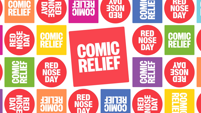
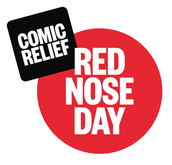
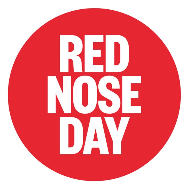
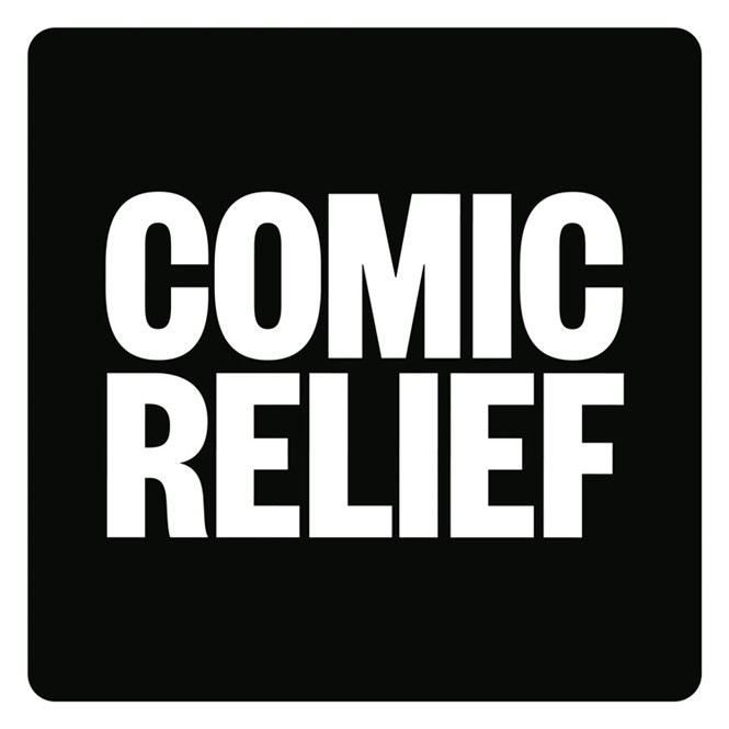
The two new logos were designed by London-based agency Whistlejacket and show a sans serif white wordmark for both brands, placed respectively inside a black square for Comic Relief and a red circle for Red Nose Day. The old typeface was dropped in favour of the new design.
The new logo aims to be flexible, in order to fit the names of different Comic Relief fundraisers and activities besides Red Nose Day. Animated versions of the logo have been created for TV and digital use, with an extended palette made up of bright and lively colours.
After an eight-year-long decline in donations, the rebrand is no doubt an effort to re-energise the charity.
Its new branding feels fresh and cheerful, showing the charity’s efforts to modernise its message. It will be rolled out across all of the Comic Relief main touchpoints in the next few months, ahead of Red Nose Day on 15 March.


