BT Group's new identity shows the purple side of the brand

To celebrate its 50th birthday, BT Group has unveiled a new identity by London-based studio Red&White, to change the overall image behind the brand. Red&White’s work showcases the company beyond telecommunications, putting emphasis on all the other services the BT Group is now providing to end customers.
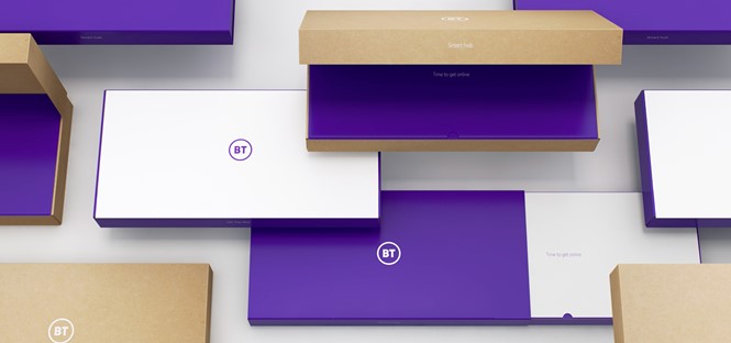
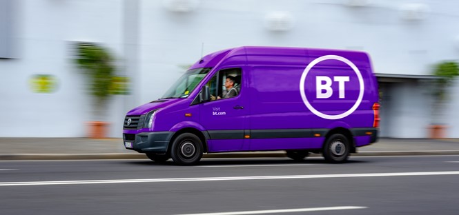
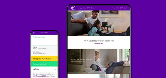
BT’s new visual identity goes full purple to reflect its brand colour from the past seven years, whilst discarding the old blue lettering. The rebrand is part of a wider strategy to increase public awareness of the company’s services, which embrace subscription television, broadband, mobile and more.
The new brand, however, comes about one month too late, following the silent introduction of the company’s new logo in May. Perhaps involuntarily, BT Group has set an eerie example in how not to rebrand a major company: last month, the minimal logo’s deployment came on its own, exposing BT’s side to criticism about its communication strategies. It led to contrasting feelings in both the branding world and the company’s audience, leaving them without guidance on what has become the first step of a major rebrand.
Red&White’s work tries to put a patch on the resulting backlash. It introduces a new global image to modernise the organisation, and it is meant to draw attention to the company’s efforts towards equality, sustainability and the environment, with pictures and posters including stories from BT’s everyday users.
BT Group is committed to using 100% renewable electricity around the globe by 2020, and it is already working to reduce gender pay gap across its departments. By putting the company under the spotlight, Red&White’s rebrand helps BT boost that newfound confidence it needs to tell its stories, through an overarching new brand which is already being rolled out to all of the company’s touchpoints.
For consistency, the new identity employs the legacy BT Font across the company’s main sub-brands, paired with the new sans-serif logotype.
For more from Transform magazine, sign up for the Transform newsletter here and follow us on Twitter @Transformsays.


