#TransformTuesday: 6 March
Every week, Transform examines recent rebrands and updated visual identities. This week’s picks are below. For more from #TransformTuesday, follow @Transformsays
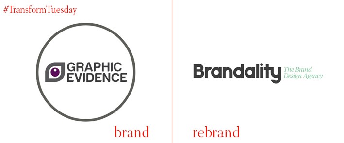
Brandality
Graphic design agency Graphic Evidence changed its name to Brandality, marking the brand’s general revamp in its service offerings. In the words of founder and creative director Adam Arnold, “Graphic Evidence as a name has served us well, but we’ve evolved since our beginnings in 2003 and now need a name to better reflect who we are.” The new name of the brand is in actuality a play on the word ‘personality’, which is a clear indication of what the brand has its focus on. Along with the introduction of the new name, Brandality has introduced new processes, partnerships and branding services in an effort to connect with their customers.
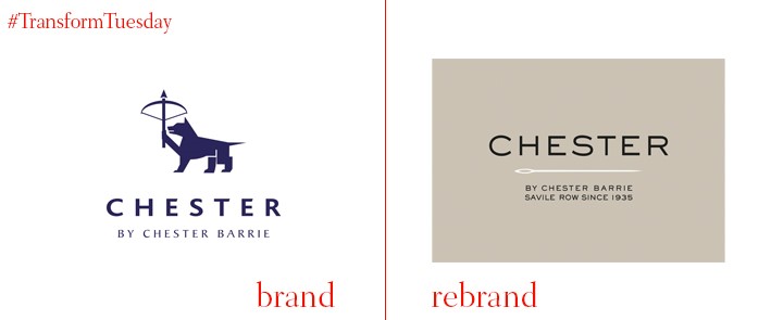
Chester by Chester Barrie
In an effort to broaden its customer base and appeal to a younger audience while reinforcing its premium “quintessentially British” positioning within a competitive industry, Reggie London has re-positioned and redesigned the Chester by Chester Barrie brand for the leading Savile Row tailors. Paul Brooking, Reggie London founder and creative director, says: “Bringing new customers to the brand was central to the brief. We needed to change perceptions, showing the brand’s outstanding commitment to quality and style was accessible and attractive to all discerning men rather than just older, more traditional elite.” The logo of the company has been significantly simplified, with the dog and crossbow logo in blue and white giving its place to the more elegant and minimalist use of Sackers Gothic font and simple needle motif in a taupe and black palette. Despite its modern makeover, Reggie London suggested adding ‘Savile Row since 1935’ to showcase the brand’s heritage.
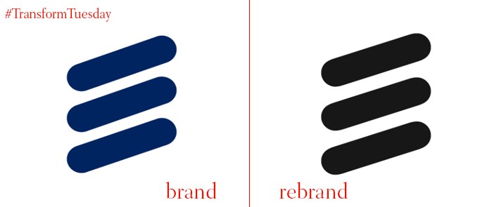
Ericsson
Established in 1876, Sweden-based company Ericsson has now introduced a revised icon designed by Stockholm Design Lab. The new, improved geometry helps it align smoothly and effortlessly with the pixel grid. Its angle, curvature and spacing have all been adjusted for optimum performance. While those changes are so refined they are nearly invisible to the naked eye, the overall change results in a smoother on-screen translation. Ericsson’s new identity goal is to deliver tools for simple communication and great product performance while putting functionality over aesthetics, which will consequently reflect Ericsson’s technical expertise. Stockholm Design Lab’s task of improvement of the entire visual system, caters to the customers’ needs and is a direct response to Ericsson’s business strategy and brand promise, the quest for easy.
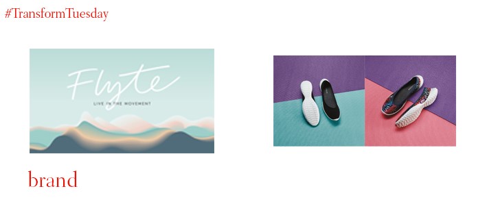
Lissom Flyte
Lissom Flyte is an up and coming shoe brand that has just made its debut in the world of retail and owes its identity and design to creative branding and communications agency Our Design Agency (ODA). The name, which was the agency’s idea, is an amalgamation of the words flexibility and light that also combines the meaning of Flight, a podiatry term for the foot in motion. ODA additionally created the brand identity, tone of voice, website design and marketing collateral. Jennifer Markham, creator of Lissom Flyte, describes, “ODA’s deep understanding of mat-based practices such as yoga and pilates informed the strategy and design from the outset, so the brand speaks to our core audience, but also feels accessible and aspirational.”
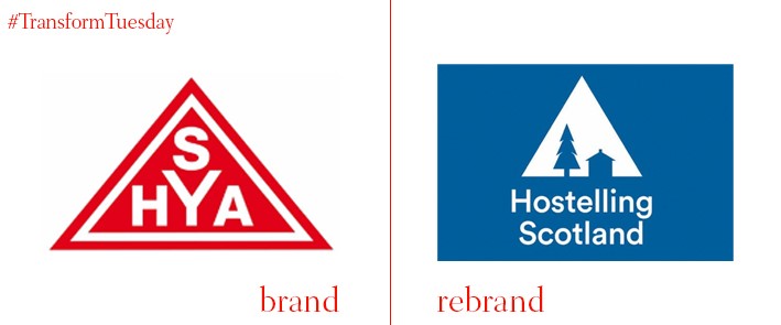
Hostelling Scotland
Previously known as the Scottish Youth Hostels Association, the charity that counts 87 years, 160 staff member and an income of £9m in 2017 has undergone a rebrand by the Glasgow-based agency Frame. It is now called Hostelling Scotland. The reason behind this identity change is that a market research revealed that people found its previous logo to be dated and baffling, as the acronym SYHA gives no indication of what this organisation is about. According to Margo Paterson, chief executive of Hostelling Scotland, “There are a lot of young people who know about hostelling abroad and we want them to know it's also here on their doorstep.” The charity’s new look, incorporates the internationally recognised symbol for youth hostelling while its background colour reflects the Saltire.
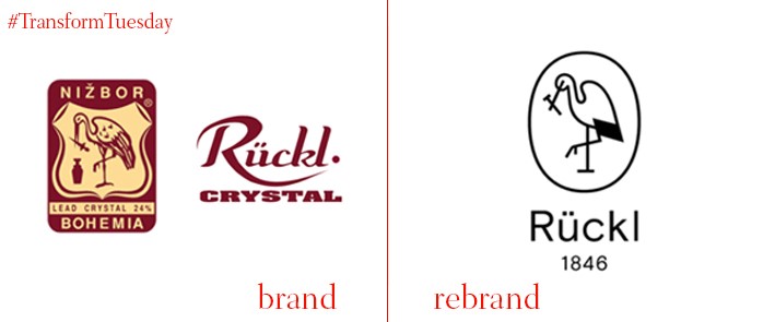
Rückl
Based in Nižbor of the Czech Republic and with a presence in the industry since 1846, Rückl is a family owned glassmaker that underwent a rebrand designed by Prague, Czech Republic-based Studio Najbrt. Without wanting to stray too far from the original 1901 logo that featured the bottle-opening stork due to its historical significance, the redesign of the logo managed to cater to the current demands by making it as readable as possible even in small sizes, such as on screens. While the bottle of pharma glass no longer exists both in the logo and as the company’s main product, the elegant linear bird with the plug in its beak remains. The colour scheme that was adopted is black and white, which mimics the color of the stork’s wings and is complemented by light apricot.

Teva Pharmaceuticals
Teva Pharmaceutical, the largest generic drug manufacturer in the world, has given its branding a makeover as part of its global reformation plan. The launch of a redesigned logo and website with its new brand positioning took place in North America last week. According to Iris Beck-Codner, EVP of global brand and corporate communications at Teva, some of the countries Teva’s rebrand has reached are are France, Russia, and Argentina. "We relaunched our brand on the heels of the recent restructuring," Beck-Codner says. "It provided us with the opportunity to galvanize employees internally and leverage the new brand and look to optimize our portfolio. We wanted to reduce complexity and increase our ability to react to change and keep pace."


