#TransformTuesday: 27 March
Every week, Transform examines recent rebrands and updated visual identities. This week’s picks are below. For more from #TransformTuesday, follow @Transformsays
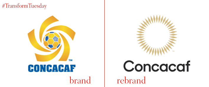
Concacaf
The Confederation of North, Central American and Caribbean Association Football, usually shortened to Concacaf, has released an updated visual identity and logo. Following a project led by London-based agency, DesignStudio, through its new branding the confederation portrays values of inclusivity and universality – this is especially represented in its neutral gold, grey and black colour palette. The previously capitalised acronym is shortened to reflect Concacaf’s integration into the footballing canon, and DesignStudio has added subtle touches such as including 41 points in the logo to represent the 41 teams of the organisation.

JetSave India Tours
In operation since 1990, JetSave India Tours creates bespoke tours across the vast country of India and specialises in securing visas for those who wish to travel from overseas. The company has stripped down its visual identity and reversed its white-on-red aesthetic to present a more professional, corporate-oriented brand. Enhancing a professionalism that was potentially lacking, the rebrand is complemented by an animation which builds a key sense of adventure.
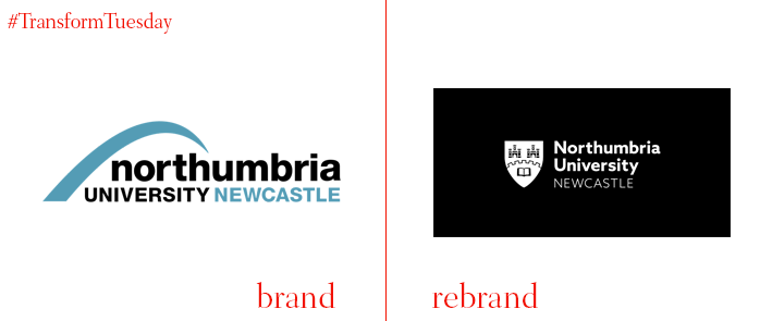
Northumbria University
Based in Newcastle, UK, Northumbria University was established as a new university in 1992. Under the core brand concept of #TakeOnTomorrow, the university has created a new logo from its previous coat of arms. While reflecting its history, the stripped-down version is more digitally-friendly and versatile to show the changes afoot at Northumbria University. The university says, “Whilst we believe the new logo is a confident statement about our future direction and a celebration of our heritage, we wanted to make sure that our stakeholders agreed… we carried out extensive research with current and prospective students… as well as representatives from the business community and our alumni.”
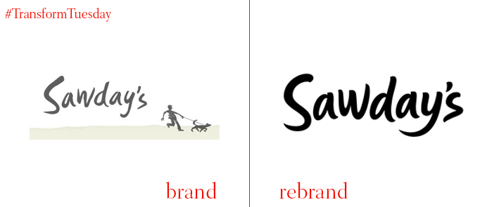
Sawday’s
Bespoke travel brand Sawday’s was launched two decades ago by Alistair Sawday. Still going strong, the company has recently rebranded, launching an updated logo drawn by UK-based typographic artist Rob Clarke. The overall visual identity, developed by Somerset, UK-based designer Damon Charles, reflects the whimsical and adventurous nature of the Sawday’s brand, using photographic imagery to reflect the vibrancy of the seasons. On the Sawday’s project page, Damon Charles says, “We drew an updated wordmark for Sawday's which felt friendlier but also more sophisticated, while retaining the interesting quirks of the existing mark… we worked to retain… the tail of the lower and uppercase ‘S,’ the distinctive shape of the ‘a’ and ‘w’ characters, and the rhythm between all the lowercase letters.”
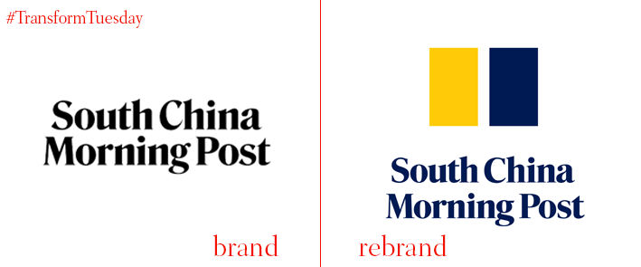
South China Morning Post
Reflecting its move from regional newspaper to respected global publication, the South China Morning Post has released a new visual identity. Employing bold colours in place of its previous black logotype suggests a new corporate identity accessible via an ever-expanding roster of digital platforms, while the yellow and blue is a nod to Hong Kong’s rich maritime heritage. Gary Liu, CEO of the South China Morning Post, says, “The new branding represents the future of the South China Morning Post. As we grow into new marketplaces across multiple platforms, we need to have an identity that is simple, recognisable, and iconic – one that tells the story of who we are, where we have come from, and what we hope to achieve.”


