#TransformTuesday: 27 February

Every week, Transform examines recent rebrands and updated visual identities. This week’s picks are below. For more from #TransformTuesday, follow @Transformsays

Air Italy
Airline conglomerate AQA Holdings has rebranded leading airline Air Italy, as it prepares to overtake insolvent Alitalia as Italy’s largest airline. The rebrand is clearly meant to set the airline apart from Alitalia’s very Italian use of red, green and white and align it with the burgandy in Qatar Airways livery. The branding, though modern and playful, isn’t instantly identifiable as Italian. To address this issue, its use of turquoise could be easily be swapped out for a deeper green to present itself with an Italian wine and olives palette. Overall, the rebranding evokes more reliability and style than its previous incarnations, and with Qatar Airways in the cockpit the service and reach of the airline is sure to improve.
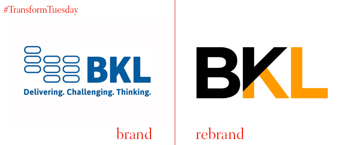
BKL
London-based Kimpton Creative has rebranded Berg Kaprow Lewis (BKL), a British firm of chartered accountants and tax advisors. Close to double its size in five years, the firm felt due for an identity refresh. Kimpton Creative helped to define BKL’s brand strategy, which centred around the core proposition and existing BKL value of ‘Making a difference.’ A new visual identity uses an angle in the logo to divide what is untouched by BKL and what is inspired by BKL. The new branding is stronger and more engaging than its predecessor, emphasising an upwards trajectory of black contrasted against orange that fits its new 'Build bright' motto. The logo is corporate but as sophisticated as accountancy can be. Its rebrand is reflected across all of its collateral.
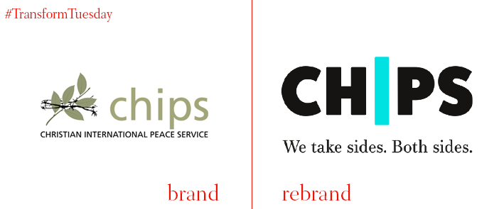
CHIPS
Birmingham, UK-based IE Brand has updated the logo and brand positioning of CHIPS (Christian International Peace Service). The charity works with groups on all sides of conflicts and has emphasised this position in its branding. Its new strapline, ‘We take sides. Both sides,’ is emphasised in the ‘I’ at the centre of of CHIPS. IE Brand also designed the bespoke CHIPS Press typeface for the organisation. The result is more inline with its mission than its previous, fairly dated, logo, which takes a bold stance against conflict and emphasises the need for a unified approach to global peacemaking.
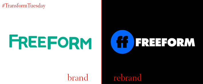
Freeform
Two years after rebranding ABC Family as Freeform, the TV channel has a new logo and identity. The best way to understand ABC’s angle is to watch its tagline ident ‘A little forward,’ showing that the brand is young, empowered and female. The short is excellent and creative. The logomark looks quite a bit like Facebook and the wordmark is youthful and fun while being more mature than its original identity. Overall, the rebranding is a clear indicator of where Freeform is heading, going forward.
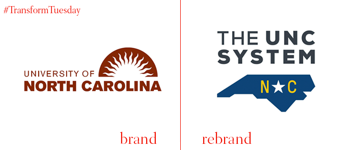
University of North Carolina
The University of North Carolina has been rebranded by Columbus, Ohio-based brand and digital agency Ologie. The university is the oldest public university in the US and covers sixteen campuses. Given that it is the overarching brand for each of these colleges, each with its own insignias, the UNC needed a logo that says ‘North Carolina’ more than ‘university logo.’ The new design system fulfils this task as literally as it could, evoking elements of the state flag set within the shape of North Carolina. University president Margaret Spelling said of the new identity, ‘A strong system means our institutions can focus on their core mission: providing North Carolinians the full promise higher education holds.’
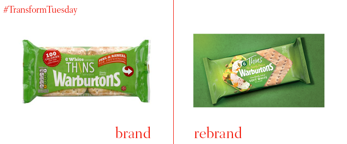
Warburtons Sandwich Thins
London-based agency Bulletproof has repackaged bread offering, Warburtons Sandwich Thins. The packaging design framework will be used for other Warburton products and is intended with longevity in mind. In considering this challenge, Bulletproof found that customers wanted the packaging to emphasise its delectability over its low-fat count. The packaging features diamonds filled with foodie photography, bright colours and a transparency window allowing a glimpse at the sandwich thins. Bulletproof describes the change as ‘a design bursting with taste appeal that achieves the perfect balance of Warburtons masterbrand and range standout.’ Compared to competitor sandwich thins, Warburtons’ packaging looks sophisticated and tasty.
For more from Transform magazine, follow us on Twitter @Transformsays


